It looks like you're using an Ad Blocker.
Please white-list or disable AboveTopSecret.com in your ad-blocking tool.
Thank you.
Some features of ATS will be disabled while you continue to use an ad-blocker.

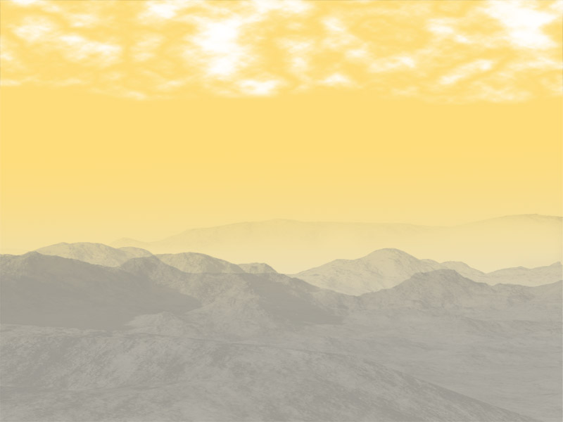
First landscape painted in photoshop, please critique
page: 2share:
reply to post by HomerinNC
composition is lacking, no focus , not enough definition, nor enough contrast. you need a focal point. even in landscapes there is a subject.
what emotions or ideas are you trying to get across. way to much sky try cutting some out and lowering clouds, you have trees darker infront of trees that should be darker
i could really hack it to pieces , but because its photoshop, you are not in art school (that i know of) i wont ^^
reply to post by Spike Spiegle
i grew up with that guy ,, hahah fluffy clouds and little happy trees lol good ol bob in 5am in the morning age 6-8 lol
i grew up with that guy ,, hahah fluffy clouds and little happy trees lol good ol bob in 5am in the morning age 6-8 lol
reply to post by HomerinNC
I think that there is room for improving the details you put into the trees, the mountains are pretty much perfect, and the clouds could be made fluffier (like you did on the outside of parts of them). These are my suggestions on things you could work on (it's always good to know that!), it's a great start and better than I could do.
I think that there is room for improving the details you put into the trees, the mountains are pretty much perfect, and the clouds could be made fluffier (like you did on the outside of parts of them). These are my suggestions on things you could work on (it's always good to know that!), it's a great start and better than I could do.
reply to post by ~widowmaker~
Thanks for your critique, I'm not in art school, just starting out doing landscapes, wasn't trying to do anything but attempt a landscape, eventually I want to do fantasy landscapes, like alien ruins and such.
The mountains are a ps brush, haven't been able to draw them myself
Does anyone suggest a good computer program (free lol) I can use to do computer art?
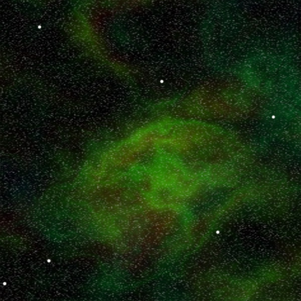
Here are 2 others I've done
Thanks for your critique, I'm not in art school, just starting out doing landscapes, wasn't trying to do anything but attempt a landscape, eventually I want to do fantasy landscapes, like alien ruins and such.
The mountains are a ps brush, haven't been able to draw them myself
Does anyone suggest a good computer program (free lol) I can use to do computer art?
Here are 2 others I've done
edit on 1/9/2013 by HomerinNC because: (no reason given)
Nice work Homer, you got me motivated to do more!!!
Keep at it, i like spreading out the paint and using the smudge tool to blend it all together...
Keep at it, i like spreading out the paint and using the smudge tool to blend it all together...
new topics
-
Russia Flooding
Other Current Events: 10 minutes ago -
MULTIPLE SKYMASTER MESSAGES GOING OUT
World War Three: 39 minutes ago -
Two Serious Crimes Committed by President JOE BIDEN that are Easy to Impeach Him For.
US Political Madness: 1 hours ago -
911 emergency lines are DOWN across multiple states
Breaking Alternative News: 1 hours ago -
Former NYT Reporter Attacks Scientists For Misleading Him Over COVID Lab-Leak Theory
Education and Media: 3 hours ago -
Why did Phizer team with nanobot maker
Medical Issues & Conspiracies: 3 hours ago -
Pro Hamas protesters at Columbia claim hit with chemical spray
World War Three: 4 hours ago -
Elites disapearing
Political Conspiracies: 6 hours ago -
A Personal Cigar UFO/UAP Video footage I have held onto and will release it here and now.
Aliens and UFOs: 6 hours ago -
Go Woke, Go Broke--Forbes Confirms Disney Has Lost Money On Star Wars
Movies: 8 hours ago
top topics
-
British TV Presenter Refuses To Use Guest's Preferred Pronouns
Education and Media: 14 hours ago, 17 flags -
Go Woke, Go Broke--Forbes Confirms Disney Has Lost Money On Star Wars
Movies: 8 hours ago, 12 flags -
Pro Hamas protesters at Columbia claim hit with chemical spray
World War Three: 4 hours ago, 11 flags -
Trump To Hold Dinner with President of Poland At Trump Tower Tonight
2024 Elections: 16 hours ago, 8 flags -
Elites disapearing
Political Conspiracies: 6 hours ago, 7 flags -
Freddie Mercury
Paranormal Studies: 8 hours ago, 7 flags -
Tucker Carlson interviews Christian pastor from Bethlehem.
Middle East Issues: 16 hours ago, 7 flags -
A Personal Cigar UFO/UAP Video footage I have held onto and will release it here and now.
Aliens and UFOs: 6 hours ago, 5 flags -
Nirvana - Immigrant Song
Music: 13 hours ago, 4 flags -
Two Serious Crimes Committed by President JOE BIDEN that are Easy to Impeach Him For.
US Political Madness: 1 hours ago, 3 flags