It looks like you're using an Ad Blocker.
Please white-list or disable AboveTopSecret.com in your ad-blocking tool.
Thank you.
Some features of ATS will be disabled while you continue to use an ad-blocker.

BTS : Avatar Creations
page: 105share:
reply to post by bigfatfurrytexan
transparent .gif backgrounds?
the entire image doesn't have to be full of something.
transparent .gif backgrounds?
reply to post by Zarniwoop
well...i was thinking .png. it seems to be far less lossy. But yeah...i have an irregularly shaped frame I am working on at home (at work right now) that would match my signature nicely. Of course, I am not ready to change avatars yet. I just finished this one and am liking it quite a bit. BUt maybe someone else would find it interesting.
well...i was thinking .png. it seems to be far less lossy. But yeah...i have an irregularly shaped frame I am working on at home (at work right now) that would match my signature nicely. Of course, I am not ready to change avatars yet. I just finished this one and am liking it quite a bit. BUt maybe someone else would find it interesting.
so I took a quick break to throw something together. It is eating at my mind.
Originally posted by Zarniwoop
reply to post by SonoftheSun
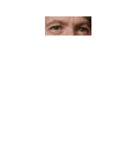
Do you think you could make another one having his right eye blink?
LOVE IT !!!!!!
You know, the first set you've done, when I looked at it on the profile page, I was like OMG Sirius' got an extra set of eyes in the forehead !!! But the meld on the avatar is perfect !!
I will keep the subtle tired eyes for when I get into debates...the ol' tired look then BAM the uppercut...
Awesome awesome work Zarniwoop ! Thank you so much, I truly appreciate !!!
reply to post by Druid42
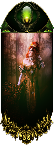
What Kinglizard made is truly an excellent piece of artwork. So certainly keep using it. This is intended more as a match to your new signature, and for an example for what I am talking about. The green one posted prior....it was just something I threw together quickly using a thumbdrive version of PS5. Not as comfortable with that version, and I like this much more
What Kinglizard made is truly an excellent piece of artwork. So certainly keep using it. This is intended more as a match to your new signature, and for an example for what I am talking about. The green one posted prior....it was just something I threw together quickly using a thumbdrive version of PS5. Not as comfortable with that version, and I like this much more
reply to post by SonoftheSun
The animated avatars never line up in the profile page. They need to be viewed in an actual post.
Go figure.
The animated avatars never line up in the profile page. They need to be viewed in an actual post.
Go figure.
Originally posted by bigfatfurrytexan
so I took a quick break to throw something together. It is eating at my mind.
I wondered earlier what your mind was farting out, now I think I understand. Profile Backgrounds need not be square, nor do avatars.
one more, to show the idea taken to the extreme, with truly open borders (i made it from scratch):

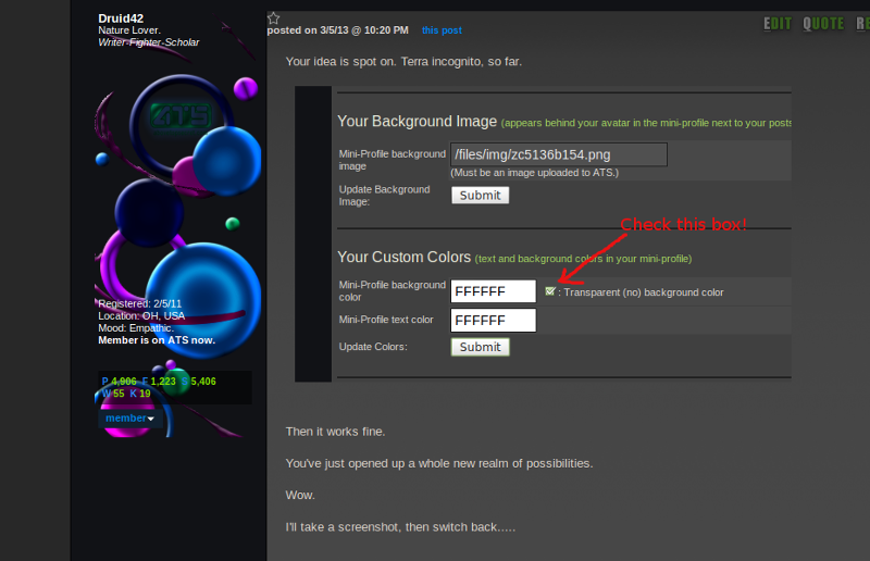
Your idea is spot on. Terra incognito, so far.
Then it works fine.
You've just opened up a whole new realm of possibilities.
Wow.
I'll take a screenshot, then switch back.....
Then it works fine.
You've just opened up a whole new realm of possibilities.
Wow.
I'll take a screenshot, then switch back.....
I'm really diggin' the new signatures guys.
Good work to those involved.
-SAP-
Good work to those involved.
-SAP-
reply to post by bigfatfurrytexan
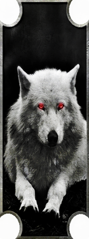
That one looks good.
About the only problem I can see with the trannsparent backgrounds is they kind of look like they are just images sitting on dark grey backgrounds. Maybe adding some shadow effect and bringing the edges so they aren't cut off might make it look more like it's floating on the side of the page.
The other ones with the shaped borders look a lot better though, they tend to stand out more than just a straight rectangle of image.
No CS5 for this week..... No creations for me....
edit on 5/3/2013 by 74Templar because: grammar...
Screen shot:
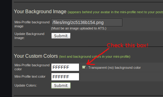
No more square Profile Backgrounds required.
Gotta switch to transparent background color.
Nice brain fart, bfft. You've set another precedent.
Awesome possibilities. Who'd thunk?
No more square Profile Backgrounds required.
Gotta switch to transparent background color.
Nice brain fart, bfft. You've set another precedent.
Awesome possibilities. Who'd thunk?
reply to post by bigfatfurrytexan
Care to round off the corners, slightly, and add a border to this?
Just to enact the "backgrounds need not be square" rule you've created?
Care to round off the corners, slightly, and add a border to this?
Just to enact the "backgrounds need not be square" rule you've created?
reply to post by 74Templar
with a touch more shadow
and some more neon effect, just to make it different.
with a touch more shadow
and some more neon effect, just to make it different.
Originally posted by bigfatfurrytexan
reply to post by Druid42
178X530? Doesn't fit.
Hang on, resizing.....
Hmm. Interesting. Turned out that 180x455 was the size it takes to get it to fit properly. Extra pixels at the top?
Still, as proof of concept, I'm prolly the first to have a non-blocked background edge. There's no longer any reason to have a rectangular looking background, thanks to bfft's idea.
Rounded top? Jagged? The possibilities.....
Still, as proof of concept, I'm prolly the first to have a non-blocked background edge. There's no longer any reason to have a rectangular looking background, thanks to bfft's idea.
Rounded top? Jagged? The possibilities.....
reply to post by bigfatfurrytexan
Just trying it on, defientely looks good against the background.
Will leave it up for a bit for the appraisal.
Just trying it on, defientely looks good against the background.
Will leave it up for a bit for the appraisal.
new topics
-
The functionality of boldening and italics is clunky and no post char limit warning?
ATS Freshman's Forum: 28 minutes ago -
Meadows, Giuliani Among 11 Indicted in Arizona in Latest 2020 Election Subversion Case
Mainstream News: 1 hours ago -
Massachusetts Drag Queen Leads Young Kids in Free Palestine Chant
Social Issues and Civil Unrest: 1 hours ago -
Weinstein's conviction overturned
Mainstream News: 2 hours ago -
Supreme Court Oral Arguments 4.25.2024 - Are PRESIDENTS IMMUNE From Later Being Prosecuted.
Above Politics: 4 hours ago -
Krystalnacht on today's most elite Universities?
Social Issues and Civil Unrest: 4 hours ago -
Chris Christie Wishes Death Upon Trump and Ramaswamy
Politicians & People: 4 hours ago -
University of Texas Instantly Shuts Down Anti Israel Protests
Education and Media: 6 hours ago -
Any one suspicious of fever promotions events, major investor Goldman Sachs card only.
The Gray Area: 9 hours ago
top topics
-
VP's Secret Service agent brawls with other agents at Andrews
Mainstream News: 17 hours ago, 11 flags -
Krystalnacht on today's most elite Universities?
Social Issues and Civil Unrest: 4 hours ago, 8 flags -
Weinstein's conviction overturned
Mainstream News: 2 hours ago, 6 flags -
Supreme Court Oral Arguments 4.25.2024 - Are PRESIDENTS IMMUNE From Later Being Prosecuted.
Above Politics: 4 hours ago, 5 flags -
Electrical tricks for saving money
Education and Media: 16 hours ago, 5 flags -
University of Texas Instantly Shuts Down Anti Israel Protests
Education and Media: 6 hours ago, 4 flags -
Meadows, Giuliani Among 11 Indicted in Arizona in Latest 2020 Election Subversion Case
Mainstream News: 1 hours ago, 3 flags -
Any one suspicious of fever promotions events, major investor Goldman Sachs card only.
The Gray Area: 9 hours ago, 2 flags -
Massachusetts Drag Queen Leads Young Kids in Free Palestine Chant
Social Issues and Civil Unrest: 1 hours ago, 2 flags -
God's Righteousness is Greater than Our Wrath
Religion, Faith, And Theology: 13 hours ago, 1 flags
active topics
-
Weinstein's conviction overturned
Mainstream News • 18 • : nugget1 -
University of Texas Instantly Shuts Down Anti Israel Protests
Education and Media • 158 • : Threadbarer -
-@TH3WH17ERABB17- -Q- ---TIME TO SHOW THE WORLD--- -Part- --44--
Dissecting Disinformation • 675 • : Thoughtful3 -
Candidate TRUMP Now Has Crazy Judge JUAN MERCHAN After Him - The Stormy Daniels Hush-Money Case.
Political Conspiracies • 760 • : matafuchs -
Meadows, Giuliani Among 11 Indicted in Arizona in Latest 2020 Election Subversion Case
Mainstream News • 3 • : network dude -
Any one suspicious of fever promotions events, major investor Goldman Sachs card only.
The Gray Area • 9 • : xuenchen -
President BIDEN Vows to Make Americans Pay More Federal Taxes in 2025 - Political Suicide.
2024 Elections • 145 • : ImagoDei -
Massachusetts Drag Queen Leads Young Kids in Free Palestine Chant
Social Issues and Civil Unrest • 7 • : nugget1 -
Nearly 70% Of Americans Want Talks To End War In Ukraine
Political Issues • 86 • : Consvoli -
Supreme Court Oral Arguments 4.25.2024 - Are PRESIDENTS IMMUNE From Later Being Prosecuted.
Above Politics • 51 • : Threadbarer