It looks like you're using an Ad Blocker.
Please white-list or disable AboveTopSecret.com in your ad-blocking tool.
Thank you.
Some features of ATS will be disabled while you continue to use an ad-blocker.

7.8%: This Is Economic Recovery?
page: 6share:
Originally posted by butcherguy
reply to post by campanionator
Yes, 7.8 %..... that's great.
When it was 5.4% the Democratic Party railed about how awful it was.
So they expected so much better of Bush at 5.4%, but when Obama has it at 7.8%, he is doing a brilliant job.
I guess they really have low expectations for Obama.
I never complained about Bush's employment numbers until the economy crashed and
burned on a historic scale.
I disagreed with Bush's war policies and pro rich tax schemes, but not employment.
Originally posted by Blarneystoner
In my 40 plus years, I've never seen such contempt for any POTUS, including Carter and Nixon.
It's as if all Republicans would jump for joy if the economy completely collapsed under the current administration. It wouldn't surprise me if they were actually praying for it.
I'd just like some honesty. I called Bush on HIS B.S. fantasyland numbers after the crash began in 2007. They cooked the books so bad I think they still have singe marks around the edges.....but Obama has taken that and gone to all new levels. It's not that I want the economy to crash...I simply don't see how it WON'T thanks to this President. In specific reference to the economy, the numbers speak for themselves and they speak loud and clear. Obama is bad for employment and it shows.
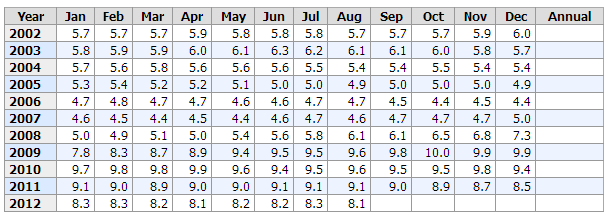
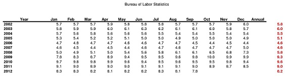
That's a screen shot of the chart last week from the Bureau of Labor Statistics. Bush had a bad time in 2002/03 for this...but then, umm... The whole tourist and travel industry had all but collapsed in the short term too. 9/11 was one heck of an economic event. What's Obama's excuse and what was MUCH worse to explain his numbers? They start just as he's winning the election and carry to this day.
Keeping comparisons out of this, those numbers suck and there is no way to sugar coat or spin it when you see the whole context there, IMO. I've also heard absolutely nothing to explain yet how 4 years into the future will be better than those past 4. "'cause they say so'" isn't what votes are cast by and it seems to be about the size of the plan for making the numbers improve by jobs and not workers just giving up.
edit on 6-10-2012 by Wrabbit2000 because: minor correction.
Considering 9th grade 150 years ago is equal to a doctorate today, we should feel lucky to have 10% employment.
Originally posted by Wrabbit2000
In specific reference to the economy, the numbers speak for themselves and they speak loud and clear. Obama is bad for employment and it shows.
That's a screen shot of the chart last week from the Bureau of Labor Statistics. Bush had a bad time in 2002/03 for this...but then, umm...
You seem to have trouble reading the chart. Jobs kept vanishing and kept vanishing and kept vanishing and when Obama took office and his policies started going into effect, that trend began to reverse.
Please show me what I am missing.
reply to post by beezzer
There's a problem with your analogy, the potus is never the driver.
Here's my analogy...
The potus is always the passenger and can direct where he wants to go, but the driver is congress. Before congress takes off for their destination, the potus's travel plans are changed because the majority who are accompanying him are being told by friends and acquaintances there are better things to do at a different destination and the benefits of going there are well worth it.
reply to post by Andcoulter
Huh? Wha? I don't get what you're talking about. That chart is the national unemployment numbers for the months/years indicated by the Bureau of Labor Stats. What do you mean the jobs kept vanishing and vanishing until Obama got elected?
Umm... I think I see what you are reading but I can't be right.. You can't mean the number going down and down for the years prior to Obama coming was a bad thing, can you? The LOWER the number, the better in this....or am I totally missing your point??
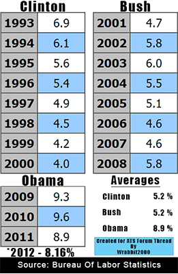
I made up a quick little graphic to show the performance problem a bit better here.... The charts are direct copies from the BLS site, the Averages are figured by those and anyone else can check it that way. The 2012 number is derived from the BLS stats on the 9 months of 2012, including the 7.8 figure, and pulling the average.
Like I said, the numbers speak for themselves and they speak loud and clear. At least on this one indicator, they sure do.
Huh? Wha? I don't get what you're talking about. That chart is the national unemployment numbers for the months/years indicated by the Bureau of Labor Stats. What do you mean the jobs kept vanishing and vanishing until Obama got elected?
Umm... I think I see what you are reading but I can't be right.. You can't mean the number going down and down for the years prior to Obama coming was a bad thing, can you? The LOWER the number, the better in this....or am I totally missing your point??
I made up a quick little graphic to show the performance problem a bit better here.... The charts are direct copies from the BLS site, the Averages are figured by those and anyone else can check it that way. The 2012 number is derived from the BLS stats on the 9 months of 2012, including the 7.8 figure, and pulling the average.
Like I said, the numbers speak for themselves and they speak loud and clear. At least on this one indicator, they sure do.
Originally posted by Andcoulter
Originally posted by Wrabbit2000
In specific reference to the economy, the numbers speak for themselves and they speak loud and clear. Obama is bad for employment and it shows.
That's a screen shot of the chart last week from the Bureau of Labor Statistics. Bush had a bad time in 2002/03 for this...but then, umm...
You seem to have trouble reading the chart. Jobs kept vanishing and kept vanishing and kept vanishing and when Obama took office and his policies started going into effect, that trend began to reverse.
Please show me what I am missing.
You have missed the fact that the jobs started disappearing after the Democrats got control of Congress (Jan 2007).
They must have done something ?
Bush had the rate down to 4.4% for while until Harry & Nancy took a closer look ...
Notice also that the Republicans took back the House starting in Jan 2011.
Seems they may have staved off some attempts by Democrats to cause even heavier damage.
Originally posted by Wrabbit2000
reply to post by Andcoulter
Huh? Wha? I don't get what you're talking about. That chart is the national unemployment numbers for the months/years indicated by the Bureau of Labor Stats. What do you mean the jobs kept vanishing and vanishing until Obama got elected?
Umm... I think I see what you are reading but I can't be right.. You can't mean the number going down and down for the years prior to Obama coming was a bad thing, can you? The LOWER the number, the better in this....or am I totally missing your point??
I made up a quick little graphic to show the performance problem a bit better here.... The charts are direct copies from the BLS site, the Averages are figured by those and anyone else can check it that way. The 2012 number is derived from the BLS stats on the 9 months of 2012, including the 7.8 figure, and pulling the average.
Like I said, the numbers speak for themselves and they speak loud and clear. At least on this one indicator, they sure do.
I agree with Andcoulter, having lost 2% in 2008, employment was @ 7.8% the month Obama was sworn in 2009,
the trend continued until it hit 9.9 - 10 %.
The DOW was at 7,300
Companies laid off, 750,000 a month
The entire global market place slowed to a crawl.
Your examination as you characterize is intellectually dishonest, it does not embody the level of damage
that occurred or the time it takes to repair as opposed to destroy.
... But you surely show how easy it is for you to point your finger -
reply to post by campanionator
I'm not making an examination. Thats the whole thing. What I'm doing here is simply presenting the facts as the U.S. Government presents them by their own armies of statisticians and number gurus. I know of no better funded or better supported source for these numbers than Uncle's very own agencies dedicated to nothing but producing them. The BLS, CBO, GAO, CRS and a few other alphabet soup groups who just produce reams of paper and studies.
I know it's a bit of a change from the norm..in that almost every media graphic of these kinds ARE modified and spun in their own special little way to show numbers derived from the data and spun right or left to support a point.
With VERY rare exception (and I can't think of one at the moment, honestly) my graphic charts and larger 'data boards' are 100% and entirely showing the data as it's displayed by the source itself. Not derived or spun out.
In my charts here, someone going to the BLS will find the page these each appear on has nothing but these charts on it. I'm not dropping anything, being cute with cropping or otherwise spinning the Government data in what few little ways are left when changing the numbers is absolutely not something I'll do.
(In case someone wants to get HYPER critical....the Year chart goes back a few decades more. THAT was cropped for 1993-2012. Years prior, removed. Nothing ...but nothing else was altered. )
Nope... I'm not even trying to do much for interpreting the numbers beyond fairly saying this is ONLY ONE indicator of many and I agree, it isn't 100% proof of anything in isolation of all other stats. However, the other stats suck too.....so it all kinda goes together. Thats for people to make their own minds on tho and why I DO present 100% precisely and literally, the numbers as they sit in those Government reports.
I didn't know it was the government's job to employ people. Hmmmmmm...that's interesting.
You know what the REAL PROBLEM is? People are just straight up LA-ZY! They want EVERYTHING handed to them on a silver platter, while being thanked.
Geesh. What a world of pathetic people....we have become.
You know what the REAL PROBLEM is? People are just straight up LA-ZY! They want EVERYTHING handed to them on a silver platter, while being thanked.
Geesh. What a world of pathetic people....we have become.
reply to post by St Udio
thanks for the positive feedback guys....
just today the big media finally addressed the point i was trying to make... with this article:
dprogram.net...-116926
the gov't call the program of food entitlement 'SNAP' instead of FOOD STAMP
NOTE. the administration figures that 141.000 jobs were created last in September (reducing the unemployment to 7.8% from the precious 8.1%)
but there were 181.000 new SNAP recipients getting monthly foodstamps...something stinks besides the job markets
the Øbama administration SPIN on the economy is coming apart at the seams to my observations
thanks for the positive feedback guys....
just today the big media finally addressed the point i was trying to make... with this article:
dprogram.net...-116926
the gov't call the program of food entitlement 'SNAP' instead of FOOD STAMP
...At 46,681,833 million the persons hooked on SNAP, the July number crossed the previous record posted a short month before, as the foodstamp curve continues ‘plumbing’ newer and greater heights each month.
More disturbing is that in the same month, the number of US households reliant on foodstamps rose by a whopping 99,493 to 22,541,744.
Assuming a modest 2 persons per household, the increase means that more people went on Foodstamps in the month of July than found jobs (181,000 according to the latest revised NFP data).
Furthermore, it appears that buying votes has become a tad more expensive in the past month. After the benefit per household dipped to a record low in April at just $275.81, this has since retraced some of its losses and is now at an inflationary $277.92.
Oh well: inflation....
NOTE. the administration figures that 141.000 jobs were created last in September (reducing the unemployment to 7.8% from the precious 8.1%)
but there were 181.000 new SNAP recipients getting monthly foodstamps...something stinks besides the job markets
the Øbama administration SPIN on the economy is coming apart at the seams to my observations
For every "1 person" added to the "labor force," "10 more people" are added to those "not in the labor force."
For Every Person Added to Labor Force, 10 Added to Those Not in Labor Force
1:09 PM, Oct 15, 2012 • By DANIEL HALPER
www.weeklystandard.com...
That is, in nearly the four years, since President Obama took office in January 2009, only 827,000 people have been added to the labor force, while during that same time period, 8,208,000 have been added to those not in the labor force. The chart relies on data available from the federal Bureau of Labor Statistics. "The numbers represented in the chart are a measure of growth from January 2009 through September 2012," the Republican side of the Senate Budget Committee explains. "The data is sourced from the Bureau of Labor Statistics’ Current Population Survey, a sample of 60,000 households conducted by personal and telephone interviews. Basic labor force data are gathered monthly. The labor force consists of all people aged 16 and over either employed or actively seeking work. It does not include discouraged workers, people who have retired, or those on welfare or disability who are no longer looking for work. The 'not in the labor force' group is defined as the total civilian non-institutional population minus the labor force."
For Every Person Added to Labor Force, 10 Added to Those Not in Labor Force
1:09 PM, Oct 15, 2012 • By DANIEL HALPER
www.weeklystandard.com...
edit on 15-10-2012 by
alternateuniverse because: (no reason given)
new topics
-
Pentagon acknowledges secret UFO project, the Kona Blue program | Vargas Reports
Aliens and UFOs: 14 minutes ago -
Boston Dynamics say Farewell to Atlas
Science & Technology: 22 minutes ago -
I hate dreaming
Rant: 1 hours ago -
Is the origin for the Eye of Horus the pineal gland?
Philosophy and Metaphysics: 2 hours ago -
Man sets himself on fire outside Donald Trump trial
Mainstream News: 2 hours ago -
Biden says little kids flip him the bird all the time.
2024 Elections: 3 hours ago -
The Democrats Take Control the House - Look what happened while you were sleeping
US Political Madness: 3 hours ago -
Sheetz facing racial discrimination lawsuit for considering criminal history in hiring
Social Issues and Civil Unrest: 3 hours ago -
In an Historic First, In N Out Burger Permanently Closes a Location
Mainstream News: 5 hours ago -
MH370 Again....
Disaster Conspiracies: 6 hours ago
top topics
-
In an Historic First, In N Out Burger Permanently Closes a Location
Mainstream News: 5 hours ago, 14 flags -
The Democrats Take Control the House - Look what happened while you were sleeping
US Political Madness: 3 hours ago, 10 flags -
Thousands Of Young Ukrainian Men Trying To Flee The Country To Avoid Conscription And The War
Other Current Events: 16 hours ago, 8 flags -
A man of the people
Medical Issues & Conspiracies: 11 hours ago, 8 flags -
Man sets himself on fire outside Donald Trump trial
Mainstream News: 2 hours ago, 7 flags -
Biden says little kids flip him the bird all the time.
2024 Elections: 3 hours ago, 6 flags -
4 plans of US elites to defeat Russia
New World Order: 12 hours ago, 4 flags -
Is the origin for the Eye of Horus the pineal gland?
Philosophy and Metaphysics: 2 hours ago, 4 flags -
Sheetz facing racial discrimination lawsuit for considering criminal history in hiring
Social Issues and Civil Unrest: 3 hours ago, 3 flags -
Are you ready for the return of Jesus Christ? Have you been cleansed by His blood?
Religion, Faith, And Theology: 8 hours ago, 3 flags
active topics
-
Do we live in a simulation similar to The Matrix 1999?
ATS Skunk Works • 28 • : JoelSnape -
The Democrats Take Control the House - Look what happened while you were sleeping
US Political Madness • 33 • : ImagoDei -
Old School Punk
Music • 537 • : underpass61 -
Pentagon acknowledges secret UFO project, the Kona Blue program | Vargas Reports
Aliens and UFOs • 1 • : imitator -
Man sets himself on fire outside Donald Trump trial
Mainstream News • 28 • : KKLOCO -
Thousands Of Young Ukrainian Men Trying To Flee The Country To Avoid Conscription And The War
Other Current Events • 32 • : Xtrozero -
Biden says little kids flip him the bird all the time.
2024 Elections • 15 • : SideEyeEverything1 -
Boston Dynamics say Farewell to Atlas
Science & Technology • 1 • : BingoMcGoof -
In an Historic First, In N Out Burger Permanently Closes a Location
Mainstream News • 7 • : underpass61 -
12 jurors selected in Trump criminal trial
US Political Madness • 102 • : Xtrozero