It looks like you're using an Ad Blocker.
Please white-list or disable AboveTopSecret.com in your ad-blocking tool.
Thank you.
Some features of ATS will be disabled while you continue to use an ad-blocker.

$5.00 dollar a gallon gas is back yay!! (NOT)
page: 3share:
reply to post by moniesisfun
That still doesnt explain the so called demand. If the Global Economy is down which usually means lower Oil use than what is the real problem??
Also, I know that Saudi Arabia is releasing more oil to "help" the price. Is that not happening anymore??
reply to post by hoochymama
China and India's demand hasn't been affected by this downturn the way the U.S. has.
www.indexmundi.com...
www.indexmundi.com...
It's this demand that continues to drive prices up.
China and India's demand hasn't been affected by this downturn the way the U.S. has.
www.indexmundi.com...
www.indexmundi.com...
It's this demand that continues to drive prices up.
edit on 4-10-2012 by antonia because: opps
reply to post by hoochymama
^this
I'm not going to have all the answers, suffice to say that major fields are going dry, or will soon...pretty much all over the world. So it could be that there is a lack of supply outside of Saudia Arabia. I think they still have expanded their production, recently.
You're correct that in the poor economy, demand slips, but these trends may take a little while to be realized, and the true down cycle of this leg is yet to be actualized. Look for a correction within months, but not just yet.
edit on 4-10-2012 by moniesisfun because: (no reason
given)
reply to post by moniesisfun
As soon as Gas Prices in Cali goes down some refinary Fire happens, especially in the last 2 years or so, which is the reason they use for
prices going up in CALI. It has nothing to do with demand. Also, considering over the last two years the amount of Gas that has been saved because
of less travel, vacations, car pooling, etc. it would be apparent that prices should be much lower. The correlation doesnt exist anymore between
supply and demand when it comes to Gasoline.
I can find sources but I am much to lazy. If you need them I will get them but in this case I dont think its needed.
I can find sources but I am much to lazy. If you need them I will get them but in this case I dont think its needed.
reply to post by hoochymama
It's missing from those charts as the U.S. doesn't have the raw data for them. Considering their economy was still growing during this time it's unlikely their demand went down.
And now I really do need to sleep.
It's missing from those charts as the U.S. doesn't have the raw data for them. Considering their economy was still growing during this time it's unlikely their demand went down.
And now I really do need to sleep.
reply to post by antonia
How Convenient. And to say the US Economy Grew in the last two years is like saying our unemployment rate is 8%.
Originally posted by hoochymama
reply to post by antonia
How Convenient. And to say the US Economy Grew in the last two years is like saying our unemployment rate is 8%.
She didn't. You must have misread.
I must go to sleep as well.
Enjoy your nite.
Originally posted by hoochymama
reply to post by moniesisfun
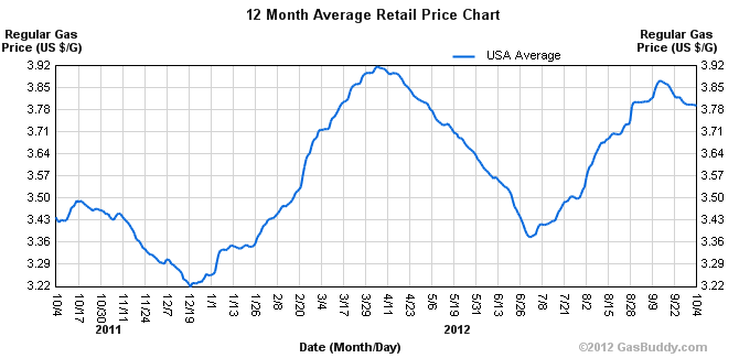
So, your Historical Gas price graph is for the year 2012 and the prices on ur graph only have a variance of .09cents??
Lets see a graph for the last 5-6 years than get an actual Historical Graph from the previous 50 years and add inflation into the mix. I guarantee that these prices dont fit even for todays standards.
The Historic rise was the precurser to get us used to $3.00 a gallon gas. So, when the fluctuations move to $4.00 its not that big of deal. Now, going from $.99 a gallon to $2.00 or even $2.50 was a huge deal.
I can provide a graph actual recorded every time I filling up. It is segmented by going from a gasoline to diesel fuelled car, but since the price of diesel is coupled with that of gasoline where I live, I dared superimposing the two.
Since I can see the year graph presented earlier rather accurate, I have tried to more or less draw us dollar prices into it. It aint science but it can give some oversight in what happened the last 5-6 years.
First the yeargraph provided earlier for comparison.
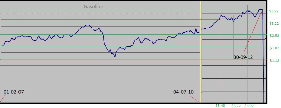
The big dip you see in the graph is the crisis setting in. A gallon would have done something like $1.20-$1.30. no?
edit on 4/10/12 by D.Wolf
because: typo-negative
edit on 4/10/12 by D.Wolf because: adapted pic
edit on 4/10/12 by D.Wolf because: yearpic
added.
Originally posted by hoochymama
reply to post by moniesisfun
As soon as Gas Prices in Cali goes down some refinary Fire happens, especially in the last 2 years or so, which is the reason they use for prices going up in CALI. It has nothing to do with demand. Also, considering over the last two years the amount of Gas that has been saved because of less travel, vacations, car pooling, etc. it would be apparent that prices should be much lower. The correlation doesnt exist anymore between supply and demand when it comes to Gasoline.
I can find sources but I am much to lazy. If you need them I will get them but in this case I dont think its needed.
In your opinion ma'am, do you think there is some sort of foul play in these refinery fire to cause the prices to go up?
reply to post by sylent6
Im not a ma'am (its juss a name) but yes, I would say the Oil Prices are now fixed for some reason. Just like everything else. But, it seems
the price of Oil no longer has anything to do with the price of Gas. I just found a "chart" to prove that point but I will wait to post it.
reply to post by hoochymama
I would gladly pay $5 a gallon, no problem. [dreaming] I would get me one of those muscle cars instead of the muesli I drive now. [/dreaming] Unfortunately, on this side of the pond, we are taxed into smaller and smaller cars if we want to stay away from the open sewer system between stations.
Meh a dinky will do.
Originally posted by sylent6
Originally posted by steve95988
its has gone from about $3.99 for regular to about $4.24 here in Chico ,ca within a day... not sure why... but i cant do nothing about it.... i always keep my tanks full just encase of a shtf scenario
You're right about that; no less that 24 hrs it had increase. I wouldn't expect Chico being so cheap. Lucky you my friend.
I find it odd that Chico is so cheap when 45 minute drive north west is 50 to 75 cents higher. I know where I am headed to fill up tomorrow.
reply to post by MsAphrodite
Don't fall for the Romney BS. We are producing more oil and gas now that ever oil production has gone up under Obama. So how can you explain the shortage? Romney wants to drill in protected areas also he wants to bring the Keystone pipeline thru even though the the oil companies have stated that none of the oil or gas will be sold here in the states it is all for export only.
Don't fall for the Romney BS. We are producing more oil and gas now that ever oil production has gone up under Obama. So how can you explain the shortage? Romney wants to drill in protected areas also he wants to bring the Keystone pipeline thru even though the the oil companies have stated that none of the oil or gas will be sold here in the states it is all for export only.
Gas is blended differently in the winter to make it burn cleaner. But if its october and youre out of summer gas cause youre making winter gas, why
not fill the tanker with winter gas wtf?
Gas is also blended differently for different areas for emissions bull. California gas costs more because it burns cleaner supposedly. You can blame your politicians.
But im not claiming expertise, i drive a soap tanker....not gas.
Gas is also blended differently for different areas for emissions bull. California gas costs more because it burns cleaner supposedly. You can blame your politicians.
But im not claiming expertise, i drive a soap tanker....not gas.
new topics
-
Has Tesla manipulated data logs to cover up auto pilot crash?
Automotive Discussion: 1 hours ago -
whistleblower Captain Bill Uhouse on the Kingman UFO recovery
Aliens and UFOs: 6 hours ago -
1980s Arcade
General Chit Chat: 8 hours ago -
Deadpool and Wolverine
Movies: 9 hours ago -
Teenager makes chess history becoming the youngest challenger for the world championship crown
Other Current Events: 10 hours ago -
CIA botched its handling of sexual assault allegations, House intel report says
Breaking Alternative News: 11 hours ago
top topics
-
Lawsuit Seeks to ‘Ban the Jab’ in Florida
Diseases and Pandemics: 13 hours ago, 20 flags -
Starburst galaxy M82 - Webb Vs Hubble
Space Exploration: 15 hours ago, 13 flags -
The Superstition of Full Moons Filling Hospitals Turns Out To Be True!
Medical Issues & Conspiracies: 17 hours ago, 8 flags -
CIA botched its handling of sexual assault allegations, House intel report says
Breaking Alternative News: 11 hours ago, 8 flags -
15 Unhealthiest Sodas On The Market
Health & Wellness: 15 hours ago, 6 flags -
whistleblower Captain Bill Uhouse on the Kingman UFO recovery
Aliens and UFOs: 6 hours ago, 6 flags -
1980s Arcade
General Chit Chat: 8 hours ago, 4 flags -
Deadpool and Wolverine
Movies: 9 hours ago, 3 flags -
Teenager makes chess history becoming the youngest challenger for the world championship crown
Other Current Events: 10 hours ago, 3 flags -
Has Tesla manipulated data logs to cover up auto pilot crash?
Automotive Discussion: 1 hours ago, 0 flags
active topics
-
Lawsuit Seeks to ‘Ban the Jab’ in Florida
Diseases and Pandemics • 23 • : burritocat -
Has Tesla manipulated data logs to cover up auto pilot crash?
Automotive Discussion • 1 • : andy06shake -
15 Unhealthiest Sodas On The Market
Health & Wellness • 36 • : tanstaafl -
My wife just had a very powerful prophetic dream - massive war in Israel...
The Gray Area • 12 • : SchrodingersRat -
-@TH3WH17ERABB17- -Q- ---TIME TO SHOW THE WORLD--- -Part- --44--
Dissecting Disinformation • 606 • : burritocat -
"We're All Hamas" Heard at Columbia University Protests
Social Issues and Civil Unrest • 199 • : FlyersFan -
It takes One to Be; Two to Tango; Three to Create.
Philosophy and Metaphysics • 7 • : Terpene -
Take it to the Media when you protest.. Don't let them ignore you!
Education and Media • 4 • : SchrodingersRat -
They Killed Dr. Who for Good
Rant • 62 • : FlyersFan -
Definitive 9.11 Pentagon EVIDENCE.
9/11 Conspiracies • 421 • : Lazy88