It looks like you're using an Ad Blocker.
Please white-list or disable AboveTopSecret.com in your ad-blocking tool.
Thank you.
Some features of ATS will be disabled while you continue to use an ad-blocker.

SEEKING MEMBER INPUT: ATS.5/3 - give your feedback -- UPDATES May 28, 2013
page: 20share:
The updated look is very nice. Currently if I'm viewing ATS on my mobile I have to turn the screen and view in widescreen. It's not a big deal at
all, but I would much prefer if I didn't have to do this. With this new layout, it looks like my preference is coming to pass.
The updated look is very nice. Currently if I'm viewing ATS on my mobile I have to turn the screen and view in widescreen. It's not a big deal at
all, but I would much prefer if I didn't have to do this. With this new layout, it looks like my preference is coming to pass.
reply to post by SkepticOverlord
I like the fact that accessing the user aspects of ATS are in tact and well put together. Although, I still have concerns about the forums. The forums are, for me, the main draw to ATS. There are so many different forums offering many different topics to get into. I want that to remain a main feature of ATS.
The mobile layout appears to work well on smart phones. The top down layout is something which will be perfect for iphone5.
This latest design mockup is really not all that attractive on an iOS device, nor a computer.
I can not, for the life of me, figure out why people like these redesigns. The home page of a website basically serves as a directory for everything that is on a website, but considering ATS is pretty much -just- a forum, there's nothing to put on the home page. The only thing you can really do is aggregate popular threads to post on the home page, and to have that be successful, you have to find a way to break up the monotony of text text text text text text. My eyes glaze over when I see the current homepage, it's just text and drab colors, same as the most recent mockup.
Whenever I come to the site now I just click the forums tab and go to the sections I view frequently. I like the forum index because there are little images/icons next to all of the sub-forums to break up all the text. If you kept the blue/green color scheme you have going on in for forum index, and put the icons that correspond to each section next to the thread titles, I think that would help break everything up and be easier on the eyes, and on top of that it would make the home page actually match the rest of the site.
reply to post by SkepticOverlord
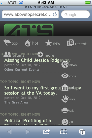
It looks good in the screen shot you provided but not on my iPhone. This is what I see:
I’m sure once the bugs are worked out it will be sweet, though I don’t have a problem with the functionality of the current format either.
Nice new look!
When's the roll out?
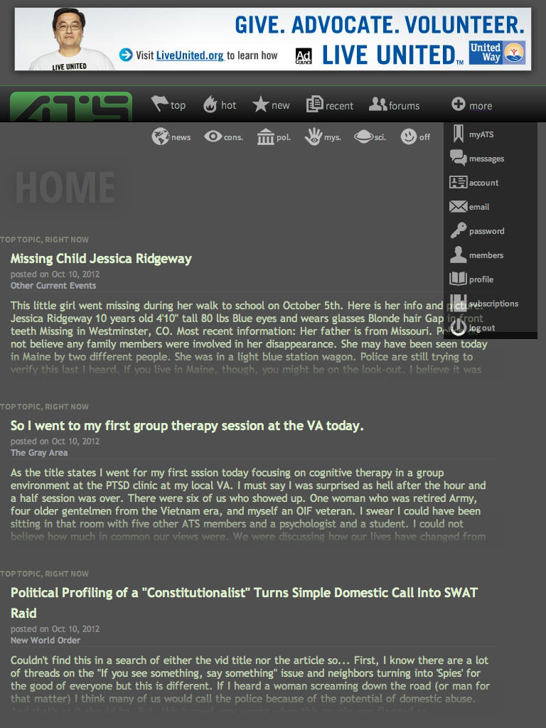
After some lengthy research and offline testing, I'm zoning in on a navigation system that remains simple, yet supports flexibility.
www.abovetopsecret.com/ats53D.php
Click the thumbnail for a view of how it looks on a iPad in "portrait" orientation:

While there's much about the aesthetics of a left-side navigation to like, the reality is that modern users (especially mobile) are accustomed to horizontal navigation/menu. After some lengthy research and offline testing, I'm zoning in on a navigation system that remains simple, yet supports flexibility.
It looks good in the screen shot you provided but not on my iPhone. This is what I see:
I’m sure once the bugs are worked out it will be sweet, though I don’t have a problem with the functionality of the current format either.
Nice new look!
When's the roll out?
edit on 18-10-2012 by seabag because: (no reason given)
reply to post by SkepticOverlord
SkepticOverlord as always 1 is pleased with the ATS set up and layout. The scale down assistance is a great feature also for smaller screen activity. I remember when on mobile in the past, it was hard to enter different threads due to link not opening from page being scaled improperly don't know could of been my not so high tech phone back then but if that type of issue has been eliminated then looks good to me thus far SkepticOverlord keep up the good work and thanks for keeping us members in mind. Take it easy SkepticOverlord
NAMASTE*******
reply to post by SkepticOverlord
'Gotta keep up with the technology. I give your proposal the "this_is_who_we_are" seal of approval:

'Gotta keep up with the technology. I give your proposal the "this_is_who_we_are" seal of approval:

I actually started using my ipod touch, surfing the web instead of just listening to music, so I can't wait.
reply to post by SkepticOverlord
I like it. It's easy on the eyes. Everything is still there but it's not so there if you know what I mean. It's also easy to navigate through. The whole layout seems to segue well from other sites I have to go to for work, and these are business sites. This new layout gives it a more professional look IMO and it's not so much of a drastic change from the other sites I work from, which makes my time online all the more easier.
Between that and all the comments I've seen about the mobile and social aspects of all this, looks like you've got a winner on your hands with this layout.
Good job.
Looks great!! Nice clean look, the colors are awesome! Great work guys and gals
I'm curious on something here and perhaps it's been addressed pages back and I simply missed it.
Is there any reason why both the new/updating model being designed now as well as the old we are using right now cannot exist side by side? Perhaps as a toggle field in the Profile page like 'Theme' is on many other sites? Of course, for the sanity of the development team....the old/current version would likely be terminated for further updates and development. Understandable if that would be the case.
However, is there actually anything being done and with the new interface in mind which flat won't work at all on the old one? Features or site areas? If not...why not leave the Legacy in place until it just breaks for good one day by changing platforms and standards. The die hard's who hate change...OR those with quirky platforms or browsers will have their solution without driving the ATS development team to drink.
My 2 cents before taxes and school loans would be just to keep everything simple. Some of us are not recent college grads. who know everything there
is to know about computers.
Looks fine on the HTC EVO 4G LTE...I have a 4.7" screen. Just keep it clean & simple.
Looks cool it has everything needed for a modern application.
I don't use Apps nor am I a member of Facebook etc. so I can't help on those. I do use Comodo Dragon as a browser, it is built on top of Chrome, and
everything appears to navigate and link just fine, no HTML style sheet font or image issues etc.
I would like to make a suggestion to duplicate the header links, to the bottom of the page as a footer too. It makes navigation way faster...no need to scroll all the way up on a long thread or click back as a short cut.
I would like to make a suggestion to duplicate the header links, to the bottom of the page as a footer too. It makes navigation way faster...no need to scroll all the way up on a long thread or click back as a short cut.
edit on 19-10-2012 by BigBrotherDarkness because: extra for
suggestion
reply to post by SkepticOverlord
I like it but have a concern. The left hand bar is way too wide. By the time the avatars and such get placed, there is going to be minimal room left for contents of posts. Thus will require much more scolling, etc. to read a page full of posts.
Is there plans to shrink down the avatars? Will users be able to determine the width of the link bar on the left?
reply to post by SkepticOverlord
Great! But can i suggest another icon beside Politics, Conspiracies, Off, etc? I think that there should be a "Religion" icon, so that "Off" isn't clouded with religious threads. Many members have commented that having a religion category separated from the others, like politics and conspiracies, would be great.
But love the fact that you can directly access the key points of ATS! It would be easier to navigate, espiecally when you're only interested in one topic in particular!
new topics
-
Is the origin for the Eye of Horus the pineal gland?
General Conspiracies: 1 hours ago -
Man sets himself on fire outside Donald Trump trial
Mainstream News: 1 hours ago -
Biden says little kids flip him the bird all the time.
2024 Elections: 1 hours ago -
The Democrats Take Control the House - Look what happened while you were sleeping
US Political Madness: 2 hours ago -
Sheetz facing racial discrimination lawsuit for considering criminal history in hiring
Social Issues and Civil Unrest: 2 hours ago -
In an Historic First, In N Out Burger Permanently Closes a Location
Mainstream News: 4 hours ago -
MH370 Again....
Disaster Conspiracies: 4 hours ago -
Are you ready for the return of Jesus Christ? Have you been cleansed by His blood?
Religion, Faith, And Theology: 6 hours ago -
Chronological time line of open source information
History: 8 hours ago -
A man of the people
Medical Issues & Conspiracies: 9 hours ago
top topics
-
In an Historic First, In N Out Burger Permanently Closes a Location
Mainstream News: 4 hours ago, 14 flags -
The Democrats Take Control the House - Look what happened while you were sleeping
US Political Madness: 2 hours ago, 8 flags -
A man of the people
Medical Issues & Conspiracies: 9 hours ago, 8 flags -
Thousands Of Young Ukrainian Men Trying To Flee The Country To Avoid Conscription And The War
Other Current Events: 14 hours ago, 7 flags -
Iran launches Retalliation Strike 4.18.24
World War Three: 17 hours ago, 6 flags -
4 plans of US elites to defeat Russia
New World Order: 11 hours ago, 4 flags -
Man sets himself on fire outside Donald Trump trial
Mainstream News: 1 hours ago, 4 flags -
12 jurors selected in Trump criminal trial
US Political Madness: 17 hours ago, 4 flags -
Biden says little kids flip him the bird all the time.
2024 Elections: 1 hours ago, 3 flags -
Sheetz facing racial discrimination lawsuit for considering criminal history in hiring
Social Issues and Civil Unrest: 2 hours ago, 3 flags
active topics
-
12 jurors selected in Trump criminal trial
US Political Madness • 79 • : matafuchs -
The Democrats Take Control the House - Look what happened while you were sleeping
US Political Madness • 17 • : matafuchs -
Biden says little kids flip him the bird all the time.
2024 Elections • 7 • : chiefsmom -
Man sets himself on fire outside Donald Trump trial
Mainstream News • 13 • : KKLOCO -
Israeli Missile Strikes in Iran, Explosions in Syria + Iraq
World War Three • 101 • : CarlLaFong -
Thousands Of Young Ukrainian Men Trying To Flee The Country To Avoid Conscription And The War
Other Current Events • 26 • : Lazy88 -
George Knapp AMA on DI
Area 51 and other Facilities • 27 • : TheValeyard -
4 plans of US elites to defeat Russia
New World Order • 35 • : Oldcarpy2 -
Sheetz facing racial discrimination lawsuit for considering criminal history in hiring
Social Issues and Civil Unrest • 6 • : chiefsmom -
Is the origin for the Eye of Horus the pineal gland?
General Conspiracies • 1 • : ARM19688