It looks like you're using an Ad Blocker.
Please white-list or disable AboveTopSecret.com in your ad-blocking tool.
Thank you.
Some features of ATS will be disabled while you continue to use an ad-blocker.

SEEKING MEMBER INPUT: ATS.5/3 - give your feedback -- UPDATES May 28, 2013
page: 17share:
I think I saw the most current updated picture. It looks good, I like the layout. But, Bill, man, where do you come up with this color schemes.
reply to post by JaxonRoberts
Hello Jaxon
The more tab is at the very top of the page beside the new ATS logo with :
new, top, recent, forums , more ; running next to it
www.abovetopsecret.com... ( Prototype)
Hello Jaxon
The more tab is at the very top of the page beside the new ATS logo with :
new, top, recent, forums , more ; running next to it
www.abovetopsecret.com... ( Prototype)
edit on 9-10-2012 by azureskys because: (no reason given)
edit on 9-10-2012 by azureskys because: added
more
edit on 9-10-2012 by azureskys because: (no reason given)
reply to post by azureskys
Nice, but that is not the format that was put out by SO on the September 30th update. The menu is on the left side, not the top... and lacks a 'more' tab...
Nice, but that is not the format that was put out by SO on the September 30th update. The menu is on the left side, not the top... and lacks a 'more' tab...
reply to post by SkepticOverlord
I think it would be very usefull if there was a function that shows all the threads that had activity in the past 24 hours. ALL the threads.
That maybe a few pages, but it would make sure that absolutely nothing would "slip by", which happens quite regularly.
I am sure that you as ATS staff agree with me.
You wouldn't want people to miss anything, right?
Art work, html and css and getting it all to work together can be tedious. Everyone has their own opinions and taste so here's my $.02 worth. I like
the layout as it is now and here's why.....
The colors and smooth buttons looks more modern and professional, however I would put those navigational buttons at the top banner like you have in the old web style. Furthermore, I would put in a sidebar as well. The top of the sidebar would have the ATS logo in the top corner and stitch both the side bar and banner bar seamlessly together. Then have center main page like it is in the center with scroll bars and on the right side frame for advertisement and what not. This would still allow the ability to change the background colors or pictures to give a new look and feel IE: Like Winter/Christmas, fall, summer, spring like themes allowing and giving you the ability to make the site look different and something new once in while without completely doing a makeover or major changes. Most websites will have a stationary banner/sidebar of some kind allowing fast navigation. If people think it takes to much footprint well they need to learn to use keys to change views IE:.... [crtl]+[scroll-wheel] or [ctrl]+[z]+[scroll-wheel] for zooming capability. Last but not least have a link to toggle between 2 different layouts, why not have both??
The colors and smooth buttons looks more modern and professional, however I would put those navigational buttons at the top banner like you have in the old web style. Furthermore, I would put in a sidebar as well. The top of the sidebar would have the ATS logo in the top corner and stitch both the side bar and banner bar seamlessly together. Then have center main page like it is in the center with scroll bars and on the right side frame for advertisement and what not. This would still allow the ability to change the background colors or pictures to give a new look and feel IE: Like Winter/Christmas, fall, summer, spring like themes allowing and giving you the ability to make the site look different and something new once in while without completely doing a makeover or major changes. Most websites will have a stationary banner/sidebar of some kind allowing fast navigation. If people think it takes to much footprint well they need to learn to use keys to change views IE:.... [crtl]+[scroll-wheel] or [ctrl]+[z]+[scroll-wheel] for zooming capability. Last but not least have a link to toggle between 2 different layouts, why not have both??
edit on 17-10-2012 by
sean because: (no reason given)
edit on 17-10-2012 by sean because: (no reason given)
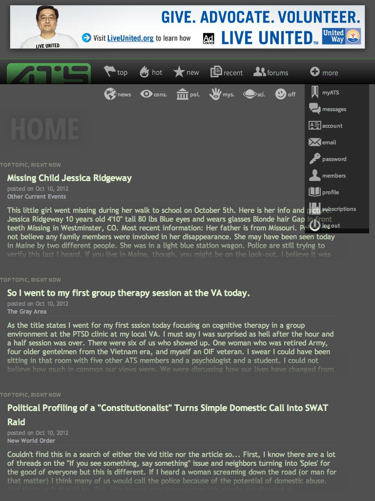
After some lengthy research and offline testing, I'm zoning in on a navigation system that remains simple, yet supports flexibility.
www.abovetopsecret.com/ats53D.php
Click the thumbnail for a view of how it looks on a iPad in "portrait" orientation:

While there's much about the aesthetics of a left-side navigation to like, the reality is that modern users (especially mobile) are accustomed to horizontal navigation/menu.
This example shows the full secondary menu as how it would look on the "Top Tier" pages "above" the actual discussion board. Once inside the discussion board, it goes away to leave the simple six-item main menu.
And the "more" drop-down works when you click it (no hovers in the new ATS).
There may be some tweaks and location color coding of the main menu, but unless we see an overwhelming backlash... this is the one I like best.
Oh... and it does a neat sticky trick when you scroll.
(disclaimer: not yet tested on all browsers and mobile devices)
Only seeking comments on the User Interface and layout at this point. The primary colors of the text and background are still being compared on a range of devices for possible changes.
www.abovetopsecret.com/ats53D.php
Click the thumbnail for a view of how it looks on a iPad in "portrait" orientation:
While there's much about the aesthetics of a left-side navigation to like, the reality is that modern users (especially mobile) are accustomed to horizontal navigation/menu.
This example shows the full secondary menu as how it would look on the "Top Tier" pages "above" the actual discussion board. Once inside the discussion board, it goes away to leave the simple six-item main menu.
And the "more" drop-down works when you click it (no hovers in the new ATS).
There may be some tweaks and location color coding of the main menu, but unless we see an overwhelming backlash... this is the one I like best.
Oh... and it does a neat sticky trick when you scroll.
(disclaimer: not yet tested on all browsers and mobile devices)
Only seeking comments on the User Interface and layout at this point. The primary colors of the text and background are still being compared on a range of devices for possible changes.
You should make sure the logo is all the way visible, it is the most important aspect to have a strong brand.
reply to post by SkepticOverlord
Looks good.
One minor request. I'd like to see the MyATS option appear on the main bar.
Looks good.
One minor request. I'd like to see the MyATS option appear on the main bar.
reply to post by 3chainz
Part of the new branding is a cut-off logo as you see it in the new design.
Part of the new branding is a cut-off logo as you see it in the new design.
reply to post by SkepticOverlord
I for one applaud the work and effort.
I'm glad we have a team who keeps up on the latest and continuously tries to improve the services.
Now, Waits to see My ATS on the main bar and if this will work in the REAL real world.
I for one applaud the work and effort.
I'm glad we have a team who keeps up on the latest and continuously tries to improve the services.
Now, Waits to see My ATS on the main bar and if this will work in the REAL real world.
Color Scheme looks great.
I like the drop down, rather than hover menu.
I like the drop down, rather than hover menu.
I LOVE IT!!!!! I love that you can choose what categories to see right there without the hassle, I know you guys are doing this for some other users
that have mobile devices, etc,. I am still on a laptop, and I LOVE IT, it weeds right through anything we don't want to have to see, but still have
the option if we want.
Hopefully the "Off" button will say something else, I thought "off"? and then said ahhhh off topic, I thought it was going to log me out
Keep it coming!!
Peace, NRE.
Hopefully the "Off" button will say something else, I thought "off"? and then said ahhhh off topic, I thought it was going to log me out
Keep it coming!!
Peace, NRE.
reply to post by SkepticOverlord
When I am on ATS, I am using an IPad 99% of the time and I can honestly say I really like it! I think my favorite part about it is the icons/little images used to navigate, and the drop down bar under the 'more' tab. How the material is layed out when I choose a topic is very neat, clean and easily readable and accessible. All around it's fresh, new, easy to use, and good on the eyes! I like it quite a bit!!
When I am on ATS, I am using an IPad 99% of the time and I can honestly say I really like it! I think my favorite part about it is the icons/little images used to navigate, and the drop down bar under the 'more' tab. How the material is layed out when I choose a topic is very neat, clean and easily readable and accessible. All around it's fresh, new, easy to use, and good on the eyes! I like it quite a bit!!
Usually change leaves me fetal balled, cuddling a bottle of whiskey... but this? This looks great! Very much a different feel - but warmer with fewer
sharp edges. I'm excited!
reply to post by SkepticOverlord
Funny enough it looks great on my 10" tablet, but not so much on my 22" monitor.
I find the bar that follows you seems to get lost on the tablet too, sometimes appearing at the top after scrolling up or down, sometimes in the middle of the page, and sometimes it just vanishes.
That's using Opera browser 12.10 on android ics using flash player 11.1 unofficially side loaded since adobe are putting flash to bed.. But this is html5 isnt it? so a non-issue then I guess.
I think the bar issue is browser related. Different browsers I've used act differently. Dolphin/Opera the bar floats around and sticks at times. Others, it stays exactly where it's supposed to.
But the overall view from my tablet is a lot easier on the eye than the current style, and it looks like I wont have to find those little text buttons inside the larger image holders to click on links now That's a good thing!
Please incorporate this into the user interface!
If these suggestions have not been made already, then PLEASE OH PLEASE, for the sake of members and information, incorporate this into the daily life of ATS:
In-Thread search feature
A polling option that OP's can fairly easily encode to gather information/opinions in the simple form of % (percentages)
In-Thread filters
Here's a Link to a thread that I started in hopes to see some of this scripting incorporated into ATS.
Respectfully,
- AeonStorm -
If these suggestions have not been made already, then PLEASE OH PLEASE, for the sake of members and information, incorporate this into the daily life of ATS:
Here's a Link to a thread that I started in hopes to see some of this scripting incorporated into ATS.
Respectfully,
- AeonStorm -
edit on 18-10-2012 by AeonStorm because: link, grammar, added, changed
reply to post by SkepticOverlord
I think the design looks beautiful. On my PC it works very well and is quick. At the moment, my Tablet is acting up for connecting to the LAN so
I can't say on it. However, you may ask the design people to have someone else with a Win based phone give it a whirl. I'm using an HTC Trophy and
Internet Explorer native to it to test..
For feedback purposes, it loads Column 1 on the Win Phone and only the first story of Column one. Part of the top line menu is visible, but not all and zooming in or out isn't possible. Clicking a top line option loads the new text over the top of the existing text as it came up. Of course, on the PC I can see how nice the effect works and looks. This is just an FYI and advanced feedback to that device, as you noted not all had been checked. Hope that helps a bit.
The design and function outside of my annoying Win Phone is 100% better and downright modern!
edit on 18-10-2012 by Wrabbit2000 because: (no reason given)
new topics
-
Is the origin for the Eye of Horus the pineal gland?
General Conspiracies: 26 minutes ago -
Man sets himself on fire outside Donald Trump trial
Mainstream News: 37 minutes ago -
Biden says little kids flip him the bird all the time.
2024 Elections: 43 minutes ago -
The Democrats Take Control the House - Look what happened while you were sleeping
US Political Madness: 1 hours ago -
Sheetz facing racial discrimination lawsuit for considering criminal history in hiring
Social Issues and Civil Unrest: 1 hours ago -
In an Historic First, In N Out Burger Permanently Closes a Location
Mainstream News: 3 hours ago -
MH370 Again....
Disaster Conspiracies: 3 hours ago -
Are you ready for the return of Jesus Christ? Have you been cleansed by His blood?
Religion, Faith, And Theology: 6 hours ago -
Chronological time line of open source information
History: 7 hours ago -
A man of the people
Diseases and Pandemics: 8 hours ago
top topics
-
Israeli Missile Strikes in Iran, Explosions in Syria + Iraq
World War Three: 17 hours ago, 18 flags -
In an Historic First, In N Out Burger Permanently Closes a Location
Mainstream News: 3 hours ago, 14 flags -
Thousands Of Young Ukrainian Men Trying To Flee The Country To Avoid Conscription And The War
Other Current Events: 13 hours ago, 7 flags -
The Democrats Take Control the House - Look what happened while you were sleeping
US Political Madness: 1 hours ago, 7 flags -
Iran launches Retalliation Strike 4.18.24
World War Three: 16 hours ago, 6 flags -
12 jurors selected in Trump criminal trial
US Political Madness: 16 hours ago, 4 flags -
4 plans of US elites to defeat Russia
New World Order: 10 hours ago, 4 flags -
A man of the people
Diseases and Pandemics: 8 hours ago, 4 flags -
Biden says little kids flip him the bird all the time.
2024 Elections: 43 minutes ago, 2 flags -
Sheetz facing racial discrimination lawsuit for considering criminal history in hiring
Social Issues and Civil Unrest: 1 hours ago, 2 flags
active topics
-
President BIDEN Warned IRAN Not to Attack ISRAEL - Iran Responded with a Military Attack on Israel.
World War Three • 46 • : ImagoDei -
Man sets himself on fire outside Donald Trump trial
Mainstream News • 7 • : OnlyYouKnow2 -
12 jurors selected in Trump criminal trial
US Political Madness • 70 • : xuenchen -
Biden says little kids flip him the bird all the time.
2024 Elections • 4 • : marg6043 -
Israeli Missile Strikes in Iran, Explosions in Syria + Iraq
World War Three • 98 • : CarlLaFong -
Thousands Of Young Ukrainian Men Trying To Flee The Country To Avoid Conscription And The War
Other Current Events • 24 • : DerBeobachter2 -
"We're All Hamas" Heard at Columbia University Protests
Social Issues and Civil Unrest • 131 • : marg6043 -
So I saw about 30 UFOs in formation last night.
Aliens and UFOs • 35 • : charlyv -
The Democrats Take Control the House - Look what happened while you were sleeping
US Political Madness • 13 • : WiiDemBoyz -
Sheetz facing racial discrimination lawsuit for considering criminal history in hiring
Social Issues and Civil Unrest • 5 • : Shoshanna