It looks like you're using an Ad Blocker.
Please white-list or disable AboveTopSecret.com in your ad-blocking tool.
Thank you.
Some features of ATS will be disabled while you continue to use an ad-blocker.

SEEKING MEMBER INPUT: ATS.5/3 - give your feedback -- UPDATES May 28, 2013
page: 16share:
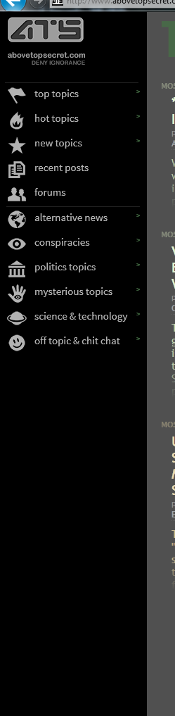
The side bar is nice and I like but...the forums are may too simplified. The thing I really like about ATS is all the depth and variety in the forums.
There are main forum sections and then there all the sub sections with each main forum. That is something I would like to see NOT change.
This layout looks to me something which could work really well for mobile, i.e. smartphones, but the desktop version would be a negative. ATS has so much depth and options for the user to explore that taking all of that away would be a bad idea.
If ATS really wants to roll this out on the desktop version then I would request to keep all the great depth which makes ATS such an engaging website.
I can only really imagine the challenges that you all must be facing as you try to get this right.
I imagine it is a matter of trying to find a balance between innovation, practicality and aesthetics while at the same time not ending up like this...
______beforeitsnews/
Which is where you are presently heading, despite how 'different' we look at the moment.
Don't be those guys. Try putting the 'frames' back around the tiles.
P.S. Also, may we have the flag and reply count on the new topics?
edit on 2-10-2012 by Xoanon because: ?
reply to post by SkepticOverlord
i have my screen set to magnify 150 (the eyes just arent what the used to be) with this set up on the home page i have to do a whole lotta scrolling (on the preview i only get one topic sometimes two across) so i wouldnt like this one the home page myself though it would be nice on other pages. the thought of having hashes to put more info on the homepage sounds very nice though.
i have my screen set to magnify 150 (the eyes just arent what the used to be) with this set up on the home page i have to do a whole lotta scrolling (on the preview i only get one topic sometimes two across) so i wouldnt like this one the home page myself though it would be nice on other pages. the thought of having hashes to put more info on the homepage sounds very nice though.
I like the concept.
Thoughts:
1. My preference is for vertical grouping of subjects on the home page. I like what you are doing with the color coding.
2. The page I use every day is the new topics page. Now that I'm looking at the correct page, I quite like it. This is the most important page for being able to quickly surmise the recent topic data at a quick glance.
3. The all the time top bar will be very useful.
Good job.
edit on 2-10-2012 by pirhanna because: (no reason given)
Hello SO,
I like the left-hand side bar. It creates a cleaner look and is efficient.
For the front page, however, even though the topics are in different colors, I would personally like to see them blocked a bit more - i.e. more definition between topics or forum colors - the "wall of text" effect is a little visually overwhelming. Does that make sense?
For example, I would make the topics more a little more 'news article' -ish with borders around groupings of topics and/or between columns, for more visual separation. If I were coming to the site for the first time, I would be a bit overwhelmed by the text wall, but that's just me.
Other than that, I think it is an interesting new format! I'm pretty easy-going about these things. As long as I can clearly see and find the information/articles I'm happy.
Thanks for the chance to give input!
peace,
AB
I have got used to the slowness, so that doesn't bother me now.
But how I use ATS is New Topics Firehose. I then scroll from the bottom to choose which ones I can gather more info from or can give info I have.
As to how the new format looks, I have eye issues and have to enlarge the screen (and I have a 17" screen ) so the new format posts became visually 'all the same'. I found reading them difficult and confusing. The colours seem to be faint to my eyes also. Could they be made brighter?
My eye issues have been caused by a microwave weapon BTW.
I also look at individual forums too, the one's I am interested in, but only if I haven't been on for a few days.
I rarely use the search as I found it difficult.
I don't know if that is helpful or not.
reply to post by SkepticOverlord
I like it, but I don't see a MyATS tab, or a Tools tab... Am I to assume that those will be added to the list of tabs?
I like it, but I don't see a MyATS tab, or a Tools tab... Am I to assume that those will be added to the list of tabs?
At first, I did not like the new look, it seemed to spread out but after a little play with it,
I realized I actually enjoyed the visuals of it better than the present version.
Less distracting.
I realized I actually enjoyed the visuals of it better than the present version.
Less distracting.
reply to post by lernmore
I agree with your suggestion of a date when thread was started.
This is something I find my self questioning often. "How old is this,sounds familiar"
I even find my self looking for a "Started On" date
forgetting that I know full-well it's not there.
I agree with your suggestion of a date when thread was started.
This is something I find my self questioning often. "How old is this,sounds familiar"
I even find my self looking for a "Started On" date
forgetting that I know full-well it's not there.
Originally posted by azureskys
reply to post by JaxonRoberts
Keep looking.
It's all there under the "MORE" tab.
...and where is this "MORE" tab you speak of???
Definitely looks better than the current design, but on my widescreen monitor the threads are somewhat overwhelming. Although I can zoom in the
threads to an easier viewing position it is hard to discern different forum/topics.

If the colours were a little stronger I think it would make it easier to navigate and negate my previous issue.

If the colours were a little stronger I think it would make it easier to navigate and negate my previous issue.
edit on 3-10-2012 by Strainz because: added
Wow, just went onto the laptop and it looks great!
And fast!
Too bad I'm on my phone most of the time these days (cheaper).
On the phone, I could only see half an inch of the threads
Once the side bar slides out of the way for the phones
And fast!
Too bad I'm on my phone most of the time these days (cheaper).
On the phone, I could only see half an inch of the threads
Once the side bar slides out of the way for the phones
it is very helpful and useful and very trendy in the same time.
It has a lot of space and refinement.
I love it
.
It has a lot of space and refinement.
I love it
.
klkl, but when are you gunna make an ATS app for the android market, i have to use twitter to get my fix when im out and about and it would be a lot
easier if i could just fire up an ATS app
Nice.
One of the things I need and others ask for is a simple way to find out how my threads and my recent posts are going. Would be nice if they were on the left side functionality.
Currently there are ways but they are convoluted, except for my ATS page.
No, I have not read all 16 pages.
P
One of the things I need and others ask for is a simple way to find out how my threads and my recent posts are going. Would be nice if they were on the left side functionality.
Currently there are ways but they are convoluted, except for my ATS page.
No, I have not read all 16 pages.
P
reply to post by SkepticOverlord
SO,
Don't know if you took my input directly earlier in this thread, but this test page is very nice! Especially how the columns adjust given the browser window! THANK YOU SIR! Love it!
I like this Sept 30th layout. It's good...if there's a newer one let me get further down the thread and I'll comment on that too! Anyway, I love it and it's good work! thanks man!
new topics
-
This is our Story
General Entertainment: 1 hours ago -
President BIDEN Vows to Make Americans Pay More Federal Taxes in 2025 - Political Suicide.
2024 Elections: 4 hours ago -
Ode to Artemis
General Chit Chat: 4 hours ago -
Ditching physical money
History: 8 hours ago -
One Flame Throwing Robot Dog for Christmas Please!
Weaponry: 8 hours ago -
Don't take advantage of people just because it seems easy it will backfire
Rant: 8 hours ago -
VirginOfGrand says hello
Introductions: 9 hours ago -
Should Biden Replace Harris With AOC On the 2024 Democrat Ticket?
2024 Elections: 10 hours ago
top topics
-
University student disciplined after saying veganism is wrong and gender fluidity is stupid
Education and Media: 12 hours ago, 12 flags -
Police clash with St George’s Day protesters at central London rally
Social Issues and Civil Unrest: 15 hours ago, 9 flags -
President BIDEN Vows to Make Americans Pay More Federal Taxes in 2025 - Political Suicide.
2024 Elections: 4 hours ago, 8 flags -
TLDR post about ATS and why I love it and hope we all stay together somewhere
General Chit Chat: 16 hours ago, 7 flags -
Should Biden Replace Harris With AOC On the 2024 Democrat Ticket?
2024 Elections: 10 hours ago, 6 flags -
Don't take advantage of people just because it seems easy it will backfire
Rant: 8 hours ago, 4 flags -
One Flame Throwing Robot Dog for Christmas Please!
Weaponry: 8 hours ago, 4 flags -
God lived as a Devil Dog.
Short Stories: 14 hours ago, 3 flags -
Ditching physical money
History: 8 hours ago, 3 flags -
VirginOfGrand says hello
Introductions: 9 hours ago, 2 flags
active topics
-
Terrifying Encounters With The Black Eyed Kids
Paranormal Studies • 70 • : burritocat -
Tucker Carlson UFOs are piloted by spiritual entities with bases under the ocean and the ground
Aliens and UFOs • 42 • : Jukiodone -
The Fight for Election Integrity Continues -- Audits, Criminal Investigations, Legislative Reform
2024 Elections • 4143 • : Station27 -
-@TH3WH17ERABB17- -Q- ---TIME TO SHOW THE WORLD--- -Part- --44--
Dissecting Disinformation • 636 • : F2d5thCavv2 -
Russia Ukraine Update Thread - part 3
World War Three • 5719 • : F2d5thCavv2 -
Who guards the guards
US Political Madness • 5 • : 19Bones79 -
One Flame Throwing Robot Dog for Christmas Please!
Weaponry • 6 • : BeTheGoddess2 -
Police clash with St George’s Day protesters at central London rally
Social Issues and Civil Unrest • 37 • : SprocketUK -
New whistleblower Jason Sands speaks on Twitter Spaces last night.
Aliens and UFOs • 48 • : baablacksheep1 -
Hate makes for strange bedfellows
US Political Madness • 40 • : 19Bones79