It looks like you're using an Ad Blocker.
Please white-list or disable AboveTopSecret.com in your ad-blocking tool.
Thank you.
Some features of ATS will be disabled while you continue to use an ad-blocker.

SEEKING MEMBER INPUT: ATS.5/3 - give your feedback -- UPDATES May 28, 2013
page: 1share:
Latest edition of the new light-background design concept is discussed in this
post.
ORIGINAL POST
So here we are again, just about 3 years since we began our last redesign, and it's time to push the mothership into this decade with a completely new "front end" that's compatible with modern browsers, and much more efficient.
I'm beginning a massive overhaul of ATS so that we end up with what's commonly known as a "Responsive Web Application" -- or -- a website that works normally on your desktop/laptop, yet gracefully scales down to run like a app on your smart phone and tablet.
NEW PAGES LISTED BELOW
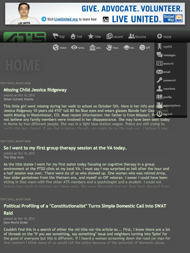
Here's a look at a functioning preliminary design concept for the site home page...
www.abovetopsecret.com...
-- update 9/14: this is now fully responsive down to smart phones held in portrait mode
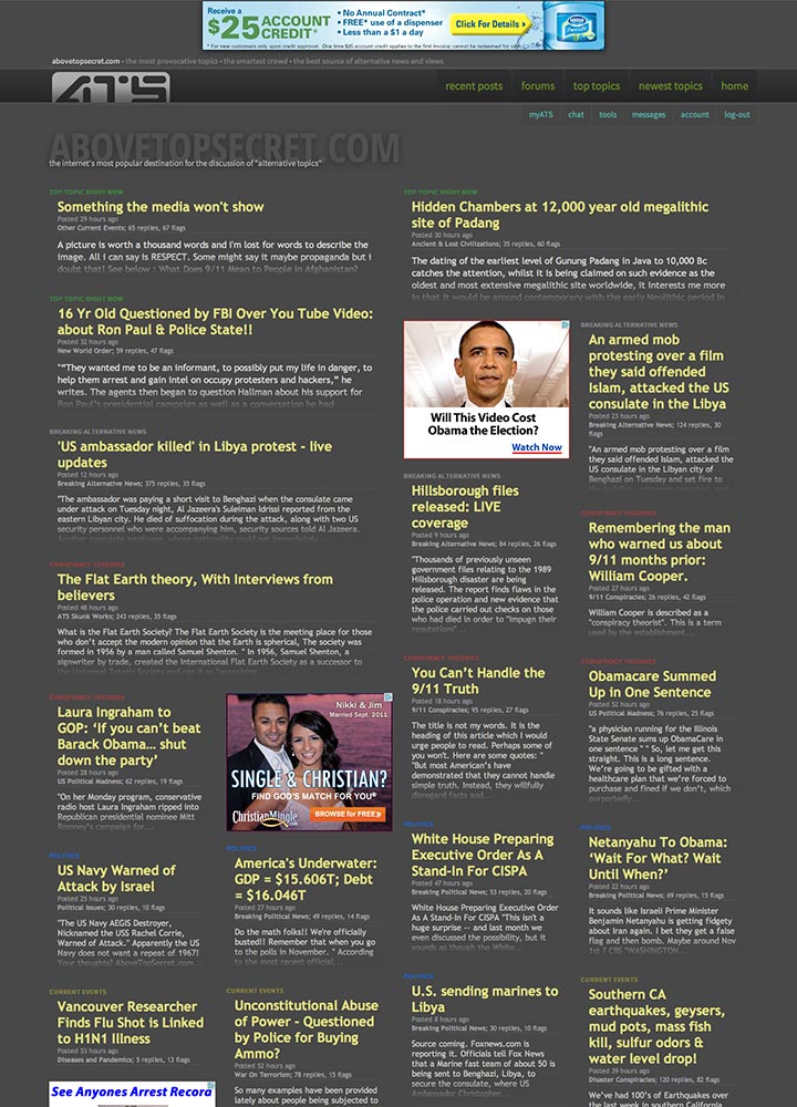
Also a the "recent posts" page is coming close to final design...
www.abovetopsecret.com...
-- update 9/13: this features a new "lazy load" that adds threads to the bottom as you scroll down
Persistent dark menu bar (not yet fully responsive down to phone-sized screens)
-- update 9/17, a refined minimalist dark menu
And update to the prototype home page's in-page menu is outlined in this post
-- update 9/19
The completed top-tier framework is discussed in this post
-- update 9/21
NEW OCTOBER UPDATES
This post shows a new and much more refined navigations system that is a solid choice for all screens.

October 19:
This post shows a refinement of the release candidate design concept.
original post...
Many structural ideas are borrowed from our existing site home, but the colors are a bit less dark, the content can be wider, and the overall User Experience is much more clean and obvious.
This version has not been reliably tested on all browsers yet. But you should see something close to this image (which is scaled 50%)

Since this is a significant redesign effort, I'm checking in on our members to get your feedback as I begin work on the rest of the pages.
Thoughts?
The thread was updated with this video to show the new full-screen responsive design, stretching across two 1920 pixels-wide monitors.
ORIGINAL POST
So here we are again, just about 3 years since we began our last redesign, and it's time to push the mothership into this decade with a completely new "front end" that's compatible with modern browsers, and much more efficient.
I'm beginning a massive overhaul of ATS so that we end up with what's commonly known as a "Responsive Web Application" -- or -- a website that works normally on your desktop/laptop, yet gracefully scales down to run like a app on your smart phone and tablet.
NEW PAGES LISTED BELOW
Here's a look at a functioning preliminary design concept for the site home page...
www.abovetopsecret.com...
-- update 9/14: this is now fully responsive down to smart phones held in portrait mode
Also a the "recent posts" page is coming close to final design...
www.abovetopsecret.com...
-- update 9/13: this features a new "lazy load" that adds threads to the bottom as you scroll down
Persistent dark menu bar (not yet fully responsive down to phone-sized screens)
-- update 9/17, a refined minimalist dark menu
And update to the prototype home page's in-page menu is outlined in this post
-- update 9/19
The completed top-tier framework is discussed in this post
-- update 9/21
NEW OCTOBER UPDATES
This post shows a new and much more refined navigations system that is a solid choice for all screens.
October 19:
This post shows a refinement of the release candidate design concept.
original post...
Many structural ideas are borrowed from our existing site home, but the colors are a bit less dark, the content can be wider, and the overall User Experience is much more clean and obvious.
This version has not been reliably tested on all browsers yet. But you should see something close to this image (which is scaled 50%)
Since this is a significant redesign effort, I'm checking in on our members to get your feedback as I begin work on the rest of the pages.
Thoughts?
The thread was updated with this video to show the new full-screen responsive design, stretching across two 1920 pixels-wide monitors.
edit on 28-5-2013 by SkepticOverlord because: (no reason given)
I'm not a great one for giving useful feedback, but all i can say is it looks fine to me.
If you are looking to make it more user friendly for phones and the likes, i can see how that would work better than the current design.
Yeah there will be a few changes that we will have to get used to, but thats always the case......and yes people will moan.....and yes people will get used to it and carry on using it.
Looks good so far.....thanks for even asking, many sites wouldn't.
CX.
reply to post by SkepticOverlord
keep up the good work.
Edit: It's actually the lighter background that i am not sure about, and the font colours might want to slightly brighter, i think it would give better definition.
keep up the good work.
Edit: It's actually the lighter background that i am not sure about, and the font colours might want to slightly brighter, i think it would give better definition.
edit on 12-9-2012 by rigel4 because: (no reason given)
I'll admit I'm usually not a fan of broad, sweeping changes. That front page does look less cluttered though, which I like. (works fine under Chrome
BTW)
If it means a less cluttered and more minimalist look/function then I'm all for it
Starting to see more users post from their phones so anything that makes that less of a PITA is great as well.
If it means a less cluttered and more minimalist look/function then I'm all for it
Starting to see more users post from their phones so anything that makes that less of a PITA is great as well.
Being on a laptop, I really like the fact that it finally fills in the whole screen. Makes it easier to read and there is enough space left to
breathe. Doesn't look as jammed packed. I like this new format !!
reply to post by SkepticOverlord
Painfully simple, Skeptic, I just love it! I say go for it and make it so. You certainly have my support.
Painfully simple, Skeptic, I just love it! I say go for it and make it so. You certainly have my support.
By the way...
The design auto-scales in a responsive way for three screen sizes right now... so resize your browser window to see it in action.
It currently accommodates...
desktops at 1280 pixels wide or more
tablets at 1024 pixels wide
tablets in portrait position at 768 pixels wide
The design auto-scales in a responsive way for three screen sizes right now... so resize your browser window to see it in action.
It currently accommodates...
desktops at 1280 pixels wide or more
tablets at 1024 pixels wide
tablets in portrait position at 768 pixels wide
I love it ! Except for the red color in the letters. Maybe you guys can choose another color. The red against the grey kinda makes it not stand out.
I have a concern that content is mixed in with ads (or the other way around, I suppose). There is a good possibility that ads will be construed as
content.
Edit: As to the appearance, that looks fine!
Edit: As to the appearance, that looks fine!
edit on 9/12/2012 by Montana because: (no reason given)
reply to post by SkepticOverlord
From a tricycle to a Delorean...smooth, elegant, easy on the eye. I like it....
Des
From a tricycle to a Delorean...smooth, elegant, easy on the eye. I like it....
Des
Originally posted by rigel4
, and the font colours might want to slightly brighter, i think it would give better definition.edit on 12-9-2012 by rigel4 because: (no reason given)
I agree. There is something not quite right about a large pale yellow font .
i remeber back in the day.... looks ok..sorta 'plain janish' but that is the way of the future, all this cool fancy stuff gets redesigned to work
on smaller and smaller platforms and loses its spark...."It is not the strongest of the species that survive, nor the most intelligent, but the one
most responsive to change"......i just better be able to keep my avatar
reply to post by SkepticOverlord
Okay...it "looks much "cleaner" and I can still find most of the things I need so I guess it's okay.
Peace
Okay...it "looks much "cleaner" and I can still find most of the things I need so I guess it's okay.
Peace
I .. uh.... dunno.... it lacks a certain..... cohesion.... and .........
JUST KIDDING
It looks elegant and it is extremely easy on the eyes.. My vote is Yay..
JUST KIDDING
It looks elegant and it is extremely easy on the eyes.. My vote is Yay..
No I hate it cause it is different
Change is Bad Bad Bad,.
dont do it,.. Im grumpy now...
Annnd on the serious side,.
Like it allot, like the former comments,. I like the full page,.
I know you were waiting for this.....You have my approval..
Change is Bad Bad Bad,.
dont do it,.. Im grumpy now...
Annnd on the serious side,.
Like it allot, like the former comments,. I like the full page,.
I know you were waiting for this.....You have my approval..
reply to post by SkepticOverlord
Maybe a "Threads that had activity today(or past 24hrs)" feature, regardless of how much activity or how many flags.
There is a big flow of new threads here on ATS and I think a lot of stuff gets lost in oblivion.
Just an idea.
edit, I also think the background could be a bit darker.
Maybe a "Threads that had activity today(or past 24hrs)" feature, regardless of how much activity or how many flags.
There is a big flow of new threads here on ATS and I think a lot of stuff gets lost in oblivion.
Just an idea.
edit, I also think the background could be a bit darker.
edit on 12-9-2012 by SentientSentinel because: (no reason given)
Thank you for asking us, very considerate of you, you didn't have to. I like it, it seems a bit pale to me and plain, but I do not know or
understand how it would play out across the different devices, I am on a laptop, sooooo. If it works for ATS it works for me, seems easy to navigate
like the current format.
I think the colours look ok, maybe a little faded though, I like the current contrast making outlines around windows, looks more 3D, which is good.
Not too sure about the pink lettering.
Seems like it needs a lot of scrolling too which is a bit off putting. Ease of use IMO is better, where things are listed clearly and lots of replies / threads / topics / forums are visible on the same page.
Like the contents page of a book is easier to choose from than from newspaper headline and column format, which requires scrolling and reading lots.
Essentially more information on a page is better than big column little choice.
SkepticOverlord
I like the changes and the content being wider..Thank you for the redesign..peace,sugarcookie1
I like the changes and the content being wider..Thank you for the redesign..peace,sugarcookie1
new topics
-
Ditching physical money
History: 1 hours ago -
One Flame Throwing Robot Dog for Christmas Please!
Weaponry: 2 hours ago -
Don't take advantage of people just because it seems easy it will backfire
Rant: 2 hours ago -
VirginOfGrand says hello
Introductions: 3 hours ago -
Should Biden Replace Harris With AOC On the 2024 Democrat Ticket?
2024 Elections: 3 hours ago -
University student disciplined after saying veganism is wrong and gender fluidity is stupid
Education and Media: 6 hours ago -
Geddy Lee in Conversation with Alex Lifeson - My Effin’ Life
People: 7 hours ago -
God lived as a Devil Dog.
Short Stories: 7 hours ago -
Police clash with St George’s Day protesters at central London rally
Social Issues and Civil Unrest: 9 hours ago -
TLDR post about ATS and why I love it and hope we all stay together somewhere
General Chit Chat: 10 hours ago
top topics
-
Hate makes for strange bedfellows
US Political Madness: 12 hours ago, 18 flags -
Who guards the guards
US Political Madness: 15 hours ago, 13 flags -
University student disciplined after saying veganism is wrong and gender fluidity is stupid
Education and Media: 6 hours ago, 11 flags -
Police clash with St George’s Day protesters at central London rally
Social Issues and Civil Unrest: 9 hours ago, 8 flags -
TLDR post about ATS and why I love it and hope we all stay together somewhere
General Chit Chat: 10 hours ago, 7 flags -
Should Biden Replace Harris With AOC On the 2024 Democrat Ticket?
2024 Elections: 3 hours ago, 5 flags -
Has Tesla manipulated data logs to cover up auto pilot crash?
Automotive Discussion: 16 hours ago, 3 flags -
One Flame Throwing Robot Dog for Christmas Please!
Weaponry: 2 hours ago, 2 flags -
Don't take advantage of people just because it seems easy it will backfire
Rant: 2 hours ago, 2 flags -
Geddy Lee in Conversation with Alex Lifeson - My Effin’ Life
People: 7 hours ago, 2 flags
active topics
-
Should Biden Replace Harris With AOC On the 2024 Democrat Ticket?
2024 Elections • 34 • : YourFaceAgain -
Hate makes for strange bedfellows
US Political Madness • 36 • : Solvedit -
Don't take advantage of people just because it seems easy it will backfire
Rant • 4 • : VirginOfGrand -
Ditching physical money
History • 10 • : annonentity -
The Superstition of Full Moons Filling Hospitals Turns Out To Be True!
Medical Issues & Conspiracies • 21 • : VirginOfGrand -
-@TH3WH17ERABB17- -Q- ---TIME TO SHOW THE WORLD--- -Part- --44--
Dissecting Disinformation • 633 • : Justoneman -
VirginOfGrand says hello
Introductions • 1 • : VirginOfGrand -
Candidate TRUMP Now Has Crazy Judge JUAN MERCHAN After Him - The Stormy Daniels Hush-Money Case.
Political Conspiracies • 740 • : matafuchs -
Gold and silver prices....woo hoo
History • 84 • : annonentity -
The Democrats Take Control the House - Look what happened while you were sleeping
US Political Madness • 108 • : Zanti Misfit