It looks like you're using an Ad Blocker.
Please white-list or disable AboveTopSecret.com in your ad-blocking tool.
Thank you.
Some features of ATS will be disabled while you continue to use an ad-blocker.

A Common Man's Guide to the Federal Budget.
page: 1share:
Good Afternoon my fellow members,
After a great number of evenings spent pouring through figures and getting those creative juices to flowing, I present everyone with my finished product. My guide to the current budget, it's projections for the future and where we have come to get here.
I'm breaking this thread into separate pages so the focus is clear for each area I've worked to assemble. It's possible there are some minor errors, but I can say every number on every board was checked and re-checked. Every number was manually located, considered and typed in. Nothing has been copied/pasted from source material. In my final post to the op, I have a citation/source page that breaks down, by board (They are numbered in the top left) and where possible, by column, which data sources were used for which data being displayed. Properly sourcing everything has been critical as this is being used in my College portfolio as well as the post here.
When at all possible, the data has been drawn from the 2013 White House Budget Proposal presented by Barack Obama's team for Congress. The numbers which may vary deal with 2012/2013 and beyond, however for historic accuracy on context numbers, they are what they are and varied Government sources agree within a few dollars.
A final note on accuracy and sources. The dollar amounts WILL vary slightly from one source to another, even within the same Government sources. This proved true when staying entirely within the same agency, let alone between them. The reason is simple. Methodology remains the same, but point of sampling changes. For instance, I have taken Jan. Data whenever possible for consistency. Some agencies use the end of the Fiscal year or the mid point. That is what I refer to when I say sampling points change.
So, knowing I'll have more to talk about as questions arise, I'll leave the introduction here and get on with what we're here to see!
First off and before getting to what matters the most, we need to take a quick look at the sheer scale of things. Millions, billions and trillions mean little to the common man and why should they? We all hear in school at one point or another, how many millions we should expect to make over the course of an entire lifetime. For many, reaching 1 million for a whole life's effort will simply never happen. For some however, millions are to them what we think of $20 bills as.
It's bridging those two planets of thinking that must happen. If not, the true horror and meaning of the budget issues will simply elude folks. Let's start with how best to define 1 Trillion as a sum and a simple number.
In the same line of thought, it becomes equally important to define a Trillion in terms we can all relate to for real world value. Gold was the standard used in the United States to back our money until Nixon. Below, I've taken a few minutes to put together the numbers and why, at this point, a return to gold is utterly impossible.
Finally, we have the grand slam game ender when it comes to matters of the budget. As a followup panel shows on actual budget numbers, the principle interest is being applied to has grown to such levels now, it's a self sustaining ride into the abyss. How does that happen though? How can interest do so much damage? It's a fair point and this board is mean to show how Compound interest does it's work to benefit or seriously harm the person with the creidt or debt, whichever the case may be.
In the case of the Government holding the debt, Compound Interest is the most destructive force nature can throw. Worse than any tornado and more certain than any Hurricane.
After a great number of evenings spent pouring through figures and getting those creative juices to flowing, I present everyone with my finished product. My guide to the current budget, it's projections for the future and where we have come to get here.
I'm breaking this thread into separate pages so the focus is clear for each area I've worked to assemble. It's possible there are some minor errors, but I can say every number on every board was checked and re-checked. Every number was manually located, considered and typed in. Nothing has been copied/pasted from source material. In my final post to the op, I have a citation/source page that breaks down, by board (They are numbered in the top left) and where possible, by column, which data sources were used for which data being displayed. Properly sourcing everything has been critical as this is being used in my College portfolio as well as the post here.
When at all possible, the data has been drawn from the 2013 White House Budget Proposal presented by Barack Obama's team for Congress. The numbers which may vary deal with 2012/2013 and beyond, however for historic accuracy on context numbers, they are what they are and varied Government sources agree within a few dollars.
A final note on accuracy and sources. The dollar amounts WILL vary slightly from one source to another, even within the same Government sources. This proved true when staying entirely within the same agency, let alone between them. The reason is simple. Methodology remains the same, but point of sampling changes. For instance, I have taken Jan. Data whenever possible for consistency. Some agencies use the end of the Fiscal year or the mid point. That is what I refer to when I say sampling points change.
So, knowing I'll have more to talk about as questions arise, I'll leave the introduction here and get on with what we're here to see!
Why the Budget Matters and How it effects each of us!
First off and before getting to what matters the most, we need to take a quick look at the sheer scale of things. Millions, billions and trillions mean little to the common man and why should they? We all hear in school at one point or another, how many millions we should expect to make over the course of an entire lifetime. For many, reaching 1 million for a whole life's effort will simply never happen. For some however, millions are to them what we think of $20 bills as.
It's bridging those two planets of thinking that must happen. If not, the true horror and meaning of the budget issues will simply elude folks. Let's start with how best to define 1 Trillion as a sum and a simple number.
In the same line of thought, it becomes equally important to define a Trillion in terms we can all relate to for real world value. Gold was the standard used in the United States to back our money until Nixon. Below, I've taken a few minutes to put together the numbers and why, at this point, a return to gold is utterly impossible.
Finally, we have the grand slam game ender when it comes to matters of the budget. As a followup panel shows on actual budget numbers, the principle interest is being applied to has grown to such levels now, it's a self sustaining ride into the abyss. How does that happen though? How can interest do so much damage? It's a fair point and this board is mean to show how Compound interest does it's work to benefit or seriously harm the person with the creidt or debt, whichever the case may be.
In the case of the Government holding the debt, Compound Interest is the most destructive force nature can throw. Worse than any tornado and more certain than any Hurricane.
Ahhh.... Now lets get down to the brass tacks and the meat of our meal. What are the numbers the last 3 boards are meant to give context to? Well,
I'm glad someone asked!
I just happen to have a few boards here I threw together to show just that situation and how the numbers actually look.
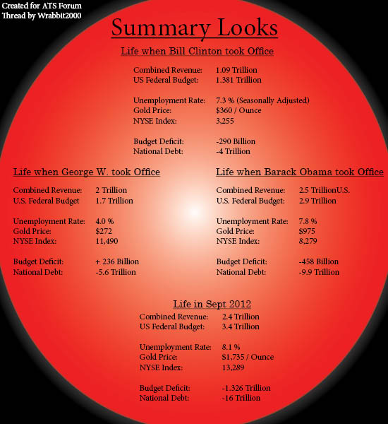
At the time of this work, 2012 is still in the category of Projection because the year has not yet ended. Despite that, the projections created last year (in some cases) come staggeringly close to accurate as we see them today and approaching the end of the Calendar year. Lets start with the most complex board I created for this thread. The U.S. Federal Debt and Budget Deficit.
Please excuse the clutter here. I had to find a way of displaying so much on a single board so what is there makes sense and has any context at all. The result isn't the most reader friendly or entertaining, but it's the most critical of the boards I've made for this thread. It's also what I spent the most days working, re-working and designing over.
A couple explanations are due for some of the display. The 3 colored columns represent the Democrat or Republican control of the respective areas indicated at the bottom. Where a year period shows 50% of each color, this represents a period of tie or shifting control by single members changing allegiances. What is in green are positive numbers and those numbers in pink are negative numbers....NUMBER coloring has no significance beyond positive/negative balances represented.
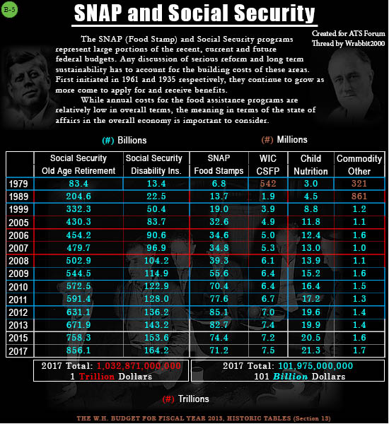
Moving along, I've created a grid of Entitlement costs to show two things that came as a surprise to me as much as anyone else. First, is to show the sheer scale of the problem we face as people get older and move to claim their rightful benefits. The Majority cost is not in SSI or Disability, but retirement. If Congress had ever had a separate accounting of Social Security funds, this would never BE an issue. However, the money has never been held apart and has, in fact, been collected and spent right along with the general funds for the United States Government. A "lock Box" is a figment of political imagination and never existed, as such.
Next however, was a shock. I had expected to find Food Assistance and Food Stamps to represent a MAJOR outlay. In fact, it's a mere 100 billion and change at the 2017 projection level. Given the magnitude of benefit they bring to needy people in hard times, the benefit to cost strikes me as far more worthy than I'd have believed without seeing the numbers myself.
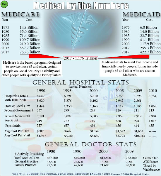
There are the main portions of Social Security and the Food Programs, but how is medical? Oddly enough, there is no "Obamacare" program to price. Despite what many seem to have come to believe, Obamacare isn't a program at all, and never was. It's simply a series of regulations and initiatives to force medical insurance from the Federal level in the same way Car insurance was once forced on the State level. Medicare and Medicaid still stand by White House figures and estimates as the highest cost area of Government. It hasn't always been that way, and this board is an attempt to show how things are and have changed over a surprisingly short period of time.
Now I hate to get out of order in my board sequence, but in this case, they were created in a different order than they present by topic, at least in this one case. So I bring you my final board in major Federal costs against the budget. The Department of Defense.
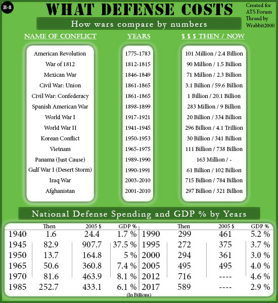
I had a lot of ways I could have gone with this one. In fact, I plan to eventually do a far more detailed board examining the DOD itself and budgetary funny business within the funding of the defense establishment.
There is enough there to make 10 boards by itself..and likely many more. Simple funding between Man Power (a good thing) and Research and Development (where the waste REALLY gets wild) is staggering to behold. However, I made every effort not to derail my focus on the budget as a whole in getting too heavily bogged down to any one section of it.
In that sense, I created my defense display board to give a general sense of perspective and meaning for the numbers as it stands against previous times of strife and war. At the bottom, of course, one can see the current and future levels as foreseen by the White House and their budget.
I just happen to have a few boards here I threw together to show just that situation and how the numbers actually look.
At the time of this work, 2012 is still in the category of Projection because the year has not yet ended. Despite that, the projections created last year (in some cases) come staggeringly close to accurate as we see them today and approaching the end of the Calendar year. Lets start with the most complex board I created for this thread. The U.S. Federal Debt and Budget Deficit.
The Federal Budget and Deficit - Revealed
Please excuse the clutter here. I had to find a way of displaying so much on a single board so what is there makes sense and has any context at all. The result isn't the most reader friendly or entertaining, but it's the most critical of the boards I've made for this thread. It's also what I spent the most days working, re-working and designing over.
A couple explanations are due for some of the display. The 3 colored columns represent the Democrat or Republican control of the respective areas indicated at the bottom. Where a year period shows 50% of each color, this represents a period of tie or shifting control by single members changing allegiances. What is in green are positive numbers and those numbers in pink are negative numbers....NUMBER coloring has no significance beyond positive/negative balances represented.
Entitlement Programs - The Reality vs. The Myths
Moving along, I've created a grid of Entitlement costs to show two things that came as a surprise to me as much as anyone else. First, is to show the sheer scale of the problem we face as people get older and move to claim their rightful benefits. The Majority cost is not in SSI or Disability, but retirement. If Congress had ever had a separate accounting of Social Security funds, this would never BE an issue. However, the money has never been held apart and has, in fact, been collected and spent right along with the general funds for the United States Government. A "lock Box" is a figment of political imagination and never existed, as such.
Next however, was a shock. I had expected to find Food Assistance and Food Stamps to represent a MAJOR outlay. In fact, it's a mere 100 billion and change at the 2017 projection level. Given the magnitude of benefit they bring to needy people in hard times, the benefit to cost strikes me as far more worthy than I'd have believed without seeing the numbers myself.
There are the main portions of Social Security and the Food Programs, but how is medical? Oddly enough, there is no "Obamacare" program to price. Despite what many seem to have come to believe, Obamacare isn't a program at all, and never was. It's simply a series of regulations and initiatives to force medical insurance from the Federal level in the same way Car insurance was once forced on the State level. Medicare and Medicaid still stand by White House figures and estimates as the highest cost area of Government. It hasn't always been that way, and this board is an attempt to show how things are and have changed over a surprisingly short period of time.
Now I hate to get out of order in my board sequence, but in this case, they were created in a different order than they present by topic, at least in this one case. So I bring you my final board in major Federal costs against the budget. The Department of Defense.
I had a lot of ways I could have gone with this one. In fact, I plan to eventually do a far more detailed board examining the DOD itself and budgetary funny business within the funding of the defense establishment.
There is enough there to make 10 boards by itself..and likely many more. Simple funding between Man Power (a good thing) and Research and Development (where the waste REALLY gets wild) is staggering to behold. However, I made every effort not to derail my focus on the budget as a whole in getting too heavily bogged down to any one section of it.
In that sense, I created my defense display board to give a general sense of perspective and meaning for the numbers as it stands against previous times of strife and war. At the bottom, of course, one can see the current and future levels as foreseen by the White House and their budget.
My next area of focus is a bit shorter in only 2 boards but more really wasn't necessary to convey the information. Here we'll take a brief look at
how Uncle Sam gets his money and who pays for it. Additionally, I put together the latest stats for employment. Taxes mean little or nothing if no one
is earning money to pay taxes ON, which is becoming the case more as time goes on right now.
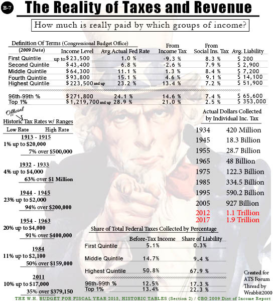
Forgive the use of strange terms like "Quintile". If there is one thing Government worldwide loves, it's obscure words and abbreviations so odd as to give anyone a headache. Quintile is just a term to name the range of income. Segment or Section would as easily have worked in the context of this chart. However, if I didn't use their terms, then checking the source material it came from with the Congressional Budget Office would make almost no sense.
The second area of focus is employment. Here are the raw numbers for the recent past and near future.
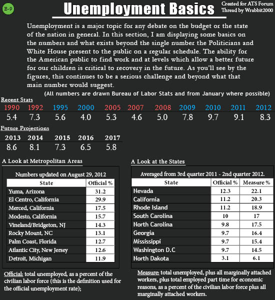
Now those numbers can be spun in a variety of ways and they are, daily. One side makes them look better than they actually are while the other makes them mean more than perhaps they do. Regardless, those are the numbers as recorded, tracked and reported by the Bureau of Labor Statistics. Uncle Sam's own Employment statisticians have spoken and the above are their words, not mine.
In commentary, I'd note a critical thing. The Measure number is used to account for those underemployed to the point of receiving Federal poverty related assistance or having serious trouble making ends meet, despite minimal work. These people are never included in the official number because they are technically employed. Also lacking from the official number are the millions who have given up and also lost benefits. When this happens, they drop from the statistics and the unemployment number DROPS, but for reasons no one wants or hopes to see.
The Measure % is meant to address that in a new initiative by the BLS to give accurate numbers on this problem.
Federal Revenue by Taxes and Payers by Employment
Forgive the use of strange terms like "Quintile". If there is one thing Government worldwide loves, it's obscure words and abbreviations so odd as to give anyone a headache. Quintile is just a term to name the range of income. Segment or Section would as easily have worked in the context of this chart. However, if I didn't use their terms, then checking the source material it came from with the Congressional Budget Office would make almost no sense.
The second area of focus is employment. Here are the raw numbers for the recent past and near future.
Now those numbers can be spun in a variety of ways and they are, daily. One side makes them look better than they actually are while the other makes them mean more than perhaps they do. Regardless, those are the numbers as recorded, tracked and reported by the Bureau of Labor Statistics. Uncle Sam's own Employment statisticians have spoken and the above are their words, not mine.
In commentary, I'd note a critical thing. The Measure number is used to account for those underemployed to the point of receiving Federal poverty related assistance or having serious trouble making ends meet, despite minimal work. These people are never included in the official number because they are technically employed. Also lacking from the official number are the millions who have given up and also lost benefits. When this happens, they drop from the statistics and the unemployment number DROPS, but for reasons no one wants or hopes to see.
The Measure % is meant to address that in a new initiative by the BLS to give accurate numbers on this problem.
Summary and Sources
In this final part of my OP, I bring the summary of the above work with a couple other stats added for general interest. This is meant as a general summary and unlike the previous charts, IS meant with more than a passing notice to the election year and politics. Among other reasons, it's why this is set off by itself and apart from the data based boards.
Now I note this is more political in nature than the previous work. That does not make it any less accurate and the numbers stand for themselves. Outside of minor fluctuation by choice of sources used, I'd expect little to no measurable change in those numbers I've presented vs. what others may find from Official and recognized sources of authority on each area of data.
What I've brought here is meant, overall, as good food for thought. It's not meant to define the debate or even set the facts of it, although facts are what I've assembled. I mean for this effort to spur more conversation and interest as well as a desire for personal research and effort to learn more behind the media and political spin being generated by BOTH camps right now.
In the interests of being as complete and as solid in this presentation as I've been able to manage, I offer copies of my Citation and Source sheets as they will accompany this work for my college portfolio.
For serious inquiries as to the background, data sources and methods I used to come up with the boards and data displays I've created, I'll be happy to supply the Word documents with clickable links on the Citations. One only need ask via U2U and we can arrange something to send those along. Likewise, I ask that anyone looking to use my graphics outside ATS drop me a similar note to at least let me know where and how my work is going to be used. I do retain all rights to what I've created here...although anyone interested will find I'm among the easiest to work with on that topic. At least that is true on these major political thread graphics.
I hope you have enjoyed my presentation of the United States Federal Budget as Offered by the White House for fiscal year 2013. If enjoyment is the wrong word, then perhaps hoping everyone has come away with something valuable is more appropriate.
Enjoy your weekend and lets all pitch in to send a message on both sides of the political spectrum. The nonsense and outright bad business of the Budget cannot continue. Mortgaging our children's futures cannot continue and $1 OVER budget is TOO much....not just this time, but EVERY time. If we don't start taking a 0 tolerance attitude on this matter as citizens, we'll have no nation left soon to be citizens OF. It really is that simple.
Wow. This is a phenomenal amount of work and effort, and it shows...
Very, very nicely done. An excellent read, too.
This is something I've taken a real interest in for quite some time, and I can see from what you've written that you've pulled together an absolute wealth of information and crammed it into digestible pieces, which is amazing... and a huge amount of work.
Definite S&F from me, and congratulations on a job very well done.
Thanks for the research and bring the topic for discussion.
I always have a problem with the numbers so here's a easy explanation for those like me who can't grasp the amounts.
It puts it into a much better perspective..
* U.S. Tax revenue: $2,170,000,000,000
* Fed budget: $3,820,000,000,000
* New debt: $ 1,650,000,000,000
* National debt: $14,271,000,000,000
* Recent budget cuts: $ 38,500,000,000
Let's now remove 8 zeros and pretend it's a household budget:
* Annual family income: $21,700
* Money the family spent: $38,200
* New debt on the credit card: $16,500
* Outstanding balance on the credit card: $142,710
* Total budget cuts so far: $3.85
Easier for me.
The numbers are a few months old, but the idea is still valid.
edit on 8/9/2012 by LamontCranston because: (no reason given)
It's about time slacker, lol. Surpassed all expectations. Just spent 15 minutes on an overview, planning on going through it in more detail in a bit.
Thought I'd add something that might get overlooked in sheer volume of the info.
The stark difference in the Presidential comparison graphic in gold price as well as deficit.
Buffet on Gold Bubble
With so many buying gold in the last few years, a major devaluation could have an economic effect nearly as extensive as a stock market crash.
Thought I'd post on a small aspect of the OP because the rest of it is fairly obvious, our debt/deficit problem is insane, overwhelming, and nearly beyond comprehension.
I have some ideas to bring down the deficit that I'll add in a little while.
The stark difference in the Presidential comparison graphic in gold price as well as deficit.
Famed billionaire investor Warren Buffett warned investors of the dangers associated with gold and bonds in his recent annual letter to shareholders.
Buffett criticized them for investing in an asset that is "neither of much use nor procreative." Buffett said that gold investors were mostly motivated by a fear of of almost all other assets and a belief that the number of investors who shared their fears would grow. He said that the rising price of gold attracted investors who saw the rising price as a validation of the gold enthusiasts' investment thesis. Buffett went on to warn that gold's “bandwagon” investors were in danger of creating another investment bubble, saying that "over the past 15 years, both Internet stocks and houses have demonstrated the extraordinary excesses that can be created by combining an initially sensible thesis with well-publicized rising prices. In these bubbles, an army of originally skeptical investors succumbed to the 'proof' delivered by the market, and the pool of buyers – for a time – expanded sufficiently to keep the bandwagon rolling. But bubbles blown large enough inevitably pop."
Buffet on Gold Bubble
With so many buying gold in the last few years, a major devaluation could have an economic effect nearly as extensive as a stock market crash.
Thought I'd post on a small aspect of the OP because the rest of it is fairly obvious, our debt/deficit problem is insane, overwhelming, and nearly beyond comprehension.
I have some ideas to bring down the deficit that I'll add in a little while.
edit on 9/8/2012 by PatrickGarrow17 because: (no reason given)
edit on 9/8/2012 by PatrickGarrow17 because: (no reason
given)
reply to post by PatrickGarrow17
Thank you very much for your insight and I look forward to what else you have to share. You're entirely correct in there being more meaning to individual numbers or sets of them than I could possibly attempt to cover in a thread as broad as this one for laying things out. It's with that in mind that I want to encourage anything you'd care to bring to the discussion! The more we can start with from a factual basis and solid analysis of what we're looking at, the better. Even if I don't agree..and heck, especially if I don't agree, I'm anxious to see it!
(I earned the slacker part...lol.. On my President's thread, I learned not to post at the end of an effort when tired and missing stupid mistakes. In THIS effort, I learned to keep my mouth shut and not voice dates to have it ready. It's all a learning experience right? Now...what topic to attack next. lol)
reply to post by Wrabbit2000
Yeah, hope saying the overall problem being obvious wasn't taken as offensive. The details are crucial.
My take on the problem:
Many citizens are taking the easy way out in blaming the government for being inefficient. The fact is WE ARE THE GOVERNMENT. Or at least, have the potential to be.
Cutting into the deficit and debt is a matter of the public taking responsibility above all else. Each of us taking a bigger role in the services that the government is now providing inefficiently.
Let's stop using charity as an excuse not to pay taxes. Let's get rid of write-offs for donations. It just doesn't make sense. By allowing a tax deduction for community service, we are limiting our ability to solve these problems in private-public sector collaboration. Essentially, private charitable giving is funded by the government.
Only 26% of Americans over 16 years old are volunteering. So much of the deficit, as shown in your graphic, is due to the government assisting people in poverty. What if the majority started donating four hours a week to helping the needy? How would that effect the burden on poverty assistance?
It's the wealthy that primarily benefit for charitable tax write offs.
This problem requires a concerted effort by the current generation to do more for society.
Instead of the federal government providing health insurance, why not have counties provide a low cost public funded health clinic to reduce overall costs in a preventative fashion?
Create a dynamic education system where public colleges in urban areas are given incentive to assist in primary education at local schools. I live in Albany County. SUNY Albany has an enrollment of 18,000 students. Albany city schools have a total population of just over 9,000 and are graduating 50%. If we inserted college students into high school classrooms, students would have younger more relate-able role models. Ask the student population to spend three hours a week as teachers assistants in exchange for a tuition break.
Instead of having a small percentage of people working full time in government, we should have a large percentage of people working part time. Have local taxes payable in direct community service. A huge percentage of local budgets is employee salary. How about instead of having 1,000 full time teachers, we have 20,000 professionals from the community rotating. A more real world education promoting a community system, helping the poor to liberate themselves through education and thus lowering the burden of Federal Gov.
Make community service a part of the high school curriculum as well.
A big part of reducing spending lies in diminishing the probability of war. In my opinion, this is also a cultural/social solution. By increasing cultural learning in the public school system and creating a young population of people who are interested and friendly toward cultures like Islam and China we will gain sympathy and anti-Americanism would be reconsidered.
Presentations like what you've provided here are essential. We have a drastic problem that requires a drastic change to the status quo in order to survive. The political system itself needs reform, particularly in areas of interest group financing. Through a grassroots movement toward higher individual political responsibility and an increase in identifying self with government, the system is more likely to fix itself.
I'm 21 years old, and I feel that attitudes must change among my demographic very soon in order to successfully address the problems faced by our nation. Many students in college do not seem to realize that their actions, or lack thereof, are a factor in whether or not our nation survives or collapses.
edit on 9/8/2012 by PatrickGarrow17 because: (no reason given)
edit on 9/8/2012 by PatrickGarrow17 because: (no reason
given)
Excellent work Wrabbit2000
There's a few things I thought I would add:
The rising price of gold is really a reflection on the devaluation on the dollar as much as it is an investor-driven bubble.
Corporate taxes didn't show up in your charts. Along with the filthy rich they have paid less and less taxes and have become recipients of tax dollars more than contributors of them (think bailouts and 0% interest "loans")
The swollen costs of Medicare disability are to a great degree due to the addition of certain psychiatric "disorders" including Social anxiety disorder, depression and other questionable ailments that are easily faked leading to a glut of people taking advantage of the system. I know personally a number of such people - all young and quite capable of working but determined to get a free ride. (notice how disability has nearly tripled since 2000)
Most importantly WHO do we "owe" all this debt to? Mostly the Federal Reserve and their private partners. This is why China has been buying up our debt as they knew eventually we would grow tired of paying a bunch of bankers for the "privilege" of using "their" money they print from thin air. We could easily just disown the Federal reserve and start printing our own money. That's why China is the enforcer who will dictate to the US the terms of settling our "debt".
As your charts graphically demonstrate we are headed for fiscal ruin burdened by an unpayable amount of debt. The security forces our overlords could use against us will be bolstered by troops from China who has unlimited manpower. Debt slavery has taken 100 years to bring us to this point of no return.
Enjoy what little bit of freedom we have left while it remains.
After that things stand to get quite nasty.
edit on 8-9-2012 by Asktheanimals because: added comment
My concepts could be considered socialist, but if applied at local levels the risk of an overreaching central system should be negligible. I think.
More, instead of federal food stamp programs have local public food production and stores for people who qualify as needing assistance.
The problems that go unsolved in my suggestions are rural ones but, hey, I live in a metro area. Rural assistance could be provided monetarily through state capitals instead of Washington.
As you might guess, I'm torn when it comes to voting because my politics are liberal but local. There is no suitable party for me. Republicans want to head toward privatization, Dems want gov't responsibility but concentrated centrally.
I consider my ideas to be simultaneously reducing and increasing the size of government. We'd be reducing the primary governing unit to the individual and community but increasing the total workforce.
reply to post by PatrickGarrow17
Wow.... Where to start. lol... First, I think I may surprise you by saying I agree with virtually everything you've said. I also don't find anything the least bit socialist about it, unless what you suggest is all the product of Government and particularly from centralized (Washington) control. That is not what you're saying and specifically comment against though. If anything, you strike me as a good 'ol fashioned Republican....back before the Bush clan came to define that word and it became something....almost dirty. Self reliance and dependence on each other, within the community is what built the nation though, heck...how could I possibly disagree with that general line of thought? lol
On a couple of the specific points...
* I agree 100% on the Government being of us and by us. The greatest conspiracy hasn't been making us believe our vote matters, but in making so many believe it doesn't. Apathy is what has brought so much of this. If Government senses the people don't care (and haven't for years), they do what THEY want to do which is never what is good for us....and they've been at it for over 12 years, across 2 Presidents.
* I also agree entirely about volunteering being something that should be strongly encouraged, but isn't in general. I think we all see signs of decay and neglect in the cities around us and it shouldn't be that way. We have obscene unemployment in many of the major cities at 12-15% and higher. Plenty of idle hands...and yet, volunteering isn't even something to cross anyone's mind. It is a sad thing that can be so easily turned around.
* As for Health, oh... here is where I feel old but I shouldn't. It wasn't THAT long ago but I recall wayyyyy back in the 90's, when General Hospitals still existed in form if not that specific name. County/State run and the refuge of last resort...yet not a bad place for care in many cases. I know...there was a nightmarish exception in the L.A. area..but it worked as a fair way to get medical to those unable to pay large sums. Then EVERYTHING turned for profit.
* I LOVE your idea about College Students in the High School classroom. I'd be happy to volunteer for such a program as a current college student. I'm 38...but heck, I was still getting carded for cigarettes just a few years ago, before I quit. I'm a youthful 38 . We have high school students into the College classes at the Community College I'm at, so at least the college attitude goes back down with those students, to some degree. It has to be a positive thing in the long term.
* I also love your idea of the majority of teacher slots being rotating people from the community. One of the most dramatic differences in Community College as compared to how I recall High School is the fact these instructors are part time and have full time jobs in the fields they're teaching in MANY cases. It makes a world of difference for learning knowledge as opposed to mere information. Not every Middle/High school subject would lend itself to that, but I'm thinking enough could benefit to make the effort well worth it. The kids would benefit ...and so would the school SYSTEM in seeing that outside blood come in and out, seeing the inner workings, on a regular basis.
Thanks for your supportive words on my effort above, as well. I put everything into it outside of essential study for my courses...and I'm as thrilled to be done as I am to have gotten positive feedback. I'd definitely reached the point a couple days ago where I was just thinking to myself "Oh..make it stop!". It looks like it will have been worth the effort though. My son can also use it as a set of references as it's getting close to that point for his school level.
reply to post by Wrabbit2000
An excellent job! This is one of those threads that'll be bookmarked and used as a reference. Well Done!
An excellent job! This is one of those threads that'll be bookmarked and used as a reference. Well Done!
reply to post by Wrabbit2000
You have a lot of stuff here. I can't believe the effort involved just to find those charts let alone copy and paste them. And if you made them yourself, well hey buddy good work.
I can't begin to understand what they mean though. I'm guessing they're saying, "The dough is out of control.". "We can't fix this."
I love the satire as well. "Budget for the common man.".
I think we all can see the exponential in pretty much all of those. Exponential growth, bad. Repeat after me, "Exponential growth bad.". Exponential growth in the numbers makes the numbers meaningless. and this is bad because the numbers are the basis of our money system They have now become meaningless. They count for nothing. New numbers must be found to start anew.
This transition is going to be difficult.
Originally posted by okyouwin
reply to post by Wrabbit2000
You have a lot of stuff here. I can't believe the effort involved just to find those charts let alone copy and paste them. And if you made them yourself, well hey buddy good work.
Exponential growth in the numbers makes the numbers meaningless. and this is bad because the numbers are the basis of our money system They have now become meaningless. They count for nothing. New numbers must be found to start anew.
This transition is going to be difficult.
On the first part, yeah...I made everything 100% from scratch. (Toots own horn just a little)
The only exception, if it could be called that, was the use of blank tables inserted on the Social Security and Debt boards..although the Debt one is several smaller tables placed in alignment to look like larger ones. I really had to learn Adobe Illustrator and Adobe Indesign better for my graphics courses..hence, this was a very valuable learning experience for 'muscle memory' by the end of it. lol (Now if I can just perfect the file save for size without the blurring...that's driving me nuts)
On the second and more critical point... I'm sitting here in mild shock. You so quickly hit the essence of what my overall effort began as finding a way to demonstrate. Your're absolutely right. The meaning and the true 'doom' in the current numbers are how they've crossed the threshold into exponential growth. I had to end the numbers somewhere, but if I carried the debt projections out a bit further, it carries right to 25 Trillion in national debt by 2022. It's just unthinkable....and basically staring into the Abyss as it stares back into us. We haven't quite lost our collective balance and over the edge...yet. I just don't see much if any time left to catch our balance entirely and step back.
Great thread and great work on the graphics, it certainly does help.
Posting a question I could not get a answer from on another thread, but it also pertains to this one.
Can you (or anyone) please explain to me how your economy with over 16 Trillion in debt can be made financially viable & how it can even think it can continue on the road its on?
I don’t want to hear about jobs, I want to hear about America fixing its atrocious debt problem before it sinks and drags the rest of the world into oblivion...... & just how long do you think it will take, 1 year, 100 years?
Sorry if that sounds a little cranky, long day for me
Thanks
Mickierocksman
Excellent job, Wrabbit. The best part about it is that everything is gives whole dollar amounts, which completely destroys that silly graph that's
been going around that the Obama White House spends the least of any president. Great research, great post!
/TOA
/TOA
Originally posted by Mickierocksman
Can you (or anyone) please explain to me how your economy with over 16 Trillion in debt can be made financially viable & how it can even think it can continue on the road its on?
Thanks
Mickierocksman
(trimmed for space )
You hit the million dollar question and one of the boards that didn't make the final thread. What I came to think of as my 'Whammy board'. It just had a couple factual issues I couldn't reconcile entirely. However..how do we fix it? You want the easy or hard answer to that?
Hard Answer (and probably only working one):
The United States comes to outright embrace the word austerity for several long years with MUCH higher taxes over MUCH lower benefits. It's the only way, with BOTH areas at once, to bring the numbers down. As others noted, the debt has become exponential with interest feeding interest and growing whether we add to it or not. So...
We not only need to bring the deficit to 0 and into full surplus as Clinton did, but go beyond that. FAR beyond it. If you look at the Deficit/Debt board under Clinton's surplus years, you see the debt still grew. Compound interest is an evil little thing. It never rests, it never stops...it just plods along by the laws of math. So....Until we have surplus large enough to cover the interest due annually AND go beyond that to actually attack principle....well... It's hard to see how that happens, huh?
Under current 1+ trillion deficits? We're probably talking upwards of 50% cuts to really see the debt number start to shrink...then several years of living at that level. Of course, we need 100% TRUST in our leaders that when the problem was solved, the 'austerity' hell would go away. Trust isn't easy to build either, IMO.
------
The Whammy solution (Nightmare option):
This is what I left off the formal boards. There *IS* a way to pay the national debt and it could be done overnight. At least....for a short time. Soon, even this solution won't work for the math. However, for the time being.....there exists enough in IRA/401k/Pensions (that aren't negative already) and similar retirement funding to entirely cover the national debt. 100% and with some to spare. Ireland has been doing this in small ways. Britain has suggested doing it as have other E.U. members. It's not a unique or new idea and it would work.
The numbers for this are contained in the Federal Reserve Bank statements dealing with Money circulation and how much is currently out there....including in savings and retirement accounts.
I call it the nightmare option because it would literally steal the life savings and retirement hopes and dreams of a good % of the U.S. population...and I believe it would immediately trigger catastrophic unrest. Ask me how I'll feel if I see my Mother broken and ruined as a person because everything she's worked her life to give herself, in her golden years, is stolen out from under her by Uncle Sam? Now multiply me by 10's of millions. Nightmare indeed.
Totally floored by your presentation, excellent work!
I knew it was bad, but having numbers staring you in the face really brings homes the reality of impending doom.
What's the fix? Hypothetically, how would you fix it?
I knew it was bad, but having numbers staring you in the face really brings homes the reality of impending doom.
What's the fix? Hypothetically, how would you fix it?
This is awesome, Wrabbit...a hard to organize topic that you've presented with handy images, too!
Nice. I know the graphics take time, too, so that is a lot of work in and of itself.
I'm sure you are thinking I might want to discuss the defense/cost of war issue...if so...you're right!
I noticed that you did list the cost of conflict, respectively for each...and I'm understanding that you got those figures by extrapolating the data from the defense budget for the years assigned to each conflict? Did you use any other data or sources for those figures or just the federal budget?
I'm also wondering about discretionary spending? Besides defense, which you have included...but specifically, I was looking for the 'non-defense discretionary' part of the budget. Such things as the various Departments, Energy, Education, Agriculture, Transportation, etc., are included in that as well as (I think) things like Homeland Security, NASA, Oversees Contingency Operations, Small Business Administration, etc., are also included under the heading of 'non-defense discretionary' spending.
Those are important parts of the budget, especially in regard to the President's administrative role in budgeting because that is where the choices are made that might be more widely variant between terms of different President's. It also gives a good and stark comparison on how we spend on other things equally important but not often discussed...for example, the realization you had about the SNAP program. When you compare the amounts spent, keeping in mind the exponential differences between one billion and one trillion, an even greater perspective on the budget as a whole emerges.
Then again, that might be more depth than you were interesting in, from your title. On the other hand, the common man might have interest in things that the average pundit or politico might not so much focus on, such as the Department of Education or Housing, etc. It is also a place where pie charts can be both challenging but eye-opening.
But I'm not suggesting you do a pie-chart! Not at all! Yikes...I'm not even suggesting I do a pie-chart....I've tried pie-charts before...better to eat pie than draw pi.
edit on 9/9/2012 by queenannie38 because: (no reason given)
new topics
-
Maestro Benedetto
Literature: 30 minutes ago -
Is AI Better Than the Hollywood Elite?
Movies: 39 minutes ago -
Las Vegas UFO Spotting Teen Traumatized by Demon Creature in Backyard
Aliens and UFOs: 4 hours ago -
2024 Pigeon Forge Rod Run - On the Strip (Video made for you)
Automotive Discussion: 4 hours ago -
Gaza Terrorists Attack US Humanitarian Pier During Construction
Middle East Issues: 5 hours ago -
The functionality of boldening and italics is clunky and no post char limit warning?
ATS Freshman's Forum: 6 hours ago -
Meadows, Giuliani Among 11 Indicted in Arizona in Latest 2020 Election Subversion Case
Mainstream News: 7 hours ago -
Massachusetts Drag Queen Leads Young Kids in Free Palestine Chant
Social Issues and Civil Unrest: 7 hours ago -
Weinstein's conviction overturned
Mainstream News: 8 hours ago -
Supreme Court Oral Arguments 4.25.2024 - Are PRESIDENTS IMMUNE From Later Being Prosecuted.
Above Politics: 10 hours ago
top topics
-
Krystalnacht on today's most elite Universities?
Social Issues and Civil Unrest: 10 hours ago, 9 flags -
Supreme Court Oral Arguments 4.25.2024 - Are PRESIDENTS IMMUNE From Later Being Prosecuted.
Above Politics: 10 hours ago, 8 flags -
Weinstein's conviction overturned
Mainstream News: 8 hours ago, 7 flags -
Gaza Terrorists Attack US Humanitarian Pier During Construction
Middle East Issues: 5 hours ago, 7 flags -
University of Texas Instantly Shuts Down Anti Israel Protests
Education and Media: 12 hours ago, 6 flags -
Massachusetts Drag Queen Leads Young Kids in Free Palestine Chant
Social Issues and Civil Unrest: 7 hours ago, 6 flags -
Meadows, Giuliani Among 11 Indicted in Arizona in Latest 2020 Election Subversion Case
Mainstream News: 7 hours ago, 5 flags -
Las Vegas UFO Spotting Teen Traumatized by Demon Creature in Backyard
Aliens and UFOs: 4 hours ago, 3 flags -
2024 Pigeon Forge Rod Run - On the Strip (Video made for you)
Automotive Discussion: 4 hours ago, 2 flags -
Any one suspicious of fever promotions events, major investor Goldman Sachs card only.
The Gray Area: 15 hours ago, 2 flags
active topics
-
SETI chief says US has no evidence for alien technology. 'And we never have'
Aliens and UFOs • 71 • : DaydreamerX -
My Poor Avocado Plant.
General Chit Chat • 77 • : JonnyC555 -
University of Texas Instantly Shuts Down Anti Israel Protests
Education and Media • 219 • : marg6043 -
New whistleblower Jason Sands speaks on Twitter Spaces last night.
Aliens and UFOs • 61 • : Ophiuchus1 -
Is AI Better Than the Hollywood Elite?
Movies • 2 • : 5thHead -
Gaza Terrorists Attack US Humanitarian Pier During Construction
Middle East Issues • 25 • : CarlLaFong -
VP's Secret Service agent brawls with other agents at Andrews
Mainstream News • 57 • : Guyfriday -
Mood Music Part VI
Music • 3102 • : Hellmutt -
Las Vegas UFO Spotting Teen Traumatized by Demon Creature in Backyard
Aliens and UFOs • 9 • : Ophiuchus1 -
British TV Presenter Refuses To Use Guest's Preferred Pronouns
Education and Media • 164 • : Annee