It looks like you're using an Ad Blocker.
Please white-list or disable AboveTopSecret.com in your ad-blocking tool.
Thank you.
Some features of ATS will be disabled while you continue to use an ad-blocker.

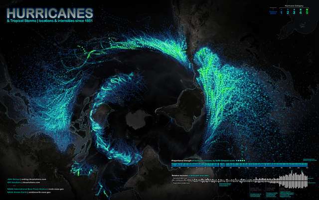
Stunning map showing every recorded hurricane path since 1851
page: 18
share:
The National Oceanic and Atmospheric Administration has a tropical storm and hurricane data archive that stretches back to 1851. But looking at each
storm individually doesn’t have nearly as much impact as seeing them all projected onto a map at once. Data visualization expert John Nelson
combined data on historical storms’ paths and intensities to create this stunning image, where the color of a dot represents that storm’s
intensity.
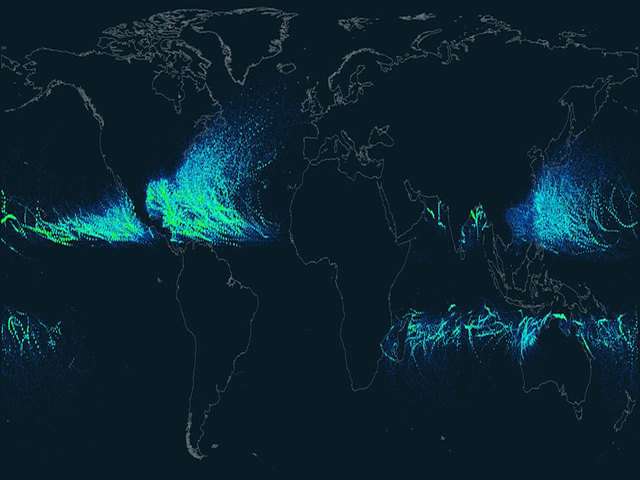
Check out also this one, visible on the APOD:
Source and hi-res map: Flickr's IDVSolutions photoalbum
Check out also this one, visible on the APOD:
Source and hi-res map: Flickr's IDVSolutions photoalbum
reply to post by elevenaugust
Oh wow. Great find! I knew that some areas were always hit a lot harder than some other places, but the map really shows us exactly where. It makes it a lot easier to understand why the USA says it wants to be able to control the weather. S&F for you
Oh wow. Great find! I knew that some areas were always hit a lot harder than some other places, but the map really shows us exactly where. It makes it a lot easier to understand why the USA says it wants to be able to control the weather. S&F for you
edit on 4-9-2012 by aboutface because:
typos
Thats really cool, I would have thought Asia, would of had an equally large amount of tracks as well, unless they didnt start tracking their Cyclones
until later on
reply to post by elevenaugust
The South Has no Wind Barriers ....( Mountains )..
That would help them a ton....Maybe that should be the future project.
Operation Build South Mountain. That way they don't have their cities torn apart every year.
The South Has no Wind Barriers ....( Mountains )..
That would help them a ton....Maybe that should be the future project.
Operation Build South Mountain. That way they don't have their cities torn apart every year.
Interesting. I never thought of Australia as being someplace hit by hurricanes. I learn something new everyday I guess.
reply to post by LucidDreamer85
As nutty as that sounds, perhaps you have something there that's worth exploring. There are some innovative ideas put out by people who are trying to find uses for old tires and plastic, for example. If the will were there, I bet the current situation could be improved.
As nutty as that sounds, perhaps you have something there that's worth exploring. There are some innovative ideas put out by people who are trying to find uses for old tires and plastic, for example. If the will were there, I bet the current situation could be improved.
new topics
-
The Good News According to Jesus - Episode 1
Religion, Faith, And Theology: 1 hours ago -
HORRIBLE !! Russian Soldier Drinking Own Urine To Survive In Battle
World War Three: 3 hours ago -
Bobiverse
Fantasy & Science Fiction: 6 hours ago -
Florida man's trip overseas ends in shock over $143,000 T-Mobile phone bill
Social Issues and Civil Unrest: 6 hours ago -
Former Labour minister Frank Field dies aged 81
People: 9 hours ago -
SETI chief says US has no evidence for alien technology. 'And we never have'
Aliens and UFOs: 10 hours ago
top topics
-
President BIDEN Vows to Make Americans Pay More Federal Taxes in 2025 - Political Suicide.
2024 Elections: 15 hours ago, 18 flags -
Florida man's trip overseas ends in shock over $143,000 T-Mobile phone bill
Social Issues and Civil Unrest: 6 hours ago, 8 flags -
SETI chief says US has no evidence for alien technology. 'And we never have'
Aliens and UFOs: 10 hours ago, 7 flags -
Former Labour minister Frank Field dies aged 81
People: 9 hours ago, 4 flags -
Ode to Artemis
General Chit Chat: 16 hours ago, 3 flags -
This is our Story
General Entertainment: 13 hours ago, 3 flags -
Bobiverse
Fantasy & Science Fiction: 6 hours ago, 3 flags -
HORRIBLE !! Russian Soldier Drinking Own Urine To Survive In Battle
World War Three: 3 hours ago, 1 flags -
The Good News According to Jesus - Episode 1
Religion, Faith, And Theology: 1 hours ago, 0 flags
active topics
-
The Good News According to Jesus - Episode 1
Religion, Faith, And Theology • 2 • : Springbok -
President BIDEN Vows to Make Americans Pay More Federal Taxes in 2025 - Political Suicide.
2024 Elections • 79 • : budzprime69 -
Bobiverse
Fantasy & Science Fiction • 2 • : Springbok -
HORRIBLE !! Russian Soldier Drinking Own Urine To Survive In Battle
World War Three • 18 • : watchitburn -
Florida man's trip overseas ends in shock over $143,000 T-Mobile phone bill
Social Issues and Civil Unrest • 13 • : Consvoli -
British TV Presenter Refuses To Use Guest's Preferred Pronouns
Education and Media • 137 • : Annee -
Remember These Attacks When President Trump 2.0 Retribution-Justice Commences.
2024 Elections • 54 • : Asher47 -
LaBTop is back at last.
Introductions • 15 • : LaBTopOld -
Russia Ukraine Update Thread - part 3
World War Three • 5727 • : YourFaceAgain -
So this is what Hamas considers 'freedom fighting' ...
War On Terrorism • 259 • : SourGrapes
8