It looks like you're using an Ad Blocker.
Please white-list or disable AboveTopSecret.com in your ad-blocking tool.
Thank you.
Some features of ATS will be disabled while you continue to use an ad-blocker.

New ATS front page ?
page: 4share:
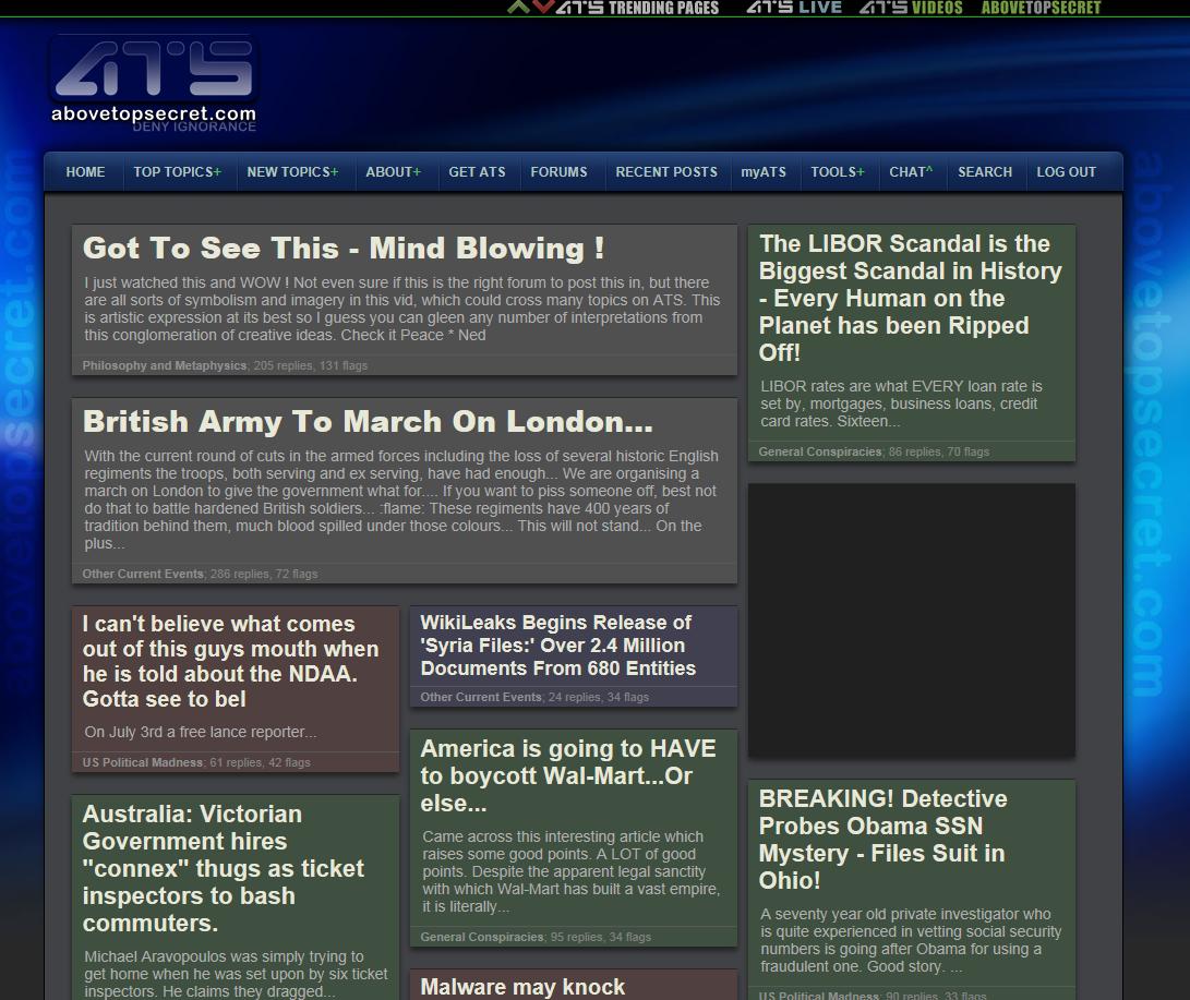
Just to confirm, everyone is seeing something like this...
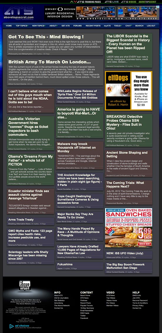
...right?
There's method to the apparent madness, and many have correctly surmised that the intentions of the site home page are to cater to new or occasional visitors. After a review of heat map metrics, hardly anyone was scrolling the previous site home, and of those who clicked on topics, about 88% clicked on the top three -- and less than 1% clicked on anything below the scroll. That tells me change is needed.
The concept on the current prototype site home page is a "Masonry" method, combined with a bit of Pinterest layout -- and yes, the rise of importance for catering to mobile users is a factor.
And there is indeed structure. Generally, higher-flagged threads are at the top and the larger the headline/box/snippet the more replies the thread is getting.
But typically this kind of design methodology works best with photos, and we have none. So I'm trying to compensate with headline size, colors, etc.
So far, we're seeing more topics being clicked... but it's too soon for a real analysis of the metrics.
reply to post by SkepticOverlord
Yes .. except the blue is more dark on your side
but pretty much the same .
and many adds dont load up each time (no add blocker)
Screen shot

tried to refresh the page a few time but the adds dont go through
worked 1 time but now their box are grey/empty
Yes .. except the blue is more dark on your side
but pretty much the same .
and many adds dont load up each time (no add blocker)
Screen shot
tried to refresh the page a few time but the adds dont go through
worked 1 time but now their box are grey/empty
edit on 7/6/2012 by Ben81 because: (no reason given)
I'd also like to elaborate on my first post in this thread with regard to
responsive design.
Mobile technologies are advancing fast. Over the past couple of years, we've often considered create mobile apps for ATS... and still are, but perhaps not a "mega-app."
The future of digital content is in the open web standards of HTML5/CSS3 and JavaScript frameworks, not platform specific apps. So over the next few months, we'll be working on a gradual evolution of all pages on ATS so that the principles of open standards and responsive design are fully embraced. The result will likely be the most advanced fully-responsive site anywhere. Meaning the same code/design will "feel" like a native app on your smart phone, but scale to normal functionality/size on your big 1080p monitor.
No complaints here, the colors go well with the site.
Actually, I loaded ATS for the first time today on my slightly slower and older Android (which I hate, for the record) and the front page loaded much faster than the previous one.
I could be mistaken but the front page also had the Recap Videos right on the front page which also slowed loading time and I'll be honest - They seem like something better suited for YouTube than ATS. Just putting it out there...
The new home page will take some time to catch on if you leave it that way.
Not really eye catching now is it?
I would like to have a try at the design myself, if permitted.
Perhaps ask your ATS Members for suggestions?
Mine?
Slick, black themed, simple interfacing, with a Above Top Secret feel.
Not really eye catching now is it?
I would like to have a try at the design myself, if permitted.
Perhaps ask your ATS Members for suggestions?
Mine?
Slick, black themed, simple interfacing, with a Above Top Secret feel.
I personally like the new change and it does seem better organized.
I do understand why the change needed to be made. I for instance, almost never go to the home page because I don't just want the two most flagged and starred threads to grab my attention and skip the rest (which a lot of us do). I go straight to the "RECENT POSTS" and this way I can read which ever one peeks my interest.
So, to have the Front Page designed this way, I can now browse to the home page and pick which ever topic I want and not feeling forced to pick from the top 2-3 threads.
Originally posted by TheEnlightenedOne
I personally like the new change and it does seem better organized.
I do understand why the change needed to be made. I for instance, almost never go to the home page because I don't just want the two most flagged and starred threads to grab my attention and skip the rest (which a lot of us do). I go straight to the "RECENT POSTS" and this way I can read which ever one peeks my interest.
So, to have the Front Page designed this way, I can now browse to the home page and pick which ever topic I want and not feeling forced to pick from the top 2-3 threads.
More place for more thread .. the new design optimise and dont waste any space
this is probably the main reason why it was completely redesigned
edit on 7/6/2012 by Ben81 because: (no reason given)
I do not like the new front page. It is hard to look at. It is quite ugly and the colors are distasteful in
my opinion. Please change it back. It just doesn't feel like home!! 'If it aint broke, don't fix it!!'
my opinion. Please change it back. It just doesn't feel like home!! 'If it aint broke, don't fix it!!'
Why change something that works so well??
This is similar to facebook constantly changing things (like the timeline) that just pisses off its users..
ATS, were you receiving complaints about the old front page?? If anything, I felt that the old front page had a very simple clean look to it which was easy for users to navigate, this new one (pardon my french) seems like a total cluster f*** to me... Anyways, this isnt my company, Im not invested, I just come here for entertainment, I hope you guys know what you're doing
New page looks like the page didn't load properly. Can't quickly scan the topics at first glance. Old page looks better. Just my opinion.
Fewer graphics means faster load times and potentially given the amount of traffic ATS gets a nice little savings on overall hosting costs if the
changes are implemented across the website. Also images are fixed in size unless dynamically generated with something like say PHP so they can
completely mangle a site's layout but when you drop them from the equation you can use percentages in the CSS so things scale from one resolution to
the next. For years the big problem with ATS was mobile browsing, so the fact that its finally becoming more friendly to devices other than
conventional computers is outstanding from where I sit.
I never use the HOME page...im a RECENT POSTS kind of gal....
but the new home page looks really good on my Droid...the colors are much more brighter and it is much easier to navigate and click on a topic rather than having tiny links and trying to use my finger to click on those tiny links or having to make the screen bigger.....
i believe this is a great interface for mobile devices (phones, tablets).....
if one doesnt like it....try MyATS or Recent Posts or New Topics or Top Topics....
as the ol' saying goes.....cant please everyone!
edit on July 6th 2012 by greeneyedleo because: (no reason given)
Like GEL mentioned I never use the front page just the Recent Posts page.
I had to click the main page to see what the fuss was all about.
I like it. It's colorful! It won't change my viewing ways since I never use that page. I like to check Recent Posts and then the forums I like to frequent.
I had to click the main page to see what the fuss was all about.
I like it. It's colorful! It won't change my viewing ways since I never use that page. I like to check Recent Posts and then the forums I like to frequent.
reply to post by Ben81
After hitting the compatibility button beside the adresse bar
the adds have returned lol
i must have hit that button by mistake
better like this
even the structure of some posts change when its On .. quite annoying
After hitting the compatibility button beside the adresse bar
the adds have returned lol
i must have hit that button by mistake
better like this
even the structure of some posts change when its On .. quite annoying
Like many others, I thought my browser had improperly loaded the home page. I have been on ATS for a little while now, and I like to start on the
home page to get a good overview of the whole site. Then I go to the new topics section of the site. With the new design I will probably avoid the
home page and go straight to new topics and top topics, which really is no big deal personally. In any case I normally use the home page on a daily
basis, and my initial reaction to the change was pretty negative:
- the color scheme doesn't really jive with the rest of the site; green, red, brown and purple just seem odd and conflicting with the predominantly blue/grey color scheme
- the date of the thread is not listed, which is one of the main things I look for when I am browsing for interesting threads
- the selection of threads seems less like an overview and more like a fire-hose
- the overall experience of the home page feels very "busy" to me, but I suppose it may be attractive to the "ADD" types
All in all I like the idea of offering more info on the home page, but I prefer the "old" format. It seems like many of the people who generally use the home page dislike the new format, while people who formerly did not use the home page like the new format.
Keep up the good work -- I love ATS
Voting NO on the front page. The weird colors are hard on the eyes. Some stuff is red, some blue, the letters are HUGE. I don't need someone ten
feet behind me to read the headlines, know what I mean? Surely I'm not the only one who would rather not have gigantic letters all over the
monitor.
Please, please put it back the way it was.
Please, please put it back the way it was.
Well as we were discussing here (www.abovetopsecret.com...) before it was closed down, it would seem that the majority of
the posters are against the layout.
The box idea is bad, but the color idea is great. Just get rid of the boxes and replace it with something else...? Who knows maybe this is just the first step and may evolve into something way better.
-SAP-
The box idea is bad, but the color idea is great. Just get rid of the boxes and replace it with something else...? Who knows maybe this is just the first step and may evolve into something way better.
-SAP-
edit on 6-7-2012 by SloAnPainful because: (no reason given)
Well here's another vote for dislike.
I just find myself skipping it altogether and just clicking top topics and new topics.
It just feels like it's made for a 4 year old or something...
I just find myself skipping it altogether and just clicking top topics and new topics.
It just feels like it's made for a 4 year old or something...
new topics
-
whistleblower Captain Bill Uhouse on the Kingman UFO recovery
Aliens and UFOs: 2 hours ago -
1980s Arcade
General Chit Chat: 4 hours ago -
Deadpool and Wolverine
Movies: 5 hours ago -
Teenager makes chess history becoming the youngest challenger for the world championship crown
Other Current Events: 6 hours ago -
CIA botched its handling of sexual assault allegations, House intel report says
Breaking Alternative News: 7 hours ago -
Lawsuit Seeks to ‘Ban the Jab’ in Florida
Diseases and Pandemics: 9 hours ago -
Starburst galaxy M82 - Webb Vs Hubble
Space Exploration: 11 hours ago
top topics
-
Lawsuit Seeks to ‘Ban the Jab’ in Florida
Diseases and Pandemics: 9 hours ago, 20 flags -
Starburst galaxy M82 - Webb Vs Hubble
Space Exploration: 11 hours ago, 11 flags -
CIA botched its handling of sexual assault allegations, House intel report says
Breaking Alternative News: 7 hours ago, 8 flags -
The Superstition of Full Moons Filling Hospitals Turns Out To Be True!
Medical Issues & Conspiracies: 13 hours ago, 8 flags -
whistleblower Captain Bill Uhouse on the Kingman UFO recovery
Aliens and UFOs: 2 hours ago, 6 flags -
IDF Intel Chief Resigns Over Hamas attack
Middle East Issues: 17 hours ago, 6 flags -
15 Unhealthiest Sodas On The Market
Health & Wellness: 12 hours ago, 5 flags -
It takes One to Be; Two to Tango; Three to Create.
Philosophy and Metaphysics: 17 hours ago, 4 flags -
Teenager makes chess history becoming the youngest challenger for the world championship crown
Other Current Events: 6 hours ago, 3 flags -
Deadpool and Wolverine
Movies: 5 hours ago, 3 flags
active topics
-
1980s Arcade
General Chit Chat • 7 • : Freeborn -
How ageing is" immune deficiency"
Medical Issues & Conspiracies • 24 • : annonentity -
Europe declares war on Russia?
World War Three • 59 • : Freeborn -
George Knapp AMA on DI
Area 51 and other Facilities • 38 • : theshadowknows -
Candidate TRUMP Now Has Crazy Judge JUAN MERCHAN After Him - The Stormy Daniels Hush-Money Case.
Political Conspiracies • 618 • : WeMustCare -
New whistleblower Jason Sands speaks on Twitter Spaces last night.
Aliens and UFOs • 38 • : baablacksheep1 -
-@TH3WH17ERABB17- -Q- ---TIME TO SHOW THE WORLD--- -Part- --44--
Dissecting Disinformation • 605 • : Ektar -
Teenager makes chess history becoming the youngest challenger for the world championship crown
Other Current Events • 3 • : Skinnerbot -
So you don't believe in the devil
Paranormal Studies • 143 • : burritocat -
whistleblower Captain Bill Uhouse on the Kingman UFO recovery
Aliens and UFOs • 5 • : budzprime69