It looks like you're using an Ad Blocker.
Please white-list or disable AboveTopSecret.com in your ad-blocking tool.
Thank you.
Some features of ATS will be disabled while you continue to use an ad-blocker.

Quake Nerds Corner: Understanding Earthquake Figures
page: 122
share:
Understanding earthquake figures.
or [Cherry] Picking Your Data - An introduction to earthquake charts.
This is in reply to post by muzzy
I have had time to take a look at the Kuril Islands properly now. Just doing the radius view from the epicentre of the last quake gives the wrong impression in some ways.
First let us take a look at all earthquakes Mag 5+ from 1900 using the Centennial catalogue and ANSS to bring it to the start of 2012.

I have to say that I have not looked in depth into the sources of the centennial but I suspect that much come from the NEIC and ANSS.
The data is sparse in the earlier years as no Mag 5+ quakes were recorded. It important to understand the population of the catalogue at this point.
For recent years (1964 - present) a cut-off magnitude of 5.5 has been chosen for the catalog, and the catalog is complete down to that threshold. For the period prior to 1964 (also referred to as "historical instrumental" or simply "historical" period) the cut-off considered is magnitude 6.5. Between the 1930's and 1963 the catalog is complete to the magnitude 6.5 threshold, but prior to that, the catalog is only complete down to magnitude 7.0.
Next I looked at 1963 to present. The reason I took 1963 was to include the 8+ in 1963 which would not have been there if I used 1964. Mag 5 stated is of course mag 5.5 until 2002 when the ANSS data kicks in.
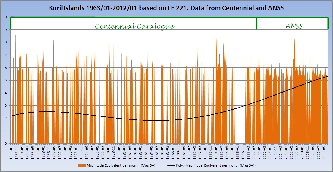
There is an interesting 'gap' between 1997 and 1999 for which I have no explanation. You can see the effect of the ANSS catalogue kicking in.
Now so far the 'trend' on these two has been up. By picking the first graph and not explaining the catalogue it would be possible to give the impression that earthquakes were seriously on the increase. Selecting data from around 1973 is common, not always as an exercise in cherry picking but purely because the ANSS/NEIC catalogues pretty much start at that point in earnest.
During this time (from 1970 onwards) of course coverage of areas by instruments increased. There were about 350 stations globally in 1930 and around 2000 by the start of the 1970s. With the arrival of the digital seismograph this took off and now there are in excess of 8000 instruments worldwide that contribute to the global networks and catalogues.
So the figures for Kuril from year 2000, with the benefit of all that technology, look like this.
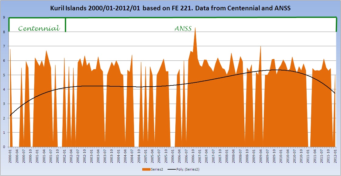
Now the trend has gone down. All three of these graphs have been unaltered except to shorten the dataset. The trendline computation is the same for all three.
The USGS has a set of graphs showing the number of earthquakes in each decade going back to 1980.
Here is a statement from a very widely quoted blog with a graph that keeps on turning up time and time again as 'proof' that earthquake numbers are increasing.
Below is a graph showing how the number of all magnitude earthquakes has grown over recent years.
Source
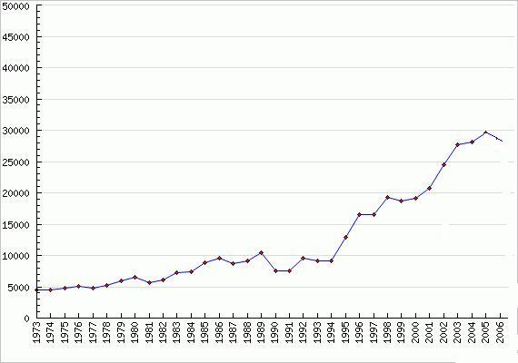
Graph above provided by DL Research. - www.dlindquist.com...
The author of the graph states on his site that:
It provides a comprehensive picture of US Geological Survey data from the 1970s until today, and exposes some interesting trends in seismic activity
In fact what it exposes is the lack of knowledge and diligence in research by the author in what he designates his 'Research' section. No mention of the number of stations is made, or of other factors. His graph so widely promulgated stops in 2006. You can see a downturn at the top. So, does anyone ever go back and look at the current situation? No. The reason is this.
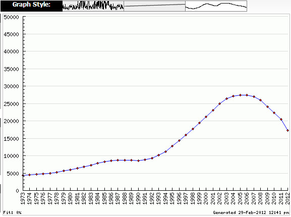
The chart from the same site for all magnitudes running up to 2012 shows a marked downturn. No web doom-sayer would want to quote that! Question is what has happened here?
It is actually very simple and illustrates what I have said time and time again that numbers do not matter, energy does. USGS, upon which his data is based, made a decision to retain only earthquakes of Magnitude 4.5, or 4.0 if reported as felt.
This graph shows the 'World' figures as a stacked column so you can see the components. This is only 1990 to 2012
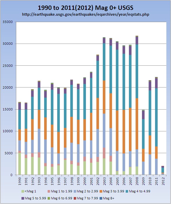
Now, if I remove the quakes under Mag 5 the chart looks like this.
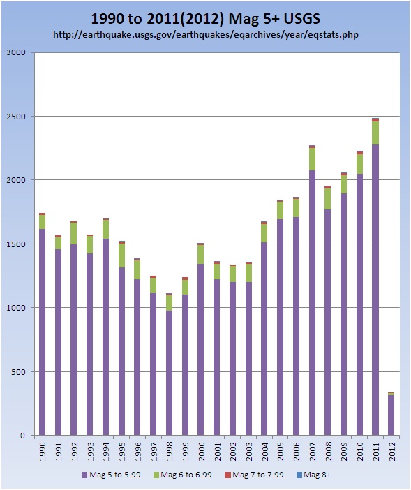
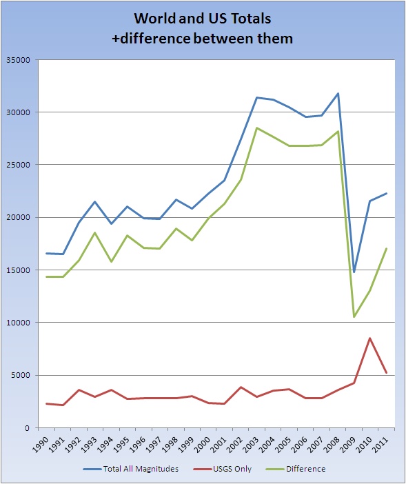
The chart of the totals shows what a dramatic difference removing the earthquakes under mag 5 (effectively) has on the chart. Where the 'world' figure drops dramatically in 2009, the US figure goes up.
So upon what data can one depend? It has effectively been stated - back to 1964 you can count on 5.5 BUT a word of warning here. We, the quake nerds, know for a fact that even today there are magnitude 5.5+ earthquakes (depending on the scale) that do not get picked up so be aware. Back to 1930 you can depend on 6.5, again however I personally would be a little wary for the data before around 1950 and suggest it may not be as complete as they would like to think. From 1900 you can depend on 7.0, and here I would agree that aside from the magnitude scales problem, which I will cover in the next quake nerds corner, this is probably OK to use. But what use is just looking at mag 7 earthquakes you ask?
I have recently taken to producing what I call "stress sawtooth graphs" which attempt to show the possible energy that is accumulating in an area. Obviously these will be affected by the number of mag 5 and 6 earthquakes - or will they?
Here is a stress tooth using exactly the same data as for the first graphs above - the Kuril Islands. The first is earthquakes of Mag 5.5 upwards, the second is Mag 6.5 upwards and the third Mag 7 upwards. Bear in mind that there are 5.6 Mag 6.5 quakes in a Mag 7.0. The columns are the same on all three graphs.
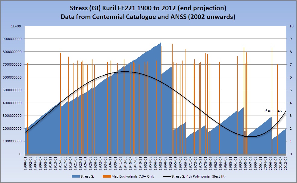
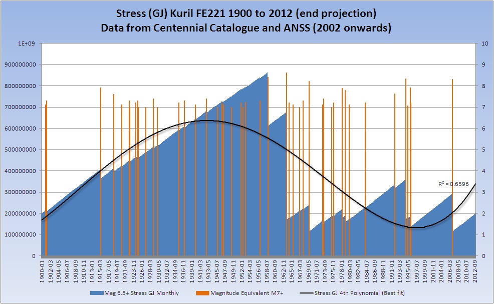
No, they are not all the same, but the difference is so small that it is almost imperceptible. I can happily use the mag 7 values back to 1900 and know that it makes no difference to the stress calculation overall.
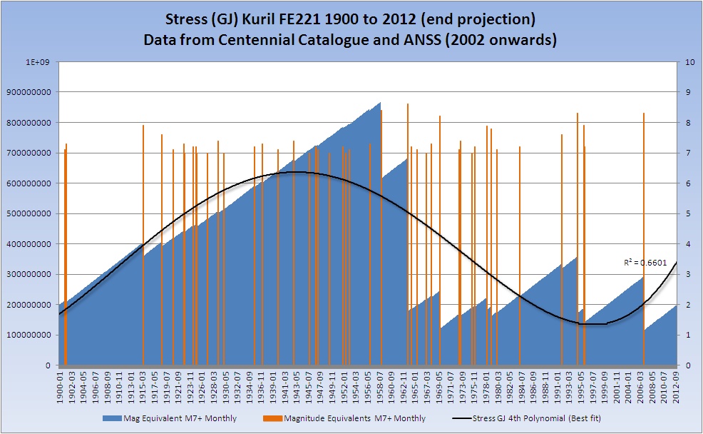
I can't load it here are it is too big but here is a small version of all three as a gif so you can see the changes
Magnitudes and Energy in the next Quake Nerds Corner on April Fools day.
For more details on Mag 7 earthquakes world wide visit:
MAJOR WORLD EARTHQUAKES ~ mapped, graphed and listed ~ 314-2012
edit on 29/2/2012 by PuterMan because: (no reason given)
Great source of information and well put together. You deserve a lot of credit friend.
Will take some time to digest.
I am very interested in learning more about earthquakes and the science behind the data. I live in an area where "the big one" is a threat, thanks for the post S&F
I am very interested in learning more about earthquakes and the science behind the data. I live in an area where "the big one" is a threat, thanks for the post S&F
reply to post by BaZooKaJ
That was fairly basic stuff but just illustrating the need for care when looking at sites.
When you say "the big one" there are many areas where "the big one" is postulated such as California, the Cascades, The New Madrid to mention a few US ones. Which area are you referring to without giving too much away?
I live in an area where "the big one" is a threat
That was fairly basic stuff but just illustrating the need for care when looking at sites.
When you say "the big one" there are many areas where "the big one" is postulated such as California, the Cascades, The New Madrid to mention a few US ones. Which area are you referring to without giving too much away?
Its definitely important for the person who creates the graph to mention what data and other factors are used to draw them.
Thats one reason yours are so convincing PM , you say where you got the info from and one can go check it out if it doesn't look right to what they percieve themselves.
That 8 in 1963 didn't effect the poly line as much as I thought it might, but it did make a difference to the sawtooth stress build up after the 1960 Mag 8 and release alright.
I remember that Mag 8.3 from 2006, it was when I was just beginning to get interested in what was going on globally, I mentioned it in a 7 day report on my 2006 Blog. Back then I was making the maps manually.
It was a busy week all round, at the time I was staggered by the numbers and sizes of aftershocks from the Kurils being greenhorn at quake watching.
Great work there Mr.
edit on 29-2-2012 by muzzy because: (no reason given)
thanks puterman! always nice to see how you people who do actually understand this info, actually look at it. too often you see specific data picked
out to represent the poster's claim and many of us have no effing clue how to call BS on it so we just wait around for you or TA to come along and
drop some knowledge.
so thanks again for the info mate!
so thanks again for the info mate!
Thank you PM! I have always enjoyed your "classes" as you lay it out in a way even newbies can understand. Looking forward to digesting these new
graphs.
new topics
-
This is our Story
General Entertainment: 1 hours ago -
President BIDEN Vows to Make Americans Pay More Federal Taxes in 2025 - Political Suicide.
2024 Elections: 3 hours ago -
Ode to Artemis
General Chit Chat: 4 hours ago -
Ditching physical money
History: 7 hours ago -
One Flame Throwing Robot Dog for Christmas Please!
Weaponry: 8 hours ago -
Don't take advantage of people just because it seems easy it will backfire
Rant: 8 hours ago -
VirginOfGrand says hello
Introductions: 9 hours ago -
Should Biden Replace Harris With AOC On the 2024 Democrat Ticket?
2024 Elections: 9 hours ago
top topics
-
University student disciplined after saying veganism is wrong and gender fluidity is stupid
Education and Media: 12 hours ago, 12 flags -
Police clash with St George’s Day protesters at central London rally
Social Issues and Civil Unrest: 15 hours ago, 9 flags -
President BIDEN Vows to Make Americans Pay More Federal Taxes in 2025 - Political Suicide.
2024 Elections: 3 hours ago, 8 flags -
TLDR post about ATS and why I love it and hope we all stay together somewhere
General Chit Chat: 16 hours ago, 7 flags -
Should Biden Replace Harris With AOC On the 2024 Democrat Ticket?
2024 Elections: 9 hours ago, 6 flags -
Don't take advantage of people just because it seems easy it will backfire
Rant: 8 hours ago, 4 flags -
One Flame Throwing Robot Dog for Christmas Please!
Weaponry: 8 hours ago, 4 flags -
God lived as a Devil Dog.
Short Stories: 13 hours ago, 3 flags -
Ditching physical money
History: 7 hours ago, 3 flags -
VirginOfGrand says hello
Introductions: 9 hours ago, 2 flags
active topics
-
Who guards the guards
US Political Madness • 5 • : 19Bones79 -
One Flame Throwing Robot Dog for Christmas Please!
Weaponry • 6 • : BeTheGoddess2 -
Police clash with St George’s Day protesters at central London rally
Social Issues and Civil Unrest • 37 • : SprocketUK -
New whistleblower Jason Sands speaks on Twitter Spaces last night.
Aliens and UFOs • 48 • : baablacksheep1 -
Russia Ukraine Update Thread - part 3
World War Three • 5718 • : Freeborn -
Hate makes for strange bedfellows
US Political Madness • 40 • : 19Bones79 -
Lawsuit Seeks to ‘Ban the Jab’ in Florida
Diseases and Pandemics • 29 • : Cre8chaos79 -
TLDR post about ATS and why I love it and hope we all stay together somewhere
General Chit Chat • 8 • : Cre8chaos79 -
This is our Story
General Entertainment • 0 • : BrotherKinsMan -
British TV Presenter Refuses To Use Guest's Preferred Pronouns
Education and Media • 126 • : Asher47
22