It looks like you're using an Ad Blocker.
Please white-list or disable AboveTopSecret.com in your ad-blocking tool.
Thank you.
Some features of ATS will be disabled while you continue to use an ad-blocker.

San Frans New DA Panders To Homeless Won't Prosecute Public Urination And Camping
page: 5share:
a reply to: Edumakated
Yeah, that’s a great example of straining at a gnat and swallowing a camel. Why would the homeless population PER CAPITA tell us anything ... except that California has the largest population and therefore, unsurprisingly, the largest homeless populations.
Further, of the top four, California and New York not only have large populations, but also, higher population density ... as I pointed out earlier.
Explain why you find homelessness per capita to be a telling statistic in your argument.
No worries, but just to be fair, the prez, no matter who it is, probably aint worried bout homeless/poor peeps. Odds are they dont vote ya see.
I mean Obama didn't do dick for Chicago's ghetto's. Im just saying, aint NOBODY in fedral government cares about poor folk....except during an election.
Now state level....
a reply to: 3NL1GHT3N3D1
I mean Obama didn't do dick for Chicago's ghetto's. Im just saying, aint NOBODY in fedral government cares about poor folk....except during an election.
Now state level....
a reply to: 3NL1GHT3N3D1
a reply to: Edumakated
Oh. Well, your conclusion is based on the FPTP system in the EC. There are no “red or blue” states, they’re all purple.
Most of America is not “Red” or Republican, every study shows that the averages are 26% Republican, 34% Democrat and 40% Independent.
The major cities are also the highest concentration of tax-payers, as it turns out.
Again, all you’re doing is a narrative discussion. You’re not expressing facts. Fascinatingly, you always end up where you started... with your beliefs. Actually, if you looked at the numbers you’ll find that most areas are within 5% points in all three schemes (conservative, independent, liberal).
You want to draw a one-to-one relationship, or in another way of saying it, a white-black comparison between the policies you don’t like and the negative aspects of the places that have implemented them. Overly simplistic if you were serious about an analysis ... but it’s easily digestible in a forum.
Augustus showed us a very clear representation of the return on tax dollars above. The “red” states are not winners economically. SO the assertions that Democrats policies are creating cesspools is not only ridiculous, but in reality, those blue dots as you call them are carrying the red empty spaces.
If you want to get rhetorical, that is.
originally posted by: Gryphon66
a reply to: Edumakated
Yeah, that’s a great example of straining at a gnat and swallowing a camel. Why would the homeless population PER CAPITA tell us anything ... except that California has the largest population and therefore, unsurprisingly, the largest homeless populations.
Further, of the top four, California and New York not only have large populations, but also, higher population density ... as I pointed out earlier.
Explain why you find homelessness per capita to be a telling statistic in your argument.
Do you not understand what per capita means and why it is important when discussing stats?
It tells you how much of a problem something is relative to the population. You can't compare absolute numbers without adjusting for population which is why the very study you linked to makes the per capita distinction and then further disproves your point by pointing out that while Texas and Florida do in fact have high absolute homeless numbers, but when taken in context with their total populations, they actually have LOWER homeless population than average.
YOU are the one that tried to throw Texas and Florida in there to make a counter point. I was just pointing out that your study actually says the opposite.
You keep trying to make case that population density has something to do with homelessness. You've yet to explain how exactly.
Yes, a more populous area may have more homeless. I pointed out to you though is it the population or that more dense areas tend to be more liberal in their attitudes towards the homeless.
The reality is of course that the politicians know that all the Red State/Blue State crap is meaningless.
That’s the puppet show. The shadows playing on the wall of the cave.
The elites take care of themselves. Sometimes, that doesn’t hurt the great majority much, sometimes it does.
I guarantee you though, it has nothing to do with what we see on TV.
That’s the puppet show. The shadows playing on the wall of the cave.
The elites take care of themselves. Sometimes, that doesn’t hurt the great majority much, sometimes it does.
I guarantee you though, it has nothing to do with what we see on TV.
originally posted by: AugustusMasonicus
a reply to: Gryphon66
Not sure if this helps but this chart shows which states also get the largest handouts. It's displaying how much each one gets back for every dollar they contribute to the Treasury:
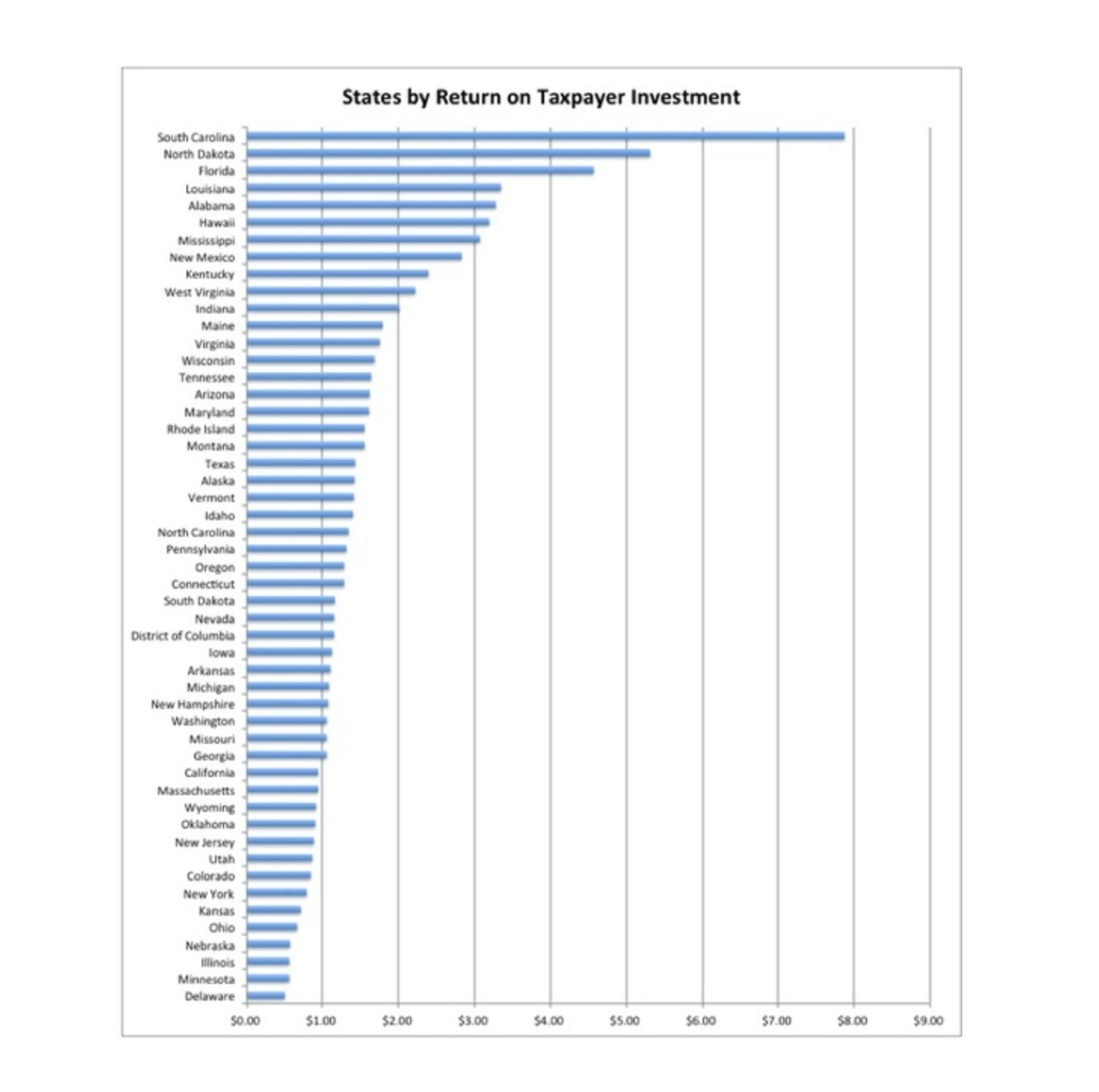
Can you link to the data and methodology that underlies the chart?
a reply to: Edumakated
I’ve demonstrated far more actual statistical and numerical arguments here than you have. You like to wave your hand at the numbers and say well, that means this, this means that.
“Per capita measures tell us how much of a problem is relative to the population?”
That proves you know absolutely nothing about actual quantitative analysis ... sorry.
I threw Texas and Florida in there to show that the problem of homelessness does not depend on the silly simplistic causes that you and others here are trying to claim,.. ie. relative “liberal vs. conservative” measures. You haven’t defined those terms, you haven’t specified your samples or your controls, you’re just stringing catch-phrases together to come back to your premises. It’s a circular argument and it’s the main reason I don’t waste time on actual debate with you folks.
SInce I have to draw it out in crayon, greater population density means more people in a smaller area. Combined with unsheltered homeless (which is why New York is doing better than California) that greater number of people in the street results in more # in the street.
I should have thought that beyond simplistic to the plainly obvious.
Thanks for the chat.
originally posted by: Edumakated
originally posted by: AugustusMasonicus
a reply to: Gryphon66
Not sure if this helps but this chart shows which states also get the largest handouts. It's displaying how much each one gets back for every dollar they contribute to the Treasury:
Can you link to the data and methodology that underlies the chart?
Googled it for you.
Took less time than typing this comment did.
Oh, and anyone who’d like to understand why I pitched a little fit up there after I realized I was barking up a hollow tree ...
The Pitfalls of Per Capita
The Pitfalls of Per Capita
The use of per capita measures in aggregate data analysis has been given little theoretical justification. This paper argues that unless there is such a justification, the employment of such transformations can lead to greatly distorted results. It is shown that such transformations can lead to either spuriously high or low correlations among sets of variables. Furthermore, there is no precise formula for determining the extent of any such biases. Even when the distortions are not great, they may lead the researcher to erroneous conclusions about the strength of the relationships among his variables. It is argued that per capita transformations are not always undesirable, but that greater attention needs to be paid to the theoretical justifications for employing such indices.
edit on 16-11-2019 by Gryphon66 because: Format
a reply to: BeenieWeenie
I don't think the problem is that simple. Those that are disabled, and the elderly, have avenues of recourse, and they are easily managed if the only issues they have to deal with is just a matter of shelter and finances,
Unfortunately, for most of the people that find themselves in the situation described, they are dependent on the system, they know how to work the system, and have been known to be violently demanding, for services that they believe they are entitled to.
I think the reason why it is so hard to fix this problems is because we only focus on what society should do. There is very little or no focus on what the person that has found themselves in this situation should do.
If they feel no sense of responsibility, if they are not expected to be accountable, then there is no real downside to being homeless, for those that choose this lifestyle, outside of personal safety. I have worked with victims that are homeless due to drug addictions. Placing them is shelters is very short lived, because they are not willing or able to follow the rules that make it possible to house them.
Any solution that does not rely on the accountability of the person that is receiving assistance, is just going to be a revolving door, with more and more people standing in line, and crapping on the street.
a reply to: NightSkyeB4Dawn
Have you ever had to beg for money to be able to eat?
I mean, was that really and truly the only option between you and not eating?
Have you ever gone more than a day without eating?
I’m not talking about working the these populations ... have you ever felt that kind of hunger that would drive you to beg for coins?
a reply to: Gryphon66
There are numerous avenues of recourse for people that have that need. Food is one of the needs that is the easiest to meet. I work with a pantry that supplies not just food, but personal hygiene items. They also offer access to places that do job training and even have a program called "Dress for Success". I am a member of a community outreach group that works together to assist with housing of the homeless. I personally know people that have opened their home to homeless families.
These measure work for a large number of people that have found themselves on hard times and need a hand up.
For those that are unable or unwilling to work toward removing themselves from what to us, may look like an undesirable situation, they are not looking for a hand up. There are still a lot of places though were they can get a meal.
a reply to: lakenheath24
Homelessness is not a Federal responsibility . It is a State and Local government responsibility .
Denying ignorance
Why ?
I gotta do what I gotta do.
No worries, but just to be fair, the prez, no matter who it is, probably aint worried bout homeless/poor peeps
Homelessness is not a Federal responsibility . It is a State and Local government responsibility .
Denying ignorance
Why ?
I gotta do what I gotta do.
a reply to: The2Billies
Hey man, my city is totally liberal and there's zero homeless people and everyone lives in mansions and has Olympic sized pools in their recreation rooms.
I'm sure you can figure out which city it is with barely any info except vague clues, it's totes legit I promise.
Hey man, my city is totally liberal and there's zero homeless people and everyone lives in mansions and has Olympic sized pools in their recreation rooms.
I'm sure you can figure out which city it is with barely any info except vague clues, it's totes legit I promise.
a reply to: NightSkyeB4Dawn
Have you ever been hungry enough to beg for food?
It’s not a hard question.
Have you ever been hungry enough to beg for food?
It’s not a hard question.
a reply to: Gryphon66
i have never had to beg for food. I have had times of need, but I had food made available to me. That is why I go out of my way to make food available to others in need. So begging for food is not necessary.
I have seen the people with the signs that say "Will work for food." I provide them with access to my phone to put them in contact with the pantry and an offer to have food delivered to them. You would be surprised at the number that refuse the offer.
It seems most of your experiences are with people that have just fallen on hard times and are hungry. I go out of my way to provide for those people and they are rarely the problem.
a reply to: NightSkyeB4Dawn
Thanks for your answer.
I submit that you don’t understand what you’re talking about. You are very charitably it seems working to make things better for folks, and I would like to say that I appreciate that and I am not trying to take a single thing away from you or cast aspersions on your work.
I am saying though, that you don’t understand first hand how the mind changes in great need or under unbearable pressure ... which is what many of these folks, though not all, are facing every day of their lives.
It’s easy to say what they should or could do. They’re faced with what they have to do.
originally posted by: Shamrock6
originally posted by: Edumakated
originally posted by: AugustusMasonicus
a reply to: Gryphon66
Not sure if this helps but this chart shows which states also get the largest handouts. It's displaying how much each one gets back for every dollar they contribute to the Treasury:
Can you link to the data and methodology that underlies the chart?
Googled it for you.
Took less time than typing this comment did.
Thanks. As I figured, the methodology is a bit light and vague.
Methodology
In order to determine which states yield the best and worst return on investment (ROI) for taxpayers, WalletHub compared the quality of government services received by residents to the total state and local taxes they pay in each of the 50 states.
First, we analyzed each state across five key government-service categories: 1) Education, 2) Health, 3) Safety, 4) Economy and 5) Infrastructure & Pollution. The categories were further broken down into 30 relevant metrics, which are listed below with their corresponding weights. Each metric was graded on a 100-point scale, with a score of 100 representing the best quality of government service.
We then determined each state’s weighted average across all 30 metrics to calculate its “Overall Government Services Score.”
Finally, we constructed the Taxpayer ROI ranking by comparing each state’s “Overall Government Services Score” to its “Total Taxes Paid per Capita.” “Per Capita” includes the population aged 18 and older.
originally posted by: Edumakated
originally posted by: Shamrock6
originally posted by: Edumakated
originally posted by: AugustusMasonicus
a reply to: Gryphon66
Not sure if this helps but this chart shows which states also get the largest handouts. It's displaying how much each one gets back for every dollar they contribute to the Treasury:
Can you link to the data and methodology that underlies the chart?
Googled it for you.
Took less time than typing this comment did.
Thanks. As I figured, the methodology is a bit light and vague.
Methodology
In order to determine which states yield the best and worst return on investment (ROI) for taxpayers, WalletHub compared the quality of government services received by residents to the total state and local taxes they pay in each of the 50 states.
First, we analyzed each state across five key government-service categories: 1) Education, 2) Health, 3) Safety, 4) Economy and 5) Infrastructure & Pollution. The categories were further broken down into 30 relevant metrics, which are listed below with their corresponding weights. Each metric was graded on a 100-point scale, with a score of 100 representing the best quality of government service.
We then determined each state’s weighted average across all 30 metrics to calculate its “Overall Government Services Score.”
Finally, we constructed the Taxpayer ROI ranking by comparing each state’s “Overall Government Services Score” to its “Total Taxes Paid per Capita.” “Per Capita” includes the population aged 18 and older.
Yeah, but not as vague as claiming that homelessness per capita proves that liberals are poo-heads.
You don’t like what the numbers show, so you make a disparaging remark and quote a passage without further commentary showing what your criticisms are ...
Weaksauce.
new topics
-
This is our Story
General Entertainment: 1 hours ago -
President BIDEN Vows to Make Americans Pay More Federal Taxes in 2025 - Political Suicide.
2024 Elections: 3 hours ago -
Ode to Artemis
General Chit Chat: 4 hours ago -
Ditching physical money
History: 7 hours ago -
One Flame Throwing Robot Dog for Christmas Please!
Weaponry: 7 hours ago -
Don't take advantage of people just because it seems easy it will backfire
Rant: 8 hours ago -
VirginOfGrand says hello
Introductions: 9 hours ago -
Should Biden Replace Harris With AOC On the 2024 Democrat Ticket?
2024 Elections: 9 hours ago
top topics
-
University student disciplined after saying veganism is wrong and gender fluidity is stupid
Education and Media: 12 hours ago, 12 flags -
Police clash with St George’s Day protesters at central London rally
Social Issues and Civil Unrest: 15 hours ago, 9 flags -
President BIDEN Vows to Make Americans Pay More Federal Taxes in 2025 - Political Suicide.
2024 Elections: 3 hours ago, 8 flags -
TLDR post about ATS and why I love it and hope we all stay together somewhere
General Chit Chat: 16 hours ago, 7 flags -
Should Biden Replace Harris With AOC On the 2024 Democrat Ticket?
2024 Elections: 9 hours ago, 6 flags -
Don't take advantage of people just because it seems easy it will backfire
Rant: 8 hours ago, 4 flags -
One Flame Throwing Robot Dog for Christmas Please!
Weaponry: 7 hours ago, 4 flags -
God lived as a Devil Dog.
Short Stories: 13 hours ago, 3 flags -
Ditching physical money
History: 7 hours ago, 3 flags -
VirginOfGrand says hello
Introductions: 9 hours ago, 2 flags
active topics
-
Who guards the guards
US Political Madness • 5 • : 19Bones79 -
One Flame Throwing Robot Dog for Christmas Please!
Weaponry • 6 • : BeTheGoddess2 -
Police clash with St George’s Day protesters at central London rally
Social Issues and Civil Unrest • 37 • : SprocketUK -
New whistleblower Jason Sands speaks on Twitter Spaces last night.
Aliens and UFOs • 48 • : baablacksheep1 -
Russia Ukraine Update Thread - part 3
World War Three • 5718 • : Freeborn -
Hate makes for strange bedfellows
US Political Madness • 40 • : 19Bones79 -
Lawsuit Seeks to ‘Ban the Jab’ in Florida
Diseases and Pandemics • 29 • : Cre8chaos79 -
TLDR post about ATS and why I love it and hope we all stay together somewhere
General Chit Chat • 8 • : Cre8chaos79 -
This is our Story
General Entertainment • 0 • : BrotherKinsMan -
British TV Presenter Refuses To Use Guest's Preferred Pronouns
Education and Media • 126 • : Asher47