It looks like you're using an Ad Blocker.
Please white-list or disable AboveTopSecret.com in your ad-blocking tool.
Thank you.
Some features of ATS will be disabled while you continue to use an ad-blocker.

Mandela Effect - Reality Being Edited Evidenced in Changing Logos
page: 1share:
I have had enough direct experiences with this particular aspect of the ME that I am left with no doubt that some hidden hand or supernatural force is
communicating something to us. This post will be focused on the themes that we see with many logo "alterations" that are happening now. I am seeing
new ones practically on a weekly basis now, if not even more frequently.
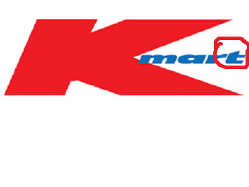
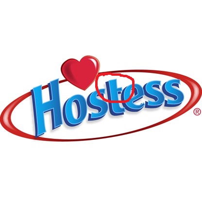
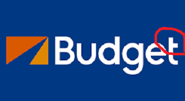
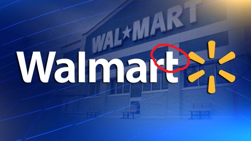
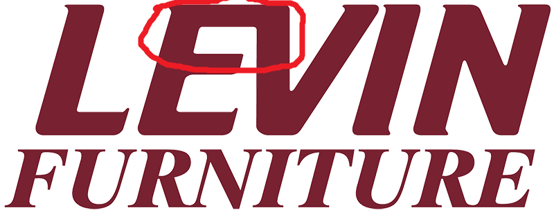
There will be three basic themes to cover here. The first is what is happening with lower case t's - in that the t is not fully crossed. Only the right side of the t has the line at the top; the left side is empty. Notice this with all of the below logos:
Next up is the connecting or blending together of letters in the logos:
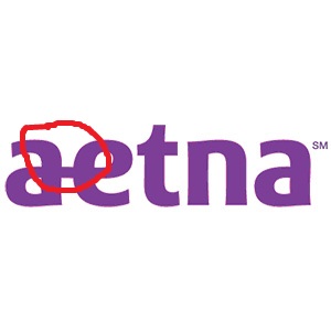
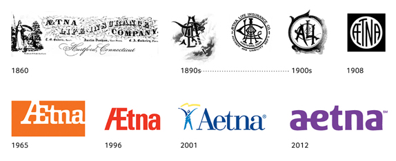
The Aetna one is particularly interesting to me. I worked there for years and saw the logo on the building every day driving in. The a and the e are now connected, and I know that wasn't the case before.
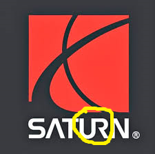
This Saturn logo is also very interesting, in that it has been "double affected" with not only the U and R being combined, but also with the line missing from the A. That is the third thematic aspect of these logo changes.
Regardless of what anyone says, these logos ARE changing in these ways; but not changing in the sense that the logos are being updated by the companies, of course. These logos have "always been this way" - even though they HAVEN'T! Whether this is reality shifting, timeline converging, or something else, there is no doubt that there is an intelligence behind all of this.

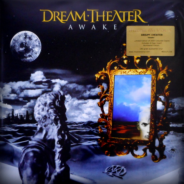
These next two resonate with me quite profoundly, as I basically witnessed the A's change before my very eyes. First up is Dream Theater. I was listening to this album on Youtube and was clicking through other screens that I had up, and upon clicking back on the album picture on the video, the A's that were normal, with lines in them, suddenly had none. They changed on my screen in mere seconds. On top of that, I have owned this particular CD for close to 20 years. It has changed.
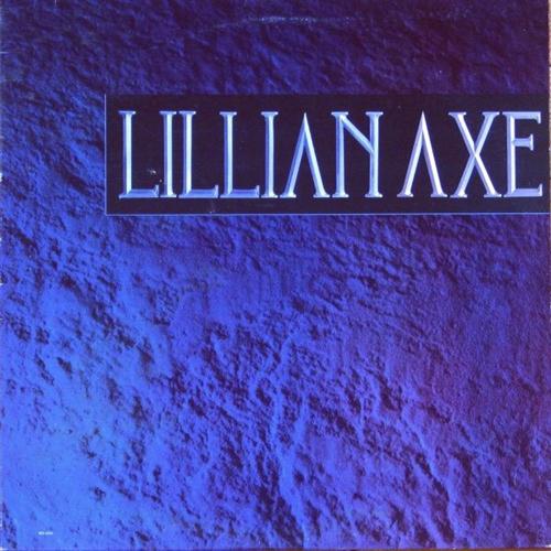
Last and most recent for me, I was listening to this Lillian Axe album on Youtube and the same damn thing happened with the A's. Just a couple of weeks ago this occurred. The A's changed mid-listen.
I don't give a damn what the skeptics and naysayers try to tell me. This is happening. I'm experiencing it directly. I don't know what the meaning behind it is, or where this is all heading. We'll see what lies ahead in the coming days!
There will be three basic themes to cover here. The first is what is happening with lower case t's - in that the t is not fully crossed. Only the right side of the t has the line at the top; the left side is empty. Notice this with all of the below logos:
Next up is the connecting or blending together of letters in the logos:
The Aetna one is particularly interesting to me. I worked there for years and saw the logo on the building every day driving in. The a and the e are now connected, and I know that wasn't the case before.
This Saturn logo is also very interesting, in that it has been "double affected" with not only the U and R being combined, but also with the line missing from the A. That is the third thematic aspect of these logo changes.
Regardless of what anyone says, these logos ARE changing in these ways; but not changing in the sense that the logos are being updated by the companies, of course. These logos have "always been this way" - even though they HAVEN'T! Whether this is reality shifting, timeline converging, or something else, there is no doubt that there is an intelligence behind all of this.
These next two resonate with me quite profoundly, as I basically witnessed the A's change before my very eyes. First up is Dream Theater. I was listening to this album on Youtube and was clicking through other screens that I had up, and upon clicking back on the album picture on the video, the A's that were normal, with lines in them, suddenly had none. They changed on my screen in mere seconds. On top of that, I have owned this particular CD for close to 20 years. It has changed.
Last and most recent for me, I was listening to this Lillian Axe album on Youtube and the same damn thing happened with the A's. Just a couple of weeks ago this occurred. The A's changed mid-listen.
I don't give a damn what the skeptics and naysayers try to tell me. This is happening. I'm experiencing it directly. I don't know what the meaning behind it is, or where this is all heading. We'll see what lies ahead in the coming days!
edit on 6-3-2018 by TombEscaper because:
Mandela Effect - Reality Being Edited Evidenced in Changing Logos
You think advertising is reality?
Or just bombing the web with the word mandela to grow a genre?
originally posted by: TombEscaper
Regardless of what anyone says, these logos ARE changing in these ways; but not changing in the sense that the logos are being updated by the companies, of course.
As long as you are keeping an open mind.
Why do you think some great intelligence is changing all this?
And why do you think some intelligence is not only skilled enough to change this but unskilled enough to get past you.
Perhaps this great intelligence has chosen you to be able to see all of this.
But then what advantage is there to seeing a reality which is completely irrelevant to our current timeline?
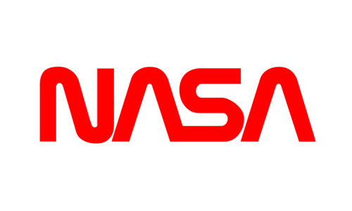
It's worth looking at the history of these logo's. The designers do revamp logos every few years. There's the history of the NASA "meatball" logo:
www.logodesignlove.com...
I have seen pictures change when you view them. That can be because visiting that webpage causes the server cache to be refreshed in the background and a new picture is loaded in. Some companies like Amazon do update prices and picture as you visit their site.
www.logodesignlove.com...
I have seen pictures change when you view them. That can be because visiting that webpage causes the server cache to be refreshed in the background and a new picture is loaded in. Some companies like Amazon do update prices and picture as you visit their site.
a reply to: TombEscaper
Something is happening. Everyone has their own examples. You will never convince people that convince themselves nothing is out of the ordinary. Don't be afraid to keep posting these things. We are reading them.
Something is happening. Everyone has their own examples. You will never convince people that convince themselves nothing is out of the ordinary. Don't be afraid to keep posting these things. We are reading them.
Logos are not set in stone, they get changed and updated from time to time.
Why do you just assume that any change is due to some supernatural thing rather than logos getting tinkered with over time?
Why do you just assume that any change is due to some supernatural thing rather than logos getting tinkered with over time?
Removed because "Storrmcell" beat me to the punch on the NASA logo, however. If the NASA logo has a history it's quite possible other do to and that
might explain away the changes.
edit on 6-3-2018 by eNaR because: (no reason given)
edit on 6-3-2018 by eNaR because: (no
reason given)
Companies change their logos all the time, who cares, it's advertising.
Pepsi changed their logo, wow.
Coke hasn't, they market based on history
It's advertising, it changes
Pepsi changed their logo, wow.
Coke hasn't, they market based on history
It's advertising, it changes
a reply to: TombEscaper
These are from 2011.


I also just msg'd John Petrucci about the band logo.
All my DT merch is packed away. If I can dig it out later, I will upload photos of my dvd's LP's etc...
These are from 2011.
I also just msg'd John Petrucci about the band logo.
All my DT merch is packed away. If I can dig it out later, I will upload photos of my dvd's LP's etc...
a reply to: TombEscaper
You saw words with letters that are arty but incorrect.
Your mind corrected this "error".
Notice how the differences are minor and follow the same pattern?
When it changes to K-Mall let me know.
Mandolia (man-DOH-lee-a) is a psychological phenomenon involving a stimulus wherin the mind assumes an error where none exists. This results in the mind correcting this "error" and adapting memories to accommodate the unwarranted correction.
You saw words with letters that are arty but incorrect.
Your mind corrected this "error".
Notice how the differences are minor and follow the same pattern?
When it changes to K-Mall let me know.
I remember that dream theater album as never having a line through the A. I've given it a good many listens.
I think that the issue of the post is more about logos having basically the same letters design.
As for me I think The Mandela effect is something almost impossible to detect and will require to store a lot of information, that cannot be changed in the current timeline, if someone decide to go back in time to change anything.
If I could travel in time and want to change something and going imperceptible, I will have to travel to the very first moment the name or logo was made up.
originally posted by: TombEscaper
I have had enough direct experiences with this particular aspect of the ME that I am left with no doubt that some hidden hand or supernatural force is communicating something to us. This post will be focused on the themes that we see with many logo "alterations" that are happening now. I am seeing new ones practically on a weekly basis now, if not even more frequently.
There will be three basic themes to cover here. The first is what is happening with lower case t's - in that the t is not fully crossed. Only the right side of the t has the line at the top; the left side is empty. Notice this with all of the below logos:
I'm not wearing the same underwear as yesterday. Mandella!!!!
edit on 3/6/2018 by eriktheawful because: Snipped excessive quote
Haven't we had moved on to "Mandella" with two l's? What reality am I in?
originally posted by: hombero
I remember that dream theater album as never having a line through the A. I've given it a good many listens.
HA! See, this proves it. You are clearly from the other timeline and aren't even aware of it.
Case closed!
(And now, everyone is wondering whether I'm serious.)
:
edit on 2018 3 06 by incoserv because: I could.
a reply to: TombEscaper
Let me break a few things down for you since I'm a graphic designer by trade (although I don't do logos much anymore):
Look, I find the whole idea of the ME interesting and possible, but even though you don't care about the naysayers and you're only here to apparently seek out an echo chamber or hope that no one debates you, the bottom line is that you just probably didn't notice a lot of this before.
I still swear that the Berenstain Bears was the "Berenstein Bears," and I will argue until I die that it used to be that way (I specifically used that "ei" in the name to learn the difference of "ei" and "ie" pronunciations of German names), but that doesn't mean that everything is attributable to such things.
Check out this website if you want to look at how logos and branding is changed by companies.
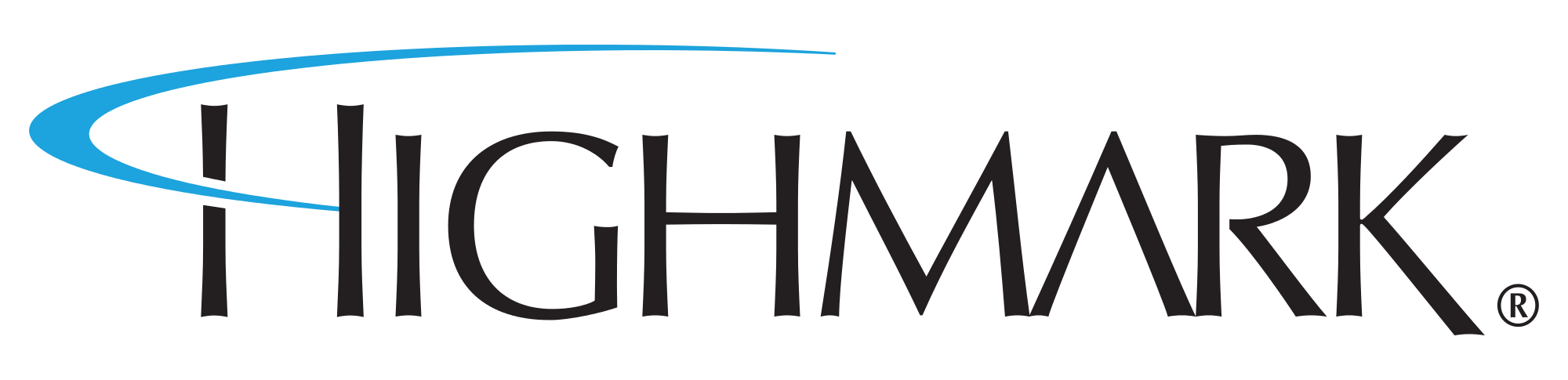
And just for fun, here is the history of Aetna logo changes. The "A" and the "E" were connected or incorporated into other letter for every single logo except the one from 2001 to 2012. I'm guessing you worked for them during that time?
Let me break a few things down for you since I'm a graphic designer by trade (although I don't do logos much anymore):
- - The "T" Phenomenon: Stop the freak-out! There are many, many fonts out there that exist with lower-case t's like that, but honestly,
anyone with vector-editing software (in my case, Adobe Illustrator, InDesign, or even Photoshop) can make any "t" from any font family look like that.
There are myriad reasons why, but a bit one is kerning (the space between two given letters in a word or series of letters)--it looks terrible in many
instances to have a lot of white space between letters, especially in logos.
In the case of logos like K-mart's, Hostess', and Walmart's, the top edge of the letters "s" and "r" serve also as the left side of the t's crossbar. And if they didn't do that with the word "mart," the white space between the "r" and "t" would be that much worse.
- Ligatures: Ligatures, or the combining of two or more letters into one symbol/glyph, is a common practice in typesetting and design. There's not always a good reason for it, but it does happen, and has happened at least the Roman times and Latin words. Theres generally nothing wrong with it, and it has been around forever, and it is generally used in ways where the combining of letters isn't readily noticeable by the casual observer.
Just because you may not have noticed it before doesn't mean that it wasn't there.
- Crossbar-lacking A's: This is another very, very common thing, and is generally used in logos that deal with techy-type companies or 'futuristic' typefaces. And, again, this is something that's not always immediately noticed by people, even if they notice it later.
- Logo Updates: Logos are updated very regularly in many companies, trying to keep their look fresh and relevant to trends and their target audience. This happens all of the time, and unless you are someone like me who looks at websites dedicated to logo redesigns, they can be so subtle that 95% of the population won't notice until it's pointed out.
Look, I find the whole idea of the ME interesting and possible, but even though you don't care about the naysayers and you're only here to apparently seek out an echo chamber or hope that no one debates you, the bottom line is that you just probably didn't notice a lot of this before.
I still swear that the Berenstain Bears was the "Berenstein Bears," and I will argue until I die that it used to be that way (I specifically used that "ei" in the name to learn the difference of "ei" and "ie" pronunciations of German names), but that doesn't mean that everything is attributable to such things.
Check out this website if you want to look at how logos and branding is changed by companies.
And just for fun, here is the history of Aetna logo changes. The "A" and the "E" were connected or incorporated into other letter for every single logo except the one from 2001 to 2012. I'm guessing you worked for them during that time?
new topics
-
Russian intelligence officer: explosions at defense factories in the USA and Wales may be sabotage
Weaponry: 1 hours ago -
African "Newcomers" Tell NYC They Don't Like the Free Food or Shelter They've Been Given
Social Issues and Civil Unrest: 2 hours ago -
Russia Flooding
Other Current Events: 3 hours ago -
MULTIPLE SKYMASTER MESSAGES GOING OUT
World War Three: 4 hours ago -
Two Serious Crimes Committed by President JOE BIDEN that are Easy to Impeach Him For.
US Political Madness: 5 hours ago -
911 emergency lines are DOWN across multiple states
Breaking Alternative News: 5 hours ago -
Former NYT Reporter Attacks Scientists For Misleading Him Over COVID Lab-Leak Theory
Education and Media: 7 hours ago -
Why did Phizer team with nanobot maker
Medical Issues & Conspiracies: 7 hours ago -
Pro Hamas protesters at Columbia claim hit with chemical spray
World War Three: 8 hours ago -
Elites disapearing
Political Conspiracies: 10 hours ago
top topics
-
British TV Presenter Refuses To Use Guest's Preferred Pronouns
Education and Media: 17 hours ago, 18 flags -
Go Woke, Go Broke--Forbes Confirms Disney Has Lost Money On Star Wars
Movies: 12 hours ago, 13 flags -
Pro Hamas protesters at Columbia claim hit with chemical spray
World War Three: 8 hours ago, 11 flags -
Elites disapearing
Political Conspiracies: 10 hours ago, 9 flags -
Freddie Mercury
Paranormal Studies: 12 hours ago, 7 flags -
Nirvana - Immigrant Song
Music: 16 hours ago, 5 flags -
A Personal Cigar UFO/UAP Video footage I have held onto and will release it here and now.
Aliens and UFOs: 10 hours ago, 5 flags -
African "Newcomers" Tell NYC They Don't Like the Free Food or Shelter They've Been Given
Social Issues and Civil Unrest: 2 hours ago, 5 flags -
Two Serious Crimes Committed by President JOE BIDEN that are Easy to Impeach Him For.
US Political Madness: 5 hours ago, 5 flags -
911 emergency lines are DOWN across multiple states
Breaking Alternative News: 5 hours ago, 4 flags
active topics
-
What Time is it on the Moon ?
Space Exploration • 50 • : wildespace2 -
Russian intelligence officer: explosions at defense factories in the USA and Wales may be sabotage
Weaponry • 18 • : Lazy88 -
Elites disapearing
Political Conspiracies • 19 • : annonentity -
Why did Phizer team with nanobot maker
Medical Issues & Conspiracies • 6 • : annonentity -
Israel ufo shoot down drones?
Aliens and UFOs • 26 • : GENERAL EYES -
African "Newcomers" Tell NYC They Don't Like the Free Food or Shelter They've Been Given
Social Issues and Civil Unrest • 4 • : GENERAL EYES -
The Acronym Game .. Pt.3
General Chit Chat • 7722 • : bally001 -
Two Serious Crimes Committed by President JOE BIDEN that are Easy to Impeach Him For.
US Political Madness • 7 • : Disgusted123 -
Russia Flooding
Other Current Events • 1 • : ksihkahe -
Running Through Idiot Protestors Who Block The Road
Rant • 107 • : FlyersFan