It looks like you're using an Ad Blocker.
Please white-list or disable AboveTopSecret.com in your ad-blocking tool.
Thank you.
Some features of ATS will be disabled while you continue to use an ad-blocker.

High ranking Global Warming scientist whistleblows on manipulated data ...
page: 14share:
a reply to: TiredofControlFreaks
The Sunday Time February 12, 2017
www.thetimes.co.uk...
The Sunday Time February 12, 2017
www.thetimes.co.uk...
Peter Stott, head of climate monitoring and attribution at the Met Office climate centre, said: “The slowdown hasn’t gone away . . . However, our confidence in a warming world doesn’t just depend on surface temperatures. It is seen in a wealth of indicators, including melting snow and ice, and rising sea levels.”
[/quote
originally posted by: TiredofControlFreaks
a reply to: Greven
I am absolutely going nowhere!
I posted a link from 2013 from Duke University to explain to you what the Pause was about - that my friend was not claim the length of any Pause at all. I looked and looked to find a link to a source that was not from climate denier site and that you would accept. Your welcome by the way.
I don't know that the Pause ended AT ALL because it was only claimed that the Pause ended when Karl et al published the Pausebuster Study. Now we find out that the Pause may not have ended then because Karl et al played jiggery pockery with the data.
I said that the Pause may be over 18 years in length because until the Karl et al investigation is finished we cannot officially say anything.
YOU still don't want to admit that you loudly proclaimed that the Pause was OVER and you didn't even know
It is over.
It was only 'a thing' in a few data sets, and only because those data sets sarted from literally the highest point on the record in recorded history in the last century by a large margin, a high only reached by the extreme El Niño of 1997-1998.
You're citing things written in 2013 to counter data I presented from 2015. Do you not see how silly that is?
Your source claims a 'pause' of about 9 years. That's my point. Perhaps you didn't read your source to realize that (yet again)?
Present evidence, here and now, that the 'pause' is still happening, because you've claimed that:
originally posted by: TiredofControlFreaks
There are 8 data sets that show a pause in the rise of global temperature over the last 18 years. There is only one data set that shows no pause. and the raw data was never available for independent review.
Let me be excruciatingly clear:
If your next reply would not contain a refutation of my claim that the 'pause' is over, don't bother replying.
Stop with this squirming bull# about how you 'know what it is' and I 'don't know' what it is, when that's entirely unrelated to the issue at hand, which is your claim that the 'pause' is still going on and my claim that it isn't. The difference between the two is that my claim is backed by data, while yours is backed by just your assertion.
Stop wasting my time with such pathetic responses and respond to the actual argument.
a reply to: Greven
The point of the OP is there is a problem with the data set in which the ocean's temperature was warmed (changing the cooler buoy data to match the warmer ship data) by the Karl et al paper. The "adjustment" had the effect of "erasing" the Pause.
This "adjustment" is also present in all the graphs that you have presented as "proof" that the Pause no longer exists!
So here we are, discussing and debating the allegations that the Karl et al paper was based on "preliminary and unverified data" and here you are contributing that the proof that this allegation is not so is that all the data sets (that have already been adjusted by ERSST v.40) says so.
Kind of a circular kind of proof, is it not?
I think it is encumbent on all of use to wait for the results of the investigation.
In the meantime, I think it is going to be very very interesting year. There is the possibility of a double El Nino causing even more heat loss from the ocean and politically speaking, there is now Scot Pruitt, new head of the EPA
pjmedia.com...
I can't continue to argue with someone who doesn't recognize that his reasoning is circular.
I would rather wait to see what comes out of a public debate on the issue of CAGW
The point of the OP is there is a problem with the data set in which the ocean's temperature was warmed (changing the cooler buoy data to match the warmer ship data) by the Karl et al paper. The "adjustment" had the effect of "erasing" the Pause.
This "adjustment" is also present in all the graphs that you have presented as "proof" that the Pause no longer exists!
So here we are, discussing and debating the allegations that the Karl et al paper was based on "preliminary and unverified data" and here you are contributing that the proof that this allegation is not so is that all the data sets (that have already been adjusted by ERSST v.40) says so.
Kind of a circular kind of proof, is it not?
I think it is encumbent on all of use to wait for the results of the investigation.
In the meantime, I think it is going to be very very interesting year. There is the possibility of a double El Nino causing even more heat loss from the ocean and politically speaking, there is now Scot Pruitt, new head of the EPA
pjmedia.com...
n light of charges by a former National Oceanic and Atmospheric Administration scientist that agency researchers are manipulating data to support climate alarmism, Scott Pruitt -- President Donald Trump’s nominee to head the Environmental Protection Agency -- is right to call for open debate on the science.
I can't continue to argue with someone who doesn't recognize that his reasoning is circular.
I would rather wait to see what comes out of a public debate on the issue of CAGW
a reply to: TiredofControlFreaks
Yeah, uh, the point is that the 'pause' is gone regardless of whether or not that paper is right.
As expected, you can't be arsed to cite data to support your claim:
You have this bizarre belief that the data from Karl et al. is incorporated in all data sets. How about you prove that one too?
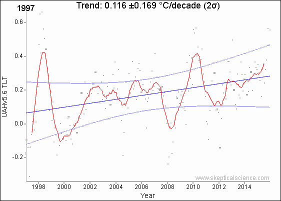
For example, here is SATELLITE data from UAH, which has nothing to do SST, 1997 - 2016:
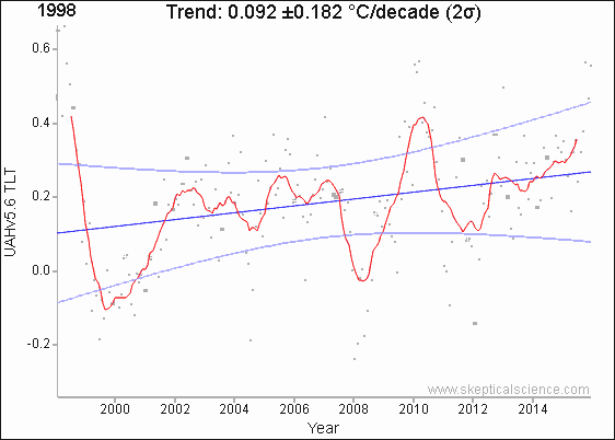
1998 - 2016:
2002 - 2016:
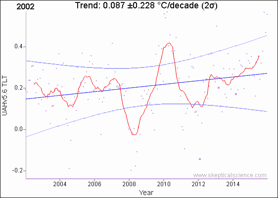
This last one has the lowest warming trend of any UAH v5.6 series that ends in 2016. There ain't a pause anymore, even in satellite sets; RSS has a slightly lower trend from 2002 - 2016 (again lower than 1998), but it's still warming.
Yeah, uh, the point is that the 'pause' is gone regardless of whether or not that paper is right.
As expected, you can't be arsed to cite data to support your claim:
originally posted by: TiredofControlFreaks
There are 8 data sets that show a pause in the rise of global temperature over the last 18 years. There is only one data set that shows no pause. and the raw data was never available for independent review.
You have this bizarre belief that the data from Karl et al. is incorporated in all data sets. How about you prove that one too?
For example, here is SATELLITE data from UAH, which has nothing to do SST, 1997 - 2016:
1998 - 2016:
2002 - 2016:
This last one has the lowest warming trend of any UAH v5.6 series that ends in 2016. There ain't a pause anymore, even in satellite sets; RSS has a slightly lower trend from 2002 - 2016 (again lower than 1998), but it's still warming.
edit on 19Fri, 17 Feb 2017 19:11:48
-0600America/ChicagovAmerica/Chicago2 by Greven because: (no reason given)
originally posted by: TiredofControlFreaks
a reply to: Greven
Please notice that in each graph you have provided, the margin of error is larger that the trend itself. It might actually be 0. which proves the Pause
Seems to be the case. The trend could even be negative. 0.087 -+0.228.
At the limits of the minus range, the trend could be -0.141 not?
a reply to: TiredofControlFreaks
Greven
www.economist.com...
Now, Greven, you have discovered what the Pause is. It is not whether or not there has been an increase in temperature. Its the fact that the rate of warming has slowed at a time when 1/3 of all carbon dioxide has been emitted into the atmosphere. The Pause shows that the rate of warming is not solely or even dominantly caused by carbon dioxide.
Greven
www.economist.com...
BETWEEN 1998 and 2013, the Earth’s surface temperature rose at a rate of 0.04°C a decade, far slower than the 0.18°C increase in the 1990s.
Now, Greven, you have discovered what the Pause is. It is not whether or not there has been an increase in temperature. Its the fact that the rate of warming has slowed at a time when 1/3 of all carbon dioxide has been emitted into the atmosphere. The Pause shows that the rate of warming is not solely or even dominantly caused by carbon dioxide.
originally posted by: TiredofControlFreaks
a reply to: Greven
Please notice that in each graph you have provided, the margin of error is larger that the trend itself. It might actually be 0. which proves the Pause
With this, you show that you have absolutely no idea what you're talking about at all. That is not "margin of error" in the slightest.
Same goes for you, D8Tee.
It's a consequence of few data points and (as is typical in temperature records) large fluctuations that the value is high, increasingly so as one reduces the range. Note that the older starting date charts (1997, then 1998) have smaller values than the younger 2002 start date. For the UAH 5.6 data, you have to go back to 1994-2016 to get warming that exceeds said value - as does ever year prior to 1994.
I'll just quote myself from long ago, because I'm seriously repeating myself a lot these days:
originally posted by: Greven
Recall the link that you posted earlier - there is a calculator on the page where you can select various date ranges. Do this for the GISTEMP data with a maximum interval of 20 years (ex. 1880-1900, 1900-1920, 1920-1940, 1940-1960, 1960-1980, 1980-2000) and you will see that within most of these ranges, there was no statistically significant warming trend. Yet, we are certainly warmer! Weird, huh?
This is because the time range is too small and the temperature range is too big, which increase the uncertainty.
The point is simply this: trends are trends. You don't get to dismiss them arbitrarily.
Do you know why?
You're misunderstanding the context. Within 2σ of the mean doesn't mean there isn't warming; rather, it means one can't reject that the warming that is happening isn't due to random chance, aka the null hypothesis.
edit on 1Sat, 18 Feb 2017 01:27:34
-0600America/ChicagovAmerica/Chicago2 by Greven because: (no reason given)
a reply to: Greven
Yes - thank you for clearing that up!
However, while your graphs clearly show warming, the rate of warming has still slowed! THAT IS THE PAUSE!
Also you must admit that the 1998, 2010 and 2015/2016 contributed a great deal of warming that was not caused by CO2 but rather by the PDO!
Yes - thank you for clearing that up!
However, while your graphs clearly show warming, the rate of warming has still slowed! THAT IS THE PAUSE!
Also you must admit that the 1998, 2010 and 2015/2016 contributed a great deal of warming that was not caused by CO2 but rather by the PDO!
originally posted by: D8Tee
a reply to: Greven
Thanks for clearing that up, understood, it's been a few years since my statistics class.
The calculator you linked to is interesting.
Does 1/10 of a degree per decade worry you?
Yeah, that's worrying.
Also worrying (UAH 5.6) is how things appear to be speeding up:
1980-2017: 0.157°C/decade
1990-2017: 0.191°C/decade
2000-2017: 0.193°C/decade
2010-2017: 0.402°C/decade
'Okay' you might say, 'but there was that El Niño' - and I will grant that an an El Niño spikes temperatures. The trend should go down in the short term.
However, if you look at what has been happening after strong El Niño events, temperatures appear to stabilize at a higher level than they were before the event.
1978 - 1981: -0.18°C
1982 - 1983: third most intense El Niño
1983 - 1996: -0.11°C
1997 - 1998: most intense El Niño
1999 - 2014: +0.11°C
2015 - 2016: second most intense El Niño (although longer at lower intensity than 1997-1998)
originally posted by: TiredofControlFreaks
a reply to: Greven
Yes - thank you for clearing that up!
However, while your graphs clearly show warming, the rate of warming has still slowed! THAT IS THE PAUSE!
Also you must admit that the 1998, 2010 and 2015/2016 contributed a great deal of warming that was not caused by CO2 but rather by the PDO!
'Slowdown' is definitely not the same as 'pause'.
a reply to: TiredofControlFreaks
Ah, before I leave I should answer this.
UAH 6.0 TLT Global anomalies... (which raise older temperatures and lower newer ones)
Year average departure:
1978: -0.36
1979: -0.21
1980: -0.04
1981: -0.11
1982: -0.30
1983: -0.04
1984: -0.24
1985: -0.36
1986: -0.22
1987: 0.05
1988: 0.04
1989: -0.21
1990: 0.01
1991: 0.02
1992: -0.28
1993: -0.20
1994: -0.06
1995: 0.07
1996: -0.01
1997: -0.01
1998: 0.48
1999: -0.02
2000: -0.02
2001: 0.12
2002: 0.22
2003: 0.19
2004: 0.08
2005: 0.20
2006: 0.11
2007: 0.15
2008: -0.10
2009: 0.09
2010: 0.33
2011: 0.02
2012: 0.06
2013: 0.13
2014: 0.18
2015: 0.26
2016: 0.50
2017: 0.30
I assume this is where your 0.3 degrees comes from. As to what happened... well, it hasn't been very long yet. Even then, though...
Years higher than 0.3:
2016 (0.50) El Niño (strong)
1998 (0.48) El Niño (strong)
2010 (0.33) El Niño
edit on 15Sun, 19 Feb 2017 15:42:32 -0600America/ChicagovAmerica/Chicago2 by Greven because: (no reason given)
a reply to: TiredofControlFreaks
And you are right, a graph or trend line still can't say what the future will be!
And you are right, a graph or trend line still can't say what the future will be!
new topics
-
Weinstein's conviction overturned
Mainstream News: 46 minutes ago -
Supreme Court Oral Arguments 4.25.2024 - Are PRESIDENTS IMMUNE From Later Being Prosecuted.
Above Politics: 2 hours ago -
Krystalnacht on today's most elite Universities?
Social Issues and Civil Unrest: 2 hours ago -
Chris Christie Wishes Death Upon Trump and Ramaswamy
Politicians & People: 2 hours ago -
University of Texas Instantly Shuts Down Anti Israel Protests
Education and Media: 5 hours ago -
Any one suspicious of fever promotions events, major investor Goldman Sachs card only.
The Gray Area: 7 hours ago -
God's Righteousness is Greater than Our Wrath
Religion, Faith, And Theology: 11 hours ago
top topics
-
VP's Secret Service agent brawls with other agents at Andrews
Mainstream News: 16 hours ago, 11 flags -
Nearly 70% Of Americans Want Talks To End War In Ukraine
Political Issues: 16 hours ago, 6 flags -
Krystalnacht on today's most elite Universities?
Social Issues and Civil Unrest: 2 hours ago, 6 flags -
Sunak spinning the sickness figures
Other Current Events: 16 hours ago, 5 flags -
Supreme Court Oral Arguments 4.25.2024 - Are PRESIDENTS IMMUNE From Later Being Prosecuted.
Above Politics: 2 hours ago, 5 flags -
Weinstein's conviction overturned
Mainstream News: 46 minutes ago, 4 flags -
Electrical tricks for saving money
Education and Media: 14 hours ago, 4 flags -
University of Texas Instantly Shuts Down Anti Israel Protests
Education and Media: 5 hours ago, 2 flags -
Any one suspicious of fever promotions events, major investor Goldman Sachs card only.
The Gray Area: 7 hours ago, 2 flags -
Chris Christie Wishes Death Upon Trump and Ramaswamy
Politicians & People: 2 hours ago, 1 flags
active topics
-
Chris Christie Wishes Death Upon Trump and Ramaswamy
Politicians & People • 8 • : network dude -
University of Texas Instantly Shuts Down Anti Israel Protests
Education and Media • 101 • : theatreboy -
Nearly 70% Of Americans Want Talks To End War In Ukraine
Political Issues • 79 • : Consvoli -
Supreme Court Oral Arguments 4.25.2024 - Are PRESIDENTS IMMUNE From Later Being Prosecuted.
Above Politics • 22 • : matafuchs -
Remember These Attacks When President Trump 2.0 Retribution-Justice Commences.
2024 Elections • 57 • : TzarChasm -
Weinstein's conviction overturned
Mainstream News • 9 • : chiefsmom -
-@TH3WH17ERABB17- -Q- ---TIME TO SHOW THE WORLD--- -Part- --44--
Dissecting Disinformation • 670 • : cherokeetroy -
British TV Presenter Refuses To Use Guest's Preferred Pronouns
Education and Media • 159 • : 5thHead -
HORRIBLE !! Russian Soldier Drinking Own Urine To Survive In Battle
World War Three • 40 • : Myhandle -
President BIDEN Vows to Make Americans Pay More Federal Taxes in 2025 - Political Suicide.
2024 Elections • 144 • : underpass61