It looks like you're using an Ad Blocker.
Please white-list or disable AboveTopSecret.com in your ad-blocking tool.
Thank you.
Some features of ATS will be disabled while you continue to use an ad-blocker.

Temps
page: 119
share:
Since temperatures, in the context of climate change, are a frequently discussed topic here on ATS, i decided to finally finish a post i started
writing on over a year ago. It is not a short read, but hopefully I've managed to keep it interesting enough to get you through it.
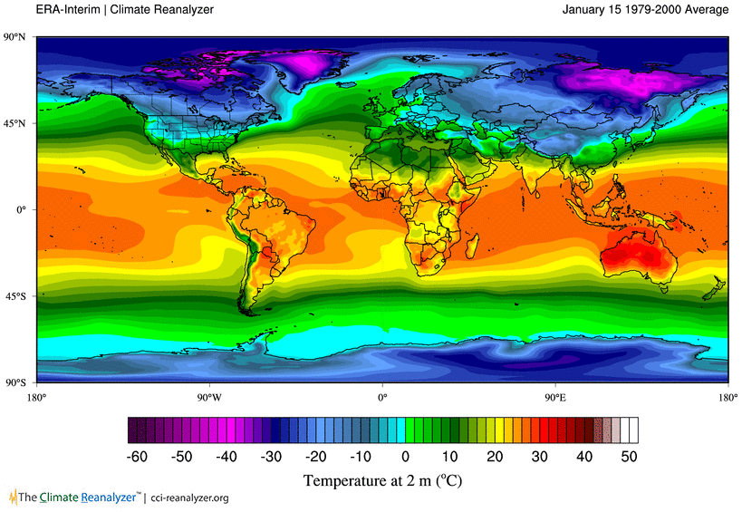
The majority of the post will be about surface air temperatures over land, that is, temperatures measured at standard weather stations (also 2 meter temperature) on which the three main global data-sets are based. Although the scope here (surface temps.) is very narrow, the subject is already too complex to fit all relevant information in a single post.
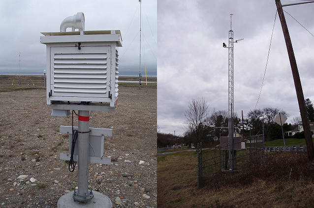 Traditional Stevenson Screen with Minimum-Maximum Thermometers & Automated Weather Station with Data-logger
To start things off. The surface temperature trends over the last one or two decades have been a controversial topic, also here on ATS. For the most part, the debate took place in the blogosphere and the media. The following is short review of the discussion in a scientific context which is usually more refined and goes beyond the more binary interpretations of that period.
The reduced rate of global surface temperature change has been first mentioned, and confirmed, by climate scientists around 8 years ago. Back then, the focus of research was primarily on the mismatch between observed and simulated temperature change. Conceptually, the output of climate model simulations represents the expected response of surface temperatures to increasing CO2 emissions.
The first attempts to find explanations for the discrepancy between models and observations were based on now outdated versions of data sets and previous model generations. But research over the last few years has shown that knowledge about fundamental aspects of the climate is still incomplete, that data sets require substantial adjustments and models still lack realistic representations of the climate system.
The majority of the post will be about surface air temperatures over land, that is, temperatures measured at standard weather stations (also 2 meter temperature) on which the three main global data-sets are based. Although the scope here (surface temps.) is very narrow, the subject is already too complex to fit all relevant information in a single post.
To start things off. The surface temperature trends over the last one or two decades have been a controversial topic, also here on ATS. For the most part, the debate took place in the blogosphere and the media. The following is short review of the discussion in a scientific context which is usually more refined and goes beyond the more binary interpretations of that period.
The reduced rate of global surface temperature change has been first mentioned, and confirmed, by climate scientists around 8 years ago. Back then, the focus of research was primarily on the mismatch between observed and simulated temperature change. Conceptually, the output of climate model simulations represents the expected response of surface temperatures to increasing CO2 emissions.
sciencemag.org 2009
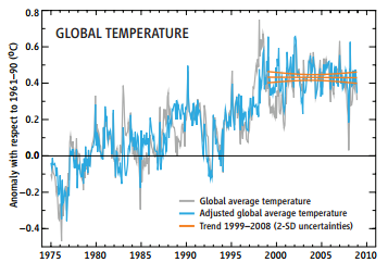
The latest response from the climate community comes in State of the Climate in 2008, a special supplement to the current (August) issue of the Bulletin of the American Meteorological Society. Climate researcher Jeff Knight and eight colleagues at the Met Office Hadley Centre in Exeter, U.K., first establish that —at least in one leading temperature record— greenhouse warming has been stopped in its tracks for the past 10 years.
In the HadCRUT3 temperature record, the world warmed by 0.07°C±0.07°C from 1999 through 2008, not the 0.20°C expected by the Intergovernmental Panel on Climate Change. Corrected for the natural temperature effects of El Niño and its sister climate event La Niña, the decade’s trend is a perfectly flat 0.00°C.
The first attempts to find explanations for the discrepancy between models and observations were based on now outdated versions of data sets and previous model generations. But research over the last few years has shown that knowledge about fundamental aspects of the climate is still incomplete, that data sets require substantial adjustments and models still lack realistic representations of the climate system.
A Hiatus of the Greenhouse Effect
The rate at which the global average surface air temperature (Ts) increases has slowed down during the past few decades. This so-called hiatus, pause, or slowdown of global warming has inspired investigations into its potential causes worldwide.
Although some researchers doubted the existence of a global warming hiatus because of coverage bias, artificial inconsistency, and a change point analysis of instrumental Ts records, it is now accepted that a recent warming deceleration can be clearly observed. There are two primary hypotheses to explain the recent slowdown of the upward trend in Ts.
Both hypotheses attempt to explain the contradiction between the trendless Ts variation and the intensifying anthropogenic greenhouse effect resulting from the steadily increasing emission of greenhouse gases (GHGs). The first attributes the warming hiatus to external radiative forcings, such as decreasing solar irradiance, increasing tropospheric and stratospheric aerosols, reduced stratospheric water vapor, and several small volcanic eruptions. The warming effect of increasing GHGs is largely cancelled out by the decreasing solar shortwave radiation received by the Earth’s surface.
The second considers the warming pause to be a result of internal oceanic and/or atmospheric decadal variabilities against the centennial warming trend, in which two leading theories are proposed. One asserts that the recent warming hiatus likely results from a La Niña-like state or a negative phase of Interdecadal Pacific Oscillation (IPO) associated with the cooling tropical Pacific sea surface temperature (SST) and the increasing Pacific trade winds. This theory is supported by the successful simulation of the warming hiatus by nudging the tropical pacific SST or trade winds relative to observations.
The other suggests that the warming hiatus is accompanied by increasing heat uptake in global deep oceans. This extra heat, which originates from a positive radiative imbalance at the top of the atmosphere (TOA), is reserved in the deep oceans instead of warming the Earth’s skin. Note that both aforementioned hypotheses indeed include an enhancing greenhouse effect in which more heat is captured by the Earth–atmosphere system.
The main difference between them is how this additional energy is prevented from warming the Earth’s surface.
Volcanic Contributions to Decadal Changes in Tropospheric Temperature
Despite continued growth in atmospheric levels of greenhouse gases, global mean surface and tropospheric temperatures show slower warming since 1998. Possible explanations for this “warming hiatus” include internal climate variability, external cooling influences, and observational errors.
One contributory factor to the relatively muted surface warming – early 21st century volcanic forcing – has been examined in several modelling studies. Here we present the first analysis of the impact of recent volcanic forcing on tropospheric temperature, and the first observational assessment of the significance of early 21st century volcanic signals.
the Pacific and the ongoing warming hiatus
A key component of the global hiatus that has been identified is cool eastern Pacific sea surface temperature, but it is unclear how the ocean has remained relatively cool there in spite of ongoing increases in radiative forcing.
Here we show that a pronounced strengthening in Pacific trade winds over the past two decades—unprecedented in observations/reanalysis data and not captured by climate models—is sufficient to account for the cooling of the tropical Pacific and a substantial slowdown in surface warming through increased subsurface ocean heat uptake.
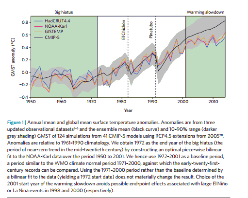
Making sense of the early 2000s warming slowdown
Research into the nature and causes of the slowdown has triggered improved understanding of observational biases, radiative forcing and internal variability. This has led to widespread recognition that modulation by internal variability is large enough to produce a significantly reduced rate of surface temperature increase for a decade or even more — particularly if internal variability is augmented by the externally driven cooling caused by a succession of volcanic eruptions.
The legacy of this new understanding will certainly outlive the recent warming slowdown. This is particularly true in the embryonic field of decadal climate prediction, where the challenge is to simulate how the combined effects of external forcing and internal variability produce the time-evolving regional climate we will experience over the next ten years
It shouldn't be surprising or even controversial that science, if understood as a process, is leading to new insights and is constantly changing (hopefully improving) the knowledge about a uniquely complex system such as the Earth climate.
Although the focus on surface temperature trends during the last decades has led to a better understanding of natural and human influences, that period is only a snapshot in context of historic temperature changes.
As mentioned above, the main purpose of the global data sets is to test how observations compare to the temperature change expected from climate model simulations. In that sense, the global record is the statistical average sum of all changes in surface temperatures.
A key question for climate science is the long term response of the Earth surface to anthropogenic forcings (e.g. CO2 emissions), under the assumption that a measurable signal will emerge from natural climate variations over time. Changes over shorter time periods are, in that specific context, sometimes considered (statistical) noise.
But the noise is the signal for all living organisms, for the ecosystems on the surface, for human societies; in short - for all things that are affected by changing temperatures.
Life on the surface is adapted to ever-changing conditions on all time scales.
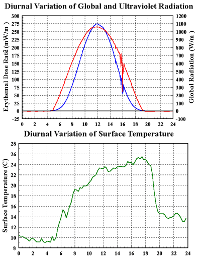
Depending on climate zone, time of the year, topography etc., daily surface temperatures can change between (avg.) 4 - 10 degrees in humid regions (low latitudes), up to more than 30 degrees over deserts or at high latitudes. Most land-based locations are experiencing temperature variations of several degrees within a single hour every day. The diurnal or day/night cycle has generally the largest effect on surface temperature change over short time periods.
Temperature variations during the seasonal or annual cycle are on average of the same magnitude. The effect increases with latitude and creates the largest seasonal difference in the high North, while it is more suppressed in the Tropics.
Regional Trends are regional
What is often missing from discussions about global average surface temperatures, is how large the differences are in temperature trends/changes over all time scales and in all regions of the World.
Ultimately, the effects of climate changes depend on the specific temperature profile of a region. Large-scale statistical averages are only representative for each part of a system if they reflect the general behaviour of change in the underlying source data. This is naturally not the case for surface temperatures.
The data set for contiguous United States is a good place to start a preliminary check on how temperature changes can differ on a region by region basis.
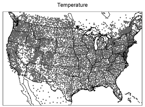
Temperature data for the U.S. is available at NOAA's Climate at a Glance webpage. The Data Viewer provides easy access to national climate indices.
Climate at a Glance has some unique features, but also a few limitations.
You can:
- create plots of annual/seasonal/monthly average, max and minimum temperatures for individual states or climate
divisions
- display linear and dynamical trends for selected periods
- change the base period for the hot/cold rankings
The tool does not provide an option to plot temperature as anomalies, however the option to select the base-period serves a similar function.
But the one major limitation is lack of documentation on which stations are used to create the divisional averages. It is technically possible to find that information via manual search in NOAA's ftp database.
*Knowing which stations or network contributed to the final data-set can help to understand potential issues, an example is provided at the end of this part.
Overall, Climate at a Glance is the perfect tool to take a first look at temperature/climate data, although it is no substitute for in-depth analysis, it does allow to test some of the main arguments made in this post.
That is:
- each region/time of the year has its own unique temperature history
- global or continental averages only provide limited information of when or where a change has occurred
- linear trends are mainly statistical but not necessarily climatic properties of large scale temperature time series
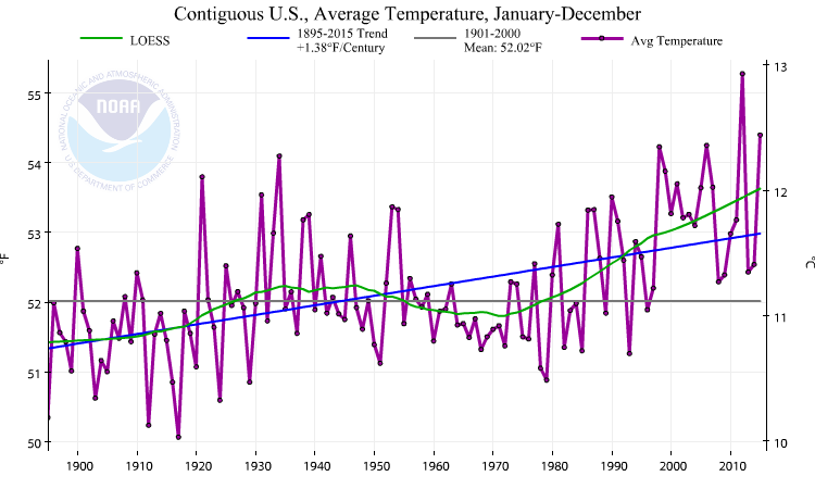
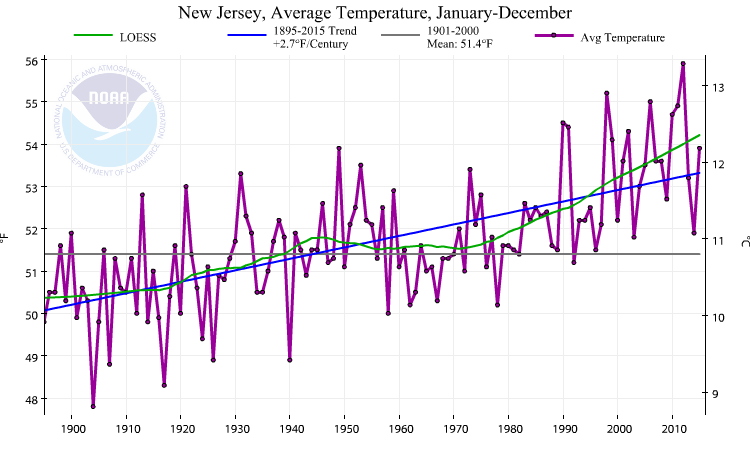
4 plots/4 trends
The first time series is the annual average temperature change for the contiguous United States over the last 120 years.
The second plot is for New Jersey, the linear trend is almost double the rate compared to the national average.
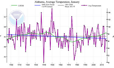
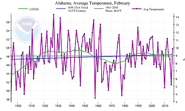
The third is for the State of Alabama, the change per century is slightly negative but would be not significant per statistical definition.
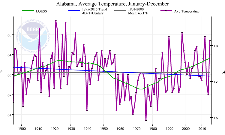
Last plot is for Arkansas, the linear trend is practically flat, but the LOESS smoothing makes the progression of temperature changes clearly visible.
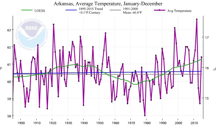
The examples are meant to illustrate the large regional differences in temperature trends. Instead of a homogeneous change, that would be more or less representative for all regions, the historical temperature change for each state/climate division varies considerably.
The same also applies to all other subsets of the data. The trends for each month of a season (e.g. winter-Dec.Jan.Feb.) can have opposite signs, it
is not necessarily apparent form a seasonal average trend how exactly temperatures have changed over time.
click links for larger images
 link
link
 link
link
 link
link
 link
link
*Station network density for U.S. surface temperature data is among the highest in the world. Due to the high sample rate, the national record is in general less sensitive to artifical inhomogeneities (time of observation-and-instrument changes, measurement errors, urbanisation). Nonetheless, raw station data almost always require substantial adjustments. The process of adjusting temperature data is ongoing and it depends on the ability to clearly identify sources of error to correct the data sets for artifical (non-climatic) influences.
Snotel is one of the networks from which stations were incorporated in NOAA's current U.S. temperature data set. Snotel records data from high-elevation sites in the western United States. A significant observational error (due to sensor changes) was detected at Snotel stations, which has artifically increased the warming trends of minimum tempratures by a factor of 10.
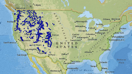 Snotel-stations
The error in the Snotel data was detected after NOAA has puplished the final version of the new U.S. data set. So far, i've been unable to find any documentation on how that might effect the regions were data from Snotel sites is used. While it is technically possible to access the complete station inventory, without a designated adjustment database that information isn't very helpful. To be clear, it does not mean that data from those regions is generally unreliable, it just needs to be kept in mind that even data sets with good quality control are not free of artificial biases.
World of Stations
When i first started writing on an early "draft" version of this post more than a year ago, NOAA's (NCEI) monthly station data set was still operational, including continuous updates of the adjustment data base. NCEI is in the process of creating a new version of that data set (GHCN-M v4).
The current version (GHCN-M v3) is still the official source for land surface temperature data, but NCEI has stopped updating its adjustment data base. As a result, it is currently impossible to reliably track the adjustments to surface temperature stations and it is somewhat more complicated to describe the effects of adjustment procedures with side-by-side comparisons.
The primary source of monthly station data for the three main global temperature indices, NASA GISTEMP, UKMO HadCRUT and NOAA NCEI; is the Global Historical Climatology Network-Monthly data set (GHCN-M).
NOAA's National Centers for Environmental Information (formerly National Climatic Data Center) is tasked with compiling, archiving and processing the station data reports from around world and it provides the surface temperature records in adjusted/unadjusted form in an integrated database.
The easiest way to access temperature station data directly is NASA's (GISS) "station data selector". It contains the full list of monthly data of the Global Historical Climatology Network (current version) and the subset of stations NASA's uses for their global temperature analysis.
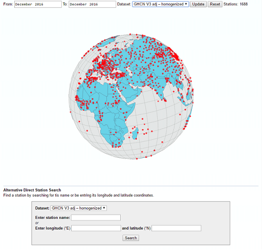 Station Data Selector
GISS has updated the original version (here) with a slightly different interface and has added some new features. You can now select stations in your region of interest directly on a virtual globe. The option "Get Neighbors" in the bottom left of each station plot will bring up a list of (40) stations in a 360° radius.
Among the additional information listed for each station -(distance, coordinates, length of record)- is the station ID number, which is needed to find the station in NOAA's adjustment database (see appendix).
The station data are plotted as annual mean temperatures, years without at least three seasonal means are left blank. Each station plot has a link below to the monthly data as text.
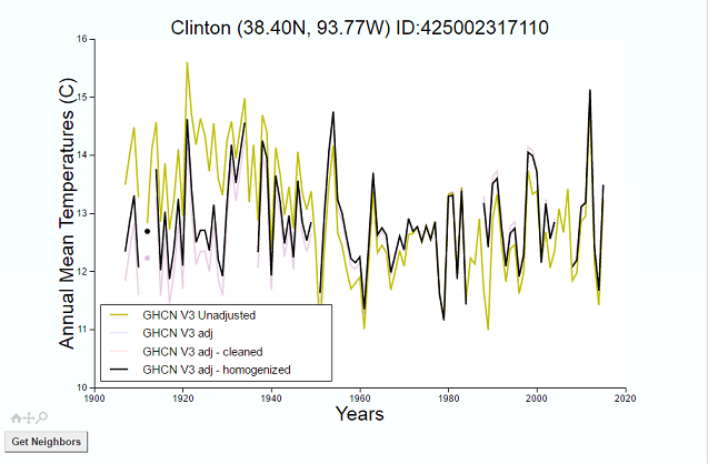 Clinton, Kansas
The station charts now also show all versions of the data (from unadjusted - to fully adjusted) for a visual comparison.
click links for larger images
*Station network density for U.S. surface temperature data is among the highest in the world. Due to the high sample rate, the national record is in general less sensitive to artifical inhomogeneities (time of observation-and-instrument changes, measurement errors, urbanisation). Nonetheless, raw station data almost always require substantial adjustments. The process of adjusting temperature data is ongoing and it depends on the ability to clearly identify sources of error to correct the data sets for artifical (non-climatic) influences.
Snotel is one of the networks from which stations were incorporated in NOAA's current U.S. temperature data set. Snotel records data from high-elevation sites in the western United States. A significant observational error (due to sensor changes) was detected at Snotel stations, which has artifically increased the warming trends of minimum tempratures by a factor of 10.
Artificial Amplification of Warming Trends Across the Mountains of the Western United States
Here we critically evaluate this network’s temperature observations and show that extreme warming observed at higher elevations is the result of systematic artifacts and not climatic conditions. With artifacts removed, the network’s 1991–2012 minimum temperature trend decreases from +1.16°C/decade to +0.106°C/decade and is statistically indistinguishable from lower elevation trends.
Moreover, longer-term widely used gridded climate products propagate the spurious temperature trend, thereby amplifying 1981–2012 western U.S. elevation-dependent warming by +217 to +562%. In the context of a warming climate, this artificial amplification of mountain climate trends has likely compromised our ability to accurately attribute climate change impacts across the mountainous western U.S.
The error in the Snotel data was detected after NOAA has puplished the final version of the new U.S. data set. So far, i've been unable to find any documentation on how that might effect the regions were data from Snotel sites is used. While it is technically possible to access the complete station inventory, without a designated adjustment database that information isn't very helpful. To be clear, it does not mean that data from those regions is generally unreliable, it just needs to be kept in mind that even data sets with good quality control are not free of artificial biases.
World of Stations
When i first started writing on an early "draft" version of this post more than a year ago, NOAA's (NCEI) monthly station data set was still operational, including continuous updates of the adjustment data base. NCEI is in the process of creating a new version of that data set (GHCN-M v4).
The current version (GHCN-M v3) is still the official source for land surface temperature data, but NCEI has stopped updating its adjustment data base. As a result, it is currently impossible to reliably track the adjustments to surface temperature stations and it is somewhat more complicated to describe the effects of adjustment procedures with side-by-side comparisons.
The primary source of monthly station data for the three main global temperature indices, NASA GISTEMP, UKMO HadCRUT and NOAA NCEI; is the Global Historical Climatology Network-Monthly data set (GHCN-M).
NOAA's National Centers for Environmental Information (formerly National Climatic Data Center) is tasked with compiling, archiving and processing the station data reports from around world and it provides the surface temperature records in adjusted/unadjusted form in an integrated database.
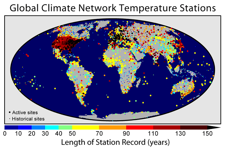
An overview of the Global Historical Climatology Network
Since the early 1990s the Global Historical Climatology Network-Monthly (GHCN-M) data set has been an internationally recognized source of data for the study of observed variability and change in land surface temperature. It provides monthly mean temperature data for 7280 stations from 226 countries and territories, ongoing monthly updates of more than 2000 stations to support monitoring of current and evolving climate conditions, and homogeneity adjustments to remove non-climatic influences that can bias the observed temperature record.
The easiest way to access temperature station data directly is NASA's (GISS) "station data selector". It contains the full list of monthly data of the Global Historical Climatology Network (current version) and the subset of stations NASA's uses for their global temperature analysis.
GISS has updated the original version (here) with a slightly different interface and has added some new features. You can now select stations in your region of interest directly on a virtual globe. The option "Get Neighbors" in the bottom left of each station plot will bring up a list of (40) stations in a 360° radius.
Among the additional information listed for each station -(distance, coordinates, length of record)- is the station ID number, which is needed to find the station in NOAA's adjustment database (see appendix).
The station data are plotted as annual mean temperatures, years without at least three seasonal means are left blank. Each station plot has a link below to the monthly data as text.
The station charts now also show all versions of the data (from unadjusted - to fully adjusted) for a visual comparison.
edit on 30-1-2017 by ArtWillR because: spelling
As before mentioned, nearly all station data require some form of bias correction and each of the three providers for the main global indices utilize
their own methods to adjust the temperature records. While the source data is the same for all three data sets, the different methods can produce
three different temperature histories for the same location
Adjustments to temperature deserve a much more detailed discussion than is possible here, but i'll answer any questions as best as i can and provide additional links if requested.
For brief summary:
UK's Climate Research Unit (CRU) does not apply any adjustments to individual station records it uses for their CRUTEM-data set. They fully rely on the National Meteorological Services to preadjust the station data for non-climatic influences. As a result, a large number of stations will still contain (documented or undocumented) inhomogeneities.
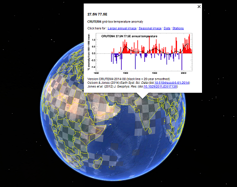
The CRUTEM4 land-surface air temperature data set
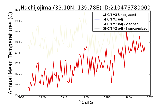
The GHCN-Unadjusted version (yellow) would represent the station data as used in CRUTEM. However, CRU sometimes uses a different record length or a station is not included at all in the final index.
No interactive web tool exists, similar to the station data selector, to access the individual station records in the HadCRUT data set. But the Hadley Centre has developed a Google Earth grid-box overlay, the file contains the latest version of all land surface temperature stations used in CRUTEM (v4).
The GHCN-adj & GHCN-adj-cleaned data (blue & red) is the version used in NOAA's (NCEI) temperature index.
For the majority of surface temperature stations (except for the U.S. & Australia) no metadata is available where the relocation, instrument changes or the local environment of a station is continuously documented. In order to detect and correct artificial biases, NOAA has developed a fully automated process, the pairwise homogenization algorithm (PHA), to adjust the station records.
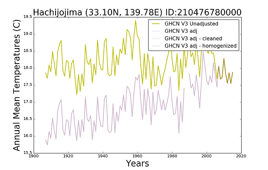
 Adjustment plot for Hachijojima, Japan
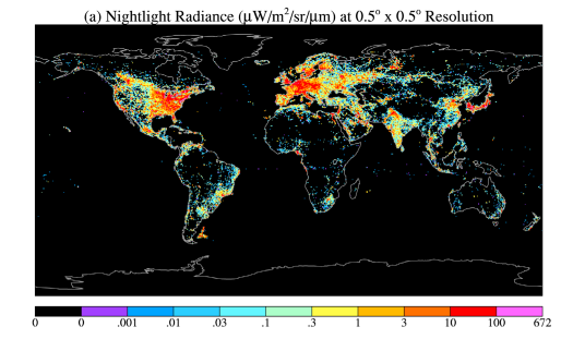
The GHCN-adj-homogenized version (black) is the data used in GISTEMP (NASA), adjusted for the effects from urban heat islands. GISS is currently the only data provider that utilises a method to directly remove the influences from urbanisation on temperature stations. NASA has developed a Brightness Index, based on Nightlight Radiance observations from satellites, to determine if stations are classified as rural or urban.
Urban heat islands have been studied for decades and the basic mechanisms are generally well-understood. However, the specific impacts of urbanization and land-cover change on local or regional climates are complex and go far beyond simple increases of surface temperatures. (see appendix)
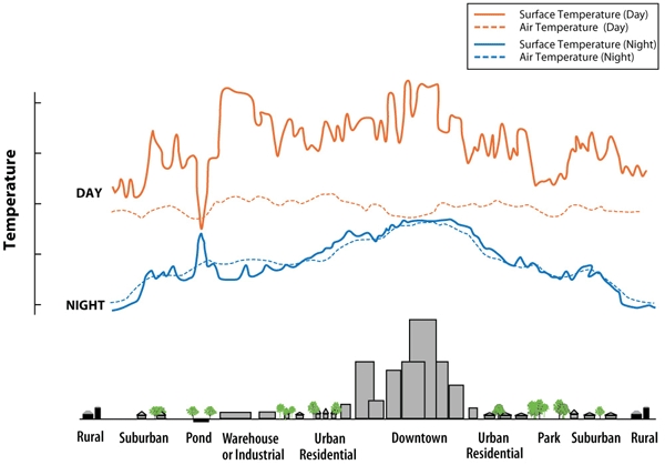 Urban Heat Islands
In the context of adjustments to temperature data, several case studies have aimed to quantify the effects on long-term trends measured at stations in urban environments. While the general effect of urbanization is an increase in surface temperatures compared to the rural surroundings, the exact structure and magnitude of urban heat islands is unique in each case and for each region.
The GISS homogeneity adjustment is practically a "one size (or proxy) fits all approach", that means when the Nightlight Radiance index exceeds a certain threshold the expected effect is an increased urban warming influence. The method generally does not consider the specific sitting or local environment of a station and should per design exclusively remove urban-only trends form a temperature series.
link added
Adjustments to temperature deserve a much more detailed discussion than is possible here, but i'll answer any questions as best as i can and provide additional links if requested.
For brief summary:
UK's Climate Research Unit (CRU) does not apply any adjustments to individual station records it uses for their CRUTEM-data set. They fully rely on the National Meteorological Services to preadjust the station data for non-climatic influences. As a result, a large number of stations will still contain (documented or undocumented) inhomogeneities.
The CRUTEM4 land-surface air temperature data set
The GHCN-Unadjusted version (yellow) would represent the station data as used in CRUTEM. However, CRU sometimes uses a different record length or a station is not included at all in the final index.
No interactive web tool exists, similar to the station data selector, to access the individual station records in the HadCRUT data set. But the Hadley Centre has developed a Google Earth grid-box overlay, the file contains the latest version of all land surface temperature stations used in CRUTEM (v4).
The GHCN-adj & GHCN-adj-cleaned data (blue & red) is the version used in NOAA's (NCEI) temperature index.
For the majority of surface temperature stations (except for the U.S. & Australia) no metadata is available where the relocation, instrument changes or the local environment of a station is continuously documented. In order to detect and correct artificial biases, NOAA has developed a fully automated process, the pairwise homogenization algorithm (PHA), to adjust the station records.
Homogenization of Temperature Series via Pairwise Comparisons
An automated homogenization algorithm based on the pairwise comparison of monthly temperature series is described. The algorithm works by forming pairwise difference series between serial monthly temperature values from a network of observing stations. Each difference series is then evaluated for undocumented shifts, and the station series responsible for such breaks is identified automatically.
The algorithm also makes use of station history information, when available, to improve the identification of artificial shifts in temperature data. In addition, an evaluation is carried out to distinguish trend inhomogeneities from abrupt shifts. When the magnitude of an apparent shift attributed to a particular station can be reliably estimated, an adjustment is made for the target series.
The GHCN-adj-homogenized version (black) is the data used in GISTEMP (NASA), adjusted for the effects from urban heat islands. GISS is currently the only data provider that utilises a method to directly remove the influences from urbanisation on temperature stations. NASA has developed a Brightness Index, based on Nightlight Radiance observations from satellites, to determine if stations are classified as rural or urban.
NASA-GLOBAL SURFACE TEMPERATURE CHANGE
Global satellite measurements of night lights allow the possibility for an additional check on the magnitude of the urban influence on global temperature analyses. We describe in this section a procedure in which all stations located in areas with night light brightness exceeding a value (see reference) that approximately divides the stations into two categories: rural and urban or periurban.
The standard GISS global temperature analysis now adjusts the long‐term trends of stations located in regions with night light brightness exceeding this limit to agree with the long‐term trend of nearby rural stations.
Urban heat islands have been studied for decades and the basic mechanisms are generally well-understood. However, the specific impacts of urbanization and land-cover change on local or regional climates are complex and go far beyond simple increases of surface temperatures. (see appendix)
In the context of adjustments to temperature data, several case studies have aimed to quantify the effects on long-term trends measured at stations in urban environments. While the general effect of urbanization is an increase in surface temperatures compared to the rural surroundings, the exact structure and magnitude of urban heat islands is unique in each case and for each region.
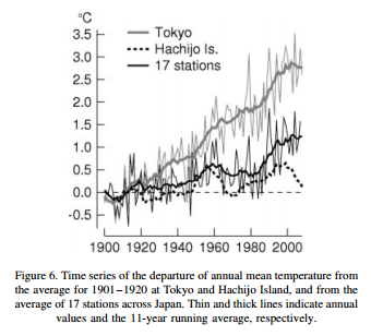
Urban warming in Japanese cities and its relation to climate change monitoring
Urban warming is quite conspicuous in large cities in Japan, reflecting their rapid growth during the last century. The temperature increase in Tokyo, where the meteorological observatory is located in the central business area of the city, has been about 3 °C/century. The warming rate is larger for nighttime (minimum) temperatures than for daytime (maximum) temperatures, in agreement with the general features of the urban heat island.
In particular, the annual extreme minimum temperature has increased at a rate exceeding 10 °C/century in some cities in Hokkaido, corresponding to drastic changes from a small city or wild land to large or medium-sized cities at these sites.
From the viewpoint of climate change monitoring, urban warming can be a biasing factor that may contaminate data used for monitoring the background temperature change. An analysis using 29 years of AMeDAS data revealed the existence of anomalous temperature changes, not only at densely inhabited sites but also at stations with relatively small populations in the surrounding area.
The GISS homogeneity adjustment is practically a "one size (or proxy) fits all approach", that means when the Nightlight Radiance index exceeds a certain threshold the expected effect is an increased urban warming influence. The method generally does not consider the specific sitting or local environment of a station and should per design exclusively remove urban-only trends form a temperature series.
link added
edit on 30-1-2017 by ArtWillR because: (no reason given)
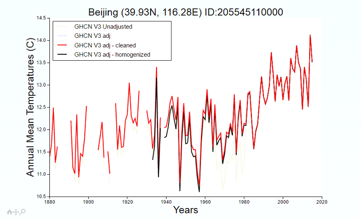
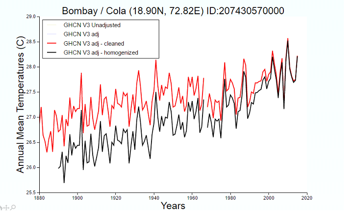
The next two examples are stations for which case studies are available and a significant urban warming bias has been deteced in both temperature
records. The adjustments expected based on the GISS method would be the, at least partial, removal of an urban warming trend.
Only a minor adjustment was applied to the Bejing station. In the case of the Mumbai station (Bombay, Colaba), instead of removing the urban bias an additional warming trend has been added to the record.
Similar inconsistent adjustments exist in a number of temperature series, especially in regions with low coverage or a high number of urban stations. In over two years of dealing with climate data i've not been able to find a clear explanation for why this is the case. Hopefully, some of the issues will be resolved with ongoing research and the release of new (updated) data sets in the near future.
Regardless of the effect any adjustments might have on the station data, what remains intact is the highly heterogeneous structure of surface temperature changes all over the world. With regards to the 'slowdown' in the global data over the last 15 years, the change in trends at the turn of the century is clearly visible in many stations worldwide.
The climate system and the study of climate change is arguably the most complex subject for contemporary Earth science, and the temperature change over the instrumental period is only a small component in context of the larger picture. All the information presented and discussed in the post should only serve as an overview, actual research would start here.
Best, Art
___________________________________________________________________________________________
Appenix
The GHCN-M (now outdated) "adjustment plots database" (as mentioned above, NOAA has discontinued updating the data-base, so i don't recommend its use for any checks on adjustments of station data, it is posted here for information purposes only.
NOAA provides the "adjustment plots" for all GHCN-monthly stations in a seperate database. The plots are stored in a FTP server directory that contains 8 sub-directories, corresponding to each continent (plus data from offshore research voyages).
1. Africa
2. Asia
3. South America
4. North America
5. Australia
6. Europe
7. Antarctica
(8. survey ships)
Clicking the link above will open the parent directory. Clicking on one of the folder numbers opens the list of plots for that continent. To find a plot in the sub-directory; copy the identification number listed behind each station in the GISS station selector, go back to the list in the subdirectory and press ctrl + f to open the search bar, then paste the ID into the bar and delete the last digit. It will jump you directly to the station plot and highlight its ID, click on the ID to open the plot.
The complex nature of Urbanisation
Only a minor adjustment was applied to the Bejing station. In the case of the Mumbai station (Bombay, Colaba), instead of removing the urban bias an additional warming trend has been added to the record.
Urban heat island intensity observed at Beijing and Wuhan stations
Annual and seasonal urbanization-induced warming for the two periods at Beijing and Wuhan stations is also generally significant, with the annual urban warming accounting for about 65∼80% of the overall warming in 1961∼2000 and about 40∼61% of the overall warming in 1981∼2000.
Increase in annual mean SAT during 1961∼2000 reaches 0.32°C/10 yr. and 0.31°C/10 yr. respectively for Beijing Station and Wuhan Station, but it is only 0.06°C/10 yr. and 0.11°C/10 yr. for averages of the rural stations around the two cities, indicating that the temperature increase at the two city stations is mostly caused by urban warming.
A case study of Mumbai
The study reveals that the rapid and potent day time heating of the air over the costal region contribute to the rise of day temperatures at Colaba, while the adjacent water stretch remains less warm. This natural contradiction contributes to the rise of UHI. It further reveals that city and suburbs of Mumbai remain warmer than the peripheral areas namely Alibag and Dahanu.
This difference is due to not only natural factors but also anthropogenic interference. The progressive replacement of natural surface with built up surface and increasing population pressure through the process of urbanisation modified the physical and chemical properties of city and suburbs of Mumbai. This negatively impacted the environment and cumulative effect of all this is the creation of UHI.
Similar inconsistent adjustments exist in a number of temperature series, especially in regions with low coverage or a high number of urban stations. In over two years of dealing with climate data i've not been able to find a clear explanation for why this is the case. Hopefully, some of the issues will be resolved with ongoing research and the release of new (updated) data sets in the near future.
Regardless of the effect any adjustments might have on the station data, what remains intact is the highly heterogeneous structure of surface temperature changes all over the world. With regards to the 'slowdown' in the global data over the last 15 years, the change in trends at the turn of the century is clearly visible in many stations worldwide.
The climate system and the study of climate change is arguably the most complex subject for contemporary Earth science, and the temperature change over the instrumental period is only a small component in context of the larger picture. All the information presented and discussed in the post should only serve as an overview, actual research would start here.
Best, Art
___________________________________________________________________________________________
Appenix
The GHCN-M (now outdated) "adjustment plots database" (as mentioned above, NOAA has discontinued updating the data-base, so i don't recommend its use for any checks on adjustments of station data, it is posted here for information purposes only.
NOAA provides the "adjustment plots" for all GHCN-monthly stations in a seperate database. The plots are stored in a FTP server directory that contains 8 sub-directories, corresponding to each continent (plus data from offshore research voyages).
1. Africa
2. Asia
3. South America
4. North America
5. Australia
6. Europe
7. Antarctica
(8. survey ships)
Clicking the link above will open the parent directory. Clicking on one of the folder numbers opens the list of plots for that continent. To find a plot in the sub-directory; copy the identification number listed behind each station in the GISS station selector, go back to the list in the subdirectory and press ctrl + f to open the search bar, then paste the ID into the bar and delete the last digit. It will jump you directly to the station plot and highlight its ID, click on the ID to open the plot.
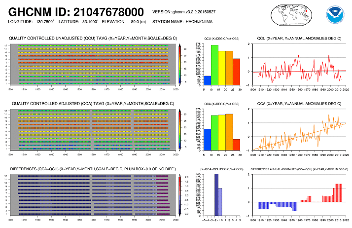
Plot Key
The plot files contain 9 individual graphs, arranged in a 3x3 matrix. The first column of graphs, contain 2-D colored symbol graphs of the actual monthly data for the entire period of record for A) the (Q)uality (C)ontrolled (U)nadjusted (QCU) data, B) the (Q)uality (C)ontrolled (A)djusted (QCA) data, and C) the differences between QCA and QCU monthly data.
The second column of graphs contain histograms of the monthly data for QCU, QCA, and (QCA-QCU) respectively.
The third column of graphs depict annual anomalies and their associated trend line for QCU and QCA, and the differences in the annual anomalies for QCAand QCU. Detailed axis titles and units are displayed in the title of each graph
The complex nature of Urbanisation
More urban heat; less summer fog, on California coast
The summer fog that shrouds coastal southern California – what locals call the June Gloom – is being driven up into the sky by urban sprawl, according to scientists who have studied 67 years of cloud heights and urban growth in the region. Less fog may, at first, seem like a good thing. But less fog is bad news for native plants in the coastal hills and mountains, which depend on the cool fog as their only source of water during the rainless summer months. So less fog means warmer, drier, less healthy hillsides and potentially more fires.(...)
Another surprising discovery was what Williams and his colleagues saw on the undeveloped airfields on islands off the coast of southern California: Cloud height lowered over the last 60 years.
The temperature inversion layer in the atmosphere that holds the moist marine air close to the ground (the same inversion that can hold smog near the ground) actually has been getting stronger, making it harder to break up the clouds, Williams said. It’s the opposite trend to what was seen in the urban areas, which suggests another long-term climate trend, like global warming, is causing the change, he added. “In the absence of urbanization we might see an increase in fog,” he concluded.
Urbanization causes increased cloud base height and decreased fog in coastal Southern California
That's one hell of a first post for a new member, hehe. But ok. S&F.
Ok so, in summary what exactly are you saying with this? That determining true temperature changes is so mind boggling complex that Al Gore wrote a Convenient Lie?
Ok so, in summary what exactly are you saying with this? That determining true temperature changes is so mind boggling complex that Al Gore wrote a Convenient Lie?
Seriously, where are the alarmists to dispute this?
They jump on every other thread and try to pick it apart...
No disputing this?
I guess the science is settled then.....
They jump on every other thread and try to pick it apart...
No disputing this?
I guess the science is settled then.....
a reply to: TrueAmerican
Hi TrueAmerican,
Work has kept me busy the last two days, so i hadn't had time to properly respond to your comment.
I understand you know a thing or two about seismological data and how 'easy' it can be to misinterpret that data without having some basic understanding or the proper context.
Temperature data, or climate data in general, are no different in that regard. Whenever i see statements like, " year x has been the hottest ever" or claims that "XYZ" has been caught faking the data, i'm reminded that some basic knowledge and context are still much-needed.
Judging from the lack of responses, i realize now that it was probably overkill, but minus some fillers and trivial facts most of the information presented here should be the basics required when discussing surface temperatures.
In summary, the post was meant to be an overview of the data-sets, how they are created, what they represent and what some of the potential issues are.
I'm convinced most people would be much less concerned about climate change, or climate science, if the research and data behind it would be better understood.
new topics
-
USO 10 miles west of caladesi island, Clearwater beach Florida
Aliens and UFOs: 2 hours ago -
Abortions in first 12 weeks should be legalised in Germany, commission says
Medical Issues & Conspiracies: 11 hours ago -
Israel ufo shoot down drones?
Aliens and UFOs: 11 hours ago -
Tesla cutting 14,000 jobs
Global Meltdown: 11 hours ago -
On this Day in History, April 15, 1865, Abraham Lincoln Passed Away.
General Chit Chat: 11 hours ago
top topics
-
Anti-Israel Protesters in CHICAGO Chant 'Death to Israel and 'Death to America'
Social Issues and Civil Unrest: 14 hours ago, 15 flags -
Denver to Defund the Police 8.4 Million To Pay for Illegal Aliens
Social Issues and Civil Unrest: 16 hours ago, 14 flags -
Running Through Idiot Protestors Who Block The Road
Rant: 13 hours ago, 12 flags -
Fossils in Greece Suggest Human Ancestors Evolved in Europe, Not Africa
Origins and Creationism: 16 hours ago, 9 flags -
Report March 2024 - Underwater UFOs display capability that ‘jeopardizes US maritime security,’
Aliens and UFOs: 16 hours ago, 6 flags -
Tesla cutting 14,000 jobs
Global Meltdown: 11 hours ago, 6 flags -
Israel ufo shoot down drones?
Aliens and UFOs: 11 hours ago, 5 flags -
Abortions in first 12 weeks should be legalised in Germany, commission says
Medical Issues & Conspiracies: 11 hours ago, 5 flags -
USO 10 miles west of caladesi island, Clearwater beach Florida
Aliens and UFOs: 2 hours ago, 5 flags -
On this Day in History, April 15, 1865, Abraham Lincoln Passed Away.
General Chit Chat: 11 hours ago, 4 flags
active topics
-
The Reality of the Laser
Military Projects • 25 • : Zaphod58 -
Running Through Idiot Protestors Who Block The Road
Rant • 44 • : ScarletDarkness -
Israel ufo shoot down drones?
Aliens and UFOs • 17 • : Zaphod58 -
Tesla cutting 14,000 jobs
Global Meltdown • 43 • : Vermilion -
USO 10 miles west of caladesi island, Clearwater beach Florida
Aliens and UFOs • 6 • : matafuchs -
-@TH3WH17ERABB17- -Q- ---TIME TO SHOW THE WORLD--- -Part- --44--
Dissecting Disinformation • 471 • : 777Vader -
Woke Leftist dems, hate Your Rights and the Country;
Political Issues • 62 • : ashisnotanidiot -
It has begun... Iran begins attack on Israel, launches tons of drones towards the country
World War Three • 625 • : Justoneman -
Candidate TRUMP Now Has Crazy Judge JUAN MERCHAN After Him - The Stormy Daniels Hush-Money Case.
Political Conspiracies • 187 • : Daughter2v2 -
Fossils in Greece Suggest Human Ancestors Evolved in Europe, Not Africa
Origins and Creationism • 45 • : whereislogic
19