It looks like you're using an Ad Blocker.
Please white-list or disable AboveTopSecret.com in your ad-blocking tool.
Thank you.
Some features of ATS will be disabled while you continue to use an ad-blocker.

cover of a conspiracy magazine
page: 18
share:
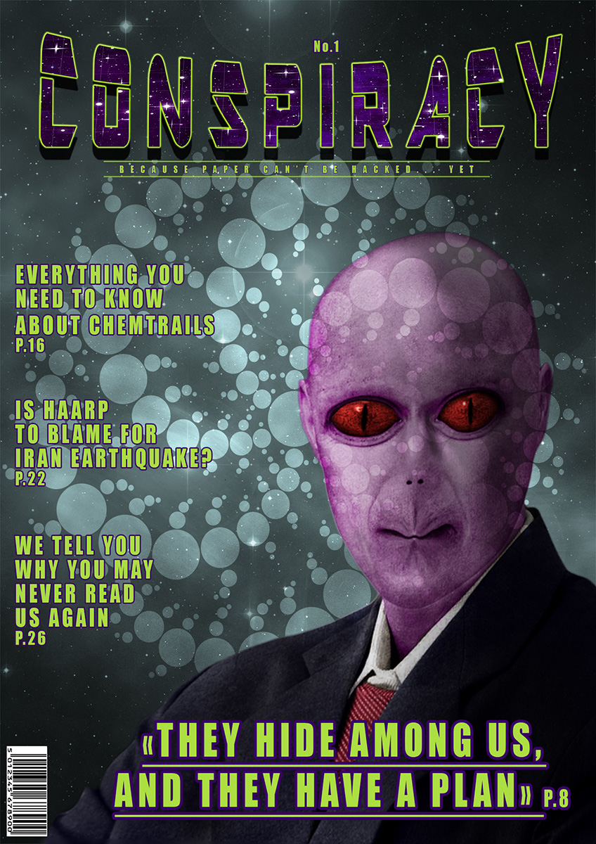
I did this for a contest using photoshop. The theme was "create a magazine cover", and the rules are not to use copyrighted images, but there was
another rule : it is prohibited to use "premanipulated images", and in this case the alien because it is CGI (or at least it seems to be, it could
be the face of a human that has been manipulated to look like this) even if it is a free image that can even be used for commercial purpose.
Anyway, I figured I would post it here instead. And here are the source images I used : alien, stars and crop circles.
click here for the high resolution version
Anyway, I figured I would post it here instead. And here are the source images I used : alien, stars and crop circles.
click here for the high resolution version
Hmmm. But where is the page where I can learn more about what a man wants, written by a woman? (and vice versa)
Nice work
Nice work
Just doesnt seem like enough headlines on the cover to make me want to steal it from a news paper stand.
Seems a little sparse on story's.
If you look at a standard issue magazine they almost have the index on the cover these days.
Obviously more info on the cover appeals to more tastes
Apart from that it looks good
Seems a little sparse on story's.
If you look at a standard issue magazine they almost have the index on the cover these days.
Obviously more info on the cover appeals to more tastes
Apart from that it looks good
edit on 18-1-2016 by Raggedyman because: (no reason given)
a reply to: gosseyn
It's a pretty decent foundation. I'm a professional graphic designer for the past 11 years, so there are quite a few things I could point out that may help polish it up, like typeface choice and the magazine wordmark, but overall it's not too bad.
But, if you're looking for constructive criticism, I'd be glad to throw that out there, I just don't want to do it without you having asked for it
a reply to: SlapMonkey
Yes, you can tell me. I know there are many things that seem out of place, like for example the sort of subtitle that doesn't look good and doesn't catch the eye. The font of the headlines also doesn't look good. To tell the truth the only things that I really like are the alien(which needs more work and I am not happy with the purple color of his skin), the title (which at the beginning was blue instead of purple), and the background (it's the star image on top of the crop circles image on top of the cloud effect of photoshop on top of a grayscale gradient) almost totally desaturated with a little blue and green. Also the "A" in the title looks distorted too much . That took me two days, I had a different version that I trashed and kept only the alien, and the font and distortion of the title.
Yes, you can tell me. I know there are many things that seem out of place, like for example the sort of subtitle that doesn't look good and doesn't catch the eye. The font of the headlines also doesn't look good. To tell the truth the only things that I really like are the alien(which needs more work and I am not happy with the purple color of his skin), the title (which at the beginning was blue instead of purple), and the background (it's the star image on top of the crop circles image on top of the cloud effect of photoshop on top of a grayscale gradient) almost totally desaturated with a little blue and green. Also the "A" in the title looks distorted too much . That took me two days, I had a different version that I trashed and kept only the alien, and the font and distortion of the title.
a reply to: gosseyn
Yeah, the alien looks okay--the only things that bother me about it are the pucker effect in the lips and the size of the eyes in relation to their distance apart, but it's an alien, so that's just subjective concerns which need not be heeded.
I'm glad you dislike the font used in the title--from a constructive point of view, I would say that the quality of the lettering and the type of lettering cause it to look relatively cheap or unrefined. That alone would make me not take the magazine seriously. Couple that with the "arc upper" curve of the title, and it takes away a lot of the credibility that could be contained within the publication.
You've already addressed the illegibility of the subtitle/tagline, so I'll leave that alone except to say that yellow isn't the best choice for type for the cover of a magazine (in most instances).
Same goes for the headlines, as well, plus the typeface that you chose (Headline or Haettenschweiler or something similar) is actually harder to read than if you were to have chosen a medium-weight without the outlines...a subtle drop shadow without any blur and held close to the letters is a much better approach than a relatively heavy outline. And I would stay away from heavily-condensed typefaces and combining that with spacious tracking, as it kind of defeats the purpose for the usefulness of a condensed typeface.
Anyhoo, that's my constructive criticism, for the most part. Hopefully it'll help in future endeavors.
Take care...and don't take anything personally, as criticism is how we grow.
new topics
-
Michigan school district cancels lesson on gender identity and pronouns after backlash
Education and Media: 1 minutes ago -
When an Angel gets his or her wings
Religion, Faith, And Theology: 54 minutes ago -
Comparing the theology of Paul and Hebrews
Religion, Faith, And Theology: 1 hours ago -
Pentagon acknowledges secret UFO project, the Kona Blue program | Vargas Reports
Aliens and UFOs: 2 hours ago -
Boston Dynamics say Farewell to Atlas
Science & Technology: 2 hours ago -
I hate dreaming
Rant: 3 hours ago -
Man sets himself on fire outside Donald Trump trial
Mainstream News: 5 hours ago -
Biden says little kids flip him the bird all the time.
Politicians & People: 5 hours ago -
The Democrats Take Control the House - Look what happened while you were sleeping
US Political Madness: 6 hours ago -
Sheetz facing racial discrimination lawsuit for considering criminal history in hiring
Social Issues and Civil Unrest: 6 hours ago
top topics
-
The Democrats Take Control the House - Look what happened while you were sleeping
US Political Madness: 6 hours ago, 16 flags -
In an Historic First, In N Out Burger Permanently Closes a Location
Mainstream News: 8 hours ago, 14 flags -
A man of the people
Medical Issues & Conspiracies: 13 hours ago, 8 flags -
Biden says little kids flip him the bird all the time.
Politicians & People: 5 hours ago, 8 flags -
Man sets himself on fire outside Donald Trump trial
Mainstream News: 5 hours ago, 7 flags -
Pentagon acknowledges secret UFO project, the Kona Blue program | Vargas Reports
Aliens and UFOs: 2 hours ago, 5 flags -
4 plans of US elites to defeat Russia
New World Order: 15 hours ago, 4 flags -
Sheetz facing racial discrimination lawsuit for considering criminal history in hiring
Social Issues and Civil Unrest: 6 hours ago, 3 flags -
Boston Dynamics say Farewell to Atlas
Science & Technology: 2 hours ago, 3 flags -
Are you ready for the return of Jesus Christ? Have you been cleansed by His blood?
Religion, Faith, And Theology: 10 hours ago, 3 flags
active topics
-
Israeli Missile Strikes in Iran, Explosions in Syria + Iraq
World War Three • 102 • : DumbNut -
Michigan school district cancels lesson on gender identity and pronouns after backlash
Education and Media • 0 • : Consvoli -
The Democrats Take Control the House - Look what happened while you were sleeping
US Political Madness • 61 • : Threadbarer -
I hate dreaming
Rant • 5 • : ScarletDarkness -
Man sets himself on fire outside Donald Trump trial
Mainstream News • 32 • : cherokeetroy -
Pentagon acknowledges secret UFO project, the Kona Blue program | Vargas Reports
Aliens and UFOs • 5 • : Ophiuchus1 -
-@TH3WH17ERABB17- -Q- ---TIME TO SHOW THE WORLD--- -Part- --44--
Dissecting Disinformation • 546 • : MetalThunder -
Boston Dynamics say Farewell to Atlas
Science & Technology • 4 • : Terpene -
12 jurors selected in Trump criminal trial
US Political Madness • 111 • : WeMustCare -
Election Year 2024 - Interesting Election-Related Tidbits as They Happen.
2024 Elections • 68 • : WeMustCare
8