It looks like you're using an Ad Blocker.
Please white-list or disable AboveTopSecret.com in your ad-blocking tool.
Thank you.
Some features of ATS will be disabled while you continue to use an ad-blocker.

Warmest Winter on Record: 2014-2015
page: 4share:
a reply to: ElectricUniverse
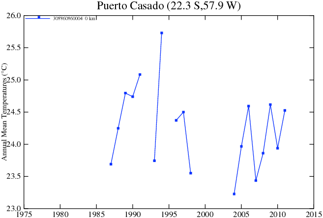
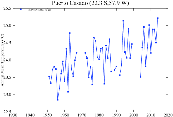
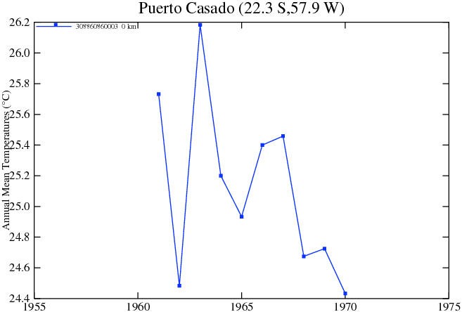
You've entirely skipped over my point with regard to the edits. There are multiple data sets being used. There are multiple data sets at some stations, like Puerto Casado, which has at least 5 different records in data set 0, then what appears to be additional ones in data set 1, 2, 12, 13, and 14.
The assumption that one is 'raw' and the other is 'adjusted' is an assumption without evidence.
e: However, some do clearly appear to be the same.
ds=1 and ds=2.
ds=12, ds=13, and ds=14.
Meanwhile, all of ds=0 records are different, and they have different id parameters:
id=308860860000
id=308860860001
id=308860860002
id=308860860003
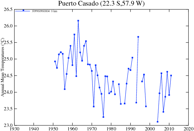
id=308860860004
You've entirely skipped over my point with regard to the edits. There are multiple data sets being used. There are multiple data sets at some stations, like Puerto Casado, which has at least 5 different records in data set 0, then what appears to be additional ones in data set 1, 2, 12, 13, and 14.
The assumption that one is 'raw' and the other is 'adjusted' is an assumption without evidence.
e: However, some do clearly appear to be the same.
ds=1 and ds=2.
ds=12, ds=13, and ds=14.
Meanwhile, all of ds=0 records are different, and they have different id parameters:
id=308860860000
id=308860860001
id=308860860002
id=308860860003
id=308860860004
edit on 9Mon, 23 Mar 2015 09:16:00 -0500America/ChicagovAmerica/Chicago3 by Greven because: (no reason given)
a reply to: Greven
What you are not saying is that some of those links you are giving are data points within a smaller time frame.
For example.
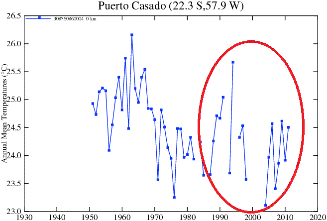
The data from ds=4 that you gave, which is the following shows surface temperature data from 1975-2014.
Is showing the surface temperature in the period 1975-2014 which can also be seen in the first graph I gave.
What you are not saying is that some of those links you are giving are data points within a smaller time frame.
For example.
The data from ds=4 that you gave, which is the following shows surface temperature data from 1975-2014.
Is showing the surface temperature in the period 1975-2014 which can also be seen in the first graph I gave.
edit on 23-3-2015 by ElectricUniverse because: correct error and add comment.
a reply to: ElectricUniverse
What I am saying is that we cannot draw the conclusion from data plots that there is gross data manipulation. Pointing at other data plots is irrelevant. We do not know which plot is for what, or what data source is even original.
The assumption that one data set or another is the 'raw' data appears to be entirely unfounded.
edit on 16Mon, 23 Mar 2015 16:59:47
-0500America/ChicagovAmerica/Chicago3 by Greven because: (no reason given)
The same can be said of the others...
For example.
DS=0 link you gave shows the surface temperatures from 1930-1990s...
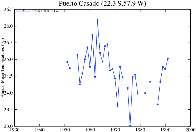
Which is almost the same graph I showed in this link.
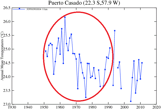
data.giss.nasa.gov...
The small differences and the added data points are added by a software program that tries to fill in any gaps in the data.
For example.
DS=0 link you gave shows the surface temperatures from 1930-1990s...
Which is almost the same graph I showed in this link.
data.giss.nasa.gov...
The small differences and the added data points are added by a software program that tries to fill in any gaps in the data.
edit on 23-3-2015 by ElectricUniverse because: to correct graph posted.
a reply to: ElectricUniverse
Okay. How?
Which plot claims to be of raw data? These data plots are items in a database of temperature data, and the data set parameter could be any number of things. Why are you certain that one particular ds=# is raw data?
What if this data set, instead, is also adjusted data? Alternatively, what if that data set is on a different variable entirely - average day or average night temperature, perhaps?
Some of the plots' points might fit on other plots, but not all of them. Consider your latest example, where there is a point reaching down to 23.0 Celsius between 1970 and 1980. See that on the other plot? If it's the point I think it is, and if it is the raw data, then it's been adjusted upwards.
a reply to: Greven
Are you kidding me?... You yourself posted graphs that corroborate the one i gave as original and completely different from the one NASA shows as the "adjusted data"...
The adjusted data shows the "opposite" of what all the other graphs you gave, which fall within the data graph I gave as being the original without the adjustment.
Again, this is the adjusted graph which NASA used as part of the proof of warming.
When all the older graphs show almost 100% what this one shows.
Take a closer look at the graphs, and the time period, you gave and compare it with the "adjusted". You will see that the data was fudged to show warming instead of what the originals show.
Look at the "adjusted graph" it shows the starting data point for surface temperatures was moved down to about 23.5 C, when the originals started at about 25 C... Then NASA moved the later data points upwards to show more warming when the originals, including the ones you gave, show less warming...
edit on 23-3-2015 by ElectricUniverse because: add comment.
a reply to: ElectricUniverse
You keep posting these plots as if they mean something, but they don't. Yeah, I looked into your claim, and played with the parameters based on my knowledge of CompSci in an attempt to discern which plot was the real raw data plot. Guess what? I still don't know!
This is not a difficult concept. You are looking into a black box, one with few labels, and little knowledge of what the things you are grabbing are. You are assuming that plots of data set X are the raw data for the adjusted data set Y.
You do not know this, however. It's like reaching for a bolt in a bag of different sizes and trying to guess which one fits a hole that you haven't yet seen.
a reply to: ElectricUniverse
And there is plenty of data that was adjusted down. In summary if the data hadn't been adjusted (all together with the up and the down) the picture would be of much greater warming.
Haven't you heard of skeptic Richard Muller and his Berkeley Earth Surface Temperature project?
And there is plenty of data that was adjusted down. In summary if the data hadn't been adjusted (all together with the up and the down) the picture would be of much greater warming.
Haven't you heard of skeptic Richard Muller and his Berkeley Earth Surface Temperature project?
a reply to: Greven
You claimed most of the records are different, when they aren't that different from the one I showed which is part of the original data before the "adjusted data"... There are very small differences between the graphs you posted and the graph I gave which shows, "like the graphs you gave", a trend to cooling in Puerto Casado. The "adjusted data" shows the opposite to every graph you gave.
Here, it actually seems that you need to be reminded of what you yourself posted.
ds=1
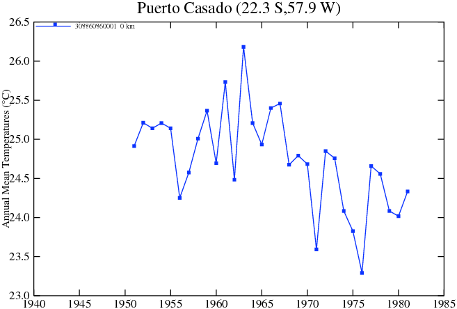
ds=2
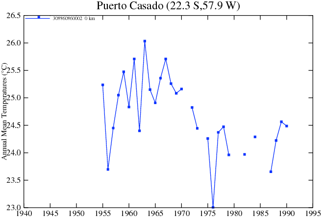
ds=12
ds=13
ds=14
All of the above are almost 100% the same as.
data.giss.nasa.gov...
But completely different from the "adjusted graph" NASA gave.
data.giss.nasa.gov...
Does that help you at all see the difference?
You claimed most of the records are different, when they aren't that different from the one I showed which is part of the original data before the "adjusted data"... There are very small differences between the graphs you posted and the graph I gave which shows, "like the graphs you gave", a trend to cooling in Puerto Casado. The "adjusted data" shows the opposite to every graph you gave.
Here, it actually seems that you need to be reminded of what you yourself posted.
ds=1
ds=2
ds=12
ds=13
ds=14
All of the above are almost 100% the same as.
data.giss.nasa.gov...
But completely different from the "adjusted graph" NASA gave.
data.giss.nasa.gov...
Does that help you at all see the difference?
edit on 23-3-2015 by ElectricUniverse because: correct error and add comment.
a reply to: ElectricUniverse
You're not understanding the problem with your analysis.
Suppose that I were to claim something like: 'old data was grossly manipulated downward to show cooling, and new data more accurately illustrates reality.'
You would then turn to the clearly-labeled raw data to disprove this. Except that you can't, because there is no clearly-labeled raw data.
a reply to: Benevolent Heretic
yes the warmest winter always occurs when there are record lows in many many places and I have to boil snow for water for a week and a half due to frozen water lines - which is okay because of the 2 feet of snow we had.Yes.. this winter was hot really...
yes the warmest winter always occurs when there are record lows in many many places and I have to boil snow for water for a week and a half due to frozen water lines - which is okay because of the 2 feet of snow we had.Yes.. this winter was hot really...
edit on 23-3-2015 by
OpinionatedB because: (no reason given)
a reply to: ElectricUniverse
No they don't. You are looking at one set that was adjusted up and using it to claim that all of them are and that simply is not the case.
No they don't. You are looking at one set that was adjusted up and using it to claim that all of them are and that simply is not the case.
a reply to: Greven
Already showed which one was older and which newer.
The newer "adjusted graph" has 3 more data points.
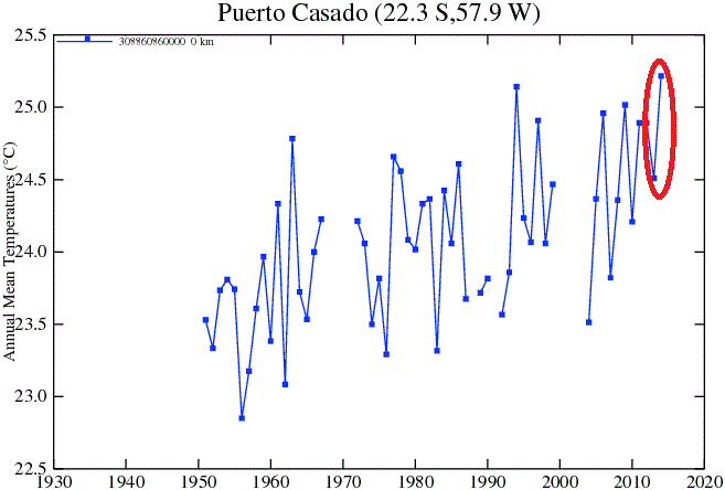
Than the older one which shows almost 100% the same temps as the other graphs you used, but does not have the last 3 data points of the "adjusted graph".
Already showed which one was older and which newer.
The newer "adjusted graph" has 3 more data points.
Than the older one which shows almost 100% the same temps as the other graphs you used, but does not have the last 3 data points of the "adjusted graph".
edit on 23-3-2015 by ElectricUniverse because: add comment.
originally posted by: Kali74
a reply to: ElectricUniverse
No they don't. You are looking at one set that was adjusted up and using it to claim that all of them are and that simply is not the case.
Wrong... i didn't write all graphs for Puerto Casado were adjusted... Read again what I wrote... The software used to fill in gaps in data IS NOT the adjustment which shows the opposite to what the older graphs show.
I even gave examples circling the data points from the graphs that Greven gave, and the first graph I gave "before the adjustment", which show almost 100% the same temperature. The only one that is very different is the "adjusted graph". Which "adjusted" the temperature from the originals which showed a trend of (cooling in Puerto Casado) and was "adjusted" to show a false trend of / (warming in Puerto Casado).
You obviously did not even bother to look at the graphs I gave.
People still need to understand the difference between "climate Change" which ALWAYS happens and is natural, and the claims behind "anthropogenic global warming" now being called by the AGW proponents simply as "climate change", not to mention that they don't even try to differentiate their "anthropogenic climate change" claims from natural climate change anymore.
There are other areas of the world that show warming, but how do we know how much warming has been really happening when they delete raw data, rig data from different countries and regions, lie and make false claims?...
The climate is changing, but no one knows what will happen for certain. More so when the majority of the GCMs have been shown to be wrong, because they try to pin the climate change on CO2.
edit on 23-3-2015 by ElectricUniverse because: add and corrent comment.
a reply to: ElectricUniverse
Again, there's no point in posting the data plots when you cannot support the fundamental assumption to your analysis.
You cannot determine based on the information available which plots have not been adjusted. You are grasping at straws which you can't see the ends of.
Which one is the raw data, and which one is the data adjusted from that raw data? This is not an answerable question by posting graphs repeatedly.
You assume that plots from data set Y were derived from adjusting data set X. Yet, you cannot even demonstrate a link between the two given that there are multiple station ids and data sets. We simply do not have the information on their database to determine such things.
edit on 19Mon,
23 Mar 2015 19:08:03 -0500America/ChicagovAmerica/Chicago3 by Greven because: (no reason given)
We had a very long cold winter -- lots of records broke... - It's still cold more snow tomorrow.... I will say last winter was colder .. but it was
super record colder..
a reply to: Greven
Puerto Casado is a small town with 6,489 people in it. Puerto Casado, in Paraguay, is not that big of an area and there is no big differences in elevation throughout Puerto Casado.
You can find Puerto Casado easily using google Earth to see how small of an area it is. How many stations do you think are needed for an area so small?
The one station was moved, and that's the excuse used for the adjustment.
As for your claim that there is no proof as to which comes first, or which is adjusted or unadjusted?
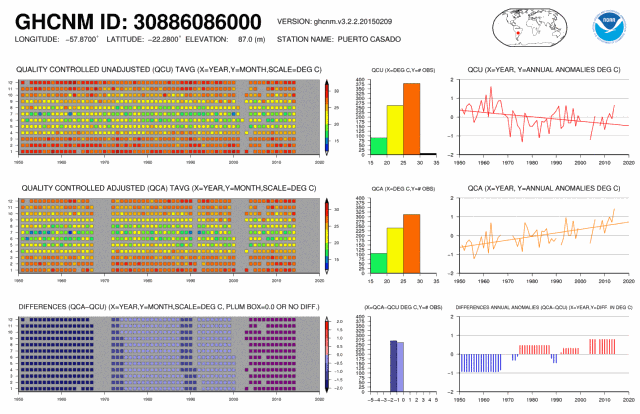
ftp.ncdc.noaa.gov...
notalotofpeopleknowthat.wordpress.com...
Puerto Casado is a small town with 6,489 people in it. Puerto Casado, in Paraguay, is not that big of an area and there is no big differences in elevation throughout Puerto Casado.
You can find Puerto Casado easily using google Earth to see how small of an area it is. How many stations do you think are needed for an area so small?
The one station was moved, and that's the excuse used for the adjustment.
As for your claim that there is no proof as to which comes first, or which is adjusted or unadjusted?
ftp.ncdc.noaa.gov...
...If this drop of more than a degree had been due to a station move, or other non-climatic factors, you would expect to see a step change in the monthly figures at some point during the year.
Yet, as the chart below shows, this is not the case. Monthly temperatures for 1971, expressed as anomalies from 1951-70, are all over the place. With so much variation from month to month, is it possible to isolate a station move from the background of natural variability, even if there had been one?
...
notalotofpeopleknowthat.wordpress.com...
edit on 23-3-2015 by ElectricUniverse because: add comment and link.
a reply to: ElectricUniverse
That does not matter.
It is irrelevant to the fundamental problem with this analysis. You cannot establish a link that one data set is derived from the other.
That does not matter.
It is irrelevant to the fundamental problem with this analysis. You cannot establish a link that one data set is derived from the other.
new topics
-
Russian intelligence officer: explosions at defense factories in the USA and Wales may be sabotage
Weaponry: 1 hours ago -
African "Newcomers" Tell NYC They Don't Like the Free Food or Shelter They've Been Given
Social Issues and Civil Unrest: 2 hours ago -
Russia Flooding
Other Current Events: 3 hours ago -
MULTIPLE SKYMASTER MESSAGES GOING OUT
World War Three: 3 hours ago -
Two Serious Crimes Committed by President JOE BIDEN that are Easy to Impeach Him For.
US Political Madness: 4 hours ago -
911 emergency lines are DOWN across multiple states
Breaking Alternative News: 4 hours ago -
Former NYT Reporter Attacks Scientists For Misleading Him Over COVID Lab-Leak Theory
Education and Media: 7 hours ago -
Why did Phizer team with nanobot maker
Medical Issues & Conspiracies: 7 hours ago -
Pro Hamas protesters at Columbia claim hit with chemical spray
World War Three: 7 hours ago -
Elites disapearing
Political Conspiracies: 9 hours ago
top topics
-
British TV Presenter Refuses To Use Guest's Preferred Pronouns
Education and Media: 17 hours ago, 17 flags -
Go Woke, Go Broke--Forbes Confirms Disney Has Lost Money On Star Wars
Movies: 11 hours ago, 13 flags -
Pro Hamas protesters at Columbia claim hit with chemical spray
World War Three: 7 hours ago, 11 flags -
Elites disapearing
Political Conspiracies: 9 hours ago, 8 flags -
Freddie Mercury
Paranormal Studies: 12 hours ago, 7 flags -
Nirvana - Immigrant Song
Music: 16 hours ago, 5 flags -
A Personal Cigar UFO/UAP Video footage I have held onto and will release it here and now.
Aliens and UFOs: 9 hours ago, 5 flags -
African "Newcomers" Tell NYC They Don't Like the Free Food or Shelter They've Been Given
Social Issues and Civil Unrest: 2 hours ago, 5 flags -
Two Serious Crimes Committed by President JOE BIDEN that are Easy to Impeach Him For.
US Political Madness: 4 hours ago, 5 flags -
911 emergency lines are DOWN across multiple states
Breaking Alternative News: 4 hours ago, 4 flags
active topics
-
Russian intelligence officer: explosions at defense factories in the USA and Wales may be sabotage
Weaponry • 12 • : twistedpuppy -
Why did Phizer team with nanobot maker
Medical Issues & Conspiracies • 6 • : annonentity -
Israel ufo shoot down drones?
Aliens and UFOs • 26 • : GENERAL EYES -
African "Newcomers" Tell NYC They Don't Like the Free Food or Shelter They've Been Given
Social Issues and Civil Unrest • 4 • : GENERAL EYES -
The Acronym Game .. Pt.3
General Chit Chat • 7722 • : bally001 -
Two Serious Crimes Committed by President JOE BIDEN that are Easy to Impeach Him For.
US Political Madness • 7 • : Disgusted123 -
Russia Flooding
Other Current Events • 1 • : ksihkahe -
Running Through Idiot Protestors Who Block The Road
Rant • 107 • : FlyersFan -
Russia Ukraine Update Thread - part 3
World War Three • 5694 • : F2d5thCavv2 -
-@TH3WH17ERABB17- -Q- ---TIME TO SHOW THE WORLD--- -Part- --44--
Dissecting Disinformation • 518 • : Guyfriday