It looks like you're using an Ad Blocker.
Please white-list or disable AboveTopSecret.com in your ad-blocking tool.
Thank you.
Some features of ATS will be disabled while you continue to use an ad-blocker.

Perfect Example of Media Manipulation through Disinformation
page: 110
share:
Hey Everyone,
Just a quick thread about how the media can use its information to portray disinformation graphically. Below is the history of a particular opinion poll by whatscotlandthinks.org regarding how the "population of Scotland" is likely to vote next Thursday.
Now, to the untrained eye, this graph looks perfectly plausible and you would suspect that the displayed graph is accurate. Well it is NOT.
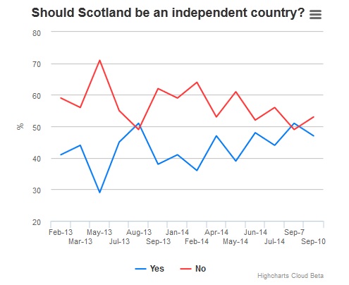
Lets break it down. The chart goes up and down over the period of about a 18 months. However, the last 2 points used are not to scale with the rest of the chart. In fact, most of it is not to scale. There are spaces between the points varying from 1 month of missing data to 3 months of missing data, then right at the end they show a massive change of heart from the Scots showing they support a NO vote. Well this is just ridiculous.
When you map a trend over time, you must use the same variables to get an accurate picture. In this case we must use data on a monthly basis and not change that. We cannot put 2 sets of data for one month yet leave a 3 month gap without changing the scale of the chart.
I have taken the time to find the correct data and what you will see is that when you follow the correct variables you see a totally different picture. See below what chart the Telegraph should have used.
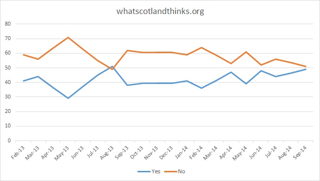
What this shows you is that over the course of the past 18 months the "true" picture is that the YES vote is gaining momentum and is trending t a victory.
I despise disinformation, it is one of my pet hates but what also annoys me is that most people will not even notice the effect this disinformation has on them.
Again, another tactic used by the UK Government and Better Together to force people to believe what they want them too.
Daily Telegraph Article
Just a quick thread about how the media can use its information to portray disinformation graphically. Below is the history of a particular opinion poll by whatscotlandthinks.org regarding how the "population of Scotland" is likely to vote next Thursday.
Now, to the untrained eye, this graph looks perfectly plausible and you would suspect that the displayed graph is accurate. Well it is NOT.
Lets break it down. The chart goes up and down over the period of about a 18 months. However, the last 2 points used are not to scale with the rest of the chart. In fact, most of it is not to scale. There are spaces between the points varying from 1 month of missing data to 3 months of missing data, then right at the end they show a massive change of heart from the Scots showing they support a NO vote. Well this is just ridiculous.
When you map a trend over time, you must use the same variables to get an accurate picture. In this case we must use data on a monthly basis and not change that. We cannot put 2 sets of data for one month yet leave a 3 month gap without changing the scale of the chart.
I have taken the time to find the correct data and what you will see is that when you follow the correct variables you see a totally different picture. See below what chart the Telegraph should have used.
What this shows you is that over the course of the past 18 months the "true" picture is that the YES vote is gaining momentum and is trending t a victory.
I despise disinformation, it is one of my pet hates but what also annoys me is that most people will not even notice the effect this disinformation has on them.
Again, another tactic used by the UK Government and Better Together to force people to believe what they want them too.
Daily Telegraph Article
I despise disinformation, it is one of my pet hates but what also annoys me is that most people will not even notice the effect this disinformation has on them.
That's why we need people like you to show us when the buggers are trying to pull a fast one mate!
a reply to: jrmcleod
The fact that the poll was done by YourUKGov says alot on whose doing the Disinformation good thread, dont believe these polls until the vote.
I support your countries Independence from Britain you should spread this info across Scotland.
What the UK government is trying to do is the same crap they tried and are trying to pull in Ukraine.
edit on 12-9-2014 by Agent_USA_Supporter because: (no reason given)
originally posted by: bitsforbytes
a reply to: jrmcleod
Seems the UK is getting a taste of their own medicine. Divide and conquer.
This what the UK Government gets for supporting and allowing for kosovo's illegal independence to happen a little taste of
of their own medicine
Not surprising ...We get a taste for manipulated pools and data from all parts of academia .Think , drug companies climate change ,elections ,
....heck I would think they manage to misinform and misdirect us in all parts of our lives ,but especially when it comes to economics and war .At one
time I may have taken part in their polls but for the past few years I simply refuse .The last one I tried to endure ended half way through because
they had the questions structured that would give them the results they wanted and it was a hot topic at the time . Thanks op and yea we do need
members like you to dig a little deeper and expose these thing ...peace
unfortunately, this type of statistical chicanery has been around for a long time. I always believed people were able to ferret this out rather
easily. all too often however, it is mentally easier for people to grab onto a sound bite, or graph that fits into their pre-conceived idea on a
topic.
Not an expert here but with the exception of the indices on the X axis, it looks pretty much the same. Both show an increase in the "Yes" vote,
starting a little above 40% and ending a little below 50%. The trend is identical.
Maybe the initial graph was manipulated to demonstrate indecision? Waffling on the part of the Scottish people? Whereas the second shows a more consistent trend towards accepting independence? IDK
I am not trying to shoot down your thread. Far from it. I have no doubt this is a contentious issue and shenanigans will be afoot. Manipulation of statistics is an old game.
a reply to: jrmcleod
With the utmost respect, I hope will pardon my presumption to offer an opinion on the latest example you so rightly offer.
Not being a citizen, nor boasting the noble heritage of these people, I fear that the most difficult hurdle for any people making such momentous decision collectively is having full unrestricted access to all data and machinery used in the voting process. Anything stated prior to the vote can - and should always be - attributed to influence peddling. It has been this way for a century now.
What information, news, etc. the people consume is never again to be trusted as factual land unbiased.
The marketeers who worship spreadsheets flatter themselves to be very clever when they tell us this or that is such and such.... because it suits them to do so. Most of the time the lie is lost in emergent situations; but I was hoping that Scotland could truly be permitted the actual choice... I fear that may have been naive.
new topics
-
University of Texas Instantly Shuts Down Anti Israel Protests
Education and Media: 14 minutes ago -
Any one suspicious of fever promotions events, major investor Goldman Sachs card only.
The Gray Area: 2 hours ago -
God's Righteousness is Greater than Our Wrath
Religion, Faith, And Theology: 6 hours ago -
Electrical tricks for saving money
Education and Media: 9 hours ago -
VP's Secret Service agent brawls with other agents at Andrews
Mainstream News: 11 hours ago -
Sunak spinning the sickness figures
Other Current Events: 11 hours ago
top topics
-
VP's Secret Service agent brawls with other agents at Andrews
Mainstream News: 11 hours ago, 9 flags -
Cats Used as Live Bait to Train Ferocious Pitbulls in Illegal NYC Dogfighting
Social Issues and Civil Unrest: 15 hours ago, 8 flags -
Nearly 70% Of Americans Want Talks To End War In Ukraine
Political Issues: 12 hours ago, 4 flags -
Electrical tricks for saving money
Education and Media: 9 hours ago, 4 flags -
Sunak spinning the sickness figures
Other Current Events: 11 hours ago, 3 flags -
Late Night with the Devil - a really good unusual modern horror film.
Movies: 13 hours ago, 2 flags -
Any one suspicious of fever promotions events, major investor Goldman Sachs card only.
The Gray Area: 2 hours ago, 2 flags -
The Good News According to Jesus - Episode 1
Religion, Faith, And Theology: 17 hours ago, 1 flags -
God's Righteousness is Greater than Our Wrath
Religion, Faith, And Theology: 6 hours ago, 0 flags -
University of Texas Instantly Shuts Down Anti Israel Protests
Education and Media: 14 minutes ago, 0 flags
active topics
-
God's Righteousness is Greater than Our Wrath
Religion, Faith, And Theology • 24 • : randomuser2034 -
Nearly 70% Of Americans Want Talks To End War In Ukraine
Political Issues • 24 • : Consvoli -
15 Unhealthiest Sodas On The Market
Health & Wellness • 43 • : JPRCrastney -
University of Texas Instantly Shuts Down Anti Israel Protests
Education and Media • 0 • : FlyersFan -
Sunak spinning the sickness figures
Other Current Events • 9 • : Ohanka -
The Acronym Game .. Pt.3
General Chit Chat • 7748 • : bally001 -
HORRIBLE !! Russian Soldier Drinking Own Urine To Survive In Battle
World War Three • 37 • : FlyersFan -
Any one suspicious of fever promotions events, major investor Goldman Sachs card only.
The Gray Area • 3 • : seekshelter -
-@TH3WH17ERABB17- -Q- ---TIME TO SHOW THE WORLD--- -Part- --44--
Dissecting Disinformation • 662 • : F2d5thCavv2 -
SETI chief says US has no evidence for alien technology. 'And we never have'
Aliens and UFOs • 61 • : andy06shake
10