It looks like you're using an Ad Blocker.
Please white-list or disable AboveTopSecret.com in your ad-blocking tool.
Thank you.
Some features of ATS will be disabled while you continue to use an ad-blocker.

Ebola - my visual charts & projections based on WHO data
page: 26share:
According to this December 1, 2014 WHO Ebola update, through
November 28, 2014 there were:
16,933 reported Ebola cases
6,002 reported Ebola deaths
As noted in a previous post, WHO removed approximately 1000 new deaths reported by Liberia last week. Allegedly, those deaths were mistakenly reported and were not due to Ebola.
I have updated the charts with the new data. Explanations of the charts are below.
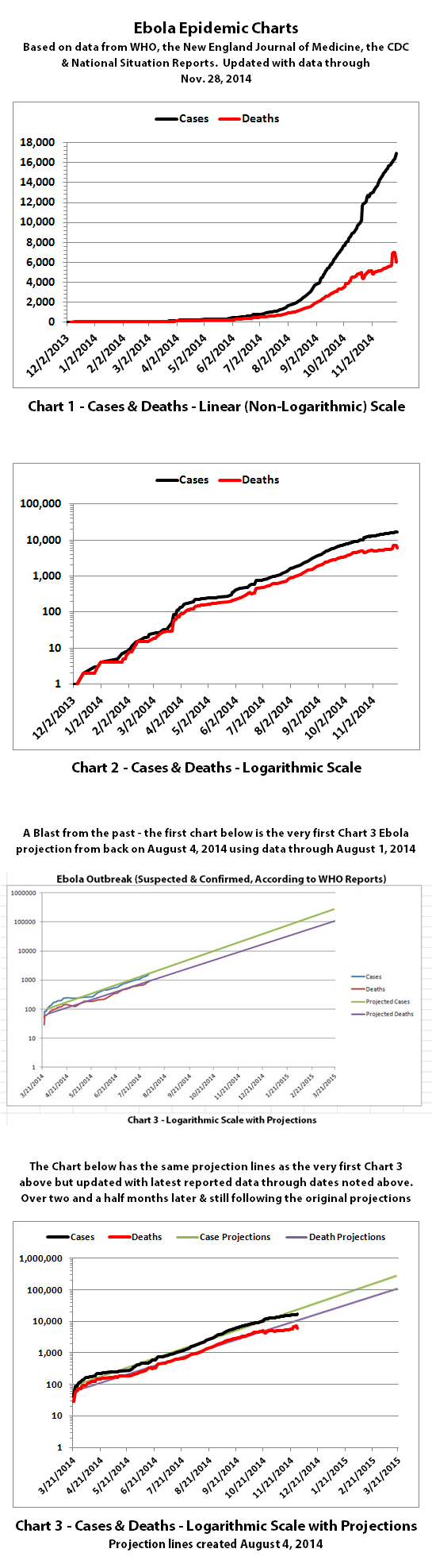
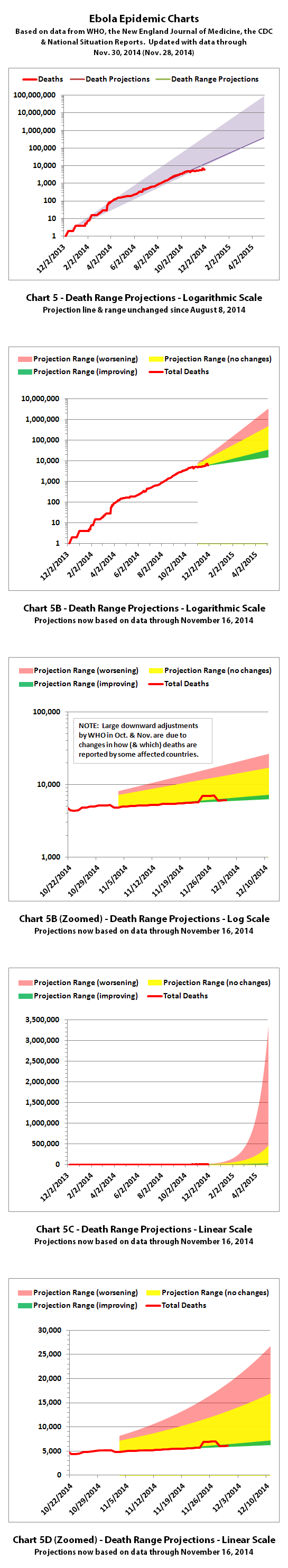
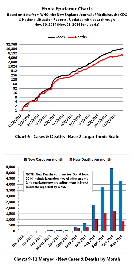
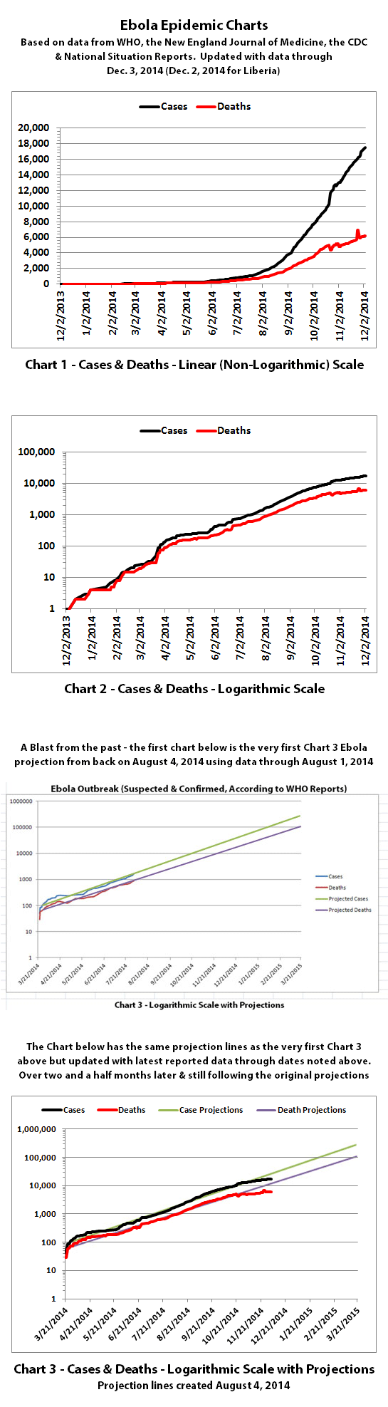
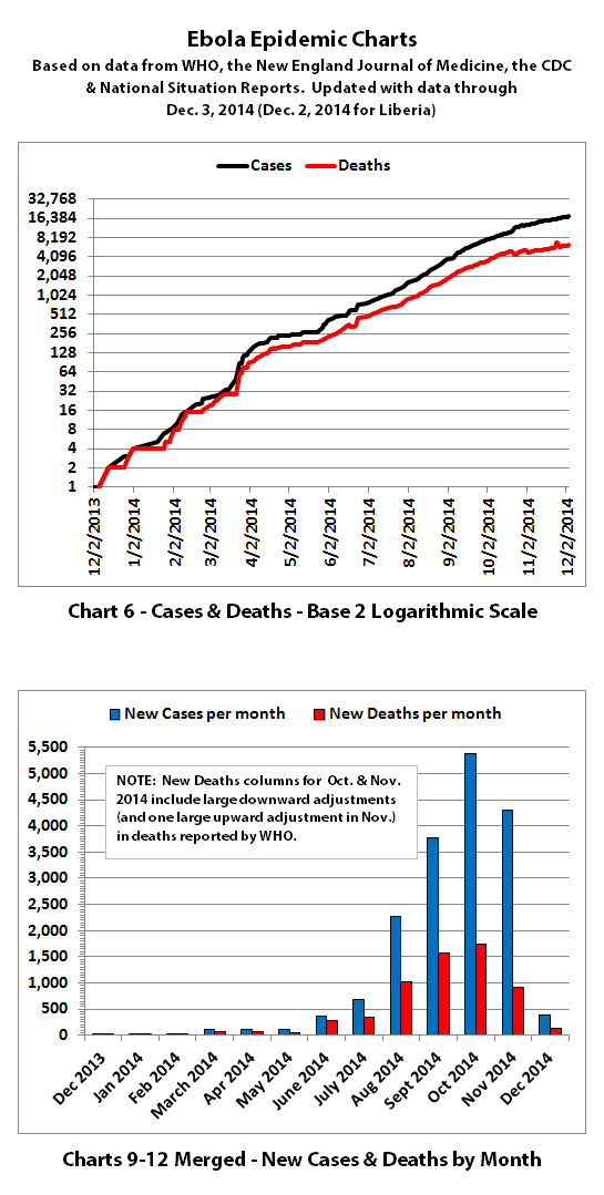
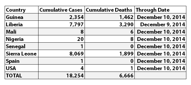
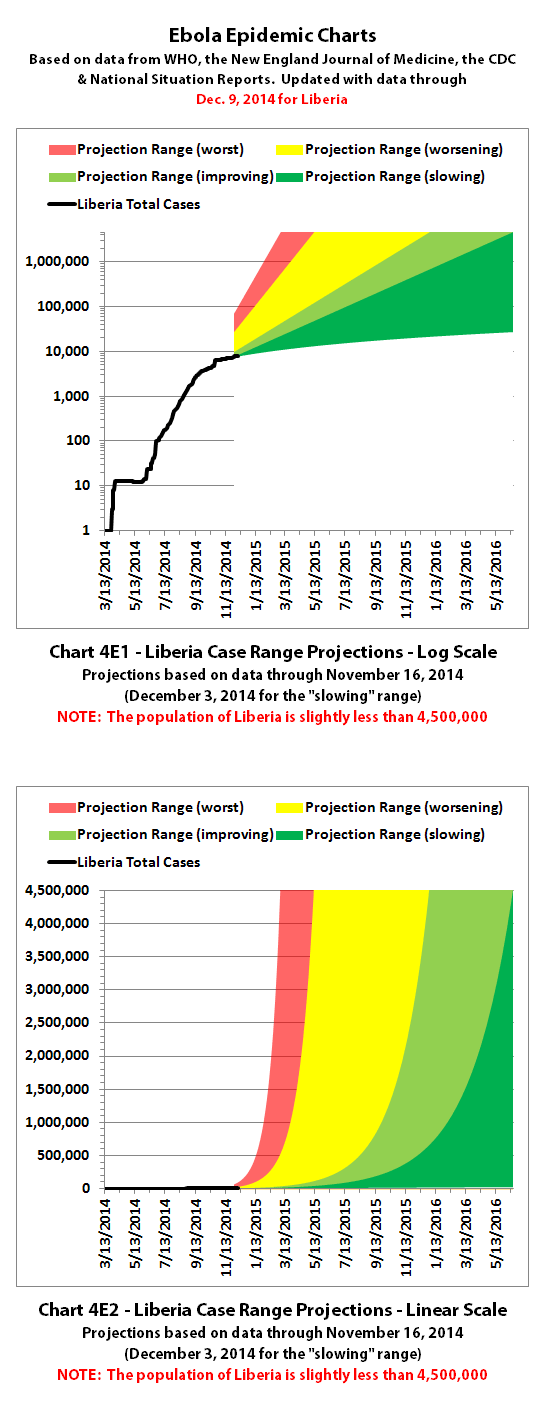
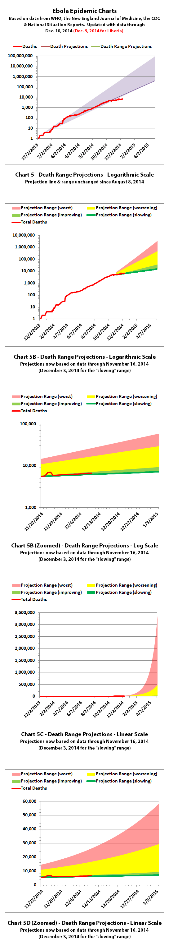
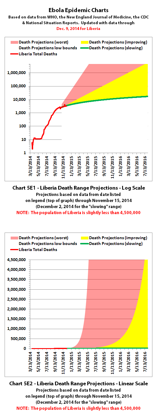
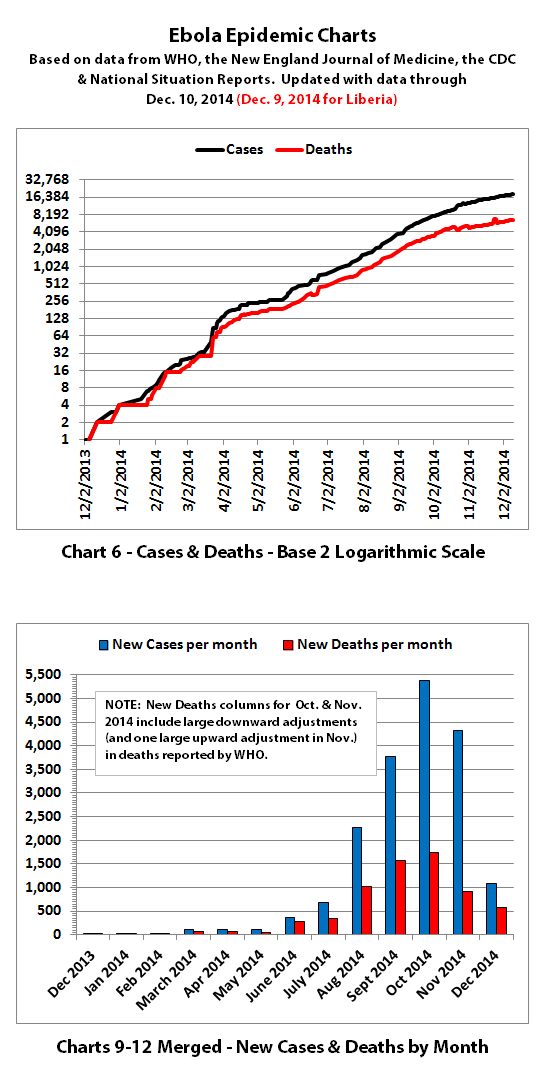
Charts 1, 2, and 6 show the cumulative numbers of reported cases and deaths so far. In Chart 1, the y (left) axis is linear. In Chart 2, the y axis is a logarithmic scale where major divisions of the axis increase by powers of 10 (the base is 10). Chart 6 has the y axis in powers of 2 (the base is 2, so 1, 2, 4, 8, etc.), so each major division represents a doubling of the numbers.
Exponential growth will look like a rapidly escalating curve on a linear scale but like a straight line on a logarithmic scale (base 10 or base 2 in these charts).
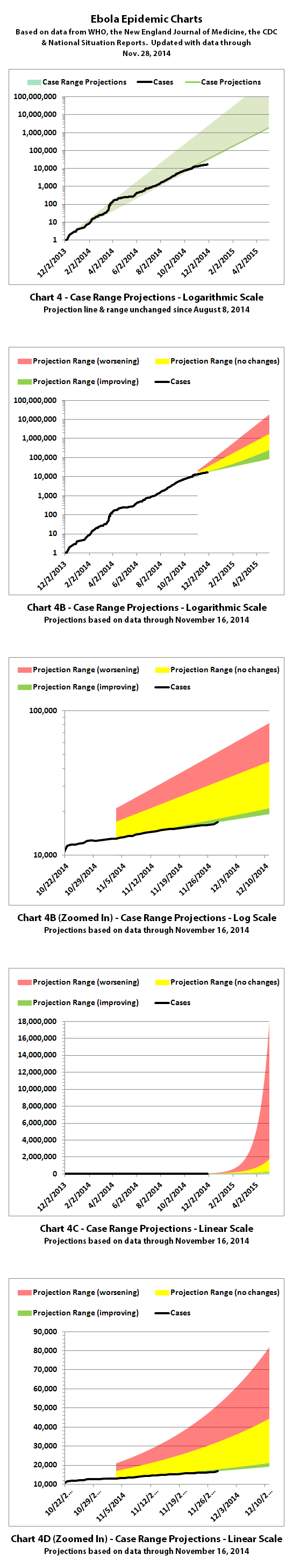
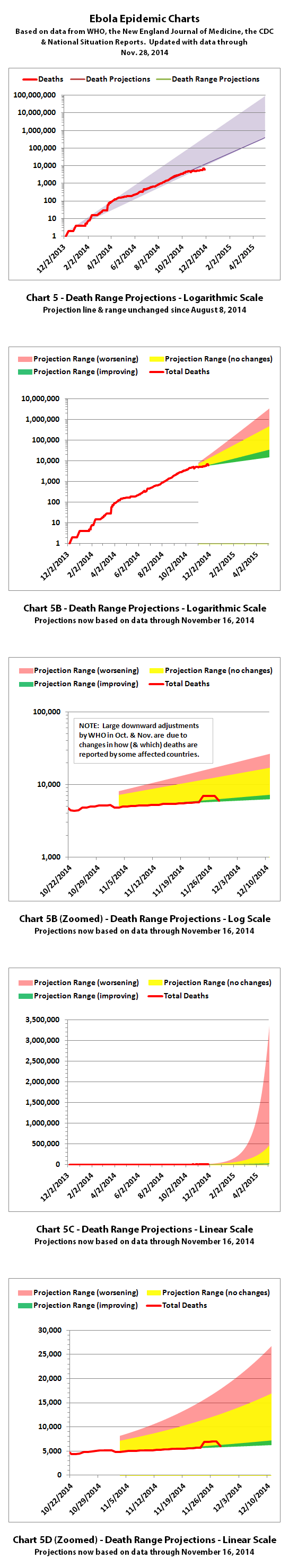
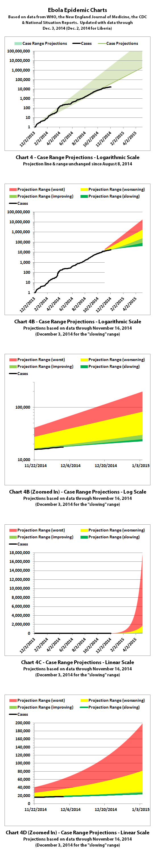
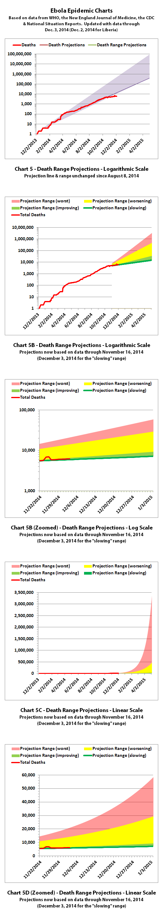
Charts 3, 4, and 5 are historical projections. These projections are based on nothing changing to significantly slow or stop the spread of Ebola. Up until now, the increases in cases and deaths have followed these projections very closely. You can now see the actual numbers dipping below the historical projections for the first time. It is unclear yet whether this represents an actual change for the better or problems in collecting or reporting data. But hopefully it is an improvement that will continue.
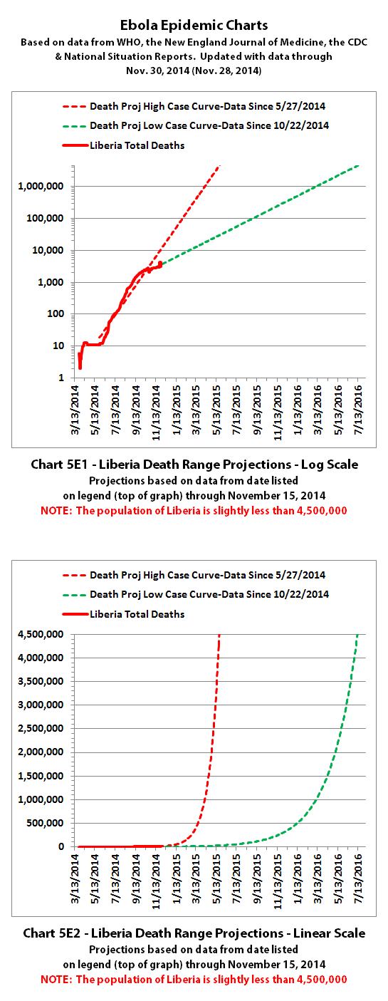
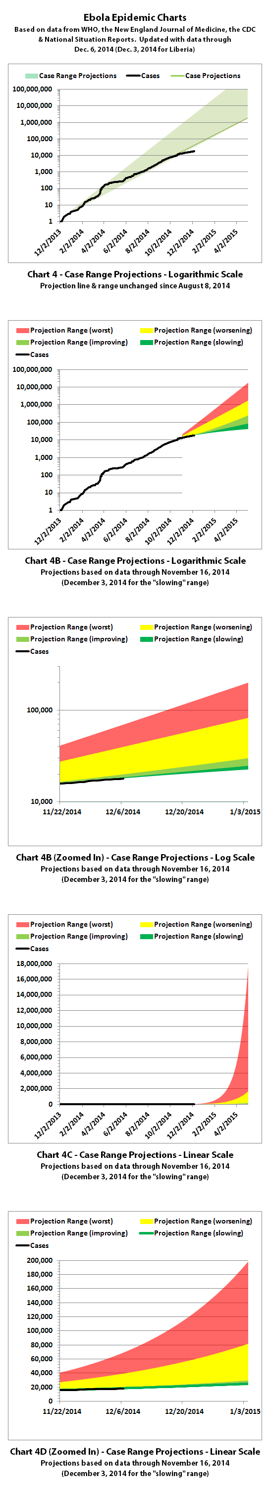
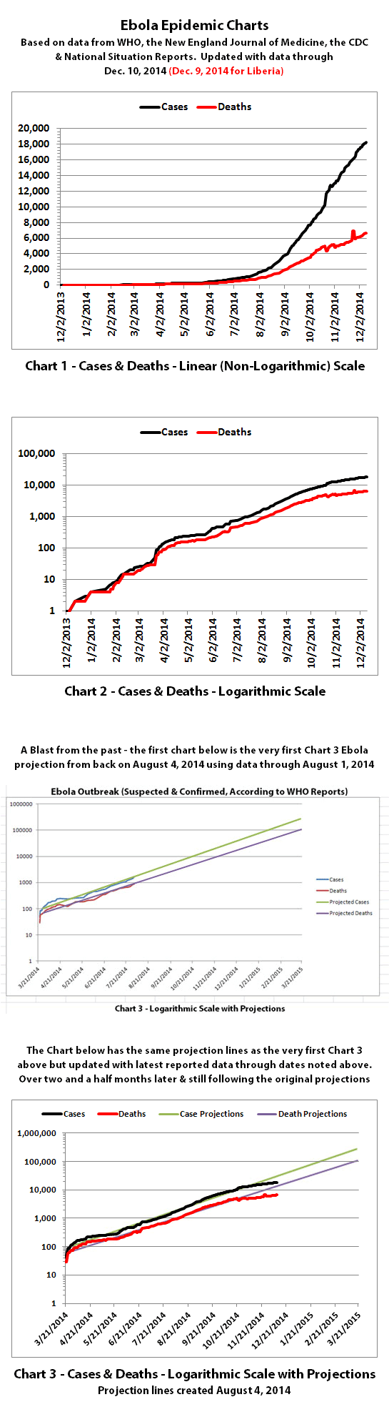
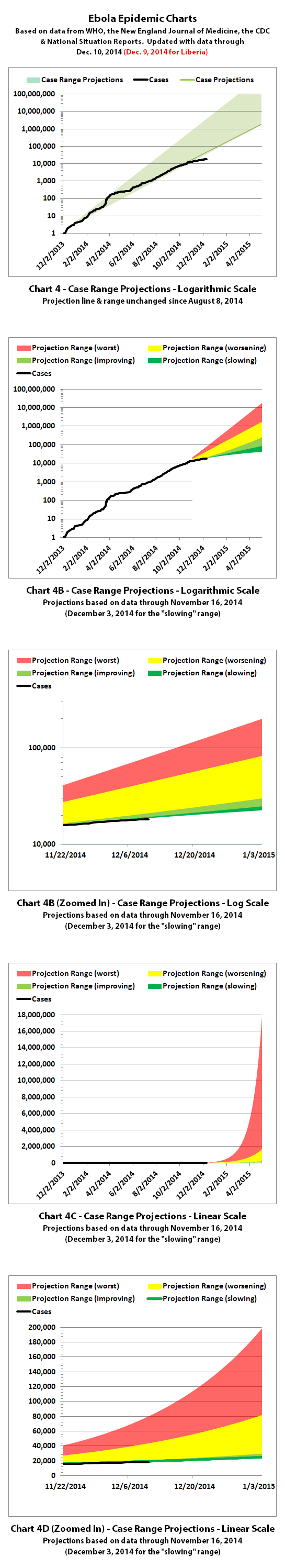
Charts 4B-4E and 5B-5E include updated projections that were recalculated in November. For the charts with color coded ranges, the green range is the projection if the spread continues as it has over recent weeks if nothing changes.
The yellow range would be if it goes back to spreading at the previous faster rates of growth. And the red range is if it spreads more at the worst rates experienced so far during this epidemic.
Charts 7-8 were discontinued quite a while back.
Charts 9-12 were merged previously, and the combined chart shows monthly new cases and deaths reported.
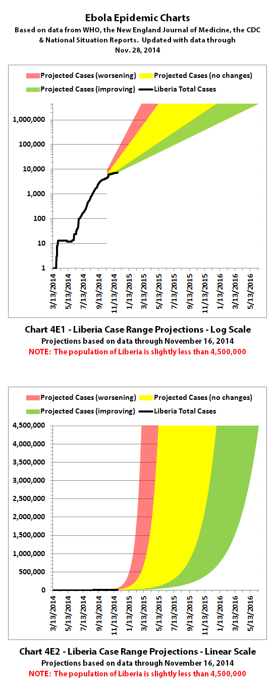
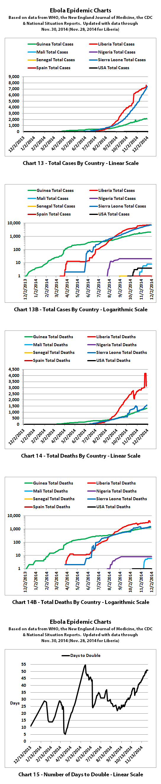
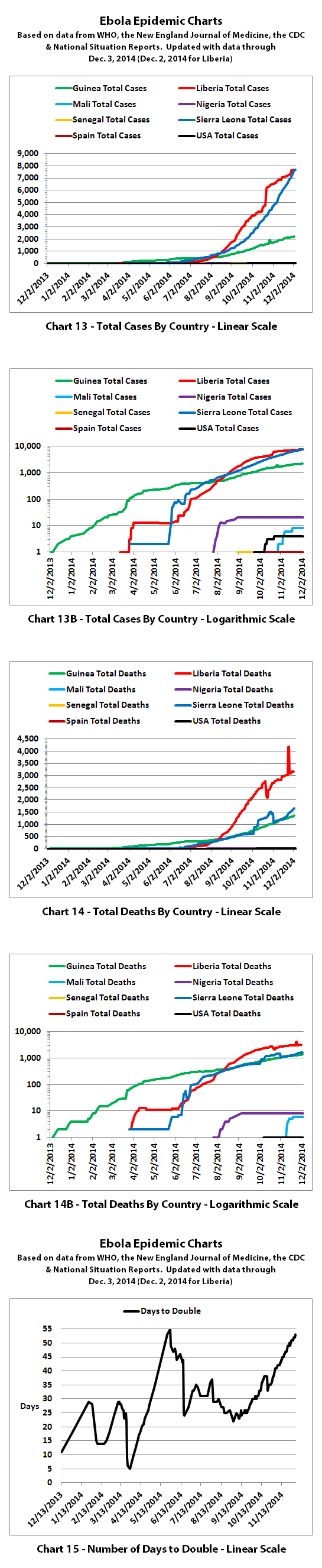
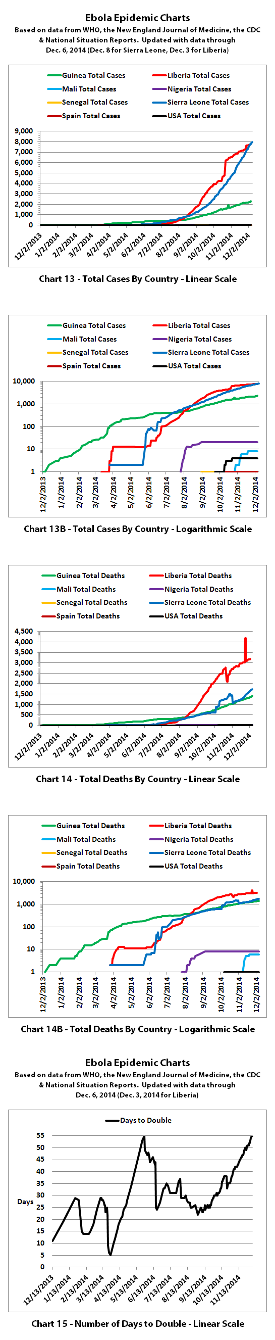
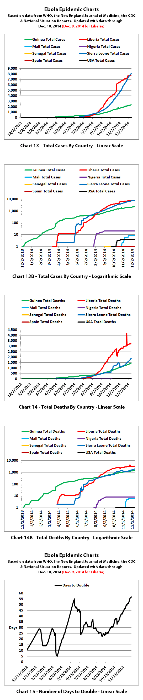
Charts 13-14B show cumulative cases and deaths by country.
Chart 15 shows how many days it has taken for the cumulative number of cases to double over time. Higher points in the chart are good, they mean it is taking longer to double. Lower points are bad, they mean it is doubling faster. Previously cases were often doubling every 3 to 4 weeks. Currently, cases are doubling in about 7 weeks according to the reported numbers.
The numbers in the charts do not include the Congo, as that was allegedly an unrelated outbreak and it has now been declared over.
These charts rely on the 'official' reported numbers and can only be as accurate as the data they are based on. Reported Ebola data is subject to change as cases and deaths are reclassified, as data sources change, or as reporting methods change. I do not know how accurate the 'official' reported numbers are, but please be aware there are a number of possible issues:
1. WHO,the CDC, Doctors Without Borders (MSF), etc. have in the past stated that actual cases and deaths "vastly" outnumber reported figures, possibly by at least 2 to 5 times.
2. There have recently been sudden large decreases in officially reported cases and deaths as well as a large increase in reported deaths that was then taken away. It is unclear whether decreases represent improvements. The decreases and increase may all be due to an inability to keep up with data tracking and recording.
3. Many countries have clamped down on Ebola news. At least one journalist has been arrested and at least one newspaper has been closed in west Africa. In the USA, an 'Ebola Czar' with a reputation as a political/public relations 'fixer' (and with no medical experience) was appointed to lead the US Ebola effort.
4. There are theories regarding Ebola that differ from the 'official' reports. Some believe there is no such thing as Ebola or that what is spreading is not Ebola. Some believe there is no outbreak at all. Some believe people are purposely being infected for economic or depopulation plans. I do not know if there is any truth to any of these beliefs, it can be a strange world.
The same disclaimers and references apply to all of these charts:
Charts and future projections were done by me, not by WHO, except in cases where it is stated that a chart includes WHO projections. I am not an Ebola expert, epidemiologist, virologist, or MD, but I manually compiled the data used to create these graphs from news updates on the following websites:
SOURCE: WHO website 1
SOURCE: WHO website 2
SOURCE: WHO website 3
SOURCE: WHO website 4
SOURCE: WHO website 5
SOURCE: CDC website 1
SOURCE: The New England Journal of Medicine
SOURCE: Guinea Situation Reports (posted on Humanitarian Response)
[NOTE: Situation Reports from Guinea are in French.]
SOURCE: Liberia Situation Reports
Mali Ministry of Sanitation and Hygiene
[NOTE: Situation Reports from Mali are in French.]
SOURCE: Sierra Leone Situation Reports
Please do not do anything you might regret based on charts or projections. Hopefully efforts to contain, quarantine, treat, prevent, or cure Ebola will eventually be successful, and hopefully sooner rather than later.
16,933 reported Ebola cases
6,002 reported Ebola deaths
As noted in a previous post, WHO removed approximately 1000 new deaths reported by Liberia last week. Allegedly, those deaths were mistakenly reported and were not due to Ebola.
I have updated the charts with the new data. Explanations of the charts are below.
Charts 1, 2, and 6 show the cumulative numbers of reported cases and deaths so far. In Chart 1, the y (left) axis is linear. In Chart 2, the y axis is a logarithmic scale where major divisions of the axis increase by powers of 10 (the base is 10). Chart 6 has the y axis in powers of 2 (the base is 2, so 1, 2, 4, 8, etc.), so each major division represents a doubling of the numbers.
Exponential growth will look like a rapidly escalating curve on a linear scale but like a straight line on a logarithmic scale (base 10 or base 2 in these charts).
Charts 3, 4, and 5 are historical projections. These projections are based on nothing changing to significantly slow or stop the spread of Ebola. Up until now, the increases in cases and deaths have followed these projections very closely. You can now see the actual numbers dipping below the historical projections for the first time. It is unclear yet whether this represents an actual change for the better or problems in collecting or reporting data. But hopefully it is an improvement that will continue.
Charts 4B-4E and 5B-5E include updated projections that were recalculated in November. For the charts with color coded ranges, the green range is the projection if the spread continues as it has over recent weeks if nothing changes.
The yellow range would be if it goes back to spreading at the previous faster rates of growth. And the red range is if it spreads more at the worst rates experienced so far during this epidemic.
Charts 7-8 were discontinued quite a while back.
Charts 9-12 were merged previously, and the combined chart shows monthly new cases and deaths reported.
Charts 13-14B show cumulative cases and deaths by country.
Chart 15 shows how many days it has taken for the cumulative number of cases to double over time. Higher points in the chart are good, they mean it is taking longer to double. Lower points are bad, they mean it is doubling faster. Previously cases were often doubling every 3 to 4 weeks. Currently, cases are doubling in about 7 weeks according to the reported numbers.
The numbers in the charts do not include the Congo, as that was allegedly an unrelated outbreak and it has now been declared over.
These charts rely on the 'official' reported numbers and can only be as accurate as the data they are based on. Reported Ebola data is subject to change as cases and deaths are reclassified, as data sources change, or as reporting methods change. I do not know how accurate the 'official' reported numbers are, but please be aware there are a number of possible issues:
1. WHO,the CDC, Doctors Without Borders (MSF), etc. have in the past stated that actual cases and deaths "vastly" outnumber reported figures, possibly by at least 2 to 5 times.
2. There have recently been sudden large decreases in officially reported cases and deaths as well as a large increase in reported deaths that was then taken away. It is unclear whether decreases represent improvements. The decreases and increase may all be due to an inability to keep up with data tracking and recording.
3. Many countries have clamped down on Ebola news. At least one journalist has been arrested and at least one newspaper has been closed in west Africa. In the USA, an 'Ebola Czar' with a reputation as a political/public relations 'fixer' (and with no medical experience) was appointed to lead the US Ebola effort.
4. There are theories regarding Ebola that differ from the 'official' reports. Some believe there is no such thing as Ebola or that what is spreading is not Ebola. Some believe there is no outbreak at all. Some believe people are purposely being infected for economic or depopulation plans. I do not know if there is any truth to any of these beliefs, it can be a strange world.
The same disclaimers and references apply to all of these charts:
Charts and future projections were done by me, not by WHO, except in cases where it is stated that a chart includes WHO projections. I am not an Ebola expert, epidemiologist, virologist, or MD, but I manually compiled the data used to create these graphs from news updates on the following websites:
SOURCE: WHO website 1
SOURCE: WHO website 2
SOURCE: WHO website 3
SOURCE: WHO website 4
SOURCE: WHO website 5
SOURCE: CDC website 1
SOURCE: The New England Journal of Medicine
SOURCE: Guinea Situation Reports (posted on Humanitarian Response)
[NOTE: Situation Reports from Guinea are in French.]
SOURCE: Liberia Situation Reports
Mali Ministry of Sanitation and Hygiene
[NOTE: Situation Reports from Mali are in French.]
SOURCE: Sierra Leone Situation Reports
Please do not do anything you might regret based on charts or projections. Hopefully efforts to contain, quarantine, treat, prevent, or cure Ebola will eventually be successful, and hopefully sooner rather than later.
Interesting that they reduced numbers. Just this morning I read an article from 11/30 that the number of deaths increased by 1,000 to roughly 6,800
because of what they believed were previously unreported numbers but I do see on their site that they seem to have reduced that number as you
indicated. Makes you wonder what the numbers are that they aren't reporting...
This is one of two articles I read discussing the sudden increase in deaths
www.newsweek.com...
This is one of two articles I read discussing the sudden increase in deaths
www.newsweek.com...
According to this December 3, 2014 WHO Ebola update,
through November 30, 2014 (November 28 for Liberia) there were:
17,145 reported Ebola cases
6,070 reported Ebola deaths
I have updated the charts with the new data. Explanations of the charts are below.


Charts 1, 2, and 6 show the cumulative numbers of reported cases and deaths so far. In Chart 1, the y (left) axis is linear. In Chart 2, the y axis is a logarithmic scale where major divisions of the axis increase by powers of 10 (the base is 10). Chart 6 has the y axis in powers of 2 (the base is 2, so 1, 2, 4, 8, etc.), so each major division represents a doubling of the numbers.
Exponential growth will look like a rapidly escalating curve on a linear scale but like a straight line on a logarithmic scale (base 10 or base 2 in these charts).
Charts 3, 4, and 5 are historical projections. These projections are based on nothing changing to significantly slow or stop the spread of Ebola. Up until now, the increases in cases and deaths have followed these projections very closely. You can now see the actual numbers dipping below the historical projections for the first time. It is unclear yet whether this represents an actual change for the better or problems in collecting or reporting data. But hopefully it is an improvement that will continue.
Charts 4B-4E and 5B-5E include updated projections that were recalculated in November. For the charts with color coded ranges, the green range is the projection if the spread continues as it has over recent weeks if nothing changes.
The yellow range would be if it goes back to spreading at the previous faster rates of growth. And the red range is if it spreads more at the worst rates experienced so far during this epidemic.
Charts 7-8 were discontinued quite a while back.
Charts 9-12 were merged previously, and the combined chart shows monthly new cases and deaths reported.
Charts 13-14B show cumulative cases and deaths by country.
Chart 15 shows how many days it has taken for the cumulative number of cases to double over time. Higher points in the chart are good, they mean it is taking longer to double. Lower points are bad, they mean it is doubling faster. Previously cases were often doubling every 3 to 4 weeks. Currently, cases are doubling in about 7 weeks according to the reported numbers.
The numbers in the charts do not include the Congo, as that was allegedly an unrelated outbreak and it has now been declared over.
These charts rely on the 'official' reported numbers and can only be as accurate as the data they are based on. Reported Ebola data is subject to change as cases and deaths are reclassified, as data sources change, or as reporting methods change. I do not know how accurate the 'official' reported numbers are, but please be aware there are a number of possible issues:
1. WHO,the CDC, Doctors Without Borders (MSF), etc. have in the past stated that actual cases and deaths "vastly" outnumber reported figures, possibly by at least 2 to 5 times.
2. There have recently been sudden large decreases in officially reported cases and deaths as well as a large increase in reported deaths that was then taken away. It is unclear whether decreases represent improvements. The decreases and increase may all be due to an inability to keep up with data tracking and recording.
3. Many countries have clamped down on Ebola news. At least one journalist has been arrested and at least one newspaper has been closed in west Africa. In the USA, an 'Ebola Czar' with a reputation as a political/public relations 'fixer' (and with no medical experience) was appointed to lead the US Ebola effort.
4. There are theories regarding Ebola that differ from the 'official' reports. Some believe there is no such thing as Ebola or that what is spreading is not Ebola. Some believe there is no outbreak at all. Some believe people are purposely being infected for economic or depopulation plans. I do not know if there is any truth to any of these beliefs, it can be a strange world.
The same disclaimers and references apply to all of these charts:
Charts and future projections were done by me, not by WHO, except in cases where it is stated that a chart includes WHO projections. I am not an Ebola expert, epidemiologist, virologist, or MD, but I manually compiled the data used to create these graphs from news updates on the following websites:
SOURCE: WHO website 1
SOURCE: WHO website 2
SOURCE: WHO website 3
SOURCE: WHO website 4
SOURCE: WHO website 5
SOURCE: CDC website 1
SOURCE: The New England Journal of Medicine
SOURCE: Guinea Situation Reports (posted on Humanitarian Response)
[NOTE: Situation Reports from Guinea are in French.]
SOURCE: Liberia Situation Reports
Mali Ministry of Sanitation and Hygiene
[NOTE: Situation Reports from Mali are in French.]
SOURCE: Sierra Leone Situation Reports
Please do not do anything you might regret based on charts or projections. Hopefully efforts to contain, quarantine, treat, prevent, or cure Ebola will eventually be successful, and hopefully sooner rather than later.
17,145 reported Ebola cases
6,070 reported Ebola deaths
I have updated the charts with the new data. Explanations of the charts are below.
Charts 1, 2, and 6 show the cumulative numbers of reported cases and deaths so far. In Chart 1, the y (left) axis is linear. In Chart 2, the y axis is a logarithmic scale where major divisions of the axis increase by powers of 10 (the base is 10). Chart 6 has the y axis in powers of 2 (the base is 2, so 1, 2, 4, 8, etc.), so each major division represents a doubling of the numbers.
Exponential growth will look like a rapidly escalating curve on a linear scale but like a straight line on a logarithmic scale (base 10 or base 2 in these charts).
Charts 3, 4, and 5 are historical projections. These projections are based on nothing changing to significantly slow or stop the spread of Ebola. Up until now, the increases in cases and deaths have followed these projections very closely. You can now see the actual numbers dipping below the historical projections for the first time. It is unclear yet whether this represents an actual change for the better or problems in collecting or reporting data. But hopefully it is an improvement that will continue.
Charts 4B-4E and 5B-5E include updated projections that were recalculated in November. For the charts with color coded ranges, the green range is the projection if the spread continues as it has over recent weeks if nothing changes.
The yellow range would be if it goes back to spreading at the previous faster rates of growth. And the red range is if it spreads more at the worst rates experienced so far during this epidemic.
Charts 7-8 were discontinued quite a while back.
Charts 9-12 were merged previously, and the combined chart shows monthly new cases and deaths reported.
Charts 13-14B show cumulative cases and deaths by country.
Chart 15 shows how many days it has taken for the cumulative number of cases to double over time. Higher points in the chart are good, they mean it is taking longer to double. Lower points are bad, they mean it is doubling faster. Previously cases were often doubling every 3 to 4 weeks. Currently, cases are doubling in about 7 weeks according to the reported numbers.
The numbers in the charts do not include the Congo, as that was allegedly an unrelated outbreak and it has now been declared over.
These charts rely on the 'official' reported numbers and can only be as accurate as the data they are based on. Reported Ebola data is subject to change as cases and deaths are reclassified, as data sources change, or as reporting methods change. I do not know how accurate the 'official' reported numbers are, but please be aware there are a number of possible issues:
1. WHO,the CDC, Doctors Without Borders (MSF), etc. have in the past stated that actual cases and deaths "vastly" outnumber reported figures, possibly by at least 2 to 5 times.
2. There have recently been sudden large decreases in officially reported cases and deaths as well as a large increase in reported deaths that was then taken away. It is unclear whether decreases represent improvements. The decreases and increase may all be due to an inability to keep up with data tracking and recording.
3. Many countries have clamped down on Ebola news. At least one journalist has been arrested and at least one newspaper has been closed in west Africa. In the USA, an 'Ebola Czar' with a reputation as a political/public relations 'fixer' (and with no medical experience) was appointed to lead the US Ebola effort.
4. There are theories regarding Ebola that differ from the 'official' reports. Some believe there is no such thing as Ebola or that what is spreading is not Ebola. Some believe there is no outbreak at all. Some believe people are purposely being infected for economic or depopulation plans. I do not know if there is any truth to any of these beliefs, it can be a strange world.
The same disclaimers and references apply to all of these charts:
Charts and future projections were done by me, not by WHO, except in cases where it is stated that a chart includes WHO projections. I am not an Ebola expert, epidemiologist, virologist, or MD, but I manually compiled the data used to create these graphs from news updates on the following websites:
SOURCE: WHO website 1
SOURCE: WHO website 2
SOURCE: WHO website 3
SOURCE: WHO website 4
SOURCE: WHO website 5
SOURCE: CDC website 1
SOURCE: The New England Journal of Medicine
SOURCE: Guinea Situation Reports (posted on Humanitarian Response)
[NOTE: Situation Reports from Guinea are in French.]
SOURCE: Liberia Situation Reports
Mali Ministry of Sanitation and Hygiene
[NOTE: Situation Reports from Mali are in French.]
SOURCE: Sierra Leone Situation Reports
Please do not do anything you might regret based on charts or projections. Hopefully efforts to contain, quarantine, treat, prevent, or cure Ebola will eventually be successful, and hopefully sooner rather than later.
Buried within the latest WHO update is what appears
to be some interesting good news. I added a line break in the first paragraph to make it a bit more readable online.
The beds aren't always where they need to be, they may be in different districts from where they are needed. Still, this is pretty good news!
At present, it is difficult to measure directly the proportion of patients who are isolated. Usually, information from clinical investigation forms could be used to provide an accurate estimate, but inconsistencies in the way different clinical investigation teams interpret and define when and how a patient is hospitalized and isolated mean that this information is not reliable enough at present to draw any conclusions about isolation.
The most robust method of estimating isolation currently available is to use the capacity to treat and isolate patients by geographical area as a proximate measure of the proportion of EVD cases who are isolated. This can be achieved by dividing the number of available EVD-treatment beds by the number of reported cases over a given period of time in a given location, taking account of varying patterns of health-seeking behaviour (e.g., in areas with poor transport links, cases are unlikely to travel large distances for diagnosis and treatment).
Using this proximate measure of isolation at a national level, all three intense-transmission countries currently have the capacity to isolate all reported cases. In Guinea (table 2) there are 2.3 available beds per reported probable and confirmed EVD case; in Liberia (table 3) there are 11.7 beds for every probable and confirmed case, and in Sierra Leone there are 1.5 beds for every probable and confirmed case (table 4). However, these numbers are, to a degree, an oversimplified representation of a more complex situation within each country.
The beds aren't always where they need to be, they may be in different districts from where they are needed. Still, this is pretty good news!
According to WHO, through December 3, 2014 (December 2 for Liberia) there were:
17,551 reported Ebola cases
6,202 reported Ebola deaths
Looking at WHO's numbers and the charts over the last several months, it appears to me that the growth may no longer be exponential in most areas. If that's true, and if it continues to be true, that is some of the best news yet regarding Ebola! It would mean it's far less likely to be a potential doomsday scenario.
It's potentially still early in this epidemic, so things may change and the growth may trend back towards more exponential. And there are still a lot of concerns over whether the numbers reported are accurate. But let's hope that this really is the good news it appears to be.
I have updated the charts with the new data. Explanations of the charts are below. And I have updated most of the projection ranges to include a range at the very bottom that depicts the trend away from exponential growth.


Charts 1, 2, and 6 show the cumulative numbers of reported cases and deaths so far. In Chart 1, the y (left) axis is linear. In Chart 2, the y axis is a logarithmic scale where major divisions of the axis increase by powers of 10 (the base is 10). Chart 6 has the y axis in powers of 2 (the base is 2, so 1, 2, 4, 8, etc.), so each major division represents a doubling of the numbers.
Exponential growth will look like a rapidly escalating curve on a linear scale but like a straight line on a logarithmic scale (base 10 or base 2 in these charts). Linear growth will look like a straight line on a linear scale and like a curve approaching a horizontal line on an exponential scale.
Charts 3, 4, and 5 are historical projections. These projections are based on nothing changing to significantly slow or stop the spread of Ebola. Up until now, the increases in cases and deaths have followed these projections very closely. You can now see the actual numbers dipping below the historical projections for the first time. It is unclear yet whether this represents an actual change for the better or problems in collecting or reporting data. But hopefully it is an indication the spread of Ebola is no longer exponential and hopefully it is an improvement that will continue.
Charts 4B-4E and 5B-5E include updated projections. For the charts with color coded ranges, the green ranges are the projection if the spread continues as it has over recent weeks if nothing changes. The darker green that can be seen in the lower part of some ranges shows the projections if the spread continues to trend away from exponential growth toward linear growth (toward the bottom of the shaded areas).
The yellow range would be if it goes back to spreading at the previous faster rates of growth. And the red range is if it spreads more at the worst rates experienced so far during this epidemic.
Charts 7-8 were discontinued quite a while back.
Charts 9-12 were merged previously, and the combined chart shows monthly new cases and deaths reported.
Charts 13-14B show cumulative cases and deaths by country.
Chart 15 shows how many days it has taken for the cumulative number of cases to double over time. Higher points in the chart are good, they mean it is taking longer to double. Lower points are bad, they mean it is doubling faster. Previously cases were often doubling every 3 to 4 weeks. Currently, cases are doubling in about 7 weeks according to the reported numbers. This may also be an indication the spread is no longer exponential.
The numbers in the charts do not include the Congo, as that was allegedly an unrelated outbreak and it has now been declared over.
These charts rely on the 'official' reported numbers and can only be as accurate as the data they are based on. Reported Ebola data is subject to change as cases and deaths are reclassified, as data sources change, or as reporting methods change. I do not know how accurate the 'official' reported numbers are, but please be aware there are a number of possible issues:
1. WHO,the CDC, Doctors Without Borders (MSF), etc. have in the past stated that actual cases and deaths "vastly" outnumber reported figures, possibly by at least 2 to 5 times.
2. There have recently been sudden large decreases in officially reported cases and deaths as well as a large increase in reported deaths that was then taken away. It is unclear whether decreases represent improvements. The decreases and increase may all be due to an inability to keep up with data tracking and recording.
3. Many countries have clamped down on Ebola news. At least one journalist has been arrested and at least one newspaper has been closed in west Africa. In the USA, an 'Ebola Czar' with a reputation as a political/public relations 'fixer' (and with no medical experience) was appointed to lead the US Ebola effort.
4. There are theories regarding Ebola that differ from the 'official' reports. Some believe there is no such thing as Ebola or that what is spreading is not Ebola. Some believe there is no outbreak at all. Some believe people are purposely being infected for economic or depopulation plans. I do not know if there is any truth to any of these beliefs, it can be a strange world.
The same disclaimers and references apply to all of these charts:
Charts and future projections were done by me, not by WHO, except in cases where it is stated that a chart includes WHO projections. I am not an Ebola expert, epidemiologist, virologist, or MD, but I manually compiled the data used to create these graphs from news updates on the following websites:
SOURCE: WHO website 1
SOURCE: WHO website 2
SOURCE: WHO website 3
SOURCE: WHO website 4
SOURCE: WHO website 5
SOURCE: CDC website 1
SOURCE: The New England Journal of Medicine
SOURCE: Guinea Situation Reports (posted on Humanitarian Response)
[NOTE: Situation Reports from Guinea are in French.]
SOURCE: Liberia Situation Reports
Mali Ministry of Sanitation and Hygiene
[NOTE: Situation Reports from Mali are in French.]
SOURCE: Sierra Leone Situation Reports
Please do not do anything you might regret based on charts or projections. Hopefully efforts to contain, quarantine, treat, prevent, or cure Ebola will eventually be successful, and hopefully sooner rather than later.
17,551 reported Ebola cases
6,202 reported Ebola deaths
Looking at WHO's numbers and the charts over the last several months, it appears to me that the growth may no longer be exponential in most areas. If that's true, and if it continues to be true, that is some of the best news yet regarding Ebola! It would mean it's far less likely to be a potential doomsday scenario.
It's potentially still early in this epidemic, so things may change and the growth may trend back towards more exponential. And there are still a lot of concerns over whether the numbers reported are accurate. But let's hope that this really is the good news it appears to be.
I have updated the charts with the new data. Explanations of the charts are below. And I have updated most of the projection ranges to include a range at the very bottom that depicts the trend away from exponential growth.
Charts 1, 2, and 6 show the cumulative numbers of reported cases and deaths so far. In Chart 1, the y (left) axis is linear. In Chart 2, the y axis is a logarithmic scale where major divisions of the axis increase by powers of 10 (the base is 10). Chart 6 has the y axis in powers of 2 (the base is 2, so 1, 2, 4, 8, etc.), so each major division represents a doubling of the numbers.
Exponential growth will look like a rapidly escalating curve on a linear scale but like a straight line on a logarithmic scale (base 10 or base 2 in these charts). Linear growth will look like a straight line on a linear scale and like a curve approaching a horizontal line on an exponential scale.
Charts 3, 4, and 5 are historical projections. These projections are based on nothing changing to significantly slow or stop the spread of Ebola. Up until now, the increases in cases and deaths have followed these projections very closely. You can now see the actual numbers dipping below the historical projections for the first time. It is unclear yet whether this represents an actual change for the better or problems in collecting or reporting data. But hopefully it is an indication the spread of Ebola is no longer exponential and hopefully it is an improvement that will continue.
Charts 4B-4E and 5B-5E include updated projections. For the charts with color coded ranges, the green ranges are the projection if the spread continues as it has over recent weeks if nothing changes. The darker green that can be seen in the lower part of some ranges shows the projections if the spread continues to trend away from exponential growth toward linear growth (toward the bottom of the shaded areas).
The yellow range would be if it goes back to spreading at the previous faster rates of growth. And the red range is if it spreads more at the worst rates experienced so far during this epidemic.
Charts 7-8 were discontinued quite a while back.
Charts 9-12 were merged previously, and the combined chart shows monthly new cases and deaths reported.
Charts 13-14B show cumulative cases and deaths by country.
Chart 15 shows how many days it has taken for the cumulative number of cases to double over time. Higher points in the chart are good, they mean it is taking longer to double. Lower points are bad, they mean it is doubling faster. Previously cases were often doubling every 3 to 4 weeks. Currently, cases are doubling in about 7 weeks according to the reported numbers. This may also be an indication the spread is no longer exponential.
The numbers in the charts do not include the Congo, as that was allegedly an unrelated outbreak and it has now been declared over.
These charts rely on the 'official' reported numbers and can only be as accurate as the data they are based on. Reported Ebola data is subject to change as cases and deaths are reclassified, as data sources change, or as reporting methods change. I do not know how accurate the 'official' reported numbers are, but please be aware there are a number of possible issues:
1. WHO,the CDC, Doctors Without Borders (MSF), etc. have in the past stated that actual cases and deaths "vastly" outnumber reported figures, possibly by at least 2 to 5 times.
2. There have recently been sudden large decreases in officially reported cases and deaths as well as a large increase in reported deaths that was then taken away. It is unclear whether decreases represent improvements. The decreases and increase may all be due to an inability to keep up with data tracking and recording.
3. Many countries have clamped down on Ebola news. At least one journalist has been arrested and at least one newspaper has been closed in west Africa. In the USA, an 'Ebola Czar' with a reputation as a political/public relations 'fixer' (and with no medical experience) was appointed to lead the US Ebola effort.
4. There are theories regarding Ebola that differ from the 'official' reports. Some believe there is no such thing as Ebola or that what is spreading is not Ebola. Some believe there is no outbreak at all. Some believe people are purposely being infected for economic or depopulation plans. I do not know if there is any truth to any of these beliefs, it can be a strange world.
The same disclaimers and references apply to all of these charts:
Charts and future projections were done by me, not by WHO, except in cases where it is stated that a chart includes WHO projections. I am not an Ebola expert, epidemiologist, virologist, or MD, but I manually compiled the data used to create these graphs from news updates on the following websites:
SOURCE: WHO website 1
SOURCE: WHO website 2
SOURCE: WHO website 3
SOURCE: WHO website 4
SOURCE: WHO website 5
SOURCE: CDC website 1
SOURCE: The New England Journal of Medicine
SOURCE: Guinea Situation Reports (posted on Humanitarian Response)
[NOTE: Situation Reports from Guinea are in French.]
SOURCE: Liberia Situation Reports
Mali Ministry of Sanitation and Hygiene
[NOTE: Situation Reports from Mali are in French.]
SOURCE: Sierra Leone Situation Reports
Please do not do anything you might regret based on charts or projections. Hopefully efforts to contain, quarantine, treat, prevent, or cure Ebola will eventually be successful, and hopefully sooner rather than later.
edit on 6-12-2014 by ikonoklast because: Emphasized the good news.
It's great to see a deviation from the projections, Ikon, and whether the "official" data correlates to real life data remains yet to be seen, I
for one would like to thank you for keeping up with your graphs. Awesome work, my friend!
In MSM, it's virtually a non-topic now. The Ebola Czar in the US has done a great job of eradicating Ebola. At least, any news of it.
In MSM, it's virtually a non-topic now. The Ebola Czar in the US has done a great job of eradicating Ebola. At least, any news of it.
I agree that the break from the curve looks sustained, and hopefully sustainable. The experts on the ground always said it was about changing
behaviors, so that is likely what we are seeing. When Ebola hit a new region, the uninitiated populace would allow the exponential growth to
continue. From the data I think this no longer occurs for long. And in Liberia perhaps all distinct regions have been hit, and most everyone has
seen it first hand and learned. Great job Iconoclast, now let's follow this thing all the way down.
Thanks again for these posts Ikon, I check it daily because you make the figures so much clearer and easier to read than the assorted Govt sites.
Thanks!
Lil
Thanks!
Lil
a reply to: ikonoklast
Supposedly the epidemic has practically stopped in Liberia but is surging out-of-control again in Sierra Leone. Any figures?
...and as per usual, thanks for all your great work. S&
Supposedly the epidemic has practically stopped in Liberia but is surging out-of-control again in Sierra Leone. Any figures?
...and as per usual, thanks for all your great work. S&
a reply to: soficrow
According to the WSJ
Ebola Death Toll in Three West African Countries Most Hit by Virus Nears 7,000 WHO Says 6,928 People Died of Ebola in Guinea, Liberia and Sierra Leone
Looks like WHO is playing around with the numbers again.
According to the WSJ
Ebola Death Toll in Three West African Countries Most Hit by Virus Nears 7,000 WHO Says 6,928 People Died of Ebola in Guinea, Liberia and Sierra Leone
Looks like WHO is playing around with the numbers again.
Thanks, everyone, I appreciate the feedback, and I'm glad the charts are helpful!
a reply to: soficrow
Thanks, and you're welcome!
ETA: As I was posting this, WHO updated the numbers, so I've updated this post with their new data. I'll update the charts when I get a chance.
These are the most recent Ebola numbers reported by WHO on December 8, 2014 for each of the countries:
I guess you could say 'Sierra Leone is the new Liberia' as far as the Ebola epidemic goes. Ebola was previously spreading the fastest in Liberia, but now that appears to have leveled off and it appears to be spreading the fastest in Sierra Leone.
The total number of Ebola cases reported in Sierra Leone probably surpassed the total cases reported in Liberia over the last few days. But it's hard to be sure yet because Liberia has only reported data through December 3, 2014.
Sierra Leone's reported cases have been running the same as WHO has reported over the last month or so, but the Sierra Leone Ministry of Health has been reporting several hundred more deaths than WHO has been reporting over that same period. WHO reports 1,742 deaths but Sierra Leone reports 2,074 deaths through December 6, 2014. I don't know why the numbers of deaths reported by WHO and by Sierra Leone's Ministry of Health have differed so much. WHO allegedly gets their data primarily from the Ministries of Health of affected countries.
a reply to: joho99
The numbers reported in that Wall Street Journal article were old numbers reported by WHO on November 25, 2014. WHO definitely has reported some large changes in numbers several times over the last couple months though. They also keep moving around the places on their website where they report the numbers. Lots of smoke and mirrors maybe...
Supposedly the epidemic has practically stopped in Liberia but is surging out-of-control again in Sierra Leone. Any figures?
...and as per usual, thanks for all your great work. S&
Thanks, and you're welcome!
ETA: As I was posting this, WHO updated the numbers, so I've updated this post with their new data. I'll update the charts when I get a chance.
These are the most recent Ebola numbers reported by WHO on December 8, 2014 for each of the countries:
I guess you could say 'Sierra Leone is the new Liberia' as far as the Ebola epidemic goes. Ebola was previously spreading the fastest in Liberia, but now that appears to have leveled off and it appears to be spreading the fastest in Sierra Leone.
The total number of Ebola cases reported in Sierra Leone probably surpassed the total cases reported in Liberia over the last few days. But it's hard to be sure yet because Liberia has only reported data through December 3, 2014.
Sierra Leone's reported cases have been running the same as WHO has reported over the last month or so, but the Sierra Leone Ministry of Health has been reporting several hundred more deaths than WHO has been reporting over that same period. WHO reports 1,742 deaths but Sierra Leone reports 2,074 deaths through December 6, 2014. I don't know why the numbers of deaths reported by WHO and by Sierra Leone's Ministry of Health have differed so much. WHO allegedly gets their data primarily from the Ministries of Health of affected countries.
a reply to: joho99
According to the WSJ
Ebola Death Toll in Three West African Countries Most Hit by Virus Nears 7,000 WHO Says 6,928 People Died of Ebola in Guinea, Liberia and Sierra Leone
Looks like WHO is playing around with the numbers again.
The numbers reported in that Wall Street Journal article were old numbers reported by WHO on November 25, 2014. WHO definitely has reported some large changes in numbers several times over the last couple months though. They also keep moving around the places on their website where they report the numbers. Lots of smoke and mirrors maybe...
edit on 8-12-2014 by ikonoklast because: WHO updated their numbers as I posted this, so I
updated with the new numbers.
link
The UN's Ebola czar on Tuesday hailed widespread progress in the fight against the deadly virus, but warned the outbreak was still surging in western Sierra Leone and northern Guinea.
"We know the outbreak is still flaming strongly in western Sierra Leone and some parts of the interior of Guinea," David Nabarro, the UN coordinator on Ebola, told reporters in Geneva.
He said more foreign health workers and specialists were needed in the areas where the disease was still spreading quickly, as were more treatment units and beds.
According to WHO, through December 6, 2014 (December 3 for Liberia) there were:
17,834 reported Ebola cases
6,346 reported Ebola deaths
As noted previously, if the data reported by WHO is sufficiently correct then the growth of Ebola may no longer be exponential in most areas. If that's true, and if it continues to be true, that is great news!
It's potentially still early in this epidemic, so things may change. And there are still a lot of concerns over whether the numbers reported are accurate. But let's hope that this really is the good news it appears to be.
I have updated the Ebola charts with the latest reported data. Explanations of the charts are also below.
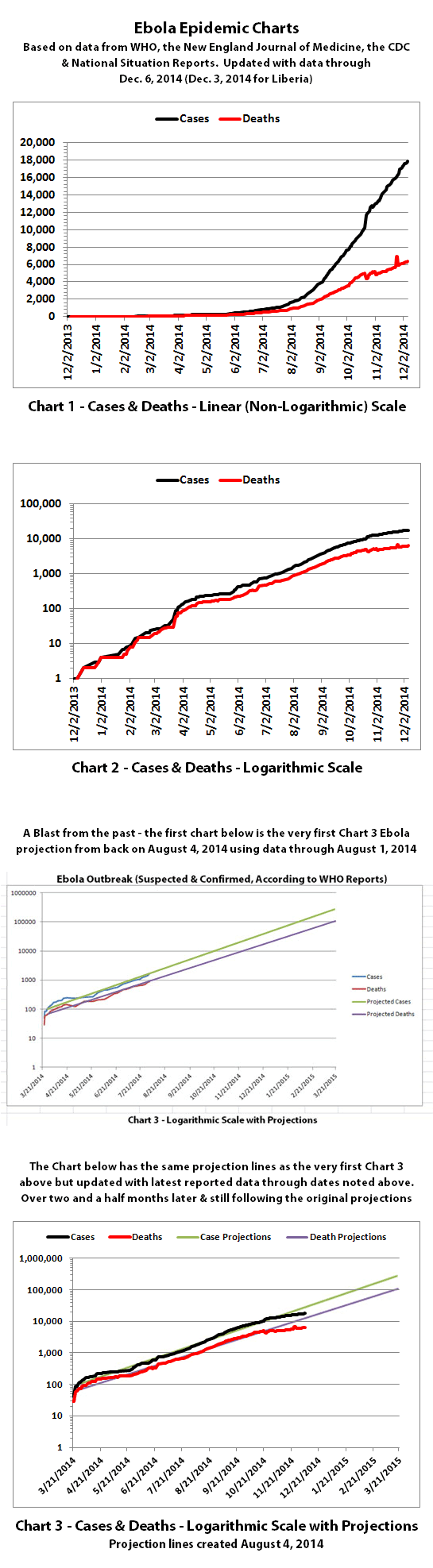
Charts 1, 2, and 6 show the cumulative numbers of reported cases and deaths so far. In Chart 1, the y (left) axis is linear. In Chart 2, the y axis is a logarithmic scale where major divisions of the axis increase by powers of 10 (the base is 10). Chart 6 has the y axis in powers of 2 (the base is 2, so 1, 2, 4, 8, etc.), so each major division represents a doubling of the numbers.
Exponential growth will look like a rapidly escalating curve on a linear scale but like a straight line on a logarithmic scale (base 10 or base 2 in these charts). Linear growth will look like a straight line on a linear scale and like a curve approaching a flat horizontal line on an exponential scale.
Charts 3, 4, and 5 are historical projections that would be most likely if nothing changed to slow or stop the spread. Until recently, reported cases and deaths followed these projections closely, but reported numbers are finally dipping below these historical projections. That may be temporary, or it may be due to problems in collecting or reporting data, or it may be a real improvement that will continue.
Charts 4B-4E and 5B-5E include more recently updated projections. For charts with color coded ranges, the green ranges are the projection if the spread continues as it has over recent weeks. The darker green in the lower part of some ranges would be expected if the spread continues to trend away from exponential growth toward linear growth (toward the bottom of the shaded areas).
The yellow range would be expected if the trend goes back to spreading at previous faster rates. And the red range would be expected if it starts growing again at the worst rates experienced so far during this epidemic.
Charts 7-8 were discontinued quite a while back.
Charts 9-12 were merged previously, and the combined chart shows monthly new cases and deaths reported.
Charts 13-14B show cumulative cases and deaths by country.
Chart 15 shows how many days it has taken for the cumulative number of cases to double over time. Higher points in the chart are good, they mean it is taking longer to double. Lower points are bad, they mean it is doubling faster. Previously cases doubled every 3 to 4 weeks. Currently, cases are doubling in about 8 weeks according to reported numbers. This may also indicate the spread is no longer exponential.
The charts do not include the Congo, as that was allegedly an unrelated outbreak and it has been declared over.
These charts rely on 'official' reported numbers and can only be as accurate as thatdata. Reported Ebola data is subject to change as cases and deaths are reclassified, or as data sources or reporting methods change. I do not know how accurate 'official' reported numbers are, but there are a number of possible issues:
1. WHO,the CDC, Doctors Without Borders (MSF), etc. have in the past stated that actual cases and deaths "vastly" outnumber reported figures, possibly by at least 2 to 5 times.
2. There have recently been sudden large decreases in officially reported cases and deaths as well as a large increase in reported deaths that was then taken away. It is unclear whether decreases represent improvements. The decreases and increase may all be due to an inability to keep up with data tracking and recording.
3. Many countries have clamped down on Ebola news. At least one journalist has been arrested and at least one newspaper has been closed in west Africa. In the USA, an 'Ebola Czar' with a reputation as a political/public relations 'fixer' (and with no medical experience) was appointed to lead the US Ebola effort.
4. There are theories regarding Ebola that differ from the 'official' reports. Some believe there is no such thing as Ebola or that what is spreading is not Ebola. Some believe there is no outbreak at all. Some believe people are purposely being infected for economic or depopulation plans. I do not know if there is any truth to any of these beliefs, it can be a strange world.
The same disclaimers and references apply to all of these charts:
Charts and future projections were done by me, not by WHO, except in cases where it is stated that a chart includes WHO projections. I am not an Ebola expert, epidemiologist, virologist, or MD, but I manually compiled the data used to create these graphs from news updates on the following websites:
SOURCE: WHO website 1
SOURCE: WHO website 2
SOURCE: WHO website 3
SOURCE: WHO website 4
SOURCE: WHO website 5
SOURCE: CDC website 1
SOURCE: The New England Journal of Medicine
SOURCE: Guinea Situation Reports (posted on Humanitarian Response)
[NOTE: Situation Reports from Guinea are in French.]
SOURCE: Liberia Situation Reports
Mali Ministry of Sanitation and Hygiene
[NOTE: Situation Reports from Mali are in French.]
SOURCE: Sierra Leone Situation Reports
Please do not do anything you might regret based on charts or projections. Hopefully efforts to contain, quarantine, treat, prevent, or cure Ebola will eventually be successful, and hopefully sooner rather than later.
17,834 reported Ebola cases
6,346 reported Ebola deaths
As noted previously, if the data reported by WHO is sufficiently correct then the growth of Ebola may no longer be exponential in most areas. If that's true, and if it continues to be true, that is great news!
It's potentially still early in this epidemic, so things may change. And there are still a lot of concerns over whether the numbers reported are accurate. But let's hope that this really is the good news it appears to be.
I have updated the Ebola charts with the latest reported data. Explanations of the charts are also below.
Charts 1, 2, and 6 show the cumulative numbers of reported cases and deaths so far. In Chart 1, the y (left) axis is linear. In Chart 2, the y axis is a logarithmic scale where major divisions of the axis increase by powers of 10 (the base is 10). Chart 6 has the y axis in powers of 2 (the base is 2, so 1, 2, 4, 8, etc.), so each major division represents a doubling of the numbers.
Exponential growth will look like a rapidly escalating curve on a linear scale but like a straight line on a logarithmic scale (base 10 or base 2 in these charts). Linear growth will look like a straight line on a linear scale and like a curve approaching a flat horizontal line on an exponential scale.
Charts 3, 4, and 5 are historical projections that would be most likely if nothing changed to slow or stop the spread. Until recently, reported cases and deaths followed these projections closely, but reported numbers are finally dipping below these historical projections. That may be temporary, or it may be due to problems in collecting or reporting data, or it may be a real improvement that will continue.
Charts 4B-4E and 5B-5E include more recently updated projections. For charts with color coded ranges, the green ranges are the projection if the spread continues as it has over recent weeks. The darker green in the lower part of some ranges would be expected if the spread continues to trend away from exponential growth toward linear growth (toward the bottom of the shaded areas).
The yellow range would be expected if the trend goes back to spreading at previous faster rates. And the red range would be expected if it starts growing again at the worst rates experienced so far during this epidemic.
Charts 7-8 were discontinued quite a while back.
Charts 9-12 were merged previously, and the combined chart shows monthly new cases and deaths reported.
Charts 13-14B show cumulative cases and deaths by country.
Chart 15 shows how many days it has taken for the cumulative number of cases to double over time. Higher points in the chart are good, they mean it is taking longer to double. Lower points are bad, they mean it is doubling faster. Previously cases doubled every 3 to 4 weeks. Currently, cases are doubling in about 8 weeks according to reported numbers. This may also indicate the spread is no longer exponential.
The charts do not include the Congo, as that was allegedly an unrelated outbreak and it has been declared over.
These charts rely on 'official' reported numbers and can only be as accurate as thatdata. Reported Ebola data is subject to change as cases and deaths are reclassified, or as data sources or reporting methods change. I do not know how accurate 'official' reported numbers are, but there are a number of possible issues:
1. WHO,the CDC, Doctors Without Borders (MSF), etc. have in the past stated that actual cases and deaths "vastly" outnumber reported figures, possibly by at least 2 to 5 times.
2. There have recently been sudden large decreases in officially reported cases and deaths as well as a large increase in reported deaths that was then taken away. It is unclear whether decreases represent improvements. The decreases and increase may all be due to an inability to keep up with data tracking and recording.
3. Many countries have clamped down on Ebola news. At least one journalist has been arrested and at least one newspaper has been closed in west Africa. In the USA, an 'Ebola Czar' with a reputation as a political/public relations 'fixer' (and with no medical experience) was appointed to lead the US Ebola effort.
4. There are theories regarding Ebola that differ from the 'official' reports. Some believe there is no such thing as Ebola or that what is spreading is not Ebola. Some believe there is no outbreak at all. Some believe people are purposely being infected for economic or depopulation plans. I do not know if there is any truth to any of these beliefs, it can be a strange world.
The same disclaimers and references apply to all of these charts:
Charts and future projections were done by me, not by WHO, except in cases where it is stated that a chart includes WHO projections. I am not an Ebola expert, epidemiologist, virologist, or MD, but I manually compiled the data used to create these graphs from news updates on the following websites:
SOURCE: WHO website 1
SOURCE: WHO website 2
SOURCE: WHO website 3
SOURCE: WHO website 4
SOURCE: WHO website 5
SOURCE: CDC website 1
SOURCE: The New England Journal of Medicine
SOURCE: Guinea Situation Reports (posted on Humanitarian Response)
[NOTE: Situation Reports from Guinea are in French.]
SOURCE: Liberia Situation Reports
Mali Ministry of Sanitation and Hygiene
[NOTE: Situation Reports from Mali are in French.]
SOURCE: Sierra Leone Situation Reports
Please do not do anything you might regret based on charts or projections. Hopefully efforts to contain, quarantine, treat, prevent, or cure Ebola will eventually be successful, and hopefully sooner rather than later.
a reply to: soficrow
This is kind of interesting, all of a sudden this is all over the news today. The report appears to be from Reuters originally (I think), but it is echoed by USA Today, the New York Times, the Washington Post, etc.
The question is: Was this shoddy and totally inaccurate reporting, or something more? Because according to WHO, through December 6, 2014, Sierra Leone has reported 1742 deaths but Liberia had reported 3177 deaths through December 3, 2014. It seems unlikely that deaths in Sierra Leone would almost double in a couple days.
In the video, they never actually show the UN's David Nabarro saying that there are more deaths in Sierra Leone now, but the reporter (Rob Muir?) clearly says that, and the video is edited to make it seem like that could be what Nabarro means.
All of the news outlets reporting this story have been reporting the numbers from WHO all along, so they all have access to the 'official' numbers reported by WHO and have been following and publishing those numbers for months. They would all have to be incompetent to make such a mistake in their reporting, which makes me wonder what's really going on and why.
This is kind of interesting, all of a sudden this is all over the news today. The report appears to be from Reuters originally (I think), but it is echoed by USA Today, the New York Times, the Washington Post, etc.
Sierra Leone now leads Liberia as having the highest number of deaths from Ebola and western health experts say the virus there is still spreading. Rob Muir reports.
The United Nations says Ebola has now claimed more lives in Sierra Leone than in any other country. According to the UN' s David Nabarro, the situation is getting worse.
The question is: Was this shoddy and totally inaccurate reporting, or something more? Because according to WHO, through December 6, 2014, Sierra Leone has reported 1742 deaths but Liberia had reported 3177 deaths through December 3, 2014. It seems unlikely that deaths in Sierra Leone would almost double in a couple days.
In the video, they never actually show the UN's David Nabarro saying that there are more deaths in Sierra Leone now, but the reporter (Rob Muir?) clearly says that, and the video is edited to make it seem like that could be what Nabarro means.
All of the news outlets reporting this story have been reporting the numbers from WHO all along, so they all have access to the 'official' numbers reported by WHO and have been following and publishing those numbers for months. They would all have to be incompetent to make such a mistake in their reporting, which makes me wonder what's really going on and why.
That sure is interesting . WOndering if there is going to be new numbers soon !
armakirais
armakirais
a reply to: ikonoklast
I read that report too. I;d like to know the true figures.
I've been away for a while... just getting on with things but I still don't see a mass panic event.
Deaths are at 7k? Or not.
Its nearly Jan and I don't see anywhere close to the Million mark.
I read that report too. I;d like to know the true figures.
I've been away for a while... just getting on with things but I still don't see a mass panic event.
Deaths are at 7k? Or not.
Its nearly Jan and I don't see anywhere close to the Million mark.
I read an article today which I cannot now find that indicated WHO was just arriving to some places in Sierra Leone that had been inundated with
infection (report of 87 bodies piled up). It seems the WHO was looking to communities to report their numbers to the WHO, but now it sounds as though
they were too overwhelmed to report anything. I think this is why we aren't seeing the numbers accurately reflecting the reality... at least in
Sierra Leone.
According to WHO, through December 10, 2014 (December 7 for Liberia) there were:
18,222 reported Ebola cases
6,598 reported Ebola deaths
But Liberia later reported an additional 32 cases and 68 deaths for December 8-9, so this chart update covers the following dates and data:
Explanations of the charts are below.
Charts 1, 2, and 6 show the cumulative numbers of reported cases and deaths so far. In Chart 1, the y (left) axis is linear. In Chart 2, the y axis is a logarithmic scale where major divisions of the axis increase by powers of 10 (the base is 10). Chart 6 has the y axis in powers of 2 (the base is 2, so 1, 2, 4, 8, etc.), so each major division represents a doubling of the numbers.
Exponential growth will look like a rapidly escalating curve on a linear scale but like a straight line on a logarithmic scale (base 10 or base 2 in these charts). Linear growth will look like a straight line on a linear scale and like a curve approaching a flat horizontal line on an exponential scale.
Charts 3, 4, and 5 are historical projections that would be most likely if nothing changed to slow or stop the spread. Until recently, reported cases and deaths followed these projections closely, but reported numbers are finally dipping below these historical projections. That may be temporary, or it may be due to problems in collecting or reporting data, or it may be a real improvement that will continue.
Charts 4B-4E and 5B-5E include more recently updated projections. For charts with color coded ranges, the green ranges are the projection if the spread continues as it has over recent weeks. The darker green in the lower part of some ranges would be expected if the spread continues to trend away from exponential growth toward linear growth (toward the bottom of the shaded areas).
The yellow range would be expected if the trend goes back to spreading at previous faster rates. And the red range would be expected if it starts growing again at the worst rates experienced so far during this epidemic.
Charts 7-8 were discontinued quite a while back.
Charts 9-12 were merged previously, and the combined chart shows monthly new cases and deaths reported.
Charts 13-14B show cumulative cases and deaths by country.
Chart 15 shows how many days it has taken for the cumulative number of cases to double over time. Higher points in the chart are good, they mean it is taking longer to double. Lower points are bad, they mean it is doubling faster. Previously cases doubled every 3 to 4 weeks. Currently, cases are doubling in about 8 weeks according to reported numbers.
The charts do not include the Congo, as that was allegedly an unrelated outbreak and it has been declared over.
These charts rely on 'official' reported numbers and can only be as accurate as that data. Reported Ebola data is subject to change as cases and deaths are reclassified, or as data sources or reporting methods change. I do not know how accurate 'official' reported numbers are, but there are a number of possible issues:
1. WHO,the CDC, Doctors Without Borders (MSF), etc. have in the past stated that actual cases and deaths "vastly" outnumber reported figures, possibly by at least 2 to 5 times.
2. There have recently been sudden large decreases in officially reported cases and deaths as well as a large increase in reported deaths that was then taken away. It is unclear whether decreases represent improvements. The decreases and increase may all be due to an inability to keep up with data tracking and recording.
3. Many countries have clamped down on Ebola news. At least one journalist has been arrested and at least one newspaper has been closed in west Africa. In the USA, an 'Ebola Czar' with a reputation as a political/public relations 'fixer' (and with no medical experience) was appointed to lead the US Ebola effort.
4. There are theories regarding Ebola that differ from the 'official' reports. Some believe there is no such thing as Ebola or that what is spreading is not Ebola. Some believe there is no outbreak at all. Some believe people are purposely being infected for economic or depopulation plans. I do not know if there is any truth to any of these beliefs, it can be a strange world.
The same disclaimers and references apply to all of these charts:
Charts and future projections were done by me, not by WHO, except in cases where it is stated that a chart includes WHO projections. I am not an Ebola expert, epidemiologist, virologist, or MD, but I manually compiled the data used to create these graphs from news updates on the following websites:
SOURCE: WHO website 1
SOURCE: WHO website 2
SOURCE: WHO website 3
SOURCE: WHO website 4
SOURCE: WHO website 5
SOURCE: CDC website 1
SOURCE: The New England Journal of Medicine
SOURCE: Guinea Situation Reports (posted on Humanitarian Response)
[NOTE: Situation Reports from Guinea are in French.]
SOURCE: Liberia Situation Reports
Mali Ministry of Sanitation and Hygiene
[NOTE: Situation Reports from Mali are in French.]
SOURCE: Sierra Leone Situation Reports
Please do not do anything you might regret based on charts or projections. Hopefully efforts to contain, quarantine, treat, prevent, or cure Ebola will eventually be successful, and hopefully sooner rather than later.
a reply to: ikonoklast
Thanks for the updates. The latest I've found, fyi -
Thanks for the updates. The latest I've found, fyi -
“A total of 18,464 confirmed, probable, and suspected cases of Ebola virus disease (EVD0 have been reported in five affected countries (Guinea, Liberia, Mali, Sierra Leone, and the United States of America) and three previously affected countries (Nigeria, Senegal and Spain) as of December 14. There have been 6,841 reported deaths,” the WHO’s report said.
new topics
-
Weinstein's conviction overturned
Mainstream News: 25 minutes ago -
Supreme Court Oral Arguments 4.25.2024 - Are PRESIDENTS IMMUNE From Later Being Prosecuted.
Above Politics: 1 hours ago -
Krystalnacht on today's most elite Universities?
Social Issues and Civil Unrest: 2 hours ago -
Chris Christie Wishes Death Upon Trump and Ramaswamy
Politicians & People: 2 hours ago -
University of Texas Instantly Shuts Down Anti Israel Protests
Education and Media: 4 hours ago -
Any one suspicious of fever promotions events, major investor Goldman Sachs card only.
The Gray Area: 6 hours ago -
God's Righteousness is Greater than Our Wrath
Religion, Faith, And Theology: 11 hours ago
top topics
-
VP's Secret Service agent brawls with other agents at Andrews
Mainstream News: 15 hours ago, 11 flags -
Nearly 70% Of Americans Want Talks To End War In Ukraine
Political Issues: 16 hours ago, 6 flags -
Sunak spinning the sickness figures
Other Current Events: 16 hours ago, 5 flags -
Supreme Court Oral Arguments 4.25.2024 - Are PRESIDENTS IMMUNE From Later Being Prosecuted.
Above Politics: 1 hours ago, 5 flags -
Krystalnacht on today's most elite Universities?
Social Issues and Civil Unrest: 2 hours ago, 5 flags -
Weinstein's conviction overturned
Mainstream News: 25 minutes ago, 4 flags -
Electrical tricks for saving money
Education and Media: 14 hours ago, 4 flags -
University of Texas Instantly Shuts Down Anti Israel Protests
Education and Media: 4 hours ago, 2 flags -
Any one suspicious of fever promotions events, major investor Goldman Sachs card only.
The Gray Area: 6 hours ago, 2 flags -
Chris Christie Wishes Death Upon Trump and Ramaswamy
Politicians & People: 2 hours ago, 1 flags
active topics
-
-@TH3WH17ERABB17- -Q- ---TIME TO SHOW THE WORLD--- -Part- --44--
Dissecting Disinformation • 668 • : 777Vader -
British TV Presenter Refuses To Use Guest's Preferred Pronouns
Education and Media • 157 • : Annee -
University of Texas Instantly Shuts Down Anti Israel Protests
Education and Media • 97 • : marg6043 -
Supreme Court Oral Arguments 4.25.2024 - Are PRESIDENTS IMMUNE From Later Being Prosecuted.
Above Politics • 11 • : network dude -
Weinstein's conviction overturned
Mainstream News • 7 • : underpass61 -
President BIDEN Vows to Make Americans Pay More Federal Taxes in 2025 - Political Suicide.
2024 Elections • 144 • : underpass61 -
Sunak spinning the sickness figures
Other Current Events • 19 • : Freeborn -
Candidate TRUMP Now Has Crazy Judge JUAN MERCHAN After Him - The Stormy Daniels Hush-Money Case.
Political Conspiracies • 746 • : matafuchs -
Chris Christie Wishes Death Upon Trump and Ramaswamy
Politicians & People • 7 • : underpass61 -
SETI chief says US has no evidence for alien technology. 'And we never have'
Aliens and UFOs • 65 • : andy06shake