It looks like you're using an Ad Blocker.
Please white-list or disable AboveTopSecret.com in your ad-blocking tool.
Thank you.
Some features of ATS will be disabled while you continue to use an ad-blocker.

Ebola - my visual charts & projections based on WHO data
page: 25share:
originally posted by: joho99
a reply to: TruthxIsxInxThexMist
What was the first predictions?
Predictions back in May/June was that this could get very ugly and we'll be seeing deaths around the World at an exponential rate by December... but that hasn't happened.
It was predicted something like 1 Million by end of Jan.
a reply to: TruthxIsxInxThexMist
You have followed this closer than most so i am curious what do you think the real numbers are?
You have followed this closer than most so i am curious what do you think the real numbers are?
a reply to: joho99
Well, its not close t a Million that's for sure... I'd say maybe double the figure we get from WHO and that's because people are getting buried before any Medics find them. So maybe around 10k.
Maybe by the end of December we'll see more cases! Only time will tell.
Well, its not close t a Million that's for sure... I'd say maybe double the figure we get from WHO and that's because people are getting buried before any Medics find them. So maybe around 10k.
Maybe by the end of December we'll see more cases! Only time will tell.
If the data in the latest WHO Ebola update on
November 26, 2014 and over the last couple months is correct, the spread of Ebola continues to slow down noticeably. Barring future information to
the contrary, that's really good news!
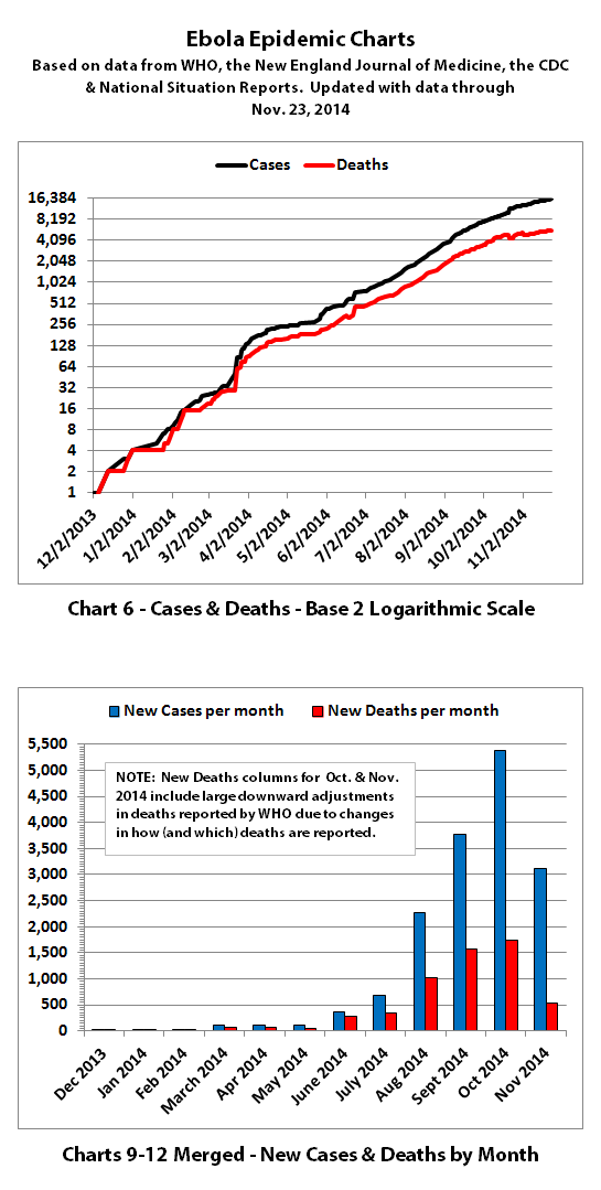
According to WHO, through November 23, 2014 (November 22, 2014 for Liberia), there were:
15,935 reported Ebola cases
5,689 reported Ebola deaths
Liberia released a situation report through November 23rd but too late for the WHO update. With the Liberian November 23rd update, the totals as of November 23, 2014 were:
15,963 reported Ebola cases
5,702 reported Ebola deaths
I have updated the charts with the new data (including the Liberian November 23rd update):
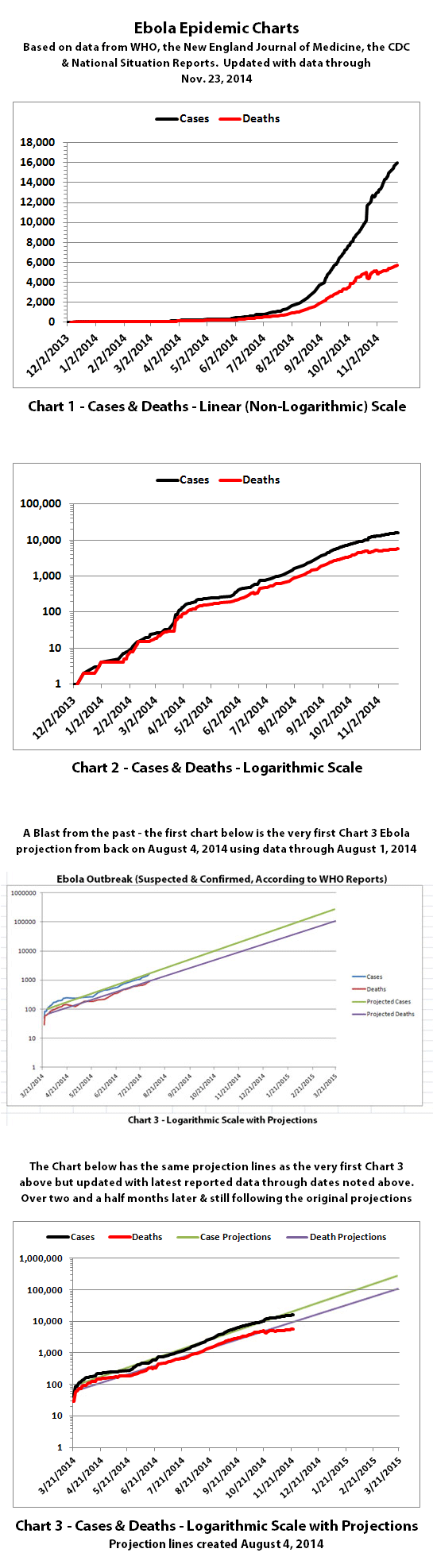
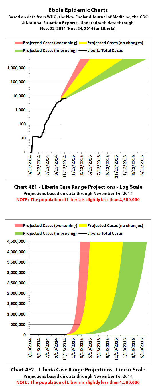
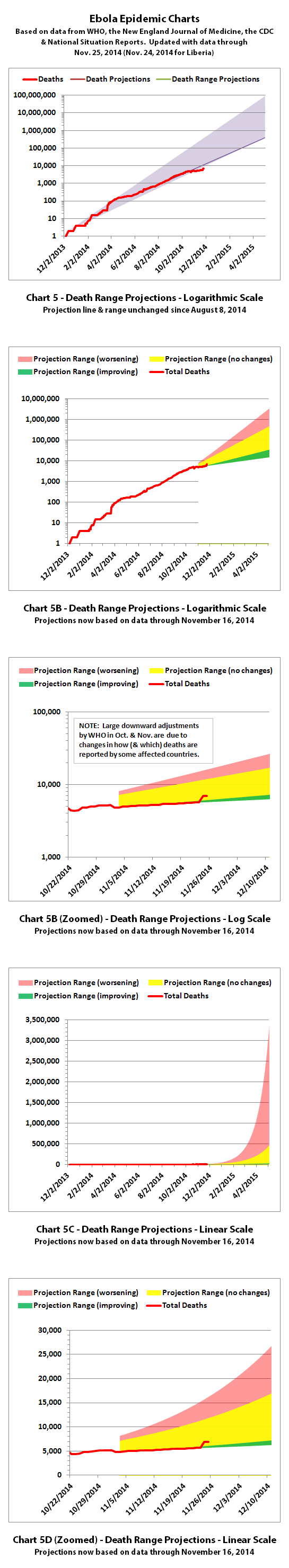
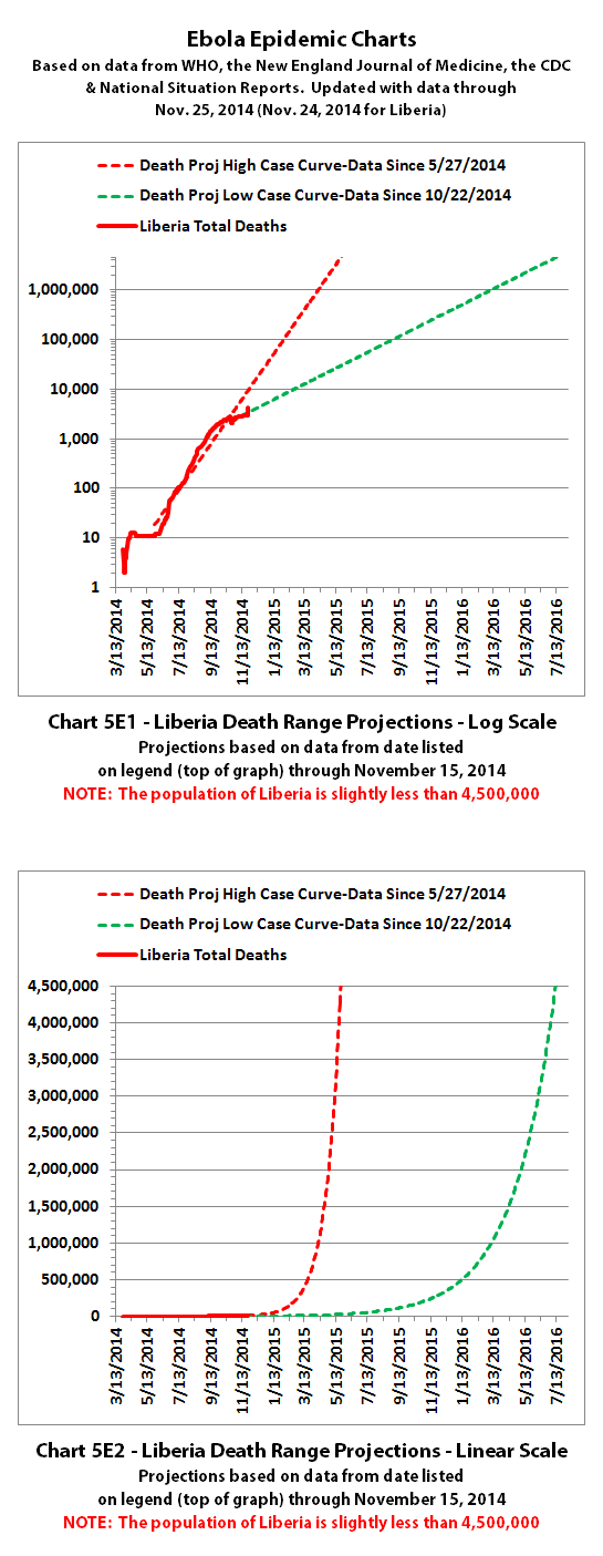
Chart 3 above and charts 4 and 5 below are historical projections. Up until now, the spread of Ebola has followed them very closely. You can see the actual numbers dipping below the historical projections for the first time. Hopefully that will continue.
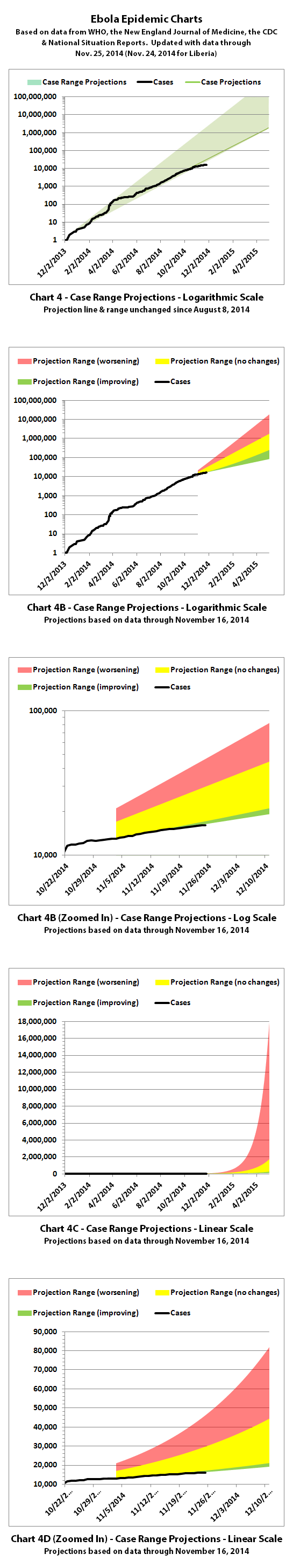
Charts 4B-4E and 5B-5E include the updated projections that were recalculated recently.
For the charts with the color coded ranges, the green range is the projection if the spread continues as it has over recent weeks.
The yellow range would be if it goes back to spreading at the previous faster rates of growth. And the red range is if it spreads more at the worst rates experienced so far during this epidemic.
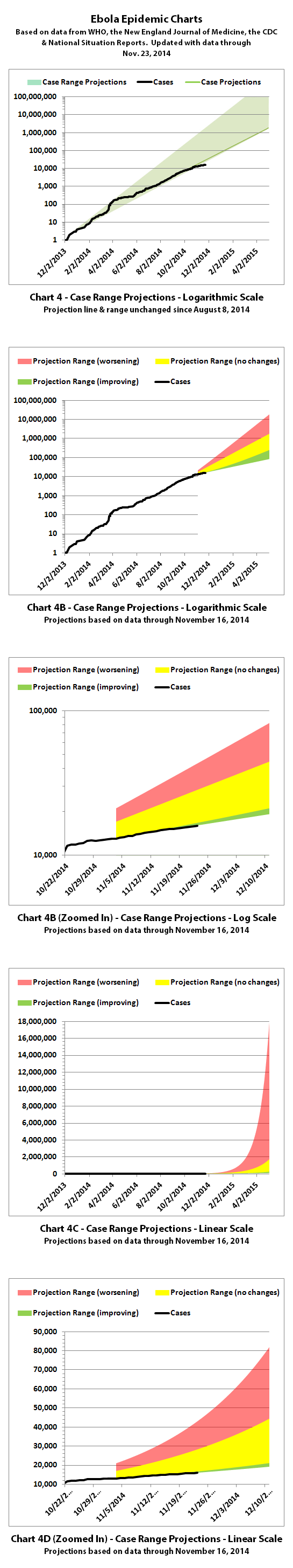

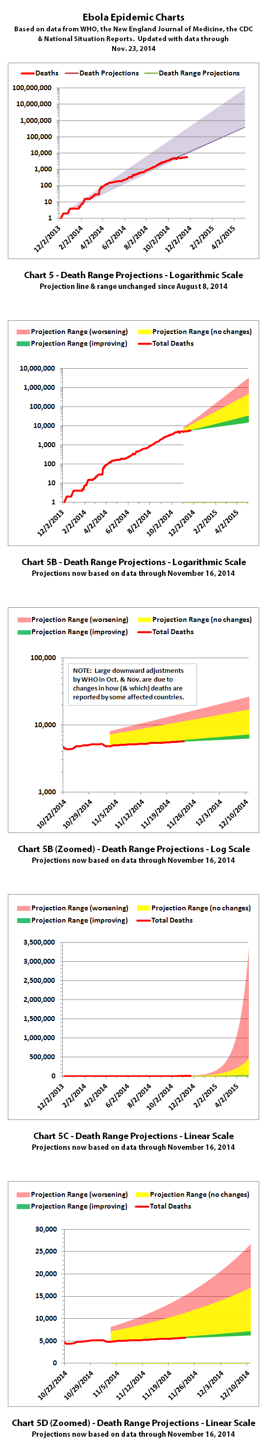
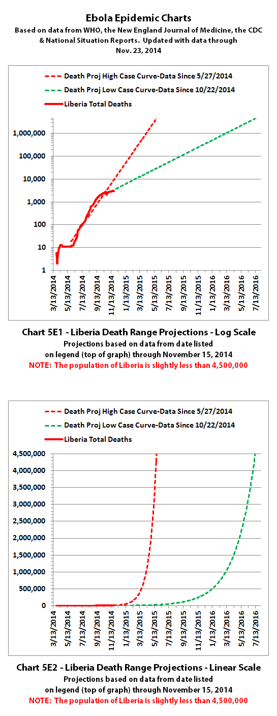
Chart 6 has the y axis in powers of 2 (1, 2, 4, 8, etc.), so it shows at a glance how quickly the epidemic doubles. Charts 7-8 were discontinued a quite a while back.
Charts 9-12 were merged quite a while back as well, and the combined chart shows monthly new cases and deaths. You can see in Charts 9-12 that the epidemic is not growing as quickly so far in November, although the number of new deaths is seriously skewed because of large decreases in total reported deaths.
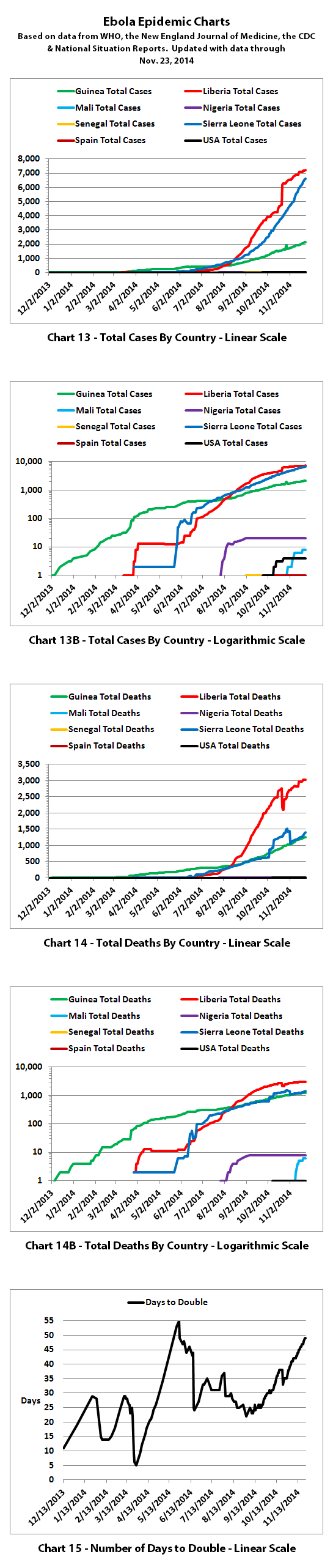
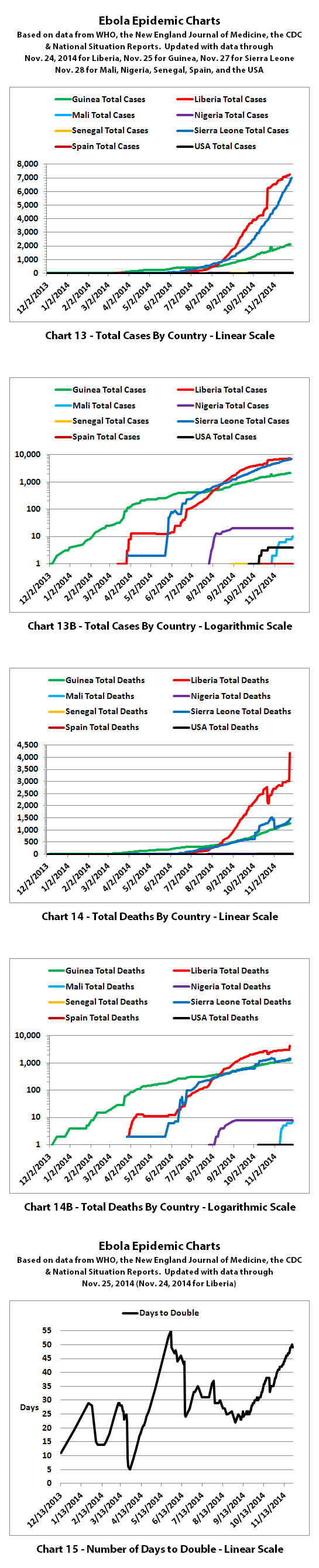
Charts 13-14B show the growth curves by country, and you can see that most of the decrease is in Liberia. Guinea and Sierra Leone continue more or less at close to the same rate.
Chart 15 shows how many days it takes to double for different points in time. Previously cases were doubling every 3 to 4 weeks. Currently, cases are doubling in about 7 weeks.
The numbers do not include the Congo, as that was allegedly an unrelated outbreak and it has now been declared over.
These charts rely on the reported numbers. Reported Ebola data is subject to change as cases and deaths are reclassified, as data sources change, or as reporting methods change.
The charts and projections can only be as accurate as the data they are based on. Please be aware there are a number of possible issues:
1. WHO,the CDC, Doctors Without Borders (MSF), etc. have in the past stated that actual cases and deaths "vastly" outnumber reported figures, possibly by at least 2 to 5 times.
2. There have recently been sudden large decreases in officially reported cases and deaths. It is unclear if this indicates improvement or inability to keep up. A sudden improvement seems unlikely, but let's hope.
3. Some of the countries most affected have clamped down on journalists, in some cases imprisoning journalists and even closing a newspaper. In the USA, Forbes recently reported:
Update: Forbes has since edited the article above and they now link a statement from the Associated Press.
4. There are theories regarding Ebola that differ from the 'official' reports. Some believe there is no such thing as Ebola or that what is spreading is not Ebola. Some believe there is no outbreak at all. Some believe people are purposely being infected for economic or depopulation plans. I do not know if there is any truth to any of these beliefs, it can be a strange world.
The same disclaimers and references apply to all of these charts:
Charts and future projections were done by me, not by WHO, except in cases where it is stated that a chart includes WHO projections. I am not an Ebola expert, epidemiologist, virologist, or MD, but I manually compiled the data used to create these graphs from news updates on the following websites:
SOURCE: WHO website 1
SOURCE: WHO website 2
SOURCE: WHO website 3
SOURCE: WHO website 4
SOURCE: CDC website 1
SOURCE: The New England Journal of Medicine
SOURCE: Guinea Situation Reports (posted on Humanitarian Response)
[NOTE: Situation Reports from Guinea are in French.]
SOURCE: Liberia Situation Reports
Mali Ministry of Sanitation and Hygiene
[NOTE: Situation Reports from Mali are in French.]
SOURCE: Sierra Leone Situation Reports
Please do not do anything you might regret based on charts or projections. Hopefully efforts to contain, quarantine, treat, prevent, or cure Ebola will eventually be successful, and hopefully sooner rather than later.
According to WHO, through November 23, 2014 (November 22, 2014 for Liberia), there were:
15,935 reported Ebola cases
5,689 reported Ebola deaths
Liberia released a situation report through November 23rd but too late for the WHO update. With the Liberian November 23rd update, the totals as of November 23, 2014 were:
15,963 reported Ebola cases
5,702 reported Ebola deaths
I have updated the charts with the new data (including the Liberian November 23rd update):
Chart 3 above and charts 4 and 5 below are historical projections. Up until now, the spread of Ebola has followed them very closely. You can see the actual numbers dipping below the historical projections for the first time. Hopefully that will continue.
Charts 4B-4E and 5B-5E include the updated projections that were recalculated recently.
For the charts with the color coded ranges, the green range is the projection if the spread continues as it has over recent weeks.
The yellow range would be if it goes back to spreading at the previous faster rates of growth. And the red range is if it spreads more at the worst rates experienced so far during this epidemic.
Chart 6 has the y axis in powers of 2 (1, 2, 4, 8, etc.), so it shows at a glance how quickly the epidemic doubles. Charts 7-8 were discontinued a quite a while back.
Charts 9-12 were merged quite a while back as well, and the combined chart shows monthly new cases and deaths. You can see in Charts 9-12 that the epidemic is not growing as quickly so far in November, although the number of new deaths is seriously skewed because of large decreases in total reported deaths.
Charts 13-14B show the growth curves by country, and you can see that most of the decrease is in Liberia. Guinea and Sierra Leone continue more or less at close to the same rate.
Chart 15 shows how many days it takes to double for different points in time. Previously cases were doubling every 3 to 4 weeks. Currently, cases are doubling in about 7 weeks.
The numbers do not include the Congo, as that was allegedly an unrelated outbreak and it has now been declared over.
These charts rely on the reported numbers. Reported Ebola data is subject to change as cases and deaths are reclassified, as data sources change, or as reporting methods change.
The charts and projections can only be as accurate as the data they are based on. Please be aware there are a number of possible issues:
1. WHO,the CDC, Doctors Without Borders (MSF), etc. have in the past stated that actual cases and deaths "vastly" outnumber reported figures, possibly by at least 2 to 5 times.
2. There have recently been sudden large decreases in officially reported cases and deaths. It is unclear if this indicates improvement or inability to keep up. A sudden improvement seems unlikely, but let's hope.
3. Some of the countries most affected have clamped down on journalists, in some cases imprisoning journalists and even closing a newspaper. In the USA, Forbes recently reported:
The Associated Press and other press outlets have agreed not to report on suspected cases of Ebola in the United States until a positive viral RNA test is completed.
Update: Forbes has since edited the article above and they now link a statement from the Associated Press.
4. There are theories regarding Ebola that differ from the 'official' reports. Some believe there is no such thing as Ebola or that what is spreading is not Ebola. Some believe there is no outbreak at all. Some believe people are purposely being infected for economic or depopulation plans. I do not know if there is any truth to any of these beliefs, it can be a strange world.
The same disclaimers and references apply to all of these charts:
Charts and future projections were done by me, not by WHO, except in cases where it is stated that a chart includes WHO projections. I am not an Ebola expert, epidemiologist, virologist, or MD, but I manually compiled the data used to create these graphs from news updates on the following websites:
SOURCE: WHO website 1
SOURCE: WHO website 2
SOURCE: WHO website 3
SOURCE: WHO website 4
SOURCE: CDC website 1
SOURCE: The New England Journal of Medicine
SOURCE: Guinea Situation Reports (posted on Humanitarian Response)
[NOTE: Situation Reports from Guinea are in French.]
SOURCE: Liberia Situation Reports
Mali Ministry of Sanitation and Hygiene
[NOTE: Situation Reports from Mali are in French.]
SOURCE: Sierra Leone Situation Reports
Please do not do anything you might regret based on charts or projections. Hopefully efforts to contain, quarantine, treat, prevent, or cure Ebola will eventually be successful, and hopefully sooner rather than later.
a reply to: ikonoklast
i have lost faith in the official numbers but that is just a personal opinion i have absolutely no wish to derail this thread.
i have lost faith in the official numbers but that is just a personal opinion i have absolutely no wish to derail this thread.
originally posted by: joho99
a reply to: ikonoklast
i have lost faith in the official numbers but that is just a personal opinion i have absolutely no wish to derail this thread.
So have I........ when the Ebola Czar took control the numbers starting getting messed with I believe. It is purely speculation and I could be 100% wrong. That being said it is suspicious timing to say the least. And the OP of this thread is really cool I doubt they would think your comments are trying to derail in any way.
edit on 29-11-2014 by SubTruth because: (no reason given)
edit on 29-11-2014 by SubTruth because:
(no reason given)
a reply to: SubTruth
You can correlate the Ebola Czar to the drop in news and interest www.google.com...=ebola
Just type ebola.
You can correlate the Ebola Czar to the drop in news and interest www.google.com...=ebola
Just type ebola.
edit on 29-11-2014 by joho99 because: (no reason given)
In modern times, deaths from epidemics of communicable diseases tend to follow a relatively sharp bell curve -- a quick rise until the disease is
identified, then as awareness increases, there is fairly rapid decline as several limiting factors arise including the identification and isolation of
infected individuals, self-isolation, quarantine, and the re-focus of resources to treat or develop a cure/vaccine. There is also a self-limiting
factor of infected individuals dying before they can infect other people.
The OP's charts are fine as long as we assume that no one is going to do anything in response to the epidemic. Which is ridiculous. Of course we're going to respond to it. The only real question is how long is it going to take to mobilize the medical response. Since the primary focus of the ebola outbreak is western central Africa, and not a more industrialized area, it may take a little longer. So the resultant bell curve is going to be a little flatter than with some other outbreaks.
But it will happen. It's not going to kill millions of people.
originally posted by: Blue Shift
It's not going to kill millions of people.
Sorry but i have to disagree we know already it is out pacing malaria and lower respiratory infections combined in deaths in mid-September in Liberia and the odds are it is doing the same in Sierra Leone now.
We are been spoon fed data and news to calm us.
edit on 29-11-2014 by joho99 because: (no reason given)
originally posted by: joho99
a reply to: ikonoklast
i have lost faith in the official numbers but that is just a personal opinion i have absolutely no wish to derail this thread.
originally posted by: SubTruth
So have I........ when the Ebola Czar took control the numbers starting getting messed with I believe. It is purely speculation and I could be 100% wrong. That being said it is suspicious timing to say the least. And the OP of this thread is really cool I doubt they would think your comments are trying to derail in any way.
So have I...
Unfortunately, the numbers from WHO, the CDC, and the ministries of health of the most affected countries are pretty much all we have since they put a political/PR fixer in as Ebola Czar in the USA and since some (all?) of the affected countries in Africa have clamped down on journalists reporting on Ebola (restricting access, closing at least one newspaper, jailing at least one journalist, etc.).
Hopefully the 'official' numbers still at least somewhat represent what is going on, but it's really hard to say.
originally posted by: Blue Shift
In modern times, deaths from epidemics of communicable diseases tend to follow a relatively sharp bell curve...
The OP's charts are fine as long as we assume that no one is going to do anything in response to the epidemic. Which is ridiculous. Of course we're going to respond to it. The only real question is how long is it going to take to mobilize the medical response...
So far the projection charts have been quite accurate for almost four months, but I certainly hope they will not hold continue to be accurate long term. That would be catastrophic on a scale that is difficult to imagine.
It should become obvious if and when reported numbers consistently fall below projections. We may be starting to see the beginning of that now, but it's too soon to tell for sure.
It's not going to kill millions of people.
Let's hope not.
Looks like they are playing around with the numbers again.
Number of Ebola infections in west Africa passes 16,000 Death toll from virus outbreak nears 7,000 as World Health Organisation warns figures may be significant underestimation
Number of Ebola infections in west Africa passes 16,000 Death toll from virus outbreak nears 7,000 as World Health Organisation warns figures may be significant underestimation
The number of people with Ebola in west Africa has risen above 16,000, with the death toll from the outbreak reaching almost 7,000, the World Health Organisation (WHO) says. The number of deaths is more than 1,000 higher than the figure issued by the WHO just two days ago, but it is thought to include deaths that have gone unreported in the weeks or months since the outbreak began. Most of the new deaths were recorded in Liberia...........
a reply to: joho99
Yes, there is a very sudden large increase in the reported deaths since their update 2 days before. Between the 23rd and the 24th, Liberia increased the cumulative number of deaths they reported by more than a thousand. But Liberia also reported that they only had 15 new deaths, so it appears to be a reporting correction rather than an actual sudden increase in deaths.
According to this November 28, 2014 WHO Ebola update, through November 25, 2014 (November 24, 2014 for Liberia), there were:
16,203 reported Ebola cases
6,943 reported Ebola deaths
I have updated the charts with the new data. I've also updated updated explanations below the new charts:
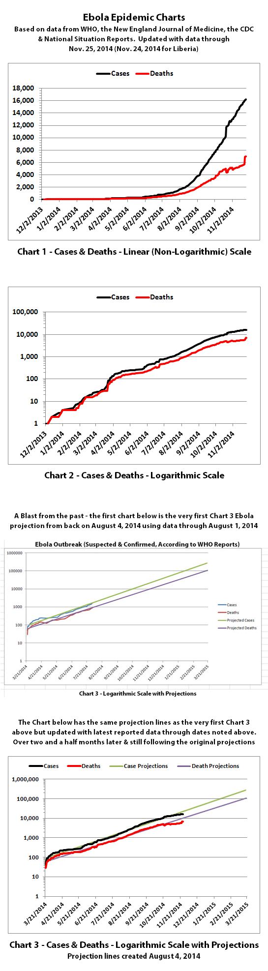
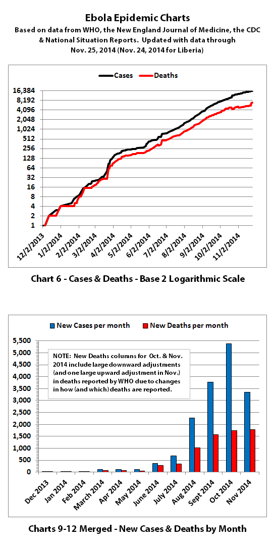
Charts 1, 2, and 6 show the cumulative numbers of reported cases and deaths so far. In Chart 1, the y (left) axis is linear. In Chart 2, the y axis is a logarithmic scale where major divisions of the axis increase by powers of 10 (the base is 10). Chart 6 has the y axis in powers of 2 (the base is 2, so 1, 2, 4, 8, etc.), so each major division represents a doubling of the numbers.
Exponential growth will look like a rapidly escalating curve on a linear scale but like a straight line on a logarithmic scale (base 10 or base 2 in these charts).
Charts 3, 4, and 5 are historical projections. These projections are based on nothing changing to significantly slow or stop the spread of Ebola. Up until now, the increases in cases and deaths have followed these projections very closely. You can now see the actual numbers dipping below the historical projections for the first time. It is unclear yet whether this represents an actual change for the better or problems in collecting or reporting data. But hopefully it is an improvement that will continue.
Charts 4B-4E and 5B-5E include updated projections that were recalculated recently. For the charts with color coded ranges, the green range is the projection if the spread continues as it has over recent weeks if nothing changes.
The yellow range would be if it goes back to spreading at the previous faster rates of growth. And the red range is if it spreads more at the worst rates experienced so far during this epidemic.
Charts 7-8 were discontinued quite a while back.
Charts 9-12 were merged quite a while back as well, and the combined chart shows monthly new cases and deaths reported.
Charts 13-14B show cumulative cases and deaths by country.
Chart 15 shows how many days it has taken for the cumulative number of cases to double over time. Higher points in the chart are good, they mean it is taking longer to double. Lower points are bad, they mean it is doubling faster. Previously cases were often doubling every 3 to 4 weeks. Currently, cases are doubling in about 7 weeks according to the reported numbers.
The numbers in the charts do not include the Congo, as that was allegedly an unrelated outbreak and it has now been declared over.
These charts rely on the 'official' reported numbers and can only be as accurate as the data they are based on. Reported Ebola data is subject to change as cases and deaths are reclassified, as data sources change, or as reporting methods change. I do not know how accurate the 'official' reported numbers are, but please be aware there are a number of possible issues:
1. WHO,the CDC, Doctors Without Borders (MSF), etc. have in the past stated that actual cases and deaths "vastly" outnumber reported figures, possibly by at least 2 to 5 times.
2. There have recently been sudden large decreases in officially reported cases and deaths as well as a large increase in reported deaths. It is unclear whether decreases represent improvements. The decreases and increase may all be due to an inability to keep up with data tracking and recording.
3. Many countries have clamped down on Ebola news. At least one journalist has been arrested and at least one newspaper has been closed in west Africa. In the USA, an 'Ebola Czar' with a reputation as a political/public relations 'fixer' (and with no medical experience) was appointed to lead the US Ebola effort.
4. There are theories regarding Ebola that differ from the 'official' reports. Some believe there is no such thing as Ebola or that what is spreading is not Ebola. Some believe there is no outbreak at all. Some believe people are purposely being infected for economic or depopulation plans. I do not know if there is any truth to any of these beliefs, it can be a strange world.
The same disclaimers and references apply to all of these charts:
Charts and future projections were done by me, not by WHO, except in cases where it is stated that a chart includes WHO projections. I am not an Ebola expert, epidemiologist, virologist, or MD, but I manually compiled the data used to create these graphs from news updates on the following websites:
SOURCE: WHO website 1
SOURCE: WHO website 2
SOURCE: WHO website 3
SOURCE: WHO website 4
SOURCE: WHO website 5
SOURCE: CDC website 1
SOURCE: The New England Journal of Medicine
SOURCE: Guinea Situation Reports (posted on Humanitarian Response)
[NOTE: Situation Reports from Guinea are in French.]
SOURCE: Liberia Situation Reports
Mali Ministry of Sanitation and Hygiene
[NOTE: Situation Reports from Mali are in French.]
SOURCE: Sierra Leone Situation Reports
Please do not do anything you might regret based on charts or projections. Hopefully efforts to contain, quarantine, treat, prevent, or cure Ebola will eventually be successful, and hopefully sooner rather than later.
Looks like they are playing around with the numbers again.
Yes, there is a very sudden large increase in the reported deaths since their update 2 days before. Between the 23rd and the 24th, Liberia increased the cumulative number of deaths they reported by more than a thousand. But Liberia also reported that they only had 15 new deaths, so it appears to be a reporting correction rather than an actual sudden increase in deaths.
According to this November 28, 2014 WHO Ebola update, through November 25, 2014 (November 24, 2014 for Liberia), there were:
16,203 reported Ebola cases
6,943 reported Ebola deaths
I have updated the charts with the new data. I've also updated updated explanations below the new charts:
Charts 1, 2, and 6 show the cumulative numbers of reported cases and deaths so far. In Chart 1, the y (left) axis is linear. In Chart 2, the y axis is a logarithmic scale where major divisions of the axis increase by powers of 10 (the base is 10). Chart 6 has the y axis in powers of 2 (the base is 2, so 1, 2, 4, 8, etc.), so each major division represents a doubling of the numbers.
Exponential growth will look like a rapidly escalating curve on a linear scale but like a straight line on a logarithmic scale (base 10 or base 2 in these charts).
Charts 3, 4, and 5 are historical projections. These projections are based on nothing changing to significantly slow or stop the spread of Ebola. Up until now, the increases in cases and deaths have followed these projections very closely. You can now see the actual numbers dipping below the historical projections for the first time. It is unclear yet whether this represents an actual change for the better or problems in collecting or reporting data. But hopefully it is an improvement that will continue.
Charts 4B-4E and 5B-5E include updated projections that were recalculated recently. For the charts with color coded ranges, the green range is the projection if the spread continues as it has over recent weeks if nothing changes.
The yellow range would be if it goes back to spreading at the previous faster rates of growth. And the red range is if it spreads more at the worst rates experienced so far during this epidemic.
Charts 7-8 were discontinued quite a while back.
Charts 9-12 were merged quite a while back as well, and the combined chart shows monthly new cases and deaths reported.
Charts 13-14B show cumulative cases and deaths by country.
Chart 15 shows how many days it has taken for the cumulative number of cases to double over time. Higher points in the chart are good, they mean it is taking longer to double. Lower points are bad, they mean it is doubling faster. Previously cases were often doubling every 3 to 4 weeks. Currently, cases are doubling in about 7 weeks according to the reported numbers.
The numbers in the charts do not include the Congo, as that was allegedly an unrelated outbreak and it has now been declared over.
These charts rely on the 'official' reported numbers and can only be as accurate as the data they are based on. Reported Ebola data is subject to change as cases and deaths are reclassified, as data sources change, or as reporting methods change. I do not know how accurate the 'official' reported numbers are, but please be aware there are a number of possible issues:
1. WHO,the CDC, Doctors Without Borders (MSF), etc. have in the past stated that actual cases and deaths "vastly" outnumber reported figures, possibly by at least 2 to 5 times.
2. There have recently been sudden large decreases in officially reported cases and deaths as well as a large increase in reported deaths. It is unclear whether decreases represent improvements. The decreases and increase may all be due to an inability to keep up with data tracking and recording.
3. Many countries have clamped down on Ebola news. At least one journalist has been arrested and at least one newspaper has been closed in west Africa. In the USA, an 'Ebola Czar' with a reputation as a political/public relations 'fixer' (and with no medical experience) was appointed to lead the US Ebola effort.
4. There are theories regarding Ebola that differ from the 'official' reports. Some believe there is no such thing as Ebola or that what is spreading is not Ebola. Some believe there is no outbreak at all. Some believe people are purposely being infected for economic or depopulation plans. I do not know if there is any truth to any of these beliefs, it can be a strange world.
The same disclaimers and references apply to all of these charts:
Charts and future projections were done by me, not by WHO, except in cases where it is stated that a chart includes WHO projections. I am not an Ebola expert, epidemiologist, virologist, or MD, but I manually compiled the data used to create these graphs from news updates on the following websites:
SOURCE: WHO website 1
SOURCE: WHO website 2
SOURCE: WHO website 3
SOURCE: WHO website 4
SOURCE: WHO website 5
SOURCE: CDC website 1
SOURCE: The New England Journal of Medicine
SOURCE: Guinea Situation Reports (posted on Humanitarian Response)
[NOTE: Situation Reports from Guinea are in French.]
SOURCE: Liberia Situation Reports
Mali Ministry of Sanitation and Hygiene
[NOTE: Situation Reports from Mali are in French.]
SOURCE: Sierra Leone Situation Reports
Please do not do anything you might regret based on charts or projections. Hopefully efforts to contain, quarantine, treat, prevent, or cure Ebola will eventually be successful, and hopefully sooner rather than later.
A return towards the exponential curve.
Worrying but not unexpected.
Worrying but not unexpected.
Be interesting to see if there is an up tick in coverage again now that Black friday has been and gone.
Regarding the recent increase of over 1000 total deaths from Ebola reported in Liberia (by their Ministry of Health and by WHO),
Reuters is reporting:
I checked and I did not yet see any announcement of this from Liberia's Ministry of Health or WHO yet.
In doing the charts, I have to rely on the 'official' reported numbers because that is all we really have other than speculation. But as noted in the text below all recent chart updates, there are a number of possible reasons to question the accuracy of reported numbers.
A surge in Ebola deaths reported by the World Health Organization at the weekend was due to about 1,000 Liberian deaths wrongly ascribed to the disease that would be removed, WHO assistant director general Bruce Aylward said on Monday.
I checked and I did not yet see any announcement of this from Liberia's Ministry of Health or WHO yet.
In doing the charts, I have to rely on the 'official' reported numbers because that is all we really have other than speculation. But as noted in the text below all recent chart updates, there are a number of possible reasons to question the accuracy of reported numbers.
a reply to: ikonoklast
They seem incompetent or that was a test to see how the public will respond to a 1000 deaths every few days?
I am not sure what one is worse lol
They seem incompetent or that was a test to see how the public will respond to a 1000 deaths every few days?
I am not sure what one is worse lol
a reply to: joho99
Lol, I wondered if maybe someone in Liberia forgot they were supposed to reduce the numbers before reporting them and no one caught it until it became a big news story, then they fixed it today.
But then again it could have been incompetence, or a test, or just a simple typo, or perhaps something else we haven't thought of. Unfortunately, I don't think it's possible to know. WHO did issue another file with the new numbers though, and I'll be posting the updated charts in a moment.
new topics
-
TLDR post about ATS and why I love it and hope we all stay together somewhere
General Chit Chat: 13 minutes ago -
Hate makes for strange bedfellows
US Political Madness: 2 hours ago -
Who guards the guards
US Political Madness: 5 hours ago -
Has Tesla manipulated data logs to cover up auto pilot crash?
Automotive Discussion: 6 hours ago -
whistleblower Captain Bill Uhouse on the Kingman UFO recovery
Aliens and UFOs: 11 hours ago
top topics
-
Hate makes for strange bedfellows
US Political Madness: 2 hours ago, 12 flags -
CIA botched its handling of sexual assault allegations, House intel report says
Breaking Alternative News: 16 hours ago, 11 flags -
whistleblower Captain Bill Uhouse on the Kingman UFO recovery
Aliens and UFOs: 11 hours ago, 10 flags -
Who guards the guards
US Political Madness: 5 hours ago, 8 flags -
1980s Arcade
General Chit Chat: 13 hours ago, 6 flags -
Teenager makes chess history becoming the youngest challenger for the world championship crown
Other Current Events: 15 hours ago, 4 flags -
Deadpool and Wolverine
Movies: 14 hours ago, 4 flags -
Has Tesla manipulated data logs to cover up auto pilot crash?
Automotive Discussion: 6 hours ago, 2 flags -
TLDR post about ATS and why I love it and hope we all stay together somewhere
General Chit Chat: 13 minutes ago, 1 flags
active topics
-
TLDR post about ATS and why I love it and hope we all stay together somewhere
General Chit Chat • 1 • : network dude -
The Fight for Election Integrity Continues -- Audits, Criminal Investigations, Legislative Reform
2024 Elections • 4140 • : IndieA -
SC Jack Smith is Using Subterfuge Tricks with Donald Trumps Upcoming Documents Trial.
Dissecting Disinformation • 103 • : Vermilion -
Hate makes for strange bedfellows
US Political Madness • 18 • : network dude -
Candidate TRUMP Now Has Crazy Judge JUAN MERCHAN After Him - The Stormy Daniels Hush-Money Case.
Political Conspiracies • 689 • : matafuchs -
Russia Ukraine Update Thread - part 3
World War Three • 5714 • : stu119 -
How ageing is" immune deficiency"
Medical Issues & Conspiracies • 27 • : RookQueen2 -
whistleblower Captain Bill Uhouse on the Kingman UFO recovery
Aliens and UFOs • 14 • : alldaylong -
"We're All Hamas" Heard at Columbia University Protests
Social Issues and Civil Unrest • 234 • : KrustyKrab -
IDF Intel Chief Resigns Over Hamas attack
Middle East Issues • 42 • : TheWoker