It looks like you're using an Ad Blocker.
Please white-list or disable AboveTopSecret.com in your ad-blocking tool.
Thank you.
Some features of ATS will be disabled while you continue to use an ad-blocker.

Ebola - my visual charts & projections based on WHO data
page: 1share:
There are a lot of threads on various aspects of the current Ebola outbreak - so many that it's hard to picture just how fast Ebola is (or isn't)
really spreading. To get a better picture and to see what kind of projections could be made, I created three charts using data I manually compiled
from periodic updates from the World Health Organization (WHO).
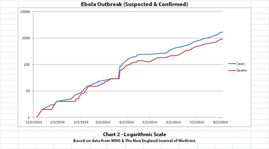
The results are pretty interesting, and a bit scary. I thought others might be interested in seeing these, too. Chart 1 and Chart 2 show the number of cases and the number of deaths for the Ebola outbreak that have been reported to WHO.
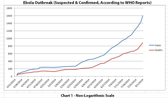
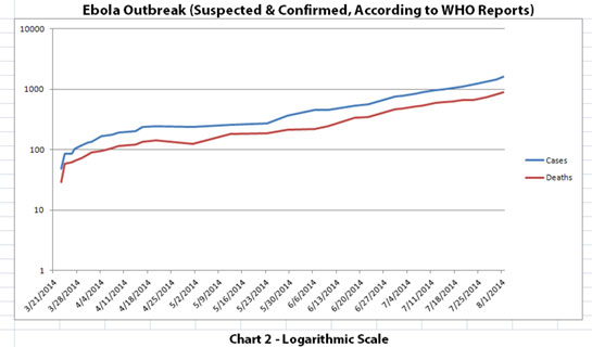
The y-axis scales are different in these graphs. In Chart 1, the y-axis is linear. In Chart 2, the y-axis is a logarithmic scale where divisions of the axis increase by powers of 10. Logarithmic scales can sometimes make a rate of progression much more clear. For example, a rapidly escalating curve may actually be a pretty straight line increase (but at a geometric rate) when viewed on a logarithmic scale.
I suspected that the spread of an epidemic like the Ebola outbreak might look more like such a straight line on a logarithmic scale. And (at least to me) that's what Chart 2 indicates.
The data used is from the news updates on these WHO sites:
SOURCE: WHO website 1
SOURCE: WHO website 2
NOTE: The WHO data used includes both laboratory-confirmed and suspected cases as reported to WHO by the affected countries in Africa.
If the trend that is pretty obvious in Chart 2 was to continue to spread at this rate without slowing down, you can make some seat-of-the-pants projections just by extending the lines. That's what Chart 3 shows... and it is scary, especially if you imagine it continuing even further at that rate.
Chart 3 has future projections that hopefully will NOT happen. Actual data was only available through August 1, 2014.
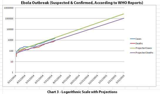
I want to stress that hopefully the trend will NOT continue as projected in Chart 3. Hopefully things like travel restrictions, quarantines, possible vaccines, treatments, or just nature will limit (and ideally halt) the spread.
The results are pretty interesting, and a bit scary. I thought others might be interested in seeing these, too. Chart 1 and Chart 2 show the number of cases and the number of deaths for the Ebola outbreak that have been reported to WHO.
The y-axis scales are different in these graphs. In Chart 1, the y-axis is linear. In Chart 2, the y-axis is a logarithmic scale where divisions of the axis increase by powers of 10. Logarithmic scales can sometimes make a rate of progression much more clear. For example, a rapidly escalating curve may actually be a pretty straight line increase (but at a geometric rate) when viewed on a logarithmic scale.
I suspected that the spread of an epidemic like the Ebola outbreak might look more like such a straight line on a logarithmic scale. And (at least to me) that's what Chart 2 indicates.
The data used is from the news updates on these WHO sites:
SOURCE: WHO website 1
SOURCE: WHO website 2
NOTE: The WHO data used includes both laboratory-confirmed and suspected cases as reported to WHO by the affected countries in Africa.
If the trend that is pretty obvious in Chart 2 was to continue to spread at this rate without slowing down, you can make some seat-of-the-pants projections just by extending the lines. That's what Chart 3 shows... and it is scary, especially if you imagine it continuing even further at that rate.
Chart 3 has future projections that hopefully will NOT happen. Actual data was only available through August 1, 2014.
I want to stress that hopefully the trend will NOT continue as projected in Chart 3. Hopefully things like travel restrictions, quarantines, possible vaccines, treatments, or just nature will limit (and ideally halt) the spread.
a reply to: ikonoklast
Thank you for taking the time to make these possible projection charts. Visuals have so much more of an impact than mere words. S&F
Do you mind if I copy your charts over to another thread doing research on ebola?
Des
Thank you for taking the time to make these possible projection charts. Visuals have so much more of an impact than mere words. S&F
Do you mind if I copy your charts over to another thread doing research on ebola?
Des
a reply to: Destinyone
You're welcome. Please feel free to copy them to the other thread if you would like, but I recommend a disclaimer on Chart 3 like what I put on it. I think people should know what's going on, but I hate to scare anyone too much with highly theoretical projections that hopefully will not happen.
You're welcome. Please feel free to copy them to the other thread if you would like, but I recommend a disclaimer on Chart 3 like what I put on it. I think people should know what's going on, but I hate to scare anyone too much with highly theoretical projections that hopefully will not happen.
originally posted by: ikonoklast
Hopefully things like travel restrictions, quarantines, possible vaccines, treatments, or just nature will limit (and ideally halt) the spread.
*Pats OP on the head*
You're adorable.
What I find concerning about the logarithmic analysis is the fact that it - the ebola - is increasing in efficacy as time passes. When we typically
see this type of a pattern it's often tracking how effectively an entity - a person, a business, a trend - LEARNS. It takes into account that
reaching a goal on day 2,000 should be significantly easier than it was on day one. Just looking at the raw numbers, it's possible this thing is
mutating on top of spreading.
But on the flip-side, what's also intriguing is that as the virus potentially evolves, so does human immunity. We're keeping up, more or less.
Your charts are the most disturbing ebola-related news I've read so far. Pass the bourbon.
But on the flip-side, what's also intriguing is that as the virus potentially evolves, so does human immunity. We're keeping up, more or less.
Your charts are the most disturbing ebola-related news I've read so far. Pass the bourbon.
a reply to: Destinyone
Thanks, Des, and you're welcome. For those who haven't seen it, I'm guessing Des is probably referring to the excellent thread: Ebola Patient In Atlanta Hospital
Thanks, Des, and you're welcome. For those who haven't seen it, I'm guessing Des is probably referring to the excellent thread: Ebola Patient In Atlanta Hospital
originally posted by: Eunuchorn
originally posted by: ikonoklast
Hopefully things like travel restrictions, quarantines, possible vaccines, treatments, or just nature will limit (and ideally halt) the spread.
*Pats OP on the head*
You're adorable.
LOL, maybe half adorable, half terrified, but not necessarily wanting to yell fire in a crowded theater.
Very nicely pieced together data.. and now I think I need an aspirin as I feel uncomfortable with the possibilities.
I came across this in an article on Bloomberg. It includes an interview by Bloomberg White House correspondent Phil Mattingly with the Liberian Vice President under this heading: "Ebola Outbreak unlike anything before, Liberian VP
Aug. 4 (Bloomberg) -- The Ebola outbreak in West Africa has already killed more than 700 people. Liberian Vice President Joseph Boakai spoke with Bloomberg White House correspondent Phil Mattingly about the Ebola crisis in Liberia, one of the three countries at the heart of the outbreak. (Source: Bloomberg)
the video interview is eye-opening ...
a reply to: ikonoklast
Very good work ikon, as des said visuals work wonders
I also second your thoughts on chat #3.
I star very few and flag even less you got both
Very good work ikon, as des said visuals work wonders
I also second your thoughts on chat #3.
I star very few and flag even less you got both
edit on 4-8-2014 by hillbilly4rent because: (no reason given)
Very nice data in a well thought out format. I think a lot of folks are trying to down play the spread of the virus and how it can be transmitted to
humans. In my opinion this is a serious threat and should be treated with caution. My heart goes out to the health workers trying to treat those
infected and putting their lives at risk as well.
Thanks for the visual!
s&f
The worst case is a terrible scenario. I'm thinking that with this new top secret super experimental "cure" they suddenly came up with, you might see those numbers fall. I hope anyways.
There is no doubt the world is ripe and ready for some sort of major epidemic outbreak, and Ebola was always one of the worries. It certainly is out of control at the moment.
I think it will stay contained for the most part in Africa.
Here is to positive thought and optimism!
The outbreak will be over within 6 months....
*crosses fingers*
I'm glad the visuals are helpful for people, you're welcome and thanks for all the feedback. To be honest, I was kind of hoping the thread would
get shot down and some of ATS's patron saints (or resident naysayers) would have really logical reasons why the projections in Chart 3 won't
happen.
The video interview is eye-opening, thanks. My impression was in the beginning the Liberian VP was saying what he really thought about the seriousness of the situation. Then Mattingly put him on the defensive questioning why more wasn't done by the government of Liberia early on and wanting to know when the situation would be contained, how Liberia would overcome corruption, etc. After that, the Liberian VP went instantly into full political-speak mode.
I find it interesting that there is suddenly such a new top secret super experimental cure to Ebola and that it seems to have come out of nowhere and was never tried until now. But that's probably the best hope since I read this in another thread:
That pretty much tells you quarantine and containment aren't going to work (at least in Africa), which leaves experimental cures and vaccines, divine intervention, or good luck I guess.
originally posted by: JohnnyAnonymous
...interview by Bloomberg White House correspondent Phil Mattingly with the Liberian Vice President under this heading: "Ebola Outbreak unlike anything before, Liberian VP
...the video interview is eye-opening ...
The video interview is eye-opening, thanks. My impression was in the beginning the Liberian VP was saying what he really thought about the seriousness of the situation. Then Mattingly put him on the defensive questioning why more wasn't done by the government of Liberia early on and wanting to know when the situation would be contained, how Liberia would overcome corruption, etc. After that, the Liberian VP went instantly into full political-speak mode.
originally posted by: Darkblade71
The worst case is a terrible scenario. I'm thinking that with this new top secret super experimental "cure" they suddenly came up with, you might see those numbers fall. I hope anyways.
I find it interesting that there is suddenly such a new top secret super experimental cure to Ebola and that it seems to have come out of nowhere and was never tried until now. But that's probably the best hope since I read this in another thread:
originally posted by: soficrow
Unfortunately, epidemic containment depends on "contact tracing" - finding everyone in contact with an infected victim... but... The city of Monrovia, Liberia, has 3 teams for contact tracing, but only one working vehicle. The other two vehicles aren't working - one is broken and there's no fuel for the other one...
That pretty much tells you quarantine and containment aren't going to work (at least in Africa), which leaves experimental cures and vaccines, divine intervention, or good luck I guess.
a reply to: chasingbrahman
The logarithmic scale is one that makes sense for Ebola spreading because the more it spreads, the more carriers there are. I never thought of it before. Ebola has some traits that make it harder to contain, such as it being highly infectious and non-curable.
It might be able to be kept out of civilized areas due to better quarantine procedures in them, but in Africa, I would suspect the logarithmic rate of infections to continue unless outside help from the West comes in the help contain the outbreak.
There are three major airports in cities that have been overtaken by the Ebola outbreak. That means that some travelers could make it out of Africa and come in contact with a few others from the West, I think it already happened once or twice, although nothing was transmitted as far as I know.
If that increases though, then I suspect to see some strain on the West's containment protocols.
a reply to: JohnnyAnonymous
Total now killed by this virus is now at over 850 according to the skynews:
Hospitals and airports around the world are on alert for anyone showing signs of the incurable virus that has now killed 887 people in West Africa.
and Nice charts OP. 100k by end of Jan 2015. Lets hope not.
Total now killed by this virus is now at over 850 according to the skynews:
Hospitals and airports around the world are on alert for anyone showing signs of the incurable virus that has now killed 887 people in West Africa.
and Nice charts OP. 100k by end of Jan 2015. Lets hope not.
edit on CDTTue, 05 Aug 2014 06:44:06 -0500u3106x106x1 by TruthxIsxInxThexMist
because: (no reason given)
Finally British Airways have suspended Flights until the end of this Month and will be monitoring the situation to see if that will be extended.
Unfortunately, they aren't the only Airline to fly there from London so lets hope the others follow suit.
Good News. But at the same time someone in Wales has admitted themselves to Hospital as they fear they may have come into contact with the virus while they were over in Western Africa. Lets hope not although the person was thinking of others and stayed at home.
news.sky.com...
Good News. But at the same time someone in Wales has admitted themselves to Hospital as they fear they may have come into contact with the virus while they were over in Western Africa. Lets hope not although the person was thinking of others and stayed at home.
news.sky.com...
edit on CDTTue, 05 Aug 2014 13:34:42 -0500u3101x142x1 by
TruthxIsxInxThexMist because: (no reason given)
I found some additional data about the early stages of the current Ebola outbreak (starting with the presumed first patient!) in The New England
Journal of Medicine. In addition, the World Health Organization (WHO) has issued an updated report. I've added all of this new data into the charts
and updated everything. Originally there was a little more than 4 months of data. Now there is a little more than 9 months of data.
As with the original charts, Chart 1 and Chart 2 show the number of cases and the number of deaths for the Ebola outbreak that have been reported. In Chart 1, the y-axis is linear. In Chart 2, the y-axis is a logarithmic scale where divisions of the axis increase by powers of 10.
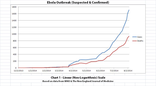
Click for a larger version of Chart 1
Click for a larger version of Chart 2
The data used is from the news updates on the following WHO and The New England Journal of Medicine websites:
SOURCE: WHO website 1
SOURCE: WHO website 2
SOURCE: The New England Journal of Medicine
Chart 3 has future projections that hopefully will NOT happen. Actual data was only available through August 4, 2014, but I had more than twice as many months of data so I projected out a bit further. Kind of wish I hadn't, it's scary.
Chart 3
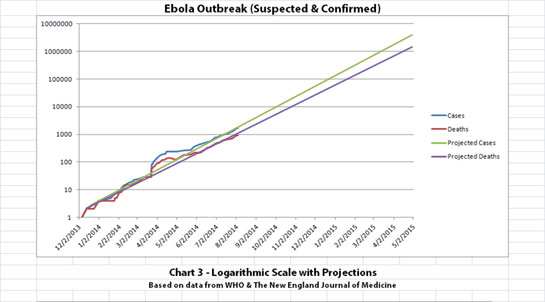
Click for a larger version of Chart 3
I again want to stress that hopefully the trend will NOT continue as projected in Chart 3. Hopefully things like travel restrictions, quarantines, possible vaccines, treatments, or just nature will limit (and ideally halt) the spread.
As with the original charts, Chart 1 and Chart 2 show the number of cases and the number of deaths for the Ebola outbreak that have been reported. In Chart 1, the y-axis is linear. In Chart 2, the y-axis is a logarithmic scale where divisions of the axis increase by powers of 10.
Click for a larger version of Chart 1
Click for a larger version of Chart 2
The data used is from the news updates on the following WHO and The New England Journal of Medicine websites:
SOURCE: WHO website 1
SOURCE: WHO website 2
SOURCE: The New England Journal of Medicine
Chart 3 has future projections that hopefully will NOT happen. Actual data was only available through August 4, 2014, but I had more than twice as many months of data so I projected out a bit further. Kind of wish I hadn't, it's scary.
Chart 3
Click for a larger version of Chart 3
I again want to stress that hopefully the trend will NOT continue as projected in Chart 3. Hopefully things like travel restrictions, quarantines, possible vaccines, treatments, or just nature will limit (and ideally halt) the spread.
edit on 6-8-2014 by ikonoklast because: Hit reply before finished...
edit on 6-8-2014 by ikonoklast because: Hit the reply key
too soon previously...
new topics
-
Are you ready for the return of Jesus Christ? Have you been cleansed by His blood?
Religion, Faith, And Theology: 1 hours ago -
Chronological time line of open source information
History: 3 hours ago -
A man of the people
Diseases and Pandemics: 4 hours ago -
Ramblings on DNA, blood, and Spirit.
Philosophy and Metaphysics: 4 hours ago -
4 plans of US elites to defeat Russia
New World Order: 6 hours ago -
Thousands Of Young Ukrainian Men Trying To Flee The Country To Avoid Conscription And The War
Other Current Events: 9 hours ago
top topics
-
Israeli Missile Strikes in Iran, Explosions in Syria + Iraq
World War Three: 13 hours ago, 17 flags -
Iran launches Retalliation Strike 4.18.24
World War Three: 12 hours ago, 6 flags -
Thousands Of Young Ukrainian Men Trying To Flee The Country To Avoid Conscription And The War
Other Current Events: 9 hours ago, 6 flags -
12 jurors selected in Trump criminal trial
US Political Madness: 12 hours ago, 4 flags -
4 plans of US elites to defeat Russia
New World Order: 6 hours ago, 2 flags -
A man of the people
Diseases and Pandemics: 4 hours ago, 2 flags -
Chronological time line of open source information
History: 3 hours ago, 2 flags -
Ramblings on DNA, blood, and Spirit.
Philosophy and Metaphysics: 4 hours ago, 1 flags -
Are you ready for the return of Jesus Christ? Have you been cleansed by His blood?
Religion, Faith, And Theology: 1 hours ago, 1 flags
active topics
-
4 plans of US elites to defeat Russia
New World Order • 27 • : andy06shake -
Israeli Missile Strikes in Iran, Explosions in Syria + Iraq
World War Three • 69 • : YourFaceAgain -
ChatGPT Beatles songs about covid and masks
Science & Technology • 22 • : iaylyan -
The Acronym Game .. Pt.3
General Chit Chat • 7730 • : RAY1990 -
Biden--My Uncle Was Eaten By Cannibals
US Political Madness • 51 • : YourFaceAgain -
Are you ready for the return of Jesus Christ? Have you been cleansed by His blood?
Religion, Faith, And Theology • 8 • : RAY1990 -
Thousands Of Young Ukrainian Men Trying To Flee The Country To Avoid Conscription And The War
Other Current Events • 12 • : ScarletDarkness -
So I saw about 30 UFOs in formation last night.
Aliens and UFOs • 33 • : Encia22 -
Two Serious Crimes Committed by President JOE BIDEN that are Easy to Impeach Him For.
US Political Madness • 18 • : xuenchen -
12 jurors selected in Trump criminal trial
US Political Madness • 34 • : Vermilion