It looks like you're using an Ad Blocker.
Please white-list or disable AboveTopSecret.com in your ad-blocking tool.
Thank you.
Some features of ATS will be disabled while you continue to use an ad-blocker.

Earthquake swarm in Northern nevada..
page: 2share:
Thanks for the heads up guys, i never really did think about that.. but does make sense to not mention any future travel plans... i will defin keep
this in mind for security purposes.. like i said.. not one sight of wildlife out there... no lizards.. birds.. and defin no antelope or deer... just
pure nothingness
edit on 01/04/2009 by steve95988 because: (no reason given)
So the swarm continues in NW nevada.... But most recently a swarm seems to now be occurring just south of MT Lassen in Northern Cali... The biggest
being a 3.9 so far... This activity is pretty damn close to the volcano.. within a cpl miles if that.. chk it..
lassen
edit on 01/04/2009 by steve95988 because: (no reason given)
I want to join others in thanking you for
going out with a camera and really being there.
We can speculate about what things must be like
until the cows come home, but actually packing up ang going,
is really cool. And although you didn't pick up any seismicity
you get an A++ for effort and thoroughness .
going out with a camera and really being there.
We can speculate about what things must be like
until the cows come home, but actually packing up ang going,
is really cool. And although you didn't pick up any seismicity
you get an A++ for effort and thoroughness .
a reply to: steve95988
Like other citizens here on ATS, I would like to extend my thanks to you for keeping an eye on this and actually following up with a field trip.
Since the 12th there have been another 38 quakes of various sizes.
I've put together a few charts of the activity since it started in July, and the results are interesting. But, I want to add the activity of the last two days before I post them.
Thanks!
Dex
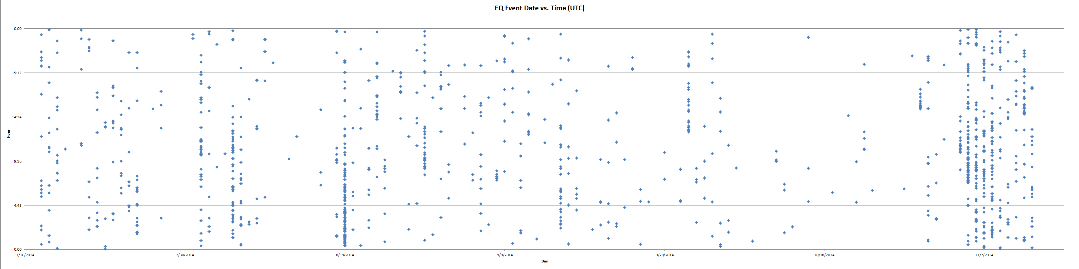
Here is some interesting info concerning the Northern NV EQ swarm:
Note that these plots are of all earth quakes, not just those above 2.0. I initially thought that these quakes were just random events over time. However, it appears that there are definite groupings of events, as well as relative quiet periods.
Click on the image to see the full size plot.
This is the scatter plot showing the events plotted as day vs. time:
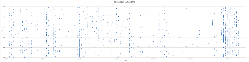 Note that there are several days where the swarm of
quakes are sequential. Then there are periods of relative calm where there are no, or very few small events. Note the extreme increase of events
within the last 2 weeks.
Note that there are several days where the swarm of
quakes are sequential. Then there are periods of relative calm where there are no, or very few small events. Note the extreme increase of events
within the last 2 weeks.
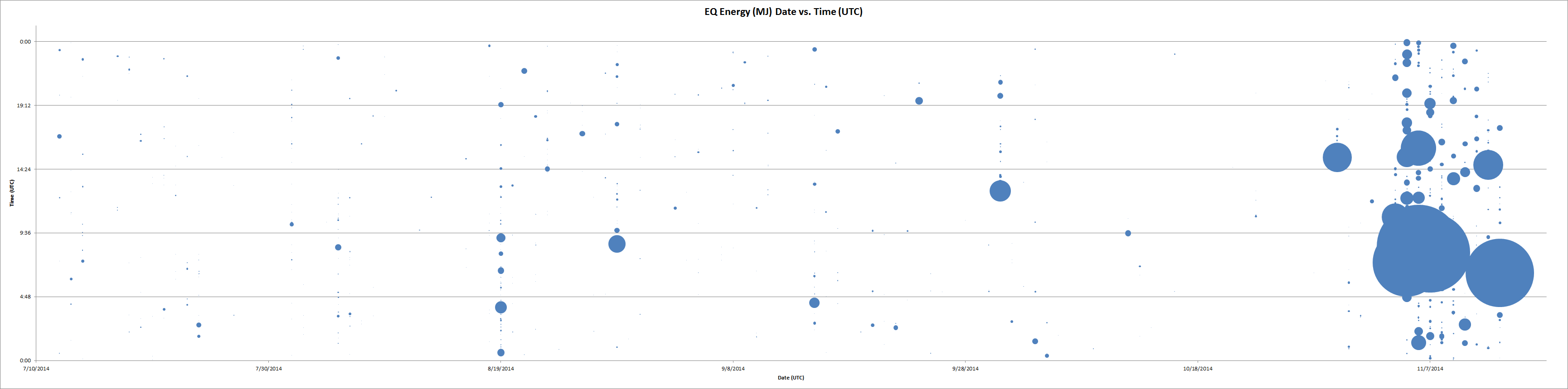
This scatter plot shows the magnitude of the earth quakes plotted as day vs. time.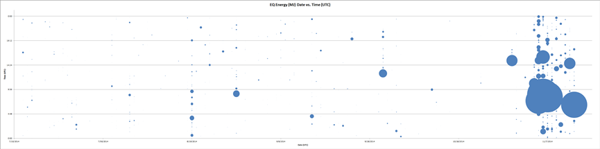 The magnitude is represented by the size of the bubble.
Note that this magnitude has been converted from the standard Richter magnitude scale to mega-joules in order to more accurately represent the size of
the quakes relative to the others in the swarm. Note that many of the smaller quakes which are indicated in the event scatter plot above are either
very tiny, or not visible at all. Also note the increase in size of the events over the last couple of weeks.
The magnitude is represented by the size of the bubble.
Note that this magnitude has been converted from the standard Richter magnitude scale to mega-joules in order to more accurately represent the size of
the quakes relative to the others in the swarm. Note that many of the smaller quakes which are indicated in the event scatter plot above are either
very tiny, or not visible at all. Also note the increase in size of the events over the last couple of weeks.
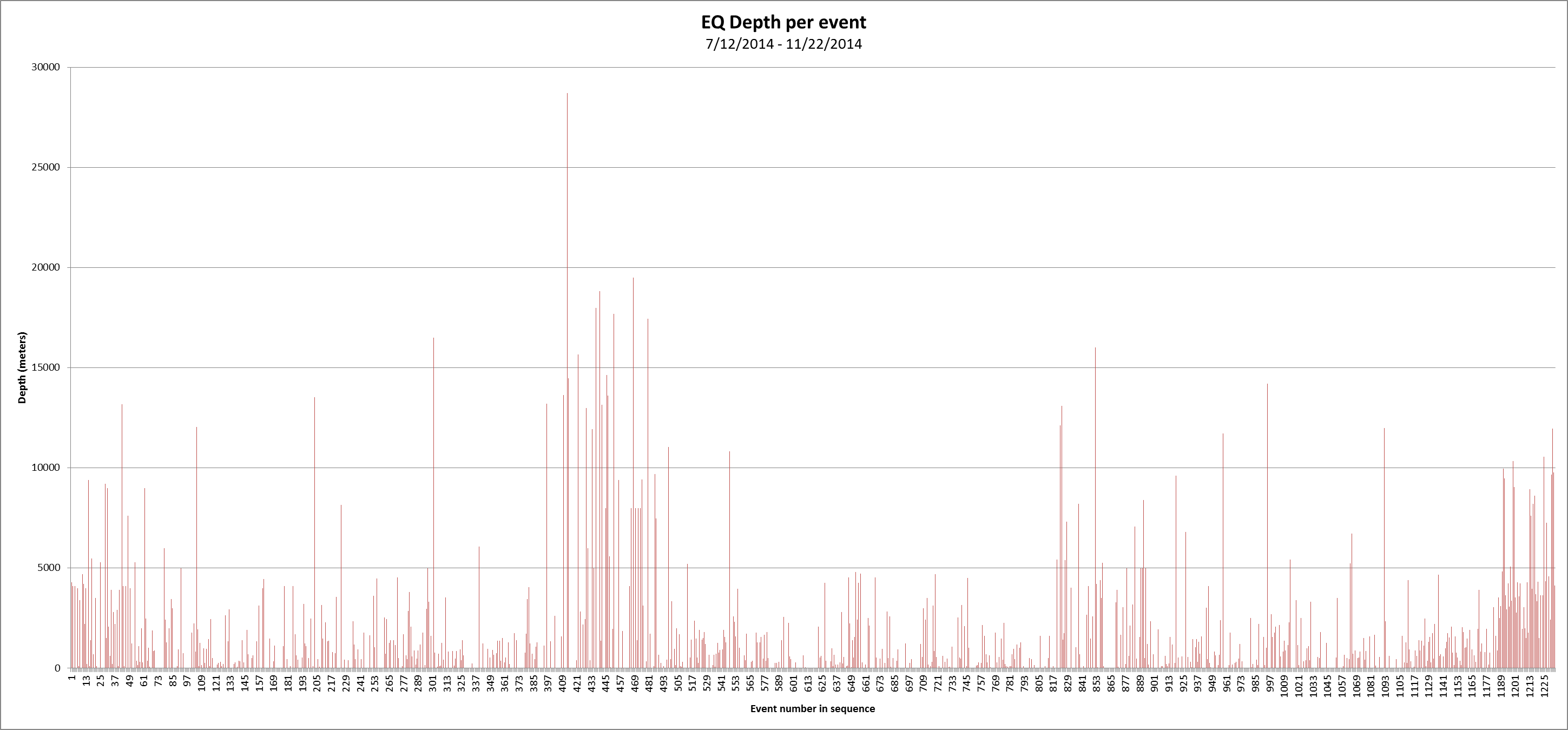
This bar chart represents the magnitudes of the quakes relative to one another plotted as a sequential series irrespective of when they occured.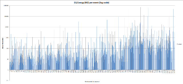 Note that this chart indicates the events as a function
of their mega-joule energy and is presented in a logarithmic scale. Again, notice the increase of event magnitude within the last month or so.
Note that this chart indicates the events as a function
of their mega-joule energy and is presented in a logarithmic scale. Again, notice the increase of event magnitude within the last month or so.
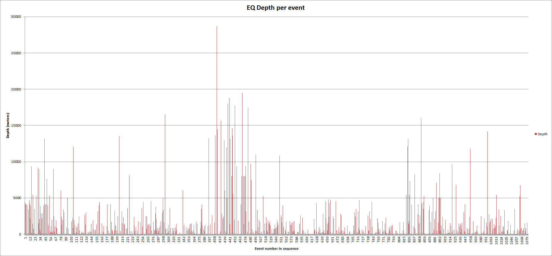
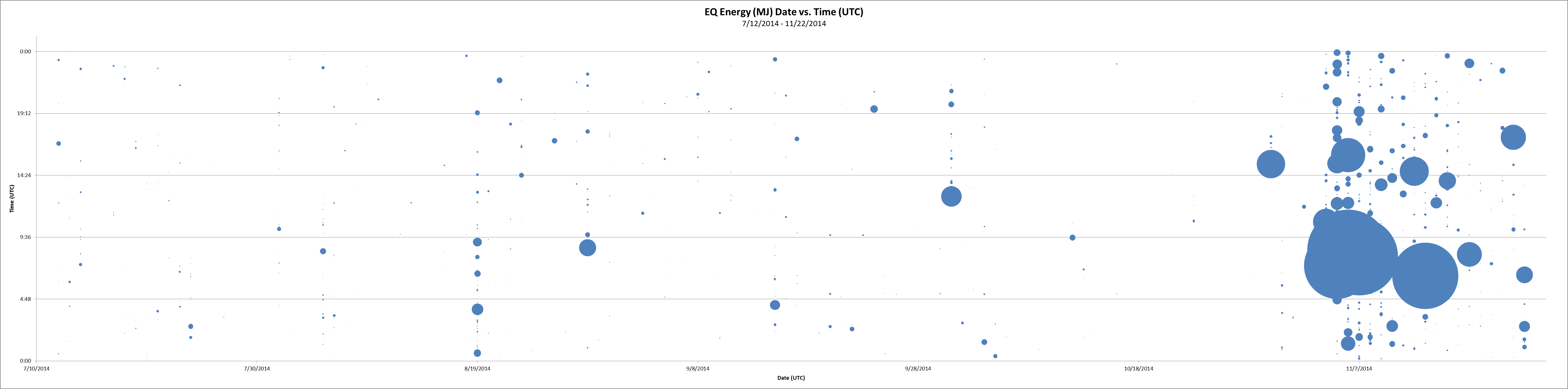
This bar chart represents the depth of the EQ events in meters.
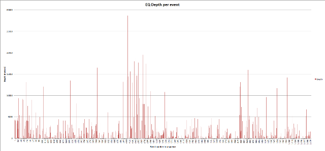 It is interesting to note that many of the Earth quake
events are listed as being at a depth of 0 km. It is also of interest that the depth of the events around the end of August increased before
returning to a shallower depth for the balance of the swarm. However, though it does not display the same grouping, there is a trend of incresing EQ
depth toward the end of the swarm as plotted here. This would also coincide with the increase in magnitude displayed in the other plots above.
It is interesting to note that many of the Earth quake
events are listed as being at a depth of 0 km. It is also of interest that the depth of the events around the end of August increased before
returning to a shallower depth for the balance of the swarm. However, though it does not display the same grouping, there is a trend of incresing EQ
depth toward the end of the swarm as plotted here. This would also coincide with the increase in magnitude displayed in the other plots above.
Please note that I am a relative neophyte with respect to EQ analysis. However, one might come to the conclusion that the increase in both the temporal density and event energy release might be predictive of a larger event in the near future.
All of the above graphics are free to use for both private and public use within the terms and conditions established by the AboveTopSecret.com website.
Dex
Note that these plots are of all earth quakes, not just those above 2.0. I initially thought that these quakes were just random events over time. However, it appears that there are definite groupings of events, as well as relative quiet periods.
Click on the image to see the full size plot.
This is the scatter plot showing the events plotted as day vs. time:
This scatter plot shows the magnitude of the earth quakes plotted as day vs. time.
This bar chart represents the magnitudes of the quakes relative to one another plotted as a sequential series irrespective of when they occured.

This bar chart represents the depth of the EQ events in meters.
Please note that I am a relative neophyte with respect to EQ analysis. However, one might come to the conclusion that the increase in both the temporal density and event energy release might be predictive of a larger event in the near future.
All of the above graphics are free to use for both private and public use within the terms and conditions established by the AboveTopSecret.com website.
Dex
Thanks to everyone giving the positive reinforcement... It was a fun trip... like i said before... wish i had more info to bring back to everyone... i
guess the professionals are out there now.. talking to the locals... which are only a few scattered about the area... 4.6 hit the other night... its
still continuing.. the swarm that is..
Just a lil quick update.. this area seemed to be quieting down a tad.. but they just had a 4.0 today.. about 9am this morning..so this area is still
somewhat active.. i still believe this is connected to a future bigger quake along the west coast... how big or where at, i have no idea.. just a
strange feeling about it all.
a reply to: steve95988
Last night Linda Moulton Howe was on coasttocoastam.com radio show and she is really focusing on the situation in Northern Nevada and California. People there are hearing the low, rumbling trumpet sounds as well as seeing amber and red lights over the area that morph like lava lamps. Here's a link to her site, earthfiles.com. I'd copy and paste part of her article and interviews here but her site does not allow that. Fascinating read:
www.earthfiles.com...
STM
a reply to: seentoomuch
Thanks for that link. It provides a lot more context to the Northern Nevada EQ swarm issue.
In reading the article, one thing that stood out to me was the changing nature of the hot springs, particularly with respect to the temperature differences measured on a day-to-day basis. One theory I remember seeing at some point in this thread was that the EQ activity was related to subsurface water movement.
If the water is migrating from one of the aquifers, where it has a lower temperature, to one of the active geyser zones, I could imagine that for a brief time the surface water emissions could cool for a short time until the new effluent could be merged into the existing hot water reservoir.
It seems to me that both the thermal and hydraulic expansion caused by the subsurface water migration could exacerbate the earthquake swarm phenomena. And in so doing could create a positive feedback loop. The increased water migration related to the EQ activity could cause more geological instability, thus increasing the water migration volume and further increasing the instability.
At some point, a large EQ event would be perpetuated as an attempt by the system to come back into equilibrium.
You indicated that Linda Moulton Howe's website did not permit copying content, even if it is properly sourced. Is that part of the T&C of the site? How would one ordinarily know about this limitation?
dex
a reply to: DexterRiley
I tried to copy and paste a few paragraphs, highlighted them blue, and when I clicked on the "copy" option a box popped up and read that this function is disabled. Perhaps it's my computer acting up, so give it a go and see if it works for you.
And yes, the hot springs going cold, then hot, then normal caught my attention too. You've got an interesting theory with the water migration. I'm not an expert in that field at all but it does make good common sense in my mind.
Keep up the good work y'all,
STM
edit on 22-11-2014 by seentoomuch because: (no reason given)
I listened to Linda interview locals played on Coast to Coast about this ongoing situation as well.
Something interesting that hadn't been mentioned I don't think in the thread before - hundreds of people have had hundreds of sightings of ORBS for years in that area, which drastically slowed just before the EQ's started up in July.
The orbs would appear shortly after the rumbling noises started.
The orbs were not planes, helicopters, stars, satellites etc. They would appear in numbers up to 70 at a time. White ones and amber ones. White ones sometimes appeared to calve off amber ones. They would hover, rise up at impossible speeds etc.
This is one of the few genuine ongoing mysteries we have in the world, most talked about on here have happened in the past or are just one-offs, I think if more members knew all the details of what is happening around these "quakes" this would be one of the top threads on ATS.
Here is the Coast to Coast episode in which these orbs, rumbling and quakes are talked about; to hear the owner of the Hot Springs resort talk about his experience with the orbs, rumbling and quakes go to about 43 mins in, to hear the reporter from the Cedarville Reporter talk about the same go to about 1hr 5mins in.
edit on 22-11-2014 by PlanetXisHERE because: spelling
edit on 22-11-2014 by PlanetXisHERE because: epiphany
Here are a few of the pics the REPORTER took of the orbs, remember, these orbs have been seen hundreds of times by hundreds of people in the area, I
think they were all in timelapse:
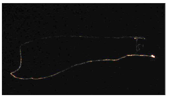
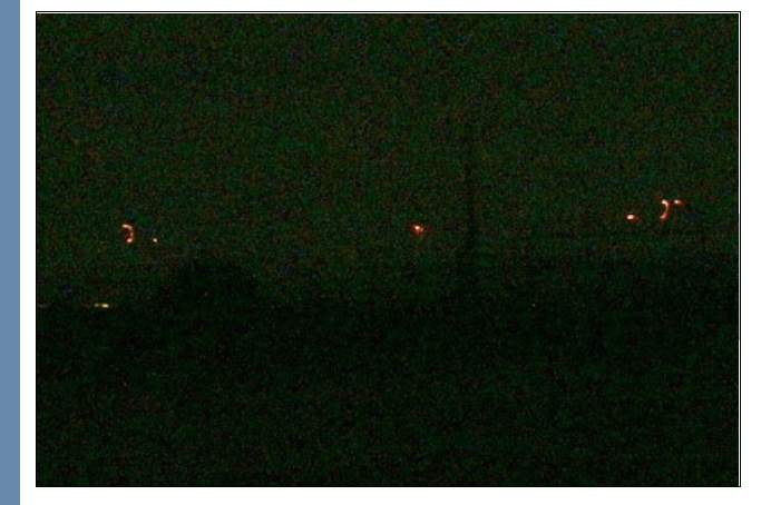
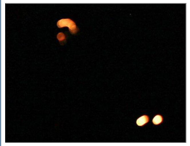
Courtesy of Earthfiles.com
Link to the Earthfiles page
I know some of you don't like Linda Moulton Howe, personally I have no feeling any way and am just looking at what she is reporting on. Please don't trot out that old logical fallacy of attacking her and ignoring the evidence. That kind of argument just shows you are either a) ignorant, or b) part of the obvious coverup.
a reply to: seentoomuch
I was a able to reproduce the "Function Disabled" popup when I highlighted and right-clicked some text in the Earthfiles.com website article. However, I was able to use the keyboard CTRL-C option to copy the text. So, it is possible to copy the text of the article. I did not encounter the same problem in other places outside of an actual article, like the main page of the site.
When I went to the contact page, I found some text that indicated that no content from the site could be reproduced without the express written consent of the Earthfiles.com. However, the T&C page indicates that Subscribers can include some information for presentation purposes as long as the copyright statement:
So, I don't know what the correct answer is. However, if the author indicates that content from her site cannot be reproduced ad hoc, then doing so violates the T&C of our beloved community here on ATS. Perhaps someone can contact her and get a decision one way or the other.
dex
I was a able to reproduce the "Function Disabled" popup when I highlighted and right-clicked some text in the Earthfiles.com website article. However, I was able to use the keyboard CTRL-C option to copy the text. So, it is possible to copy the text of the article. I did not encounter the same problem in other places outside of an actual article, like the main page of the site.
When I went to the contact page, I found some text that indicated that no content from the site could be reproduced without the express written consent of the Earthfiles.com. However, the T&C page indicates that Subscribers can include some information for presentation purposes as long as the copyright statement:
is displayed prominently. Although there is a paid subscription process, the article in question appears to be available without a subscription.
© 1999-2014 by Reporter and Editor Linda Moulton Howe
So, I don't know what the correct answer is. However, if the author indicates that content from her site cannot be reproduced ad hoc, then doing so violates the T&C of our beloved community here on ATS. Perhaps someone can contact her and get a decision one way or the other.
dex
a reply to: PlanetXisHERE
I'm with you on that. I'm more interested in the message than the messenger. As long as her interviews are not fabrications, and I have no reason to believe they are, I will make my judgement based on the evidence provided.
****************
It is interesting that the appearances of the "orbs" seem to have diminished since the onset of the EQ swarm. As I recall, it is usually the opposite. In most cases the earthquake lights precede an earthquake rather than the opposite. Of course that is assuming these are your typical EQ lights. However, there appear to be a number of extenuating circumstances involved in this case, so the disappearance of the orbs may be more telling than their appearance in other situations.
dex
I know some of you don't like Linda Moulton Howe, personally I have no feeling any way and am just looking at what she is reporting on. Please don't trot out that old logical fallacy of attacking her and ignoring the evidence. That kind of argument just shows you are either a) ignorant, or b) part of the obvious coverup.
I'm with you on that. I'm more interested in the message than the messenger. As long as her interviews are not fabrications, and I have no reason to believe they are, I will make my judgement based on the evidence provided.
****************
It is interesting that the appearances of the "orbs" seem to have diminished since the onset of the EQ swarm. As I recall, it is usually the opposite. In most cases the earthquake lights precede an earthquake rather than the opposite. Of course that is assuming these are your typical EQ lights. However, there appear to be a number of extenuating circumstances involved in this case, so the disappearance of the orbs may be more telling than their appearance in other situations.
dex
I've updated the charts to show the new USGS data since 11/13/2014.
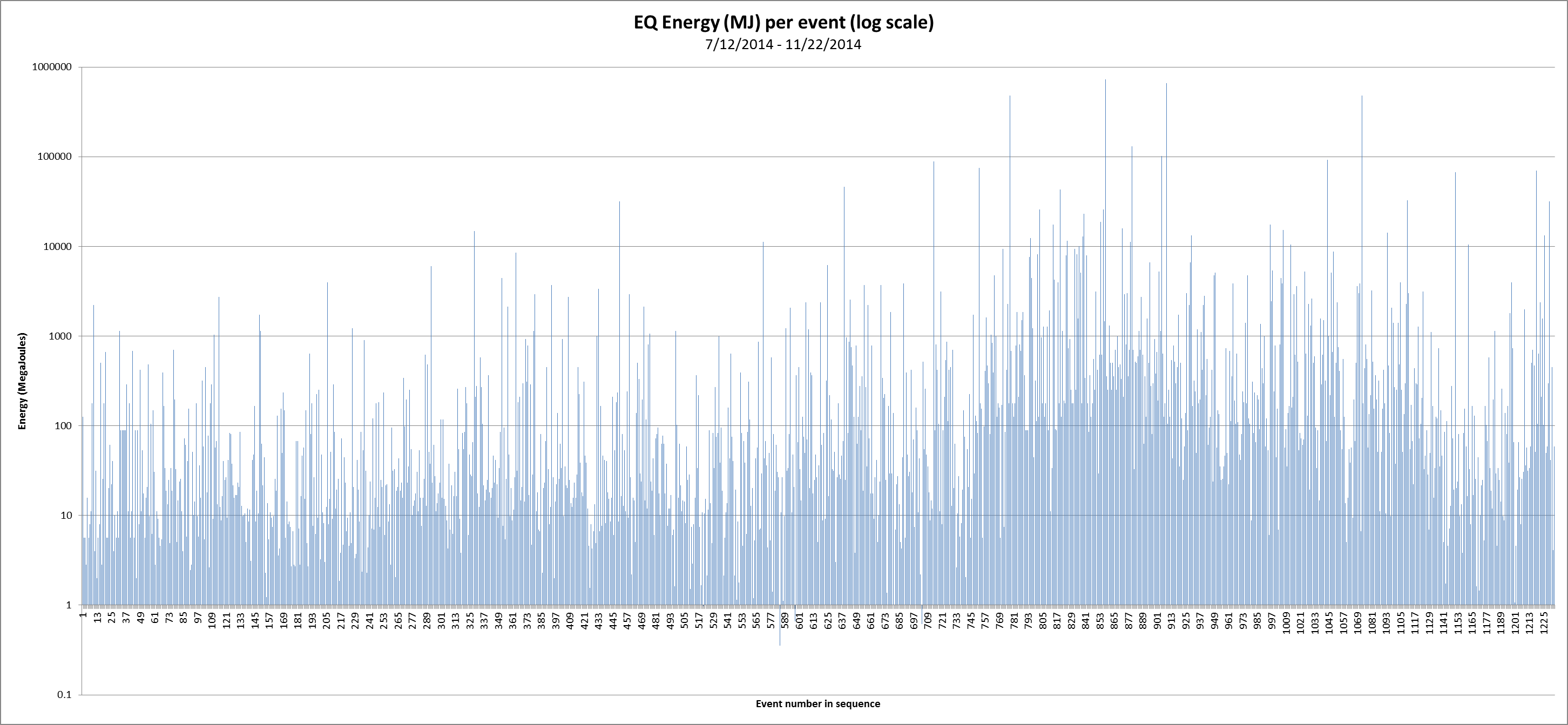 Energy per event graph
Slight increase in energy after a brief lull.
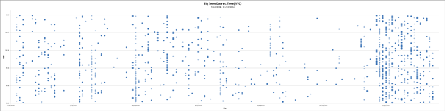 Event scatter plot
Continued frequency of events.
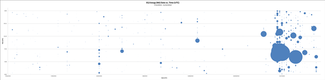 Energy per event scatter plot
Slight increase in energy after a brief lull.
 Depth per event graph
General increase of average depth of 5km to 10km
Summary:
After a brief lull in the energy of the earthquakes, it appears to be increasing again. The number of events and frequency seems to be consistent with the previous summary. The increase in earthquake depth seems to be the biggest difference from the previous summary.
I'll try to update these graphics from time-to-time as the EQ event swarm continues.
dex

Slight increase in energy after a brief lull.

Continued frequency of events.
Slight increase in energy after a brief lull.

General increase of average depth of 5km to 10km
Summary:
After a brief lull in the energy of the earthquakes, it appears to be increasing again. The number of events and frequency seems to be consistent with the previous summary. The increase in earthquake depth seems to be the biggest difference from the previous summary.
I'll try to update these graphics from time-to-time as the EQ event swarm continues.
dex
new topics
-
An Apology From the Dunderbeck Sausage Company
Music: 15 minutes ago -
Tucker on Joe Rogan talking Kona Blue and UFOs
Aliens and UFOs: 51 minutes ago -
Remember These Attacks When President Trump 2.0 Retribution-Justice Commences.
2024 Elections: 1 hours ago -
Predicting The Future: The Satanic Temple v. Florida
Conspiracies in Religions: 1 hours ago -
WF Killer Patents & Secret Science Vol. 1 | Free Energy & Anti-Gravity Cover-Ups
General Conspiracies: 3 hours ago -
Hurt my hip; should I go see a Doctor
General Chit Chat: 4 hours ago -
Israel attacking Iran again.
Middle East Issues: 5 hours ago -
Michigan school district cancels lesson on gender identity and pronouns after backlash
Education and Media: 5 hours ago -
When an Angel gets his or her wings
Religion, Faith, And Theology: 6 hours ago -
Comparing the theology of Paul and Hebrews
Religion, Faith, And Theology: 7 hours ago
top topics
-
The Democrats Take Control the House - Look what happened while you were sleeping
US Political Madness: 11 hours ago, 18 flags -
In an Historic First, In N Out Burger Permanently Closes a Location
Mainstream News: 13 hours ago, 16 flags -
Biden says little kids flip him the bird all the time.
Politicians & People: 11 hours ago, 9 flags -
Man sets himself on fire outside Donald Trump trial
Mainstream News: 11 hours ago, 9 flags -
WF Killer Patents & Secret Science Vol. 1 | Free Energy & Anti-Gravity Cover-Ups
General Conspiracies: 3 hours ago, 7 flags -
Michigan school district cancels lesson on gender identity and pronouns after backlash
Education and Media: 5 hours ago, 7 flags -
Pentagon acknowledges secret UFO project, the Kona Blue program | Vargas Reports
Aliens and UFOs: 8 hours ago, 6 flags -
Remember These Attacks When President Trump 2.0 Retribution-Justice Commences.
2024 Elections: 1 hours ago, 5 flags -
Israel attacking Iran again.
Middle East Issues: 5 hours ago, 5 flags -
Boston Dynamics say Farewell to Atlas
Science & Technology: 8 hours ago, 4 flags
active topics
-
Are you ready for the return of Jesus Christ? Have you been cleansed by His blood?
Religion, Faith, And Theology • 22 • : glend -
Predicting The Future: The Satanic Temple v. Florida
Conspiracies in Religions • 7 • : randomuser2034 -
Tucker on Joe Rogan talking Kona Blue and UFOs
Aliens and UFOs • 1 • : NoCorruptionAllowed -
An Apology From the Dunderbeck Sausage Company
Music • 0 • : TheMichiganSwampBuck -
Comparing the theology of Paul and Hebrews
Religion, Faith, And Theology • 1 • : glend -
MULTIPLE SKYMASTER MESSAGES GOING OUT
World War Three • 56 • : cherokeetroy -
Hurt my hip; should I go see a Doctor
General Chit Chat • 12 • : tarantulabite1 -
Remember These Attacks When President Trump 2.0 Retribution-Justice Commences.
2024 Elections • 13 • : xuenchen -
Man sets himself on fire outside Donald Trump trial
Mainstream News • 43 • : Vermilion -
Israel attacking Iran again.
Middle East Issues • 28 • : KrustyKrab