It looks like you're using an Ad Blocker.
Please white-list or disable AboveTopSecret.com in your ad-blocking tool.
Thank you.
Some features of ATS will be disabled while you continue to use an ad-blocker.

New Ways of Seeing the World We Live
page: 14
share:
I spent my morning looking at the country, some of us live in, and in the end wanted to better understand my relationship to it. I found some
beautiful modern renditions about the world we live from many different angles.
Race is my personal favorite, I find the images amazing!
Sunlight Foundation: New Ways of Visualizing
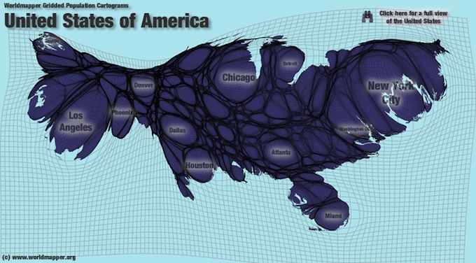
And here is a more modern take on density in the USA:
And next it's race, which I find the most beautiful of them all. Go look at your area if listed!
And here are some other cool charts:
I find this last crime interactive map VERY revealing! (Probably will spend more time on this then any of the rest)
Trulia Crime Maps
I hope you enjoyed these maps and images as much as I did this morning.
Have fun, happy mothers day to all the mom's out there!
TTYS. . . AB
Race is my personal favorite, I find the images amazing!
Sunlight Foundation: New Ways of Visualizing
POPULATION DENSITY
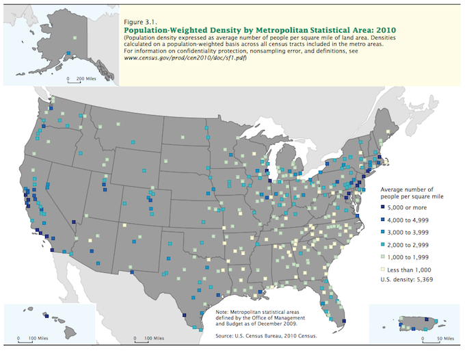
1 -- This 2010 U.S. Census map, from a report about population change, shows population-weighted density by metropolitan statistical area. That's a complicated way of essentially saying the map shows how tightly packed people are on average in metropolitan areas, as defined by the U.S. Census Bureau. The map shows how people generally are more condensed in metropolitan areas along the East and West coasts than they are in metropolitan areas in the middle of the country.
And here is a more modern take on density in the USA:
POPULATION CHANGE
2 -- Population can also be visualized by how it is changing. Where are people moving to and from? Looking at U.S. population growth rings in this map from Data Pointed reveals a few trends: the rise of the suburbs contrasted with the repopulation of some urban centers. Taking a closer look at some of the urban areas reveals that while many people are moving out of cities in favor of the suburban life, some people are also choosing to move into the heart of cities.
POPULATION
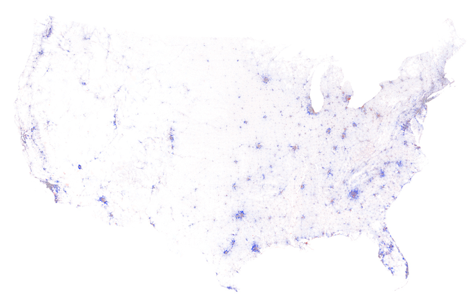
3 -- This Census Dotmap by Brandon Martin-Anderson represents each person counted in the 2010 U.S. Census and the 2011 Canadian Census with one dot. That's 341,817,095 dots. (The U.S. population in 2010, according to the Census, was more than 308 million.) The Dotmap is an interesting way of visualizing where people live -- and where they don't. The map shows some of the major urban centers of the country, and the lack of people in other areas highlights the boundaries of natural features like deserts, lakes, and mountains.
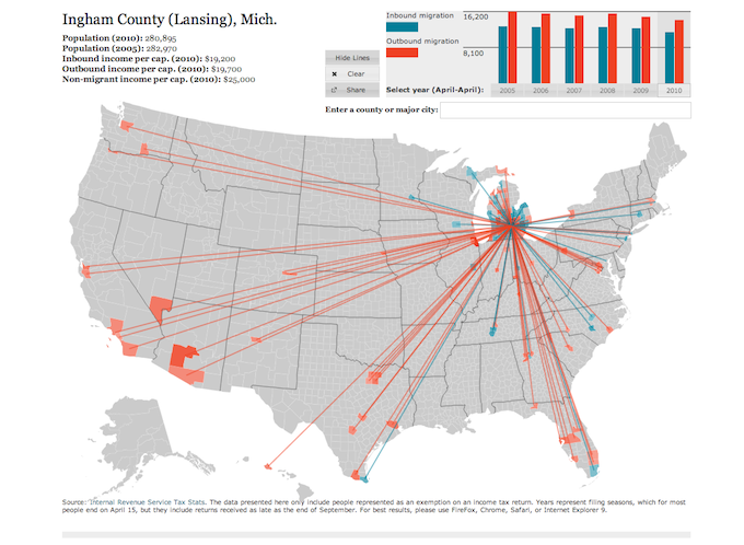
Forbes: Interactive Migration Map
MIGRATION
4 -- We can also understand places by tracking how people move between them. Forbes created an interactive visualization that tracks inbound and outbound migration by county and year using IRS tax stats. It gives some clues about what areas of the country are becoming more (or less) popular destinations for living.
Link to Interactive Map Showing Income Desparity
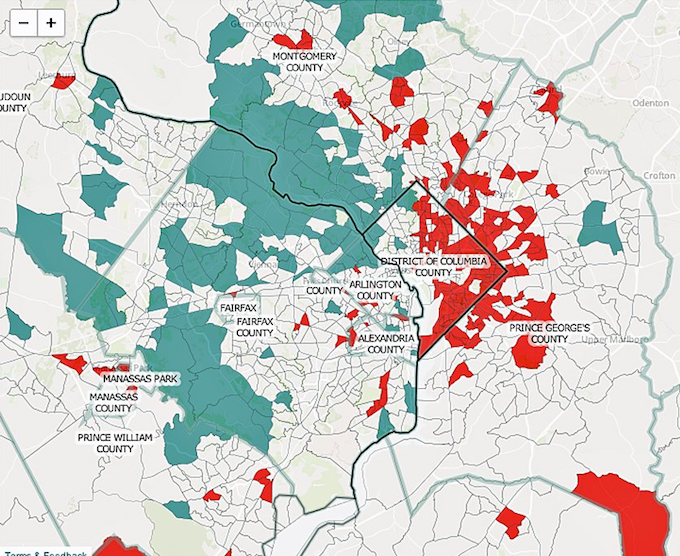
INCOME DISPARITY
5 -- There are lots of socioeconomic factors we can use to help understand the complexity and diversity of places. Pew Social Trends created an interactive map showing income disparity in the top 10 most populated metro areas. The Pew Research Center found an increasing number of metropolitan areas are segregated by income. The District of Columbia and the surrounding states provide one stark example. The blue shows upper income, tan shows middle or mixed income, and red shows lower income.
And next it's race, which I find the most beautiful of them all. Go look at your area if listed!
Flicker: Race and Ethnicity by City
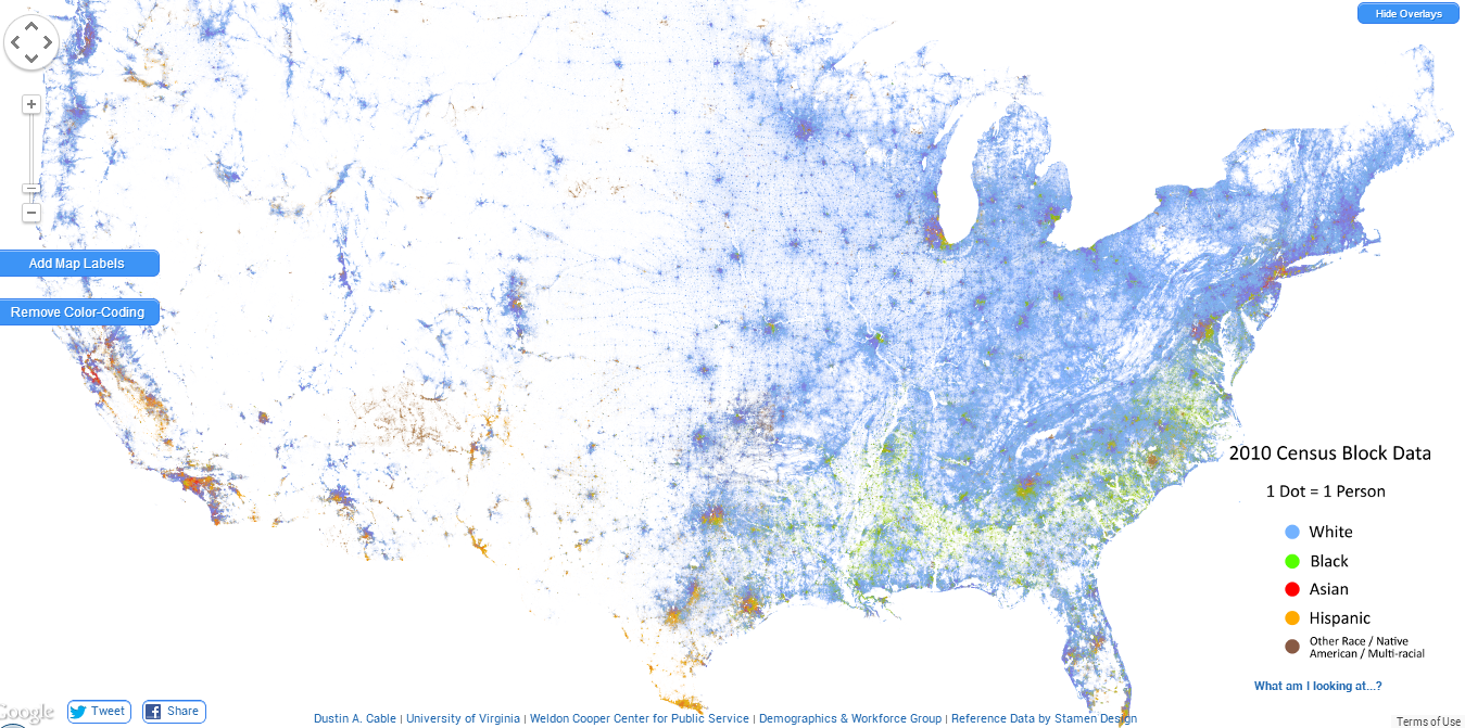
RACE
6 -- Segregation isn't limited to factors like income. Eric Fischer used data from the 2000 Census to create a series of maps showing the racial makeup of various cities. The city of Detroit and its suburbs have clear lines of segregation when we look at them with the overlay of race.
And here are some other cool charts:
I find this last crime interactive map VERY revealing! (Probably will spend more time on this then any of the rest)
Trulia Crime Maps
I hope you enjoyed these maps and images as much as I did this morning.
Have fun, happy mothers day to all the mom's out there!
TTYS. . . AB
edit on 5/10/2014 by AnteBellum because: spellin'
Scared me for a second, I almost called my mother haha. Mother's day is tomorrow.
But you sure are thorough, thanks for a well researched post. There's a lot to take in so ill get back to it.
But you sure are thorough, thanks for a well researched post. There's a lot to take in so ill get back to it.
Great thread. Maps have always been a great overview of what America is about. (You got me....I'm a map nerd)
For instance, Germany's Autobahns are what American planners modeled the current Interstate system after, with Eisenhower approving the idea.
www.onlineatlas.us...
Now take that map with the other stat maps you posted and you'll see a trend. The parts of the country with the most interstates have the highest concentrations of people and are also the parts with higher crime per capita......among other negatives.
us-highways.com...
With a good enough understanding of why and how Interstates, U.S. highways, state highways, and county roads are numbered.....you don't necessarily need a map to get around. Just a good head for numbers, how time and distance work together and knowing where due north stands.
The reason I'm pointing this out is because of the title of your thread.......New ways of seeing the world. Most people these days are stuck in a geographical box, and this in turn constricts the way they view the rest of the world. They see it through the lens of the political, religious and overall social views of the majority of the people who live around them. Anything else outside of that view is different and is often viewed with suspicion.
I was going to keep going with this, but I may start my own thread in a few days concerning where this "overview" of America can lead. I would be going off topic and derailing your thread if I did that, so out of respect, I'll shut up now.
a reply to: DeepImpactX
Thank you for noticing what initially led me to looking at these maps/diagrams.
Let me know when you do your thread. I'm in R&D mode right now trying to get as much information as possible into my head before the cork blows off the world.
Thank you for noticing what initially led me to looking at these maps/diagrams.
Let me know when you do your thread. I'm in R&D mode right now trying to get as much information as possible into my head before the cork blows off the world.
new topics
-
Las Vegas UFO Spotting Teen Traumatized by Demon Creature in Backyard
Aliens and UFOs: 54 minutes ago -
2024 Pigeon Forge Rod Run - On the Strip (Video made for you)
Automotive Discussion: 1 hours ago -
Gaza Terrorists Attack US Humanitarian Pier During Construction
Middle East Issues: 2 hours ago -
The functionality of boldening and italics is clunky and no post char limit warning?
ATS Freshman's Forum: 3 hours ago -
Meadows, Giuliani Among 11 Indicted in Arizona in Latest 2020 Election Subversion Case
Mainstream News: 3 hours ago -
Massachusetts Drag Queen Leads Young Kids in Free Palestine Chant
Social Issues and Civil Unrest: 4 hours ago -
Weinstein's conviction overturned
Mainstream News: 5 hours ago -
Supreme Court Oral Arguments 4.25.2024 - Are PRESIDENTS IMMUNE From Later Being Prosecuted.
Above Politics: 6 hours ago -
Krystalnacht on today's most elite Universities?
Social Issues and Civil Unrest: 7 hours ago -
Chris Christie Wishes Death Upon Trump and Ramaswamy
Politicians & People: 7 hours ago
top topics
-
Krystalnacht on today's most elite Universities?
Social Issues and Civil Unrest: 7 hours ago, 8 flags -
Weinstein's conviction overturned
Mainstream News: 5 hours ago, 6 flags -
University of Texas Instantly Shuts Down Anti Israel Protests
Education and Media: 9 hours ago, 6 flags -
Supreme Court Oral Arguments 4.25.2024 - Are PRESIDENTS IMMUNE From Later Being Prosecuted.
Above Politics: 6 hours ago, 5 flags -
Massachusetts Drag Queen Leads Young Kids in Free Palestine Chant
Social Issues and Civil Unrest: 4 hours ago, 4 flags -
Meadows, Giuliani Among 11 Indicted in Arizona in Latest 2020 Election Subversion Case
Mainstream News: 3 hours ago, 4 flags -
Chris Christie Wishes Death Upon Trump and Ramaswamy
Politicians & People: 7 hours ago, 2 flags -
Any one suspicious of fever promotions events, major investor Goldman Sachs card only.
The Gray Area: 11 hours ago, 2 flags -
Gaza Terrorists Attack US Humanitarian Pier During Construction
Middle East Issues: 2 hours ago, 2 flags -
2024 Pigeon Forge Rod Run - On the Strip (Video made for you)
Automotive Discussion: 1 hours ago, 1 flags
4