It looks like you're using an Ad Blocker.
Please white-list or disable AboveTopSecret.com in your ad-blocking tool.
Thank you.
Some features of ATS will be disabled while you continue to use an ad-blocker.

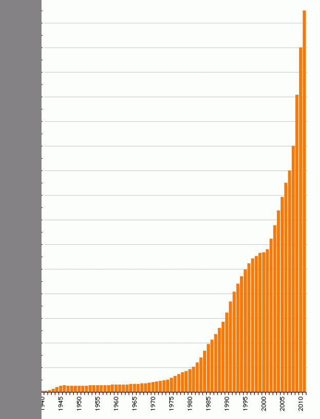
Game: What this chart show ?
page: 1share:
I'm bored, so are you, lets play a guessing game.
Previous picture test:Europe satellite picture , explain
Here is a chart, the legends are removed, your job is to guess/deduct what this chart is showing.
Is it world population?/number of cars in Europe ?/transistor usage ?/number of UFO sighting/ships in the world ? ...or what ?
Dont use Google please, its cheating!
edit on 6-3-2014 by NullVoid because: (no reason given)
nvm
must be an arbitrary scale of the rage of the people towards the truth
must be an arbitrary scale of the rage of the people towards the truth
edit on 6-3-2014 by Indigent because: (no reason
given)
Is it showing the rise of dumbassery and idiocy throughout the years?
My only other guess would be how many deer saw Bigfoot having interspecies relationships as opposed to kids who preferred chicken nuggets to cheeseburgers...
S&F for the original idea and trying to have a bit of fun, even though it was ruined.
My only other guess would be how many deer saw Bigfoot having interspecies relationships as opposed to kids who preferred chicken nuggets to cheeseburgers...
S&F for the original idea and trying to have a bit of fun, even though it was ruined.
edit on 3/6/2014 by Kangaruex4Ewe because: (no
reason given)
Nevermind, game over
edit on 3/6/2014 by seentoomuch because: (no reason given)
reply to post by Indigent
Awwww
You should wait others reply first, just to see what is obvious but people cant see.
My game killed so fast
Ahh edited, seems I still have the chance
You can post the answer after we see some people response.
Awwww
You should wait others reply first, just to see what is obvious but people cant see.
My game killed so fast
Ahh edited, seems I still have the chance
You can post the answer after we see some people response.
edit on 6-3-2014 by NullVoid because: (no reason given)
reply to post by NullVoid
This chart represents the number of people who now regret voting Obama in for a second term...
Des
This chart represents the number of people who now regret voting Obama in for a second term...
Des
reply to post by NullVoid
Hey, that was my first gut reaction post....I'm hearing a lot of people saying they wish they had voted no instead of yes. Look at it this way...my silly guess, and you asked for guesses. Got you a star and flag...
Des
Hey, that was my first gut reaction post....I'm hearing a lot of people saying they wish they had voted no instead of yes. Look at it this way...my silly guess, and you asked for guesses. Got you a star and flag...
Des
I know, I know, amount of people with university studies unemployed
I'm guessing wealth of the 1% or something along those lines.
If you changed the dates could also represent the amount of toilet paper I go through now that my girlfriend spends more and more time here lol
If you changed the dates could also represent the amount of toilet paper I go through now that my girlfriend spends more and more time here lol
DeadGhost
1992-2000 looks pretty good IMO
Yes, it get more and more, a progress and exponential at it, technology ?.
reply to post by NullVoid
It's either the graph of income disparity/wealth of the top 1% or CO2 emissions. Both, iirc, look ironically similar.
It's either the graph of income disparity/wealth of the top 1% or CO2 emissions. Both, iirc, look ironically similar.
Televisions owned? Cancer rate? Death by technology?
I am trying to think of positive things that would fit , sadly, I can think of very little and that bothers me.
I am trying to think of positive things that would fit , sadly, I can think of very little and that bothers me.
edit on 6-3-2014 by calstorm
because: (no reason given)
edit on 6-3-2014 by calstorm because: (no reason given)
calstorm
Televisions owned? Cancer rate? Death by technology?
I am trying to think of positive things that would fit , sadly, I can think of very little and that bothers me.edit on 6-3-2014 by calstorm because: (no reason given)edit on 6-3-2014 by calstorm because: (no reason given)
lol, although I definitely recognized the graph (I am a graph junky lol--they are awesome), I still wished it was for something good, too. Would be nice, wouldn't it?
How about it being a graph of the number of good deeds done in a day set in millions?
NullVoid
reply to post by Destinyone
LOL
Since 1940s ?
Romney showed them how to "retroactively" do things in the past like regret voting or... resigning from companies.
reply to post by NullVoid
I was looking at it comparing administrations and trends. Whatever it is, it climbed during Reagan, tapered off with Clinton, and then skyrocketed with Bush and Obama.
I'd say it would be the general level of government douchebaggery .
I was looking at it comparing administrations and trends. Whatever it is, it climbed during Reagan, tapered off with Clinton, and then skyrocketed with Bush and Obama.
I'd say it would be the general level of government douchebaggery .
new topics
-
University of Texas Instantly Shuts Down Anti Israel Protests
Education and Media: 22 minutes ago -
Any one suspicious of fever promotions events, major investor Goldman Sachs card only.
The Gray Area: 2 hours ago -
God's Righteousness is Greater than Our Wrath
Religion, Faith, And Theology: 6 hours ago -
Electrical tricks for saving money
Education and Media: 10 hours ago -
VP's Secret Service agent brawls with other agents at Andrews
Mainstream News: 11 hours ago
top topics
-
VP's Secret Service agent brawls with other agents at Andrews
Mainstream News: 11 hours ago, 9 flags -
Cats Used as Live Bait to Train Ferocious Pitbulls in Illegal NYC Dogfighting
Social Issues and Civil Unrest: 15 hours ago, 8 flags -
Nearly 70% Of Americans Want Talks To End War In Ukraine
Political Issues: 12 hours ago, 4 flags -
Electrical tricks for saving money
Education and Media: 10 hours ago, 4 flags -
Sunak spinning the sickness figures
Other Current Events: 12 hours ago, 3 flags -
Late Night with the Devil - a really good unusual modern horror film.
Movies: 14 hours ago, 2 flags -
Any one suspicious of fever promotions events, major investor Goldman Sachs card only.
The Gray Area: 2 hours ago, 2 flags -
The Good News According to Jesus - Episode 1
Religion, Faith, And Theology: 17 hours ago, 1 flags -
God's Righteousness is Greater than Our Wrath
Religion, Faith, And Theology: 6 hours ago, 0 flags -
University of Texas Instantly Shuts Down Anti Israel Protests
Education and Media: 22 minutes ago, 0 flags
active topics
-
Nearly 70% Of Americans Want Talks To End War In Ukraine
Political Issues • 28 • : andy06shake -
VP's Secret Service agent brawls with other agents at Andrews
Mainstream News • 43 • : Hakaiju -
Everest-sized ‘Devil comet’ Pons-Brooks Visible Now
Space Exploration • 17 • : Compendium -
Russia Ukraine Update Thread - part 3
World War Three • 5729 • : stu119 -
Nakedeye Mother of Dragons Comet Is Here!
Space Exploration • 5 • : Compendium -
HORRIBLE !! Russian Soldier Drinking Own Urine To Survive In Battle
World War Three • 38 • : BernnieJGato -
God's Righteousness is Greater than Our Wrath
Religion, Faith, And Theology • 24 • : randomuser2034 -
15 Unhealthiest Sodas On The Market
Health & Wellness • 43 • : JPRCrastney -
University of Texas Instantly Shuts Down Anti Israel Protests
Education and Media • 0 • : FlyersFan -
Sunak spinning the sickness figures
Other Current Events • 9 • : Ohanka